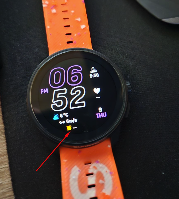
@sky-runner said in [Vertical 2, 2.53.42] Map and Navigation features are greatly improved but there are still a lot of old issues and also new bugs introduced in the latest update:
@dreamer_ I used the navigation arrow on Garmin Fenix 6 and 7 watches - the one that goes around the data screen.
I thought about suggesting the same for Suunto watches but I think it won’t fit the design because there is already intensity zone dial around most data screens on Suunto watches, and it has its own arrow. Having two different arrows would be confusing.
And besides, in my experience that navigation arrow didn’t work that well at running speeds. Often, it would delay pointing me in the right direction until after I was already past the turn if I wanted to go quickly without stopping, so in many situations it was adding to the confusion rather than helping me to navigate.
I’m not that sure. The thing is the arrow we already have for the intensity zone is always is in the other direction, pointing to the datafields. Perhaps that arrow, instead of being white, should have the color that matches the intensity zone. But doing that, red is still invalidated.
So, much better, change the arrow for something else that is not an arrow and problem solved (I.E, a double T).
[image: 1779655780905-13332.jpg]
This is only the idea . The design could be made a lot better, so the problem is not really there.
In the other side, I see an scenario where having the arrow in the datafields is more than nothing. I still remember an ultra running at night with fog and deep forest following that arrow in the datafields. That was several years ago, and also with a Fenix 6 Pro and navigation is much better now. But watches are also a lot more reactive for the arrow.
It’s just an idea, of course. The how, if possible, should be thinked much better than this.