@seanvk said in Device Pairing notifications, how to block:
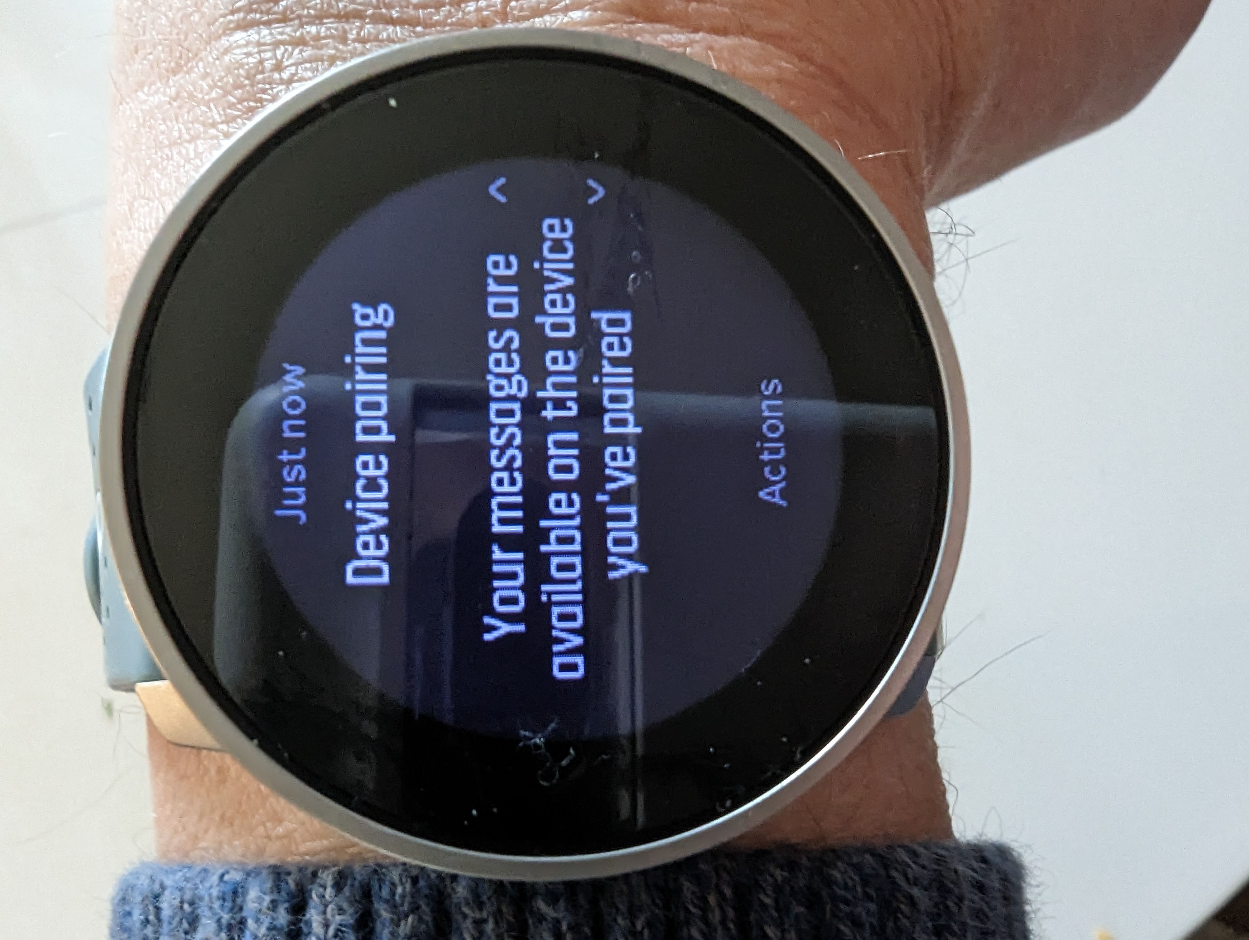
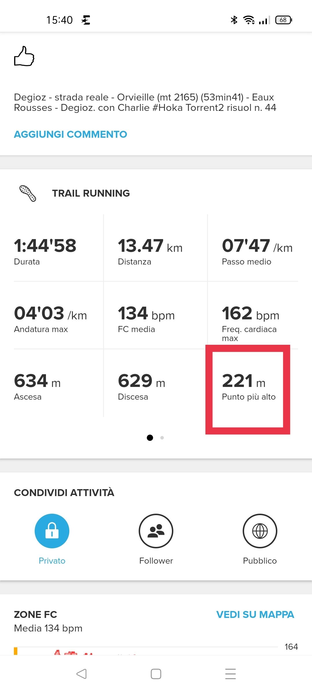
@zhang965 Last post was it. Found it just now on my phone - happens 118 times a day !?!?!?
[image: 1672268490498-screenshot_20221228-145726.png]
118? Bizarre, it should be a number which is multiples of 24 right? 120, 96, or 144