@Garageman
No, there is no direct way to import or transfer dive logs from a Vyper Novo into the Suunto Nautic dive computer itself, nor to merge them natively between different computers in the Suunto app.
My situation was similar with a Vyper Air (DM5 only):
I downloaded the dive logs from the Vyper Air to Suunto DM5 via USB.
In SuuntoLink, I used the “Import dive logs” option (under the menu) to pull the DM5 history directly into the Suunto app on my Android phone—no device connection required for this step.
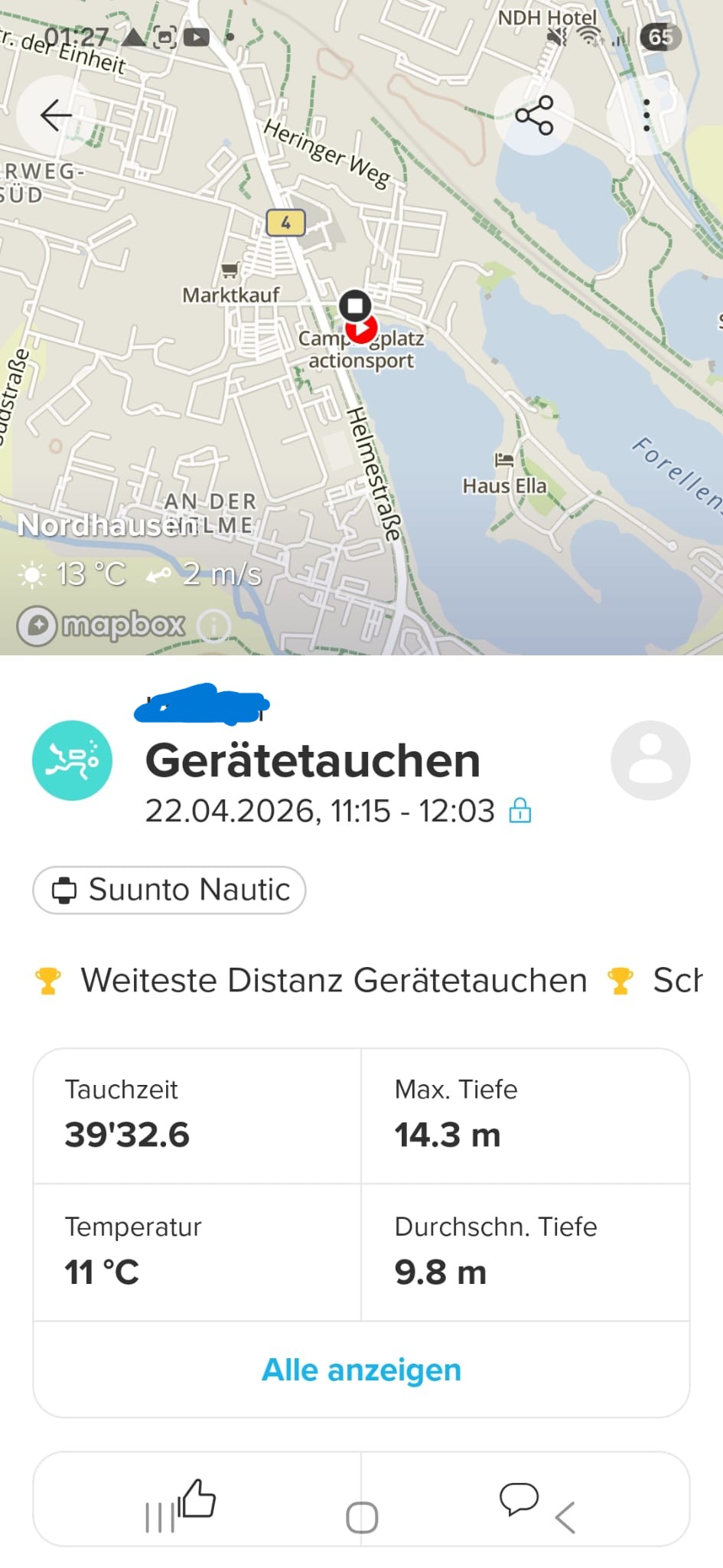
All my previous dives are now in the Suunto app.
Unfortunately, this only consolidates everything in the app (not on the Nautic device). The app remains the central storage for historical logs across Suunto computers. So I guess that’s how it is, and it makes sense for the vast majority of users. I don’t expect Suunto to add an “export to dive computer” function anytime soon.