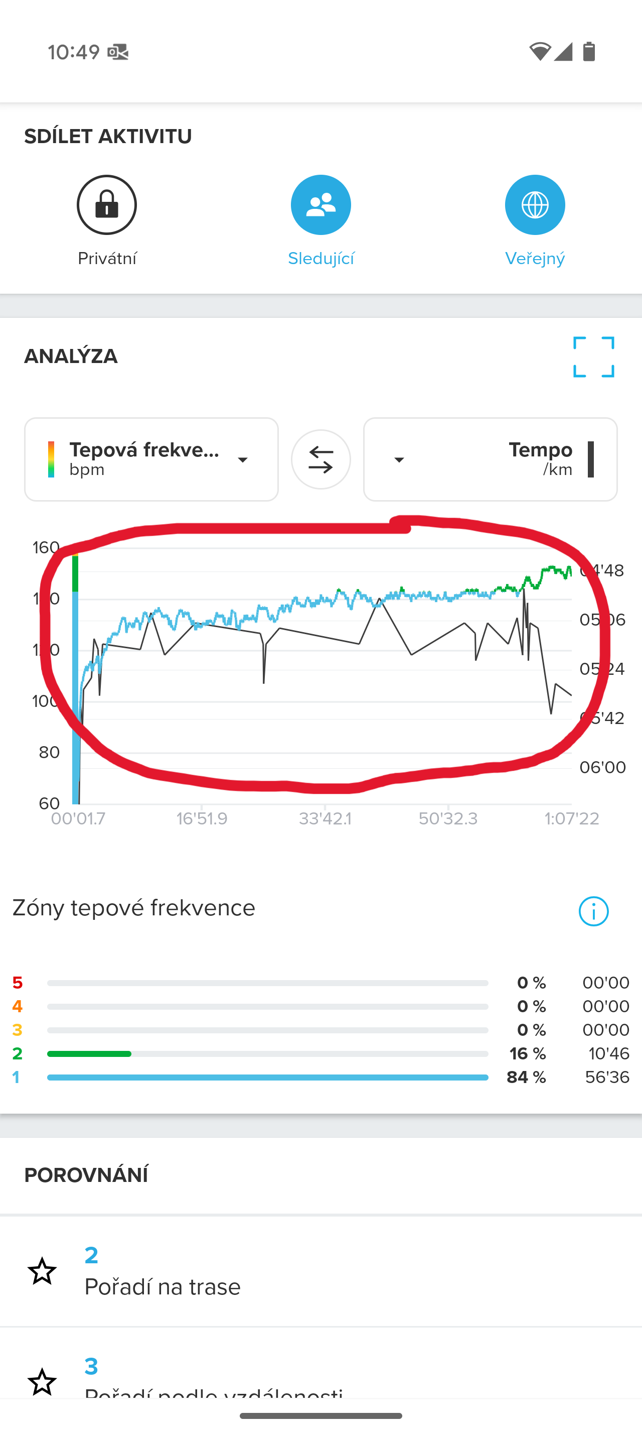
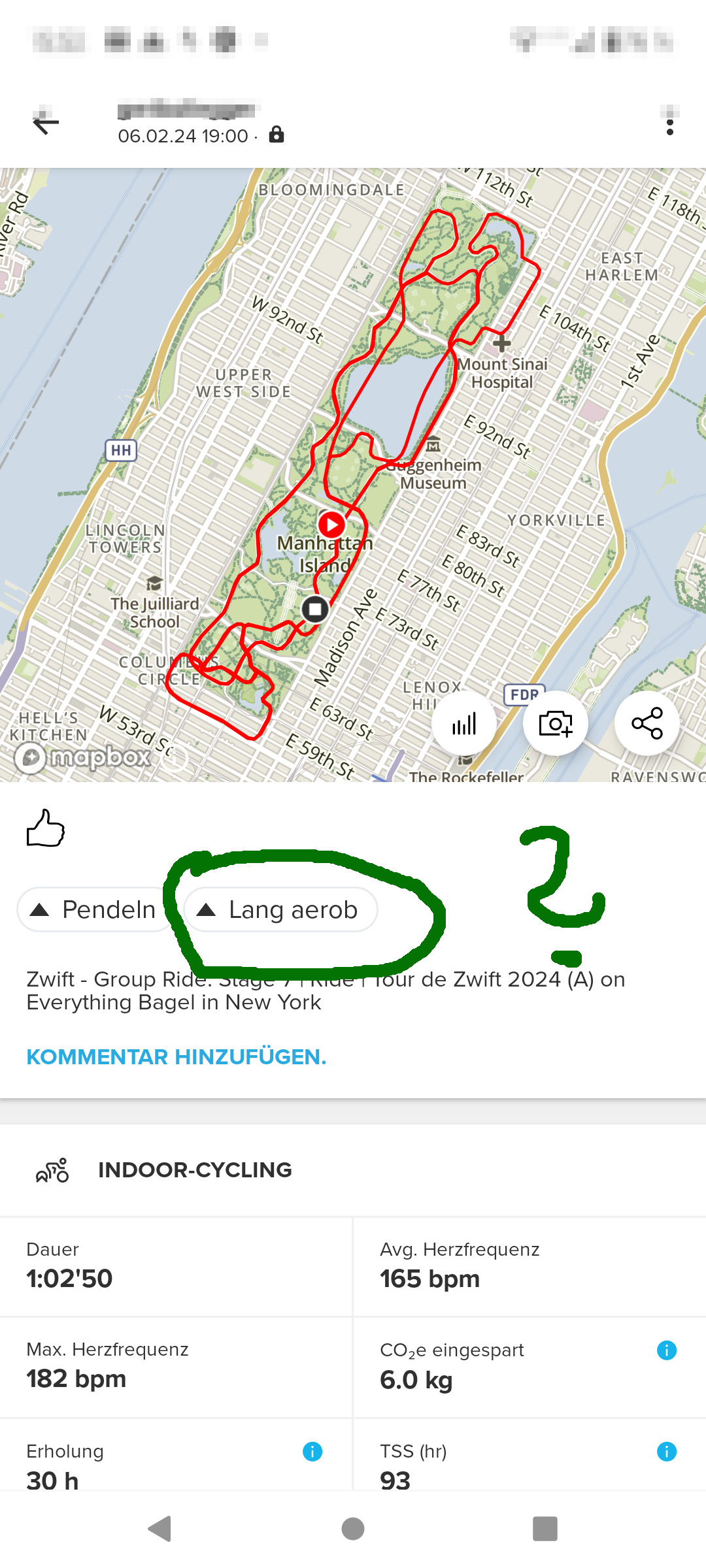
Darn… I brought this up yesterday in an open topic (I’m seldom logged in and therefore can’t read things in this forum section). From my experience, having used a Race S since December 2024 and never gotten a finely plotted pace graph, the length of the session does not matter, it is the span between fastest and slowest pace that trigger different renderings. As a ‘bug fix’ (I wrote today) I will walk the last 10 seconds of every run henceforth:
“Zonesense difficult to understand”
https://forum.suunto.com/post/165127
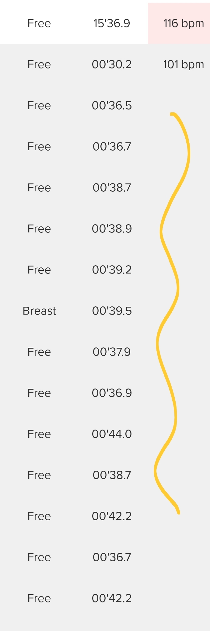
Otherwise we get things like the plot below, where I upped the pace with 5 seconds every kilometres the first 5 km, and then fell back to the opening pace for the last 5 km. But there’s not a chance to see the pace changes with this coarse platting:
[image: 1743693563927-1000006892.jpg]
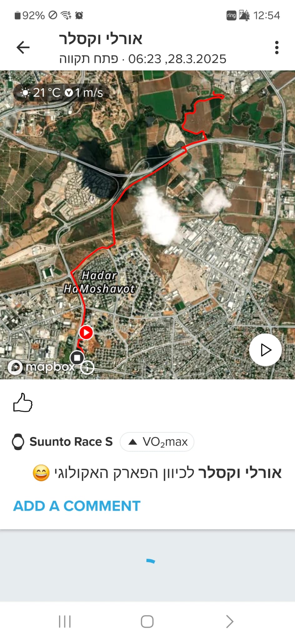
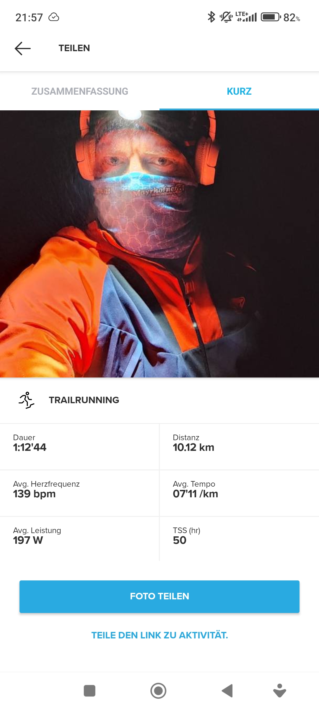
Contrast this with today’s experiment where I began with walking pace the first 30 seconds (same screenshot as in the linked posting):
[image: 1743693693225-1000006891.jpg]