-
by the way I’m using glasses since I was 12
-
@tomas5
Very good to see that you like this second screen information.
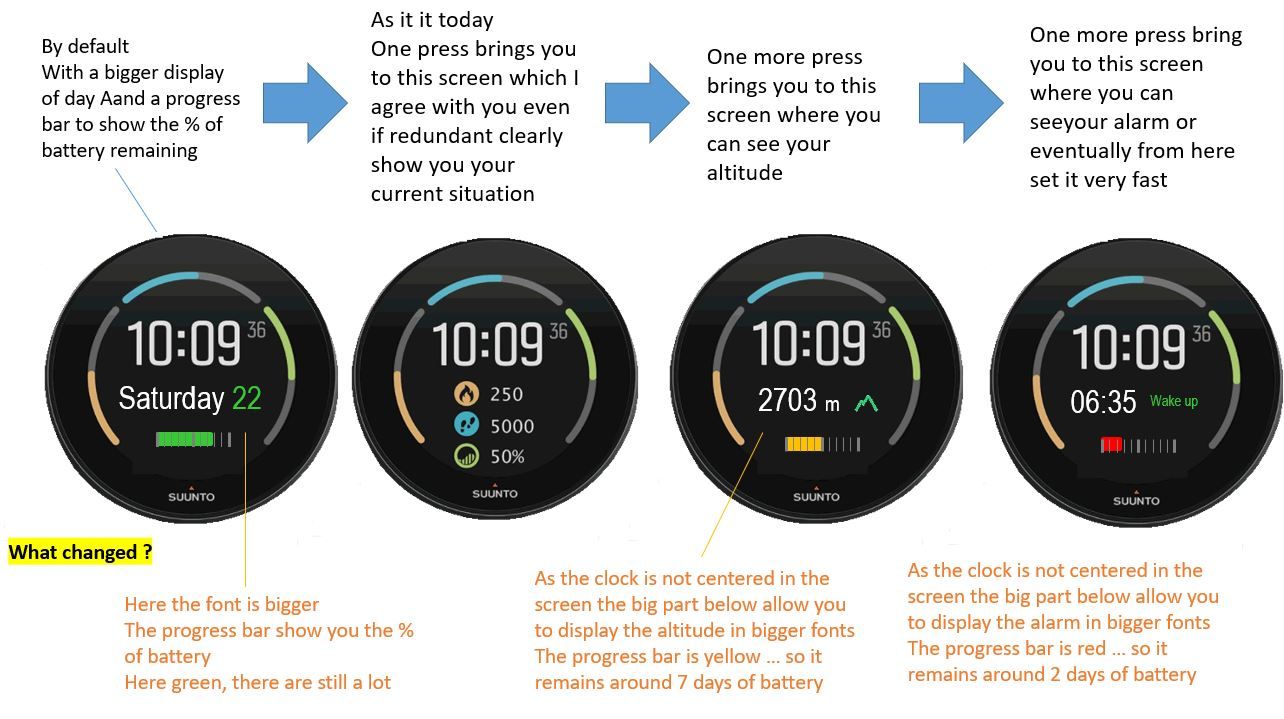
you use of the watch is different than mine and I can catch it !Now … Keeping your need what do you think if the watchface was allowing you this …

You will have what is missing … and also the font are bigger as it is doable thanks to the fact this watch face as the time not in the center but in the upper part, which is giving more space below for secondary informations …
-
@pierre-yves-colle Yeah, an altitude would be great on this face.
-
@pierre-yves-colle well 3rd screen is good for Suunto 9 Baro users, but for users of S3, S5, S9 it is useless because they don’t have hardware for correct altitude. So maybe split functionality between S9 Baro and rest of Suunto watches without baro.
To keep it more united I would suggest to use battery icon + numeric percentage of battery instead of progress bar. It would be more consistent.
Last screen on S5 shows alarm, date, battery, number of notification (this number doesn’t work well), and info if today is scheduled as training day or not. And this screen is accesible by single press of middle right button. With your proposail it would be 4th screen and even with removed info about training.
I prefer original suunto desing more. Best solution would be customization of suunto watch faces but that is challenge for programmers.
-
@tomas5 said in Some much more interresting screens from main default clock screen when we pressing the middle button:
creen on S5 shows alarm, date, battery, nu
Hello Thomas
Thanks for your reply and info provided.
I’m a SUUNTO watch’s user not part of their DEV or PRODUCT team (truly I have 9 BARO which I like a lot), I was not aware that Altitude is not available in other SUUNTO as I was guessing that it could be computed using GPS signal – less precise but still available –
Concerning the battery … on purpose I put a progress bar … by the way for me it is simplier than for the DEV-- even so it is easy – as I create the screens in PowerPoint
 … in fact I like a lot the visual aspect of the progress bars … even if you do not read precislly the value or cannot read it very well … the size of the progress bar and its color give you an insteantaneous indication and feeling
