-
@pierre-yves-colle
Hi, I agree … we’re getting older and our eyesight is getting worse. I use a standard screen (as in the picture on the box from the watch) and I have trouble seeing a small date of the day. I have been using glasses for about a year and I am 44 years old… -
@durri said in Some much more interresting screens from main default clock screen when we pressing the middle button:
I have been using glasses for about a year and I am 44 years old
Maybe you started too late

-
@durri
Good to see I’m not alone who has difficulties to read
I was feeling a poor lonseome mountainer
The paradox of this watch is that it depends a lot of the conditions around to be able or not to read.
For exemple, I have less problems in these 2 situations : either in complete dark where the light of the information is very bright and allow a good reading, or when it is super sunny, I realized that SUUNTO did a beautiful miracle as the sun beans are increasing a lot the contrast and the watch is becoming easier to read.
However …
Most of the time I’m neither in the first nor in the second situation and in a cloudy day or early in morning or late in the evening the constrast is no more here and then the small things are super difficult even impossiple to read … .and then come my bad thoughs … …I’m asking myself … .why so many black empty space, why these so small informations … why this beautiful green or gray for buttons background but with a characters in white make them not easy to read …
If I could have access to this to change …
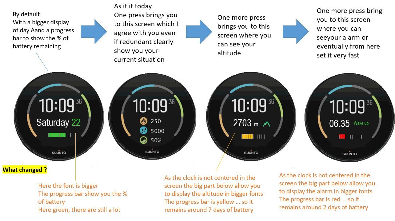
with the clock information a little bit on the up side of the watch, I gain a lot below (by the way I’m inventing nothing … THEY DID IT in the last watch face !!!) then I can write bigger the secondary information, I can put a progress bar to show the % of battery … let’s make it super pro with a different color depending on what’s remain … only 2 days => red, only 7 days => yellow, other green (of course 2 and 7 are approximative measure of percentage … but it could a valuable alertt hat you should refuel your watch…
…
A option in configuration “Improved visibility” which is very positive and that will have allowed all of this will have been fantastic. -
@sartoric
Bad guy


I started with glasses when I was a kid … not able to see far object
then at my 35 I got a surgery operation of the eyese and now I’m no more wearing glasses and have almost a 12/10 view on far objects which is awesome for a mountainer … I can see so well the mountains and enjoy it so much …
however … becoming a old 53y man … my near view is becoming worth and worth …

Just to say … if you wear glasses for far distance and you do not like this… the laser surgery makes fantastic results …
PS : nothing asked to SUUNTO folks to do with their watch here


-
The new suunto partnership for a new product line … coming soon

-
by the way I’m using glasses since I was 12
-
@tomas5
Very good to see that you like this second screen information.
you use of the watch is different than mine and I can catch it !Now … Keeping your need what do you think if the watchface was allowing you this …

You will have what is missing … and also the font are bigger as it is doable thanks to the fact this watch face as the time not in the center but in the upper part, which is giving more space below for secondary informations …
-
@pierre-yves-colle Yeah, an altitude would be great on this face.
-
@pierre-yves-colle well 3rd screen is good for Suunto 9 Baro users, but for users of S3, S5, S9 it is useless because they don’t have hardware for correct altitude. So maybe split functionality between S9 Baro and rest of Suunto watches without baro.
To keep it more united I would suggest to use battery icon + numeric percentage of battery instead of progress bar. It would be more consistent.
Last screen on S5 shows alarm, date, battery, number of notification (this number doesn’t work well), and info if today is scheduled as training day or not. And this screen is accesible by single press of middle right button. With your proposail it would be 4th screen and even with removed info about training.
I prefer original suunto desing more. Best solution would be customization of suunto watch faces but that is challenge for programmers.
-
@tomas5 said in Some much more interresting screens from main default clock screen when we pressing the middle button:
creen on S5 shows alarm, date, battery, nu
Hello Thomas
Thanks for your reply and info provided.
I’m a SUUNTO watch’s user not part of their DEV or PRODUCT team (truly I have 9 BARO which I like a lot), I was not aware that Altitude is not available in other SUUNTO as I was guessing that it could be computed using GPS signal – less precise but still available –
Concerning the battery … on purpose I put a progress bar … by the way for me it is simplier than for the DEV-- even so it is easy – as I create the screens in PowerPoint
 … in fact I like a lot the visual aspect of the progress bars … even if you do not read precislly the value or cannot read it very well … the size of the progress bar and its color give you an insteantaneous indication and feeling
