-
@surfboomerang said in Some much more interresting screens from main default clock screen when we pressing the middle button:
@pierre-yves-colle Keep in mind that your idea of perfection can differ from other people’s perspective.
@pierre-yves-colle said in Some much more interresting screens from main default clock screen when we pressing the middle button:
The one with with barometric info … super beautiful on paper … totally unreadable in reality
This is exactly what I mean.
I like the Outdoor watchface very much. For me the dial is clearly readable, but I can imagine it can be really hard to read for other people.
If you make the font larger or change the design, other people will have comments about it.I did a suggestion in another post when the watchface just came out because it would make sense to me, but maybe other people have other ideas. At the end it’s up to Suunto if, and how, they implement it.
I think it’s really hard (if not, impossible) for Suunto to design a “one size fits all” watch and compromises will always be made. Not only on Suunto’s side, but also on the customer side.
So eventhough Suunto still hasn’t implemented my suggestion, I still love the watchface. -
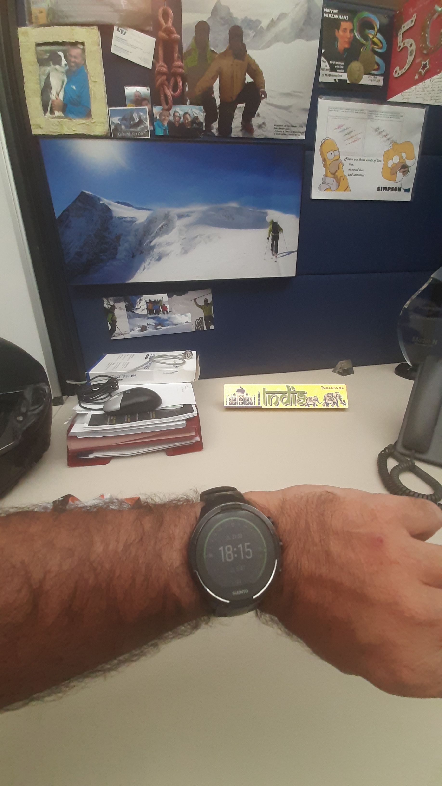
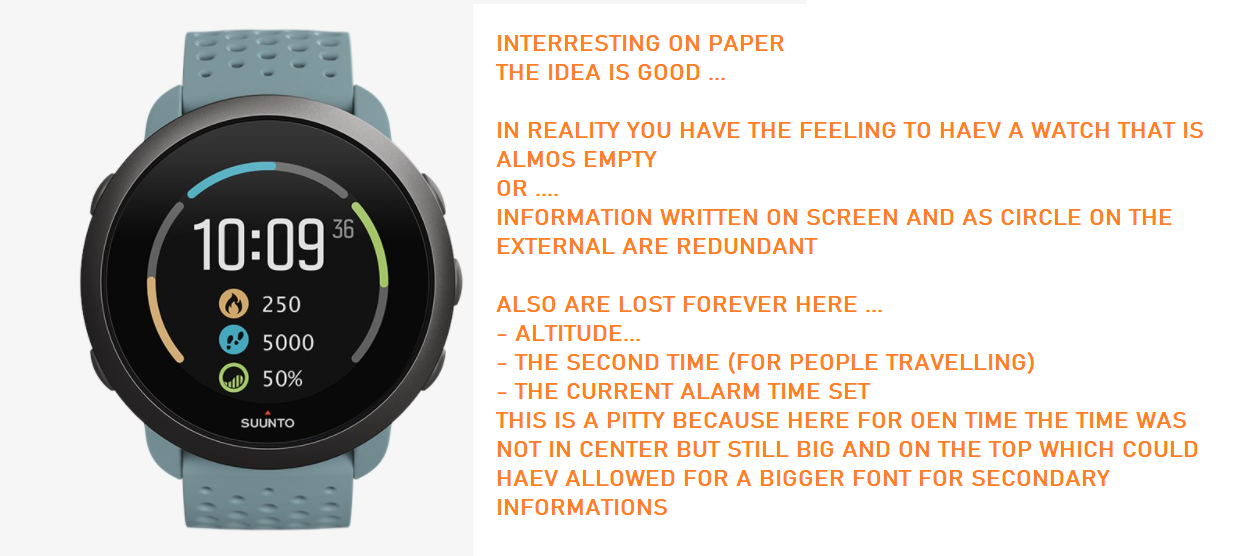
Just to illustrate what I see with my poor eyes


Here honestly I see a big green plate on the top but cannto catch anythign
I still confirm I can see the time

Here … well well well you may tell me that I should not see more …
not exactly …
In fact I see more !!! and I can catch better the sun course …
why ?
As is it just a part of a circle line and a point, I can see this green point which shows the current sun rise position …
BTW I appreciate this a lot, some times I’m even myself surprised when the race is just at its middle and there is still so many day light time remaining.After that … I practically can see the 2 times written … in fact … NO
 …
…
It is too small … so I cannot tell precisely that it started at 5:48 and ends at 21:30
… too too small written and I’m obliged to do an effort of reading, moving the watch like this like that to try to better see …Hence I had preferred to have the TIME displayed not centered on the screen but more on the top part of it, which have given a bigger space below to put information with bigger fonts.

-
@pierre-yves-colle I am becoming an „older“ guy too with 51 and my eyesight is deteriorating, making it difficult to read small numbers and letters - so I am with you, when it comes to readability! Would be great to have some „bigger“ digits AND additional data.
AND I really love your ideas and how you present them! I am not into IT, but teach, and how you transport information is really great! You would have become a good teacher too!
BUT for me - I don’t want to have 10.000 features, from watchfaces to barometric screens to snow calculating screens …🤪. I love the certain „simplicity“ Suunto offer and that’s what makes me enjoying the watch because I can concentrate on what I am doing with it. I had a Fenix 6 Pro which had way more features than a S9 but I did not really enjoy running or hiking with it as much as I do with the Suuntos. It somehow felt like „working“ and in the end the data I got wasn’t even as good and readable and evaluating it again felt more like work and not recreation. So at least for me it’s ok that Suunto is relatively sensible when it comes to implementing new features. -
@chrisa
Hello Chris, first of all, thanks a lot for the very kind words.
Let me precise few things.
I’m exactly liek you. I do not want a “gadget” watch but totally in reverse a watch for mountainer … I should even say professional mountainers … so something hyper practical.
Of course everybody is different and what I judge as superficial might be in reverse the best feature that someone else might want to have.
If it was me to had the magic stick to add or remove feature … I will have removed these ones in order to put some other that are more of use in mountain (summer or winter) … but that’s only my choices and some other will chose some others features and are also very rights in their demands.
for me are gadgets :- the notification screen, in any case the text being too small I cannot read them easily
- the screen that tells me that I’m stressed … it stress me even more

- the advise screen indicating me my level of health
…
Of course someone more oriented on trails, running activities or just heatlh care will feel these screen are important.
This is why I also understand that Suunto has to do some compromise.
Having said that … having a sort of “bigger font” option for visually impaired people should be somethign that SUUNTO should think … many people I know who are less “mountain” oriented than me do not like this watch when I show them because they say it is not readable … and they prefer a much bright one even if the battery will be consumed far more faster.
So somehow … SUUNTO is restricting by themself their potential market …

-

My apologize if I may have hurt some people.
I like this watch face. Circle is really redundant but at least I have Calories, Steps and Resources on one screen. I miss only battery percentage on this screen.
I have Suunto 5 I don’t have HW for compass or baro so this screen displays almost all data possible for watch face. And information about alarm is accesible by middle button press. So it is not an issue. Don’t see any reason to display alarm on main screen since it is almost “static” information.
Just my thoughts.
-
@pierre-yves-colle
Hi, I agree … we’re getting older and our eyesight is getting worse. I use a standard screen (as in the picture on the box from the watch) and I have trouble seeing a small date of the day. I have been using glasses for about a year and I am 44 years old… -
@durri said in Some much more interresting screens from main default clock screen when we pressing the middle button:
I have been using glasses for about a year and I am 44 years old
Maybe you started too late

-
@durri
Good to see I’m not alone who has difficulties to read
I was feeling a poor lonseome mountainer
The paradox of this watch is that it depends a lot of the conditions around to be able or not to read.
For exemple, I have less problems in these 2 situations : either in complete dark where the light of the information is very bright and allow a good reading, or when it is super sunny, I realized that SUUNTO did a beautiful miracle as the sun beans are increasing a lot the contrast and the watch is becoming easier to read.
However …
Most of the time I’m neither in the first nor in the second situation and in a cloudy day or early in morning or late in the evening the constrast is no more here and then the small things are super difficult even impossiple to read … .and then come my bad thoughs … …I’m asking myself … .why so many black empty space, why these so small informations … why this beautiful green or gray for buttons background but with a characters in white make them not easy to read …
If I could have access to this to change …
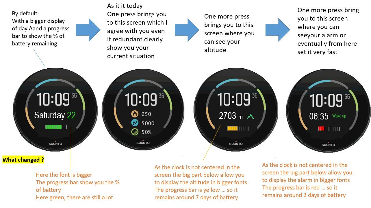
with the clock information a little bit on the up side of the watch, I gain a lot below (by the way I’m inventing nothing … THEY DID IT in the last watch face !!!) then I can write bigger the secondary information, I can put a progress bar to show the % of battery … let’s make it super pro with a different color depending on what’s remain … only 2 days => red, only 7 days => yellow, other green (of course 2 and 7 are approximative measure of percentage … but it could a valuable alertt hat you should refuel your watch…
…
A option in configuration “Improved visibility” which is very positive and that will have allowed all of this will have been fantastic. -
@sartoric
Bad guy


I started with glasses when I was a kid … not able to see far object
then at my 35 I got a surgery operation of the eyese and now I’m no more wearing glasses and have almost a 12/10 view on far objects which is awesome for a mountainer … I can see so well the mountains and enjoy it so much …
however … becoming a old 53y man … my near view is becoming worth and worth …

Just to say … if you wear glasses for far distance and you do not like this… the laser surgery makes fantastic results …
PS : nothing asked to SUUNTO folks to do with their watch here


-
The new suunto partnership for a new product line … coming soon

-
by the way I’m using glasses since I was 12
-
@tomas5
Very good to see that you like this second screen information.
you use of the watch is different than mine and I can catch it !Now … Keeping your need what do you think if the watchface was allowing you this …

You will have what is missing … and also the font are bigger as it is doable thanks to the fact this watch face as the time not in the center but in the upper part, which is giving more space below for secondary informations …
-
@pierre-yves-colle Yeah, an altitude would be great on this face.
-
@pierre-yves-colle well 3rd screen is good for Suunto 9 Baro users, but for users of S3, S5, S9 it is useless because they don’t have hardware for correct altitude. So maybe split functionality between S9 Baro and rest of Suunto watches without baro.
To keep it more united I would suggest to use battery icon + numeric percentage of battery instead of progress bar. It would be more consistent.
Last screen on S5 shows alarm, date, battery, number of notification (this number doesn’t work well), and info if today is scheduled as training day or not. And this screen is accesible by single press of middle right button. With your proposail it would be 4th screen and even with removed info about training.
I prefer original suunto desing more. Best solution would be customization of suunto watch faces but that is challenge for programmers.
-
@tomas5 said in Some much more interresting screens from main default clock screen when we pressing the middle button:
creen on S5 shows alarm, date, battery, nu
Hello Thomas
Thanks for your reply and info provided.
I’m a SUUNTO watch’s user not part of their DEV or PRODUCT team (truly I have 9 BARO which I like a lot), I was not aware that Altitude is not available in other SUUNTO as I was guessing that it could be computed using GPS signal – less precise but still available –
Concerning the battery … on purpose I put a progress bar … by the way for me it is simplier than for the DEV-- even so it is easy – as I create the screens in PowerPoint
 … in fact I like a lot the visual aspect of the progress bars … even if you do not read precislly the value or cannot read it very well … the size of the progress bar and its color give you an insteantaneous indication and feeling
