-
Just to show again my dream and why …


For me this design reusing part of what alreayd exist iswhat I would have dreamed for.
-
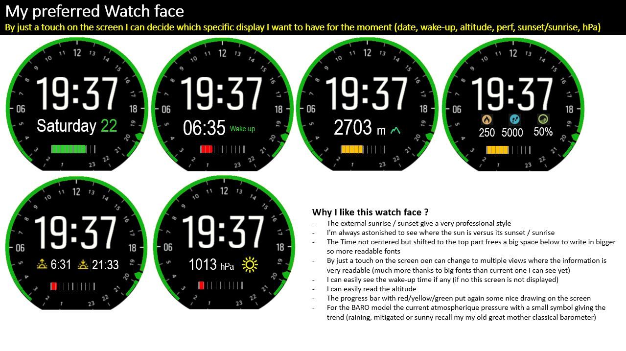
I like so much the external circle of sunrise / sunset and this point representing the sun … each time I see it I’m astonished, especially when the sun is in the middle to see how much still daylight I will have … it enjoys the rest of my day … or when I wake up to see how much daylight I have already missed … like a promise to wake up earlier tomorrow to see a full sunny day
-
The time not centered but displayed big and in the upper part is already existing in some watch face and provide very big advantages … it is easy to read, it free a big part below allowing to display bigger the secondary information so to make it also very easy to read
-
you take all the advantage of having a touchable screen, by just touching it you can switch from one screen to another … today the altitude, this afternoon the atmospheric pressure if you have a baro model, at the end of your journey the performances, during the night a small check on the alarm set if any,
Giant !!! -
the progress bar for the remainign battery put again a drawing which gives a very progfessional rendering, also the trick of red for 2 days approximative remaining battery, yellow for 7 days and green elsewhere give you an immediate signal for refueling the watch depending on what you plan to do
Last but not least
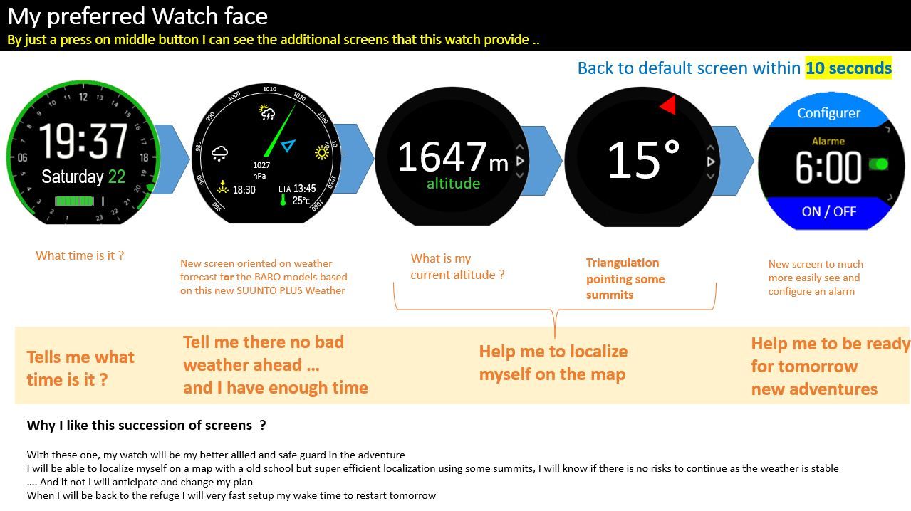
WIth the center button I will have access immediatelly to some super interresting secondary screens … I will really feel that this watch is my safeguard dog as I can very fast make a point of situation : what time is it ?, how much time is remaining and I can continue or not as I get idea of the weather (for the BARO models), localize me … and then when I’m at refuge … setup my wake up so tomorrow I restart the adventure
-