Suunto Software update Q2 (2.56.18) - July 14th, 2026 - Vertical 2 and Race 2
-
The issue with Bluetooth sensors disconnecting is still there after the update. It’s been over half a year now, and still no fix.
Considering that actual real support – warranty and regular updates – lasts about two years with Suunto, that means over 25% of the product’s life has been affected by a serious issue. That’s hard to accept when you’re buying top‑end, most expensive Suunto watches.
I have the same problem with my race s and reported it several times. From the conversation I had with Suunto support last week, they only started to look into in a few days ago and concluded it is not a watch firmware problem but a bluetooth firmware problem so they directed the problem to the bluetooh firmware team.
This worries me. For half a year they did nothing with the problem and at some point even denied knowing about the problem (although I reported it, with logs, months before that)
-
My Vertical 2 is for the last ± 5h since firmware update in a boot loop. Its either “The device is being restored to a safe state”, “Improving your watch for adventure”, or “This is taking longer than expected. Thank you for being patient”. It always ends at the attached error screen, which is hard to capture since it reboots again a few seconds later.
Not sure what to do now. no key combos change that, probably the battery will run out soon.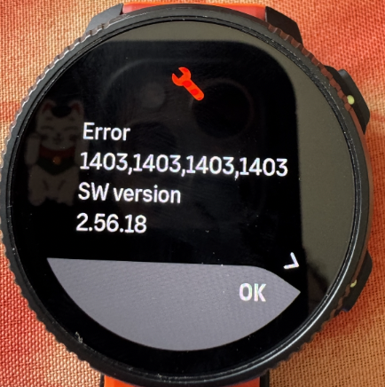
-
To me this Tide widget is very debatable. It only benefits people who actually live near a beach and also people who do a sport related to it. And even they probably use better tools for more refined information.
There are bugs to be fixed and features to be made which target larger audiences.
To me altitude measurement is very debatable. It only benefits people who actually live in the mountains and also people who do a sport related to them.
…it seems you are not living near the sea. Others (like me) do. While I only need altitude information when I am travelling far into the mountains, I see that this function could benefit others. Maybe you can see what benefits others as well…
t6, S6, Elementum Terra, Ambit 3 Sapphire, Spartan Ultra Copper, Traverse Alpha, S7 Graphite LE, S9B Ambassador, S9P Titanium, S9PP Titanium, Vertical All Black, Race Titanium Charcoal, Race S Titanium Courtney, Run Lime, Race 2, Vertical 2 Titanium
-
@makoc maybe it is a good idea to contact support about this.
-
@makoc there is a separate thread with the same problem… in this thread a possible workaround is described by @dimitrios-kanellopoulos
https://forum.suunto.com/topic/15551/suunto-race-2-device-is-being-restored-to-a-safe-state-bootloop -
@SuperFlo75 I think I solved my own problem. But indeed the solution seems to be keeping up. And watch is still operational after a 2,5h ‘move’.
@makoc ; seems to be the same error as yours, so give it a try. good luck. For me it took two days to have the bootloop drain all the power from the watch.
-
@mich-heller Sorry but this is an incredibly out of touch response. I don’t need contact lenses, I only wear glasses to read smaller text which is why I always complain about tiny fonts on the watch.
I know Apple is Apple but their watch offers accessibility options which make everything very legible, even while on the run. I’d just like to see a bump in font size which would benefit people like me, but disadvantage no-one else.
It can be done because the menu list is very legible, I just want to see system messages and complications using a similar font size and weight.
Watch: Suunto Race S
-
As I said above, the problem isn’t necessary with the font size. The problem is with an poor choice of colors, but probably also insufficient outlines and spacing between letters.
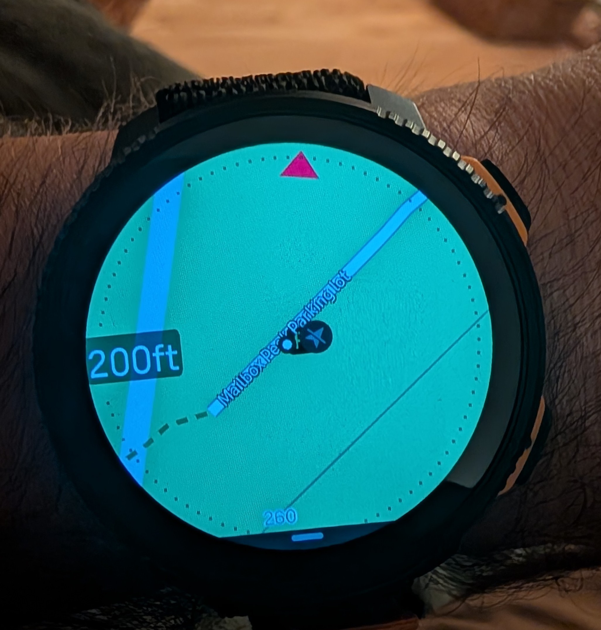
Let’s compare. Here is a screenshot of my Vertical 2 map on the Light map - can’t read this at all unless I enlarge the image a lot:
Now for comparison a couple of pictures of Fenix 8 map that I downloaded from Garmin Forum:
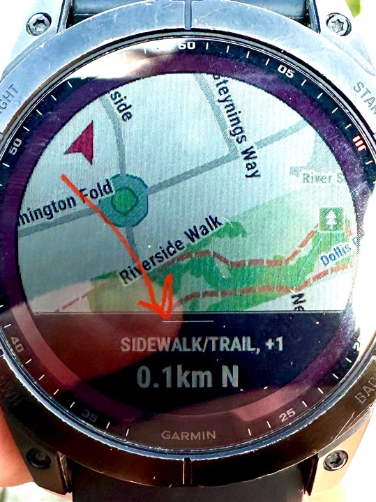
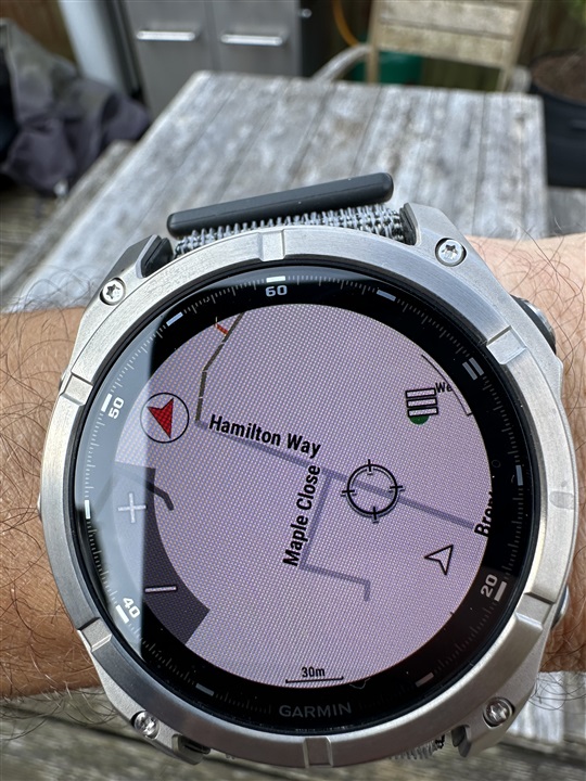
Garmin fonts aren’t necessarily much larger, but look how crisp the letters are compared to what we see on a Suunto map.
The differences that I.can see are the following:
- Garmin renders letters as black on white with a relatively thick outlines so letters stand out.
- The font is bolder, which makes better contrast
- The spacing between letters seems to be a bit wider so that letters are more distinct.
- Labels are offset from roads which makes it easier for them to stand out against the solid background.
It seems that Garmin labels have been specifically optimized for the best possible readability. Now look. At the Suunto screenshot.
- Letters are rendered as white with thin black outlines - the worst possible contrast!
- Letters are very close to each other which makes them sort of blend into each other. Even spacing between words is too tight. The legibility is just horrible in my opinion.
- Labels are rendered directly on top of roads or trails, which makes the contrast even worse.
It seems like someone developed this on a computer looking at a large computer screen and called it done without trying to use it on a real watch. Was there a usability study or feedback collected from multiple field testers before this was released? I highly doubt it!
The worst thing is that now it will take forever to get this improved.
Suunto: Ambit, Ambit 3 Peak, 9 Baro, Race S, Race Ti, Vertical 2 Ti
Garmin: Forerunner 210, Forerunner 610, Fenix 6X, Fenix 7X Ti -
@Steven-Hambleton No offense intended, this is a serious suggestion as I’ve been using something similar for a while now: Amazon
Maybe sports glasses with built-in reading zones/bifocals could be a helpful workaround for you in the meantime.
-
@sky-runner
Huge difference here. Well probably Suunto will work with font in next update/future.
So far I find out Dark Mode good enough. In normal bright map mode sadly for me it’s unreadable. -
@sky-runner Try switching the offline map to Dark Mode if you’re having trouble seeing it.
For me, city names aren’t really necessary—I actually turn them off because I already know where I am. What I want from my watch is a smooth, real-time map that shows my route without lag.
That’s one thing I really like about Suunto. The map rendering is fluid, even while moving, unlike Garmin, which can sometimes feel choppy. The color scheme is also well designed, especially in the forest, making trails much easier to distinguish and read at a glance.
Sometimes the issue isn’t the map itself—it might just come down to how it’s being used. A few small adjustments to the map settings can make a surprisingly big difference.
-
@sky-runner Try switching the offline map to Dark Mode if you’re having trouble seeing it.
Both Dark and Light maps are quite poor at rendering trails at 500 ft and 0.2 mi zoom levels - the contrast is just too poor due to choice of colors. The only acceptable option for me is High Contrast maps.
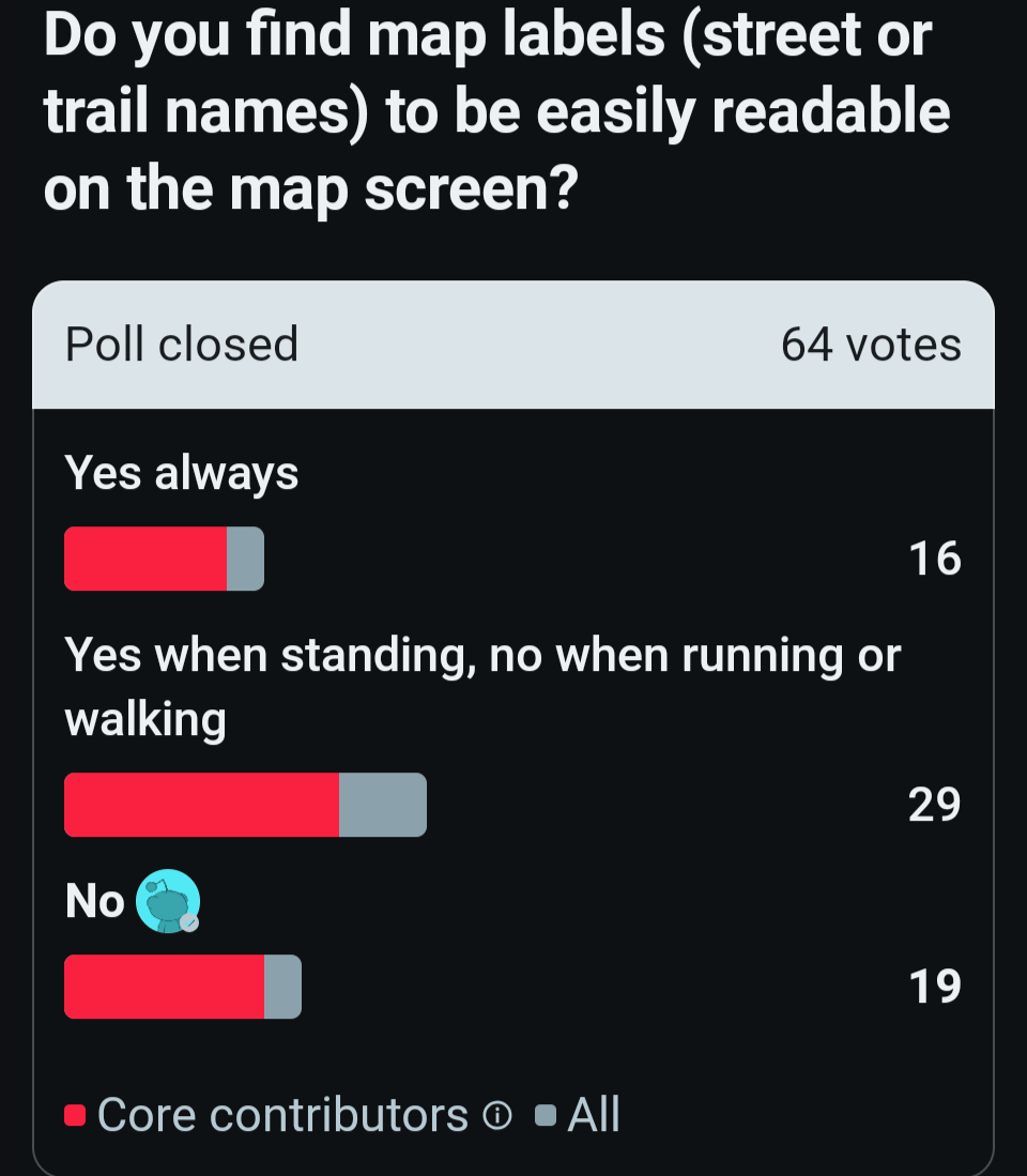
I shouldn’t have to use a workaround just to see labels. I think Suunto developers should improve this for everyone in all map styles. And I am not alone - here is a screenshot of a poll I did on Reddit:
Suunto: Ambit, Ambit 3 Peak, 9 Baro, Race S, Race Ti, Vertical 2 Ti
Garmin: Forerunner 210, Forerunner 610, Fenix 6X, Fenix 7X Ti -
@sky-runner I understand your point, but the reality is that everyone sees and uses maps differently. That’s exactly why Suunto offers multiple map styles, including High Contrast, Dark, and Light.
I don’t think the goal should be to make every map style look the same. If Suunto changed everything to match one group’s preferences, another group of users might end up unhappy. Personally, if Suunto maps looked like Garmin’s, I probably wouldn’t buy their products either.
Different preferences are exactly why having choices is better than forcing a single design on everyone.
-
@sky-runner pass me the poll so I can tranfer it to PM
-
@sky-runner The text on the Garmin’s screen is easier to read – hard to argue with that. But Garmin’s maps look more like graphics than actual maps.
Suunto’s maps, despite sometimes poor colour choices, are often much more readable in the field.
Note that even on professional paper maps – the Holy Grail of maps – the text isn’t the most important thing; it’s the landscape features. -
@Egika for others, of course, but this is avery tiny user base being addressed.







Hello! It looks like you're interested in this conversation, but you don't have an account yet.
Getting fed up of having to scroll through the same posts each visit? When you register for an account, you'll always come back to exactly where you were before, and choose to be notified of new replies (either via email, or push notification). You'll also be able to save bookmarks and upvote posts to show your appreciation to other community members.
With your input, this post could be even better 💗
Register Login