-
@egika
Hello egika,You are very right.
This is why it brings few things here.-
Any such change has to be coved by testing for all langagues which could be achieved in an easy manner …
if all texts from all langagues are imported into a DB with a reference where they are used, then for each sentences, one can detect easily the potential problematic too long texts and concentrate the testing on them
either it works (because the font being not proportional, still it can make it)
or … . -
some times some text could be revisited and another one shorter used.
-
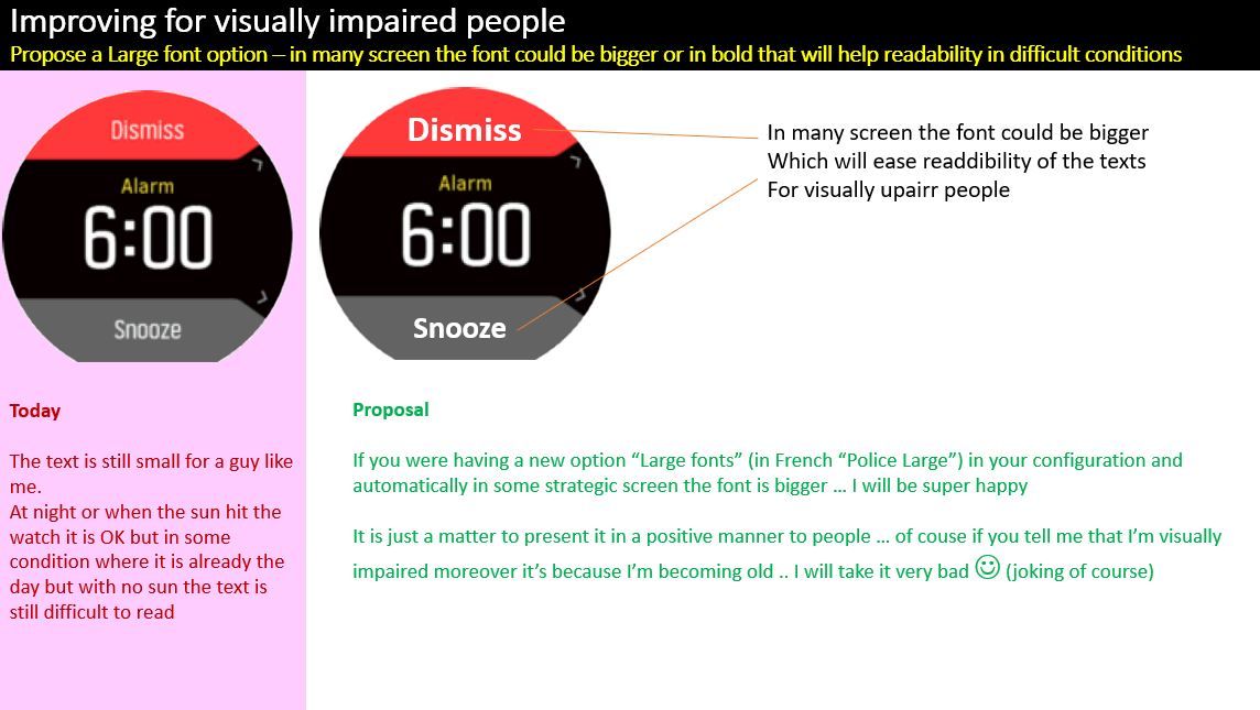
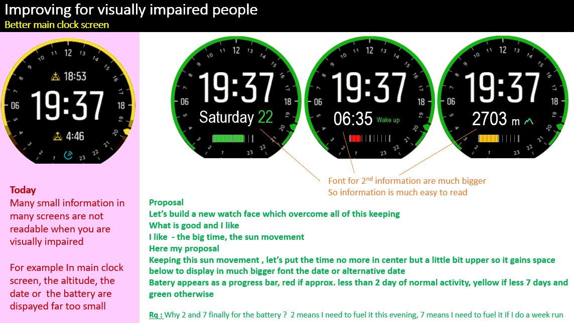
some times it is also a re-organisation of the screen which allow larger font usage … for exemple : in you look to my first image where I propose a default new watch face … you will realize that I did not put on purpose the time center in the screen but on the above part so that it free a bigger place below … and hence it allow to use bigger fonts for the secondary informations like altitude, second time, current alarm, sunrise-sunset
also even below there should be enough space to display the percentage of battery as a progress bar…
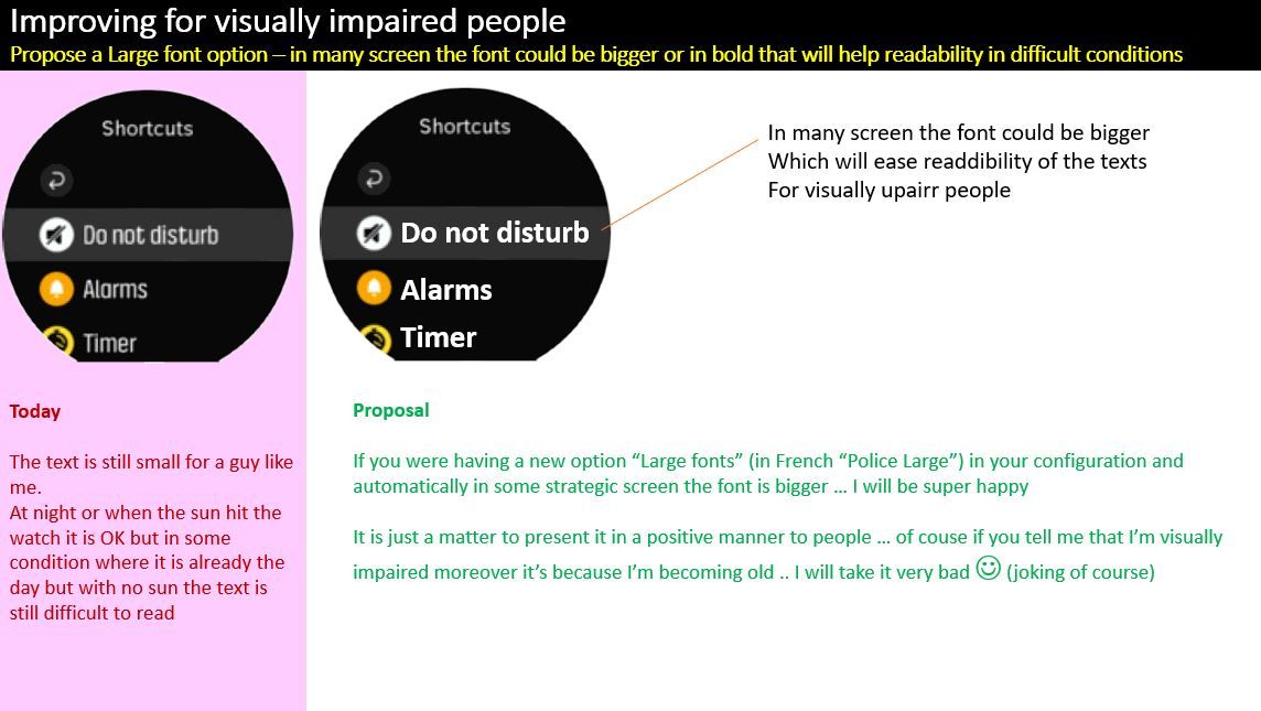
Still I’m convinced that in many places the font could be
Another remark … the choose of background color is also very important. for example the GREEN background which is displayed for example when you press the buttom 1 (up) during an exercice is very beautiful but too bright so the font written in white is not very visible. having a darker green will have allowed to better see the text
-
-
@pierre-yves-colle I believe the fonts are optimized as best they can be, it is highly unlikely that they will change much. You argue that something is easy when it may very well not be easy. Don’t forget that the firmware is running on 4 different hardware platforms 9baro, 9Peak, S5 and S3 all with different screen sizes. It is not simply a matter of changing the font in one selected hardware platform.
Vector/T6c/Vertical 2 Ti
-
@brad_olwin said in A New configuration "large fonts" to improve readibility (or for visually impaired people):
is highly un
It’s unfortunate …
for sure the super big fonts are easy to read but for the smaller information believe me they are much much more difficult to read …Some times , it could have been written in bigger font by reorganizing the screen and avoid the big black area. for example the very last watch face with the time no more center but put in the top part of the screen allow to free a big space where now information in bigger fonts could be written.
Another point :
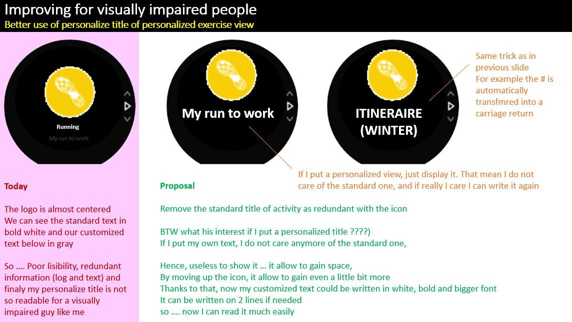
When I personalize a title, space could have been gained and hence my personamlized info writen neturally in bigger font just by no more displaying the standard text.
If I still want to see the standard text, I can simply repeat it in my personalized title.Look to the screen I captured :
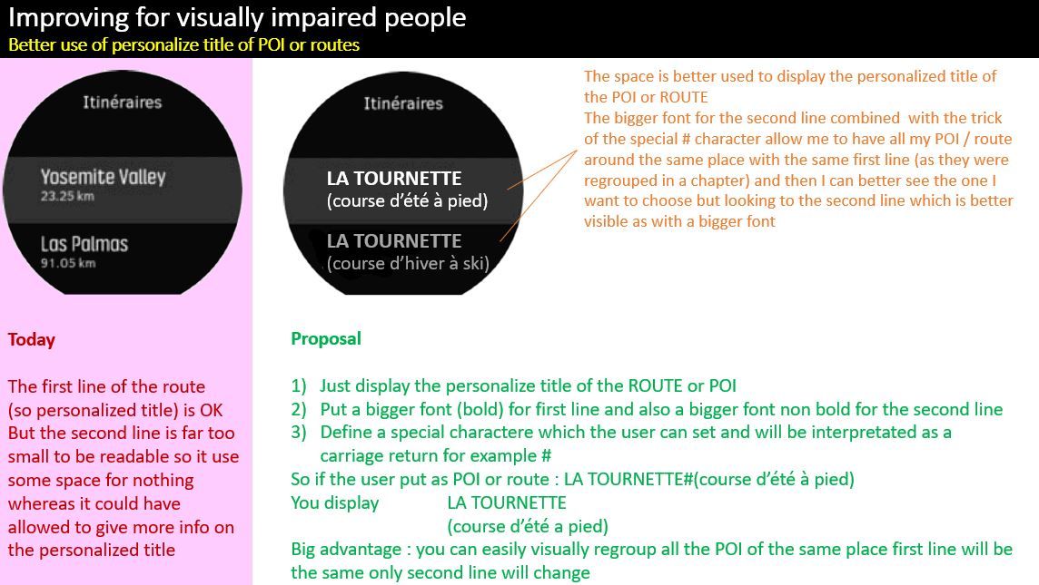
are you sure that systematically it is the number of kilometers that I want to see in the course ??? by forcing this display you put a constraint.
If there was 3 quite similar courses in the Yosemite valley may be it is not the number of kilometers which I liked to see to determine which one I want to take today but another indication that I will put myself, for example : (easy run) or (super difficultt) or (pay attention to snakes) …
Believe me I will surely not have chosen the last one with snakes in the middle … except if today I bring my mother in law with me")
-
@brad_olwin
hum hum … I’m an IT guy
I never say something is easy where I will npt have been able to do it
For sure, things are not easy as taking 1 hour but still my experience showed me that when someone tells it is impossible … another one found an alternative approach which made it super easy …All is doable in IT, is it not what you should say
Of course it is after a matter of cost, time, technic and priority
So I agree with you … never say too fast easy …Still look to all the dark space in the screens … there is margin for information to be written bigger. for example a time made always of 4 digits and a : in middle has a maximimed well know size whatever the language used
-
Great input!
-
Thanks for your gentle comment
I like super much my 9 BARO and honestly I feel she is at few centimeter of perfection …
If they were doing what I’m asking plus tomorrow a much visible screen but of course with same abttery consumption then I could have said
GIANT !!!I’m not so far to be able to say it and with the fact that SUUNTO DEV team continuously offer some upgraded release, I hope to see in the coming future ones some of the ideas I suggested …
-
I do vote for a in activity “large” font size. Coros has something similar which is pretty slick. Basically just gets rid of the labels for each field and ups the font size a bit.
-
@pierre-yves-colle Totally agree! I love Suunto S9B but font is very small for users over 45 year. I have a lot of friends in my age with Suunto and they have same problem. Suunto has pretty font against Garmin but very thin. Garmin´s fonts is much readable…Maybe add Bold version to Settings will improve “user friendly visibility”
-
I really hope SUUNTO will listen to us on the fonts because there is really something that could be done at a small cost, in many places there are space that could be just better used.
Now …
Let’s dream … but here it is a material change … so very irrealistic for the moment …
See my last post of today … .I’M SURE YOU WILLL DREAM ALL THE NIGHT OF THIS !!!
-
Another thing that I don’t understand is why the watch can’t show all the information that it has (sunset/sunshine time, moon phase, altimenter, barometer pressure, step, heart, battery %, date etc…) all in one screen.
For example it could be show all the informations in the screen that you have when you press central botton in all the watch face.
Now you can see only the date, % battery and number of notifications with a lot of black space unused…

I hope ever in the future features…

-
hello matteo
I have a slight different opinion here …
I personally do never need all the information at a time, rather I prefer to have few but extreemly visible and easy to read rather that a tons but that give me headache to read.
Moreover what I like super much in my BARO 9 is this “touchable” screen and the very wise approach they use it … you just press the glass and you see another secondary information …Look to my other proposal here :
https://forum.suunto.com/topic/6692/my-prefered-watch-face-if-i-could-developp-it?_=1625153386673
It took me a lot of time to think of it … and also I was experimenting it mentally each time I was walking or doinf some mountain actrivities …There is a logic here to have only specific info but very visible …
- Classical approach when I’m at work => I see the date
- When I go to bed and the next day I have a wake up constraint => I just touch the screen until I see if there is an alarm … as the alarm is big it’s easy to read
- When I’m in mountain => I will touch the screen to put as default the altimeter or may be the barometer (I’m lucky having a 9 BARO) so I can monitor the evolution of weather if I have a doubt
- Eventually also during a course => I could put the sunrise sunset … just to impress the girls and tell them that the day will be long or the night … all depend the other activies foreseen
- Finally when I arrive to the refuge => I could get a look to the performances
So you see, this touch screen is wonderful I like it a lot and even if not all is displayed at the same time, I prefer by far an very easy way to read – here you are right SUUNTO could better use the lot of empty black place – but better reading especially on a whatch which is not very bright to economize the energy if for me more important …
May be it’s also because I’m old
-
Just to add a comment here :
today I did my first kite surf course. we took a dingy boat during ~20 minutes to reach a beach from where all the kites were navigating … when we did the same to return back, when I was already in the boat, I tried to activate an exercice wiht a POI which was the nautic place …
simple …
MISSION IMPOSSIBLE
reason : impossible to read which was the POI corresponding to the nautic center … we were in a quite turbulent sea, the wind was ~30 knots and the waves of 1 meters with a lot of spray …
I was totally unable to be sure abotu which POI the correct was …
This is also in such conditions that we could be …hence why it is so important to improve as much as poossiblity the readibility of screens and avoid useless informations …
In the POI the fact to write both the Suunto standard text and my personalized one (by the way the suunto text is in white and the personalized in gray, on a black screen so even less visible), so a big loose of space …
if instead when there is a personalized text, the standard one is no more displayedn, then it free some text … so the font could be bigger and also white and eventually bold …Most surely I will have been able to choose the POI … I promise you that I was like in a rollercoster + with wind and sea spray in the head
-
@mister-pyc Changed the strap of my wife’s Ambit3 (couple of weeks ago). Here’s Ambit3 and S5. “What time is it?”
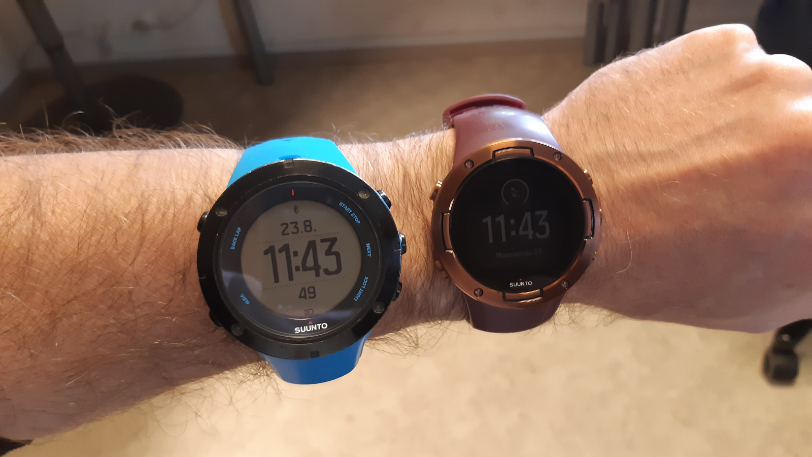
So, larger fonts AND a light background watch would be great. And why not an overall light background theme, for menus and other screens, too.
-
@juhis70 I am also a fan of the light backgound.
This should be a simple change with a big impact on readability.In outdoor situations with a lot of sunlight it is not so bad with the dark background though.
Plus the Ambit has a b/w LCD display which by default has a larger contrast -
@egika said in A New configuration "large fonts" to improve readibility (or for visually impaired people):
@juhis70 I am also a fan of the light backgound.
This should be a simple change with a big impact on readability.Not that simple, as someone else already commented, Ambit has a on/off LCD where changing colors is just a matter of a switch, the newer models have color screens where you have to redesign the watch faces (not every color is good on every background, etc.).
Anyway, this is doable, just not always simple.Watch: Suunto Vertical 2 Titanium Black
Blog: isazi's home
-
@isazi Happy to see that this post is alive.
I think it is not just a matter of white screen but also font size, bold size that make the difference.
My concern is less with the time which is the main information and generally quite big but with the secondary informations which are fare too small whereas they could be much larger.
I may repeat …
If instead of having the time centered… if it was placed upper it will have free a big part of the rest of the screen for having a secondary information much bigger.
et Hop … le tout est joué … for … not so many efforts -
Well, at least now white background is available for all watch faces for the S9 too.
Watch: Suunto Vertical 2 Titanium Black
Blog: isazi's home
-
@isazi What about battery life using the white background in the S9?
-
@cosmecosta no issues that I know about, battery life should be exactly the same.
-
@juhis70 the new update brings white backgrounds!
Hello! It looks like you're interested in this conversation, but you don't have an account yet.
Getting fed up of having to scroll through the same posts each visit? When you register for an account, you'll always come back to exactly where you were before, and choose to be notified of new replies (either via email, or push notification). You'll also be able to save bookmarks and upvote posts to show your appreciation to other community members.
With your input, this post could be even better 💗
Register Login