S9 Watch faces
-
@surfboomerang said in S9 Watch faces:
@rhustox I like the design. However, I don’t think HR is running in the back all the time.
But more information in once glance is more then welcome to me.Absolutel right, HR maybe is not something that will be needed when at the office or enjoying an ice cream, as is not active all the time, but other features would be for sure more than welcome.
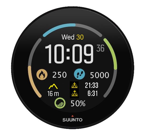
What about these two quick ideas?
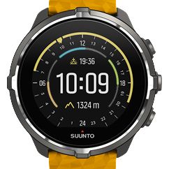
The Suunto 3 Watch face has been just added for S9 in last uptade, with some extra info and same color bars in the classic outdoor view.


-
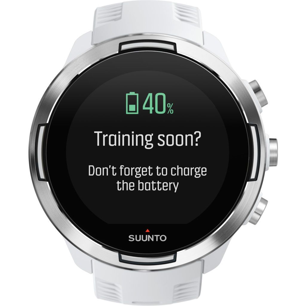
Actually I love this feature S9 has as a reminder.
Something S7 hasn’t or we did not find on that difficult menu. My partner has a S7 which is tomorrow will be delivered (fingers crossed) coming from service as had issues trying to start a sport mode and being real frustrating everytime she wanted to sync. She is always running out of battery and sometimes she’s not able to do some things like sync or so because battery is about 20-15%!

-
@rhustox I love all your ideas. Just I know that some people here will be having issues with more smaller icons, text and numbers and are just proposing bigger information

-
@egika In the end it’s Suunto’s decision.
-
@rhustox
Humm … it is nice but I’m wishing SUUNTO dev team to go to another direction …
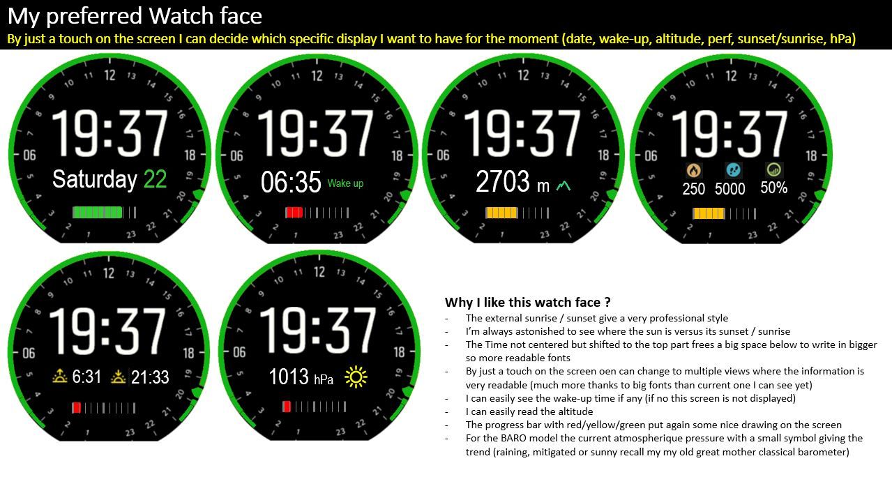
What is sure … you are on the same page than me on the fact that having the time not centered but on the upper part of the screen is an advantage as it free a bigger place below to show better the additional informationWhere I differ from you …
2 points here
- too much information on screen force to have very small fonts which results into too difficult to read
- you do not take advantage of this screen which is touchable and hence allow you super easily to select the current specific secondary details you want to emphasis … and in case you wish to see another one it is super easy … just touch the screen until you new prefered one …
So here my counterproposal

-
very true.
but if they listen their users, they will see that we are not asking things for stupid but because we already love a lot their watch and just want the cream and quintessence of what they could develop … and they are just at few centimeter far from it …See my full proposal here => https://forum.suunto.com/topic/6692/my-prefered-watch-face-if-i-could-developp-it
-
@rhustox
Adding the date + moon illumination and I am good to go.
I really love this watchface, but the missing date is inconvenient for daily usage.
Looks amazing btw! -
@pierre-yves-colle said in S9 Watch faces:
very true.
but if they listen their users, they will see that we are not asking things for stupid but because we already love a lot their watch and just want the cream and quintessence of what they could develop … and they are just at few centimeter far from it …See my full proposal here => https://forum.suunto.com/topic/6692/my-prefered-watch-face-if-i-could-developp-it
I like the spririt you put into your suggestions.
Still please always remember: listening to one’s user base does not necessarily mean to follow every idea of one individual.
Product management is always a difficult task to get the big picture of the customer base and to prioritize development resources in the best possible way. -
@egika Sure thing, fortunately for the ones we still have good sight may not be a need but as well as smartphones do, I like the idea of option 1-2-3… letter/icon zoom.
Not in my list of needs now though but I’m sure someone like my dad who has an Ambit 3 Vertical will be very happy for this feature while his running or cycling. (Actually he’s got progressive lens on his Oakley, but yes, this will be so much helpful). -
@pierre-yves-colle Thanks for your proposal, I’m aware of it, just quick reading it last night and of course I like it.
All ideas for good, are good I guess, the only important thing here is for Suunto to get them, decide what’s best/viable/needed and mash it together hopefully for most of us with some cool new and customizable watch faces.I used to like when Movescount had the feature as well as the phone app to customize sport modes with also customizable apps. I love the browser use, confortable, easier instead of an app and ‘relaxed’ with a big screen, mouse, etc.
Anyway my point is that those old features gave so many options that now somewho I’m missing and self custom faces would bring some light into.
Imagine same design with multiple choices wouldn’t you buy it? I would love to choose what I want to see in my Suunto screen and with which zoom level if so. -
@theguyfromthesummit said in S9 Watch faces:
the missing d
Hello I do not catch … what is the missing date ?
If you look in my proposal the very first image there is the date.Moreover … with this approach we could imagine as many screen that could be accessible with a secondary information, so following you example
if there was the abacus for the moon rise inside the memory of this watch, they could have added effectively an additional screen where the below part contain a nice representation of the moon walk
-
@rhustox
Hello Just to be sure I catch yoru point correctly. Sorry my english is not my mother tongue.
What you mean to say is …
Why not to haev many many screen … but in such case, each person could decide in the Android/Apple application to keep or remove the screens that they think is useless for them (of course if they change their mind they can later come back and add them again) , so that the watch is perfectly tailored to what they want to have …
For example a guy who use this watch just for running might not want the altimeter, barometer, sunset/sunrise, but will keep the alarm, performance and may be some other screen of same spirit also available (his hearth rate always visible
 )
)It brings me another remark.
SUUNTO made the choice to not OPEN their watch to anyone to develop
instead may be what GARMIN is doing and for which you can find thousand of free or payable watch face …Is is an issue …
I’m an IT engineer … I though a lot about this …
And at the end, I prefer SUUNTO approach, assuming that they will continue to deliver interesting upgrades even if tomorrow they sell new watch models (and they will not put us in a diktat which is : you want the new beauty … then buy the new watch and throw the other in trash bin.
For sure at beginning you may feel you will not have the latest new watch face that your friend is constantly looking for over the internet … but in reverse you nad a higher garantee of quality as only SUUNTO Dev teams boys (& girls
 ) are developping …
All this is good as long as they move …
When they will stop … they will open the door for us to go and see elsewhere as nothing is worth than a feeling of having been caught in a trap.
-
@pierre-yves-colle hey I think we do speak same language here, sometimes might be a lot difficult to understand each other by writing rather than in a personal conversation.
Honestly I have never had a Garmin watch, neither had the chance nor the interest to see its functions. As I mentioned in my first post here in 2008, if not wrong, I’ve got my first Suunto Core until four months ago when bought the S9 Baro and I felt happy with them all ever since.
Just now, after knowing that lots of cheaper watches offer multiple faces, like younger brother S7 with Wear OS (my partner prefered this one so I could see the differences by myself), came to my mind the idea of a little customization.
I sure there is and would be so much discussion on these kind of topics, on the premise that everyone has an opinion… Haha, my suggestion is or was to make these amazing watches a little more customizable.
For me, boring analog faces are useless on daily bases, remember I have never said anything regarding sport modes. When I do sport, mostly cycling and surfing and sometimes trecking and rollerblading I have little time to keep my mind and sight on the watch. It is a plus of info like HR, speed, etc. but not a mandatory need. I’m really happy with those face options.
Going back to the 95% of every watch use which is watch mode, there is when some missing things would be great to have. Some of these features disappear after few seconds shown on the screen which I’d love to keep on sight so I have not to push any button and if it happens that we users are able to add more options to our cool watch faces by preference or interest the better!Downloadable and smartphone app customizable watch faces would be good, great or the best! If that option brings too much unpaid work or long and frustrating developing. Customization on the watch itself may be a good end. Like now choosing watch faces and color plus some kind of ON/OFF options to be shown. I guess this will make a big difference.
-
@rhustox said in S9 Watch faces:
wing that
Hello again … ok I may have better understood.
Humm … On the downloadable watch faces I should say after havign though a lot to SUUNTO approach which is a very closed world totally under strictly their control that … I almost prefer this finally … again assuming that if we propose them better – but just better in the same spirit of what they are doing – then they considere and do it
“In fine” although it is marvelous to have tons of watch faces downloadable from the internet … you expose yoruself to the risk of someone who will do a totally messy and full of bugs one or even worth someone who will play a game to hack or on purpose damage your watchSo I prefer SUUNTO approach at the end.
After that and where I agree with you … it will have been really nice is you could more control the watch face and content from the Apps and not have in the watch was you will make no sense for you to be used …
Personnaly I’m a mountainer … up to recently and even it I was wearing my SUUNTO 9 BARO now since more than one or two year I was sill a old school guy using my old compass and altimeter that are with me since I’m 16 … so … 53-16= 37 years … whaoooo I did not realize it was so long … and even more because the altimeter is the one of my father … a wonderful object that you have pleasure to use
Where I agree with you, effectivelly some time also I was wishing that the screen I choose remains and not just a couple of seconds then back to standard watch face … this is why in some of my post I was mentionning to remain 10 seconds (today If I’m correct it is only 6)
This is also why in my proposal
https://forum.suunto.com/topic/6692/my-prefered-watch-face-if-i-could-developp-it?_=1625094058174
I was proposing a series of different watch face options working on the same principle than today … when you just touch the screen it goes from one watch face option to another and consider now it is the default one …
going that way we could have many ones … so the one which will interrest you now … and that you can turn to another one laterPersonnaly as mountainer, my sport watch must have a very good GPS, altimeter, compass and barometer … all these features are important in mountain … the rest like computing performances … I do not care … my backpack is here to recall me my performances


-
@pierre-yves-colle
Right! Suunto must have their watch faces ready to download, I do not like the ‘play store or app store’ developers idea for high end equipment like these watches.Understanding that at some point every ABC and now GPS watch owner has some kind of interest of enjoy/perform/enhance their sport it is viable that the brand designer and manufacturer listens to their customers so even it is difficult to get ‘all in one’, from the point that 2021 technology is above clouds I’m sure there are options and ways to help and fill nearly everyone’s need.
I do remember Ambit 3 series had an ON/OFF option of making your sport mode screens to change every… 5 secons?
As said before and knowing it brought lot of discussion, happy or not, leaving Movescount should have to bring something else better and I know some users are not very happy.
At least if Suunto is taking care of some things like:
- Improve the smartphone app with new options.
- New add/delete customisable watch faces.
- Zoom options
- More than one alarm.
- Keep info on watch mode.
- Basic downloadable mapping areas (that would be super!)
- Suunto 7 (Battery alarm alert)
… and so on, I’m sure we all will be a bit happier!

Maybe not that easy after all, but I keep faith.
-
@rhustox said in S9 Watch faces:
nto 7 (Battery alarm
Super interresting reply !!!
What I hope … SUUNTO DEV team appreciate that we are discussing so much on their products … at least that means we like it a lot already … and just want even more from them …
SO …
The should enjoy working not for nothing but for happy people thanks to their product.
I will put few proposal of improvement on the Apps part …
For exemple : one idea on which I’m interrested to get feedback (of course it concerns more the people who take advantage of the GPS and navigation)
On the POIs and COURSEs … for me a big missing is the capacity to regroup them into some sort of libraries that you can build by yourself
For example : all the POIs and COURSE related to a specific mountain I would like to have this mountain as the first criteria (so the library)
for example : nearby Annecy, haute-savoie where I leave => a super wonderful mountain is “LA TOURNETTE”… and inside this library I will find- the summer course which is generally done on the side which see the lake
- the winter ski course which is in fact on the opposite side because the other ones is nto so good for skiing (too many rocks, not a north face)
- multiple interresting POIs, of course the summit but also some intermediates points which brings some interrest
Another example : when you do a race of 5 days, if you were having a library for that race … for example "LA HAUTE ROUTE between Chamonix and Zermatt, then inside this library you could have created 5 courses one per days and also some crucial POIs …
I did it in 2013 and the 2 days we were obliged to ski down a glacier in totally foggy situation, I can promise you that the guides were using theyr own GPS intensively … because in such conditions you can pass nearby the refuge by just a dozen of meter and in fact you miss it
-
@pierre-yves-colle said in S9 Watch faces:
@rhustox said in S9 Watch faces:
nto 7 (Battery alarm
Super interresting reply !!!
What I hope … SUUNTO DEV team appreciate that we are discussing so much on their products … at least that means we like it a lot already … and just want even more from them …
SO …
The should enjoy working not for nothing but for happy people thanks to their product.
I will put few proposal of improvement on the Apps part …
For exemple : one idea on which I’m interrested to get feedback (of course it concerns more the people who take advantage of the GPS and navigation)
On the POIs and COURSEs … for me a big missing is the capacity to regroup them into some sort of libraries that you can build by yourself
For example : all the POIs and COURSE related to a specific mountain I would like to have this mountain as the first criteria (so the library)
for example : nearby Annecy, haute-savoie where I leave => a super wonderful mountain is “LA TOURNETTE”… and inside this library I will find- the summer course which is generally done on the side which see the lake
- the winter ski course which is in fact on the opposite side because the other ones is nto so good for skiing (too many rocks, not a north face)
- multiple interresting POIs, of course the summit but also some intermediates points which brings some interrest
Another example : when you do a race of 5 days, if you were having a library for that race … for example "LA HAUTE ROUTE between Chamonix and Zermatt, then inside this library you could have created 5 courses one per days and also some crucial POIs …
I did it in 2013 and the 2 days we were obliged to ski down a glacier in totally foggy situation, I can promise you that the guides were using theyr own GPS intensively … because in such conditions you can pass nearby the refuge by just a dozen of meter and in fact you miss it
That is such a great point on the wish list that will help improve everyone’s experience with the help of our Suuntos!
Imagine all these great ideas can be taken really serious by Suunto development team along with department managers and they decide to get those improvements in next coming updates.
First, we will be happy to have them on our wrist when needed.
Second, every idea that becomes real and to be used is the answer to the users that have been asking for improvements, so kind of the end product is in part thanks to many people who’s needs are to improve their experience and at the end of the day Suunto’s improvements will bring better and better as brand and product making.Sounds good, right?
-
@rhustox
Hello, this is exactly why I’m posting suggestion for improvments.
First of all, very sefl ecntric and egoistinc … if the SUUNTO DEV team was materializing my proposal then I will be hyper happy because it means I will have my dreamed features on an already super beautiful watch
Secondly, it is always rewarding to know that some other people might enjoyed your ideas and are also happy
Third … and no gentle … your watch is a little bit like your football team … you want it to be the champion one … better than the other


Last but now least … and naively hoping … if your ideas are retained and bring your trademark better … may be you could be rewarded … for example … one day your trademark tell you that you become part of their few users testing team and you get their last product to test … with at the end … to keep it for free
… <= a little joking / serious wish to SUUNTO


-
@pierre-yves-colle the dev team is not the one deciding or designing

-
@dimitrios-kanellopoulos said in S9 Watch faces:
@pierre-yves-colle the dev team is not the one deciding or designing

Outrageous! Although, if the design skills of my dev team are anything to go by, that might actually be a good thing
 . Let’s just say it sometimes looks like we’re trying to bring Windows 95 back into fashion.