Suunto Vertical is here
-
Not sure if it belongs here, but does anyone know how this works in the SA?
A workout recorded with the S9PP looks like this:

A workout recorded with the Vertical looks like this:

The information about he watch is missing. Is this intended?
-
the download does not take long it’s the unpacking of really compressed data and creating indexes that does. That’s why the charger requirement.
That said you can downloaded a whole country in a couple of hours and never worry.
-
For those having map issues did you download one region or more than one ?
-
@Dimitrios-Kanellopoulos said in Suunto Vertical is here:
it’s the unpacking of really compressed data and creating indexes that does.
You need Middle Out! Paging Richard and Elrich from Piped Piper…

-
@mikeorbreak Here are some comparison pictures S9B and SV
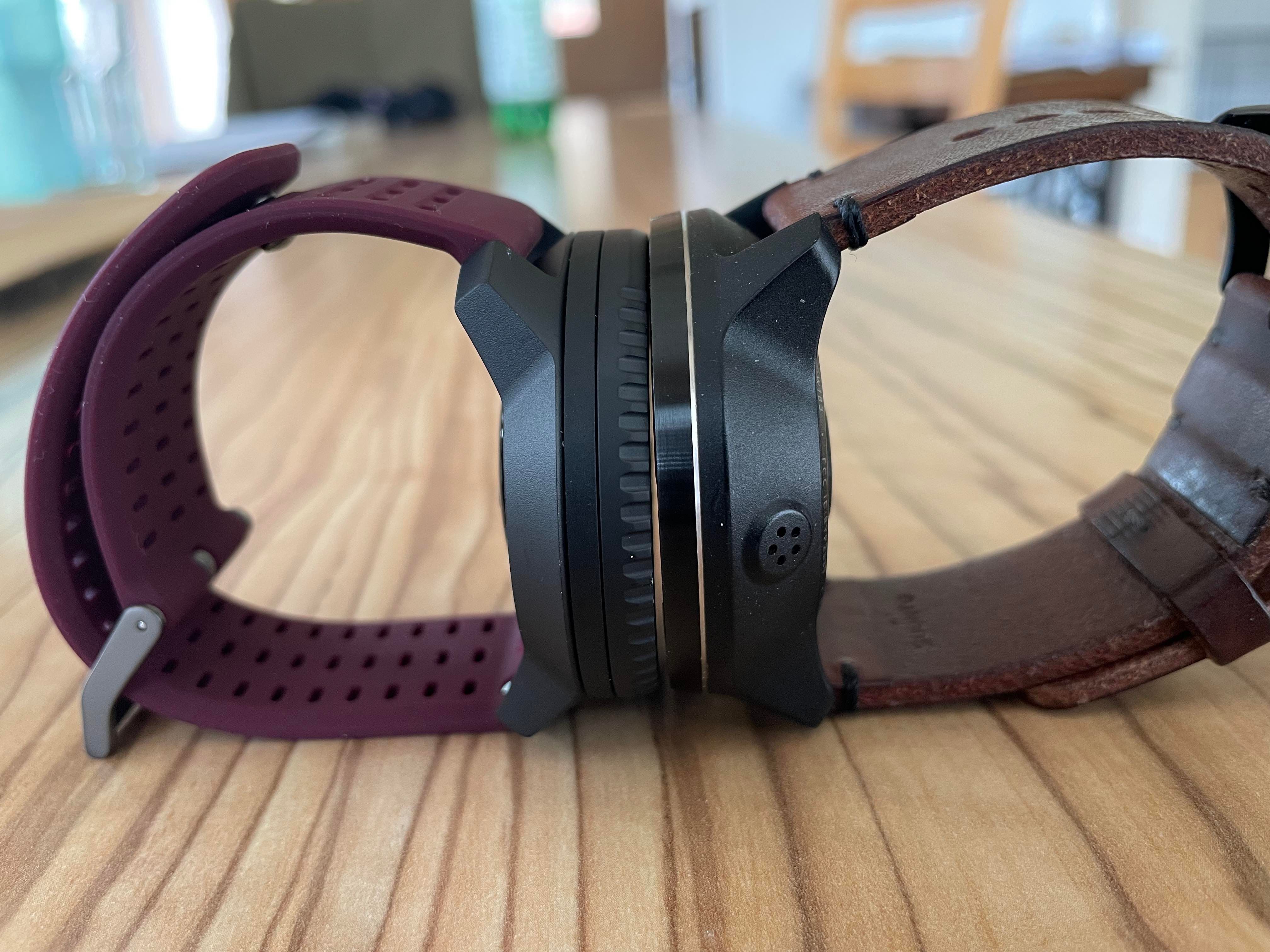
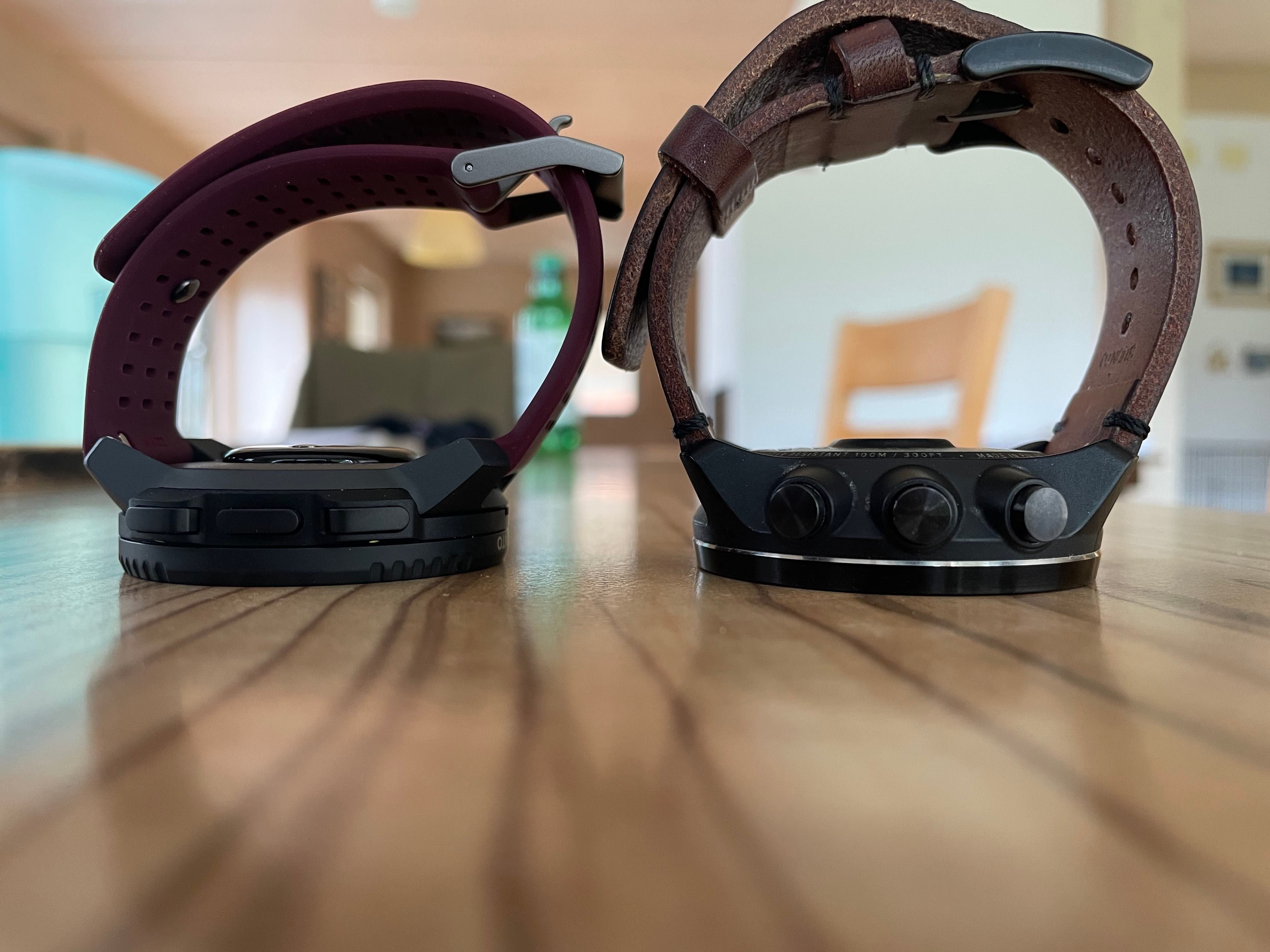
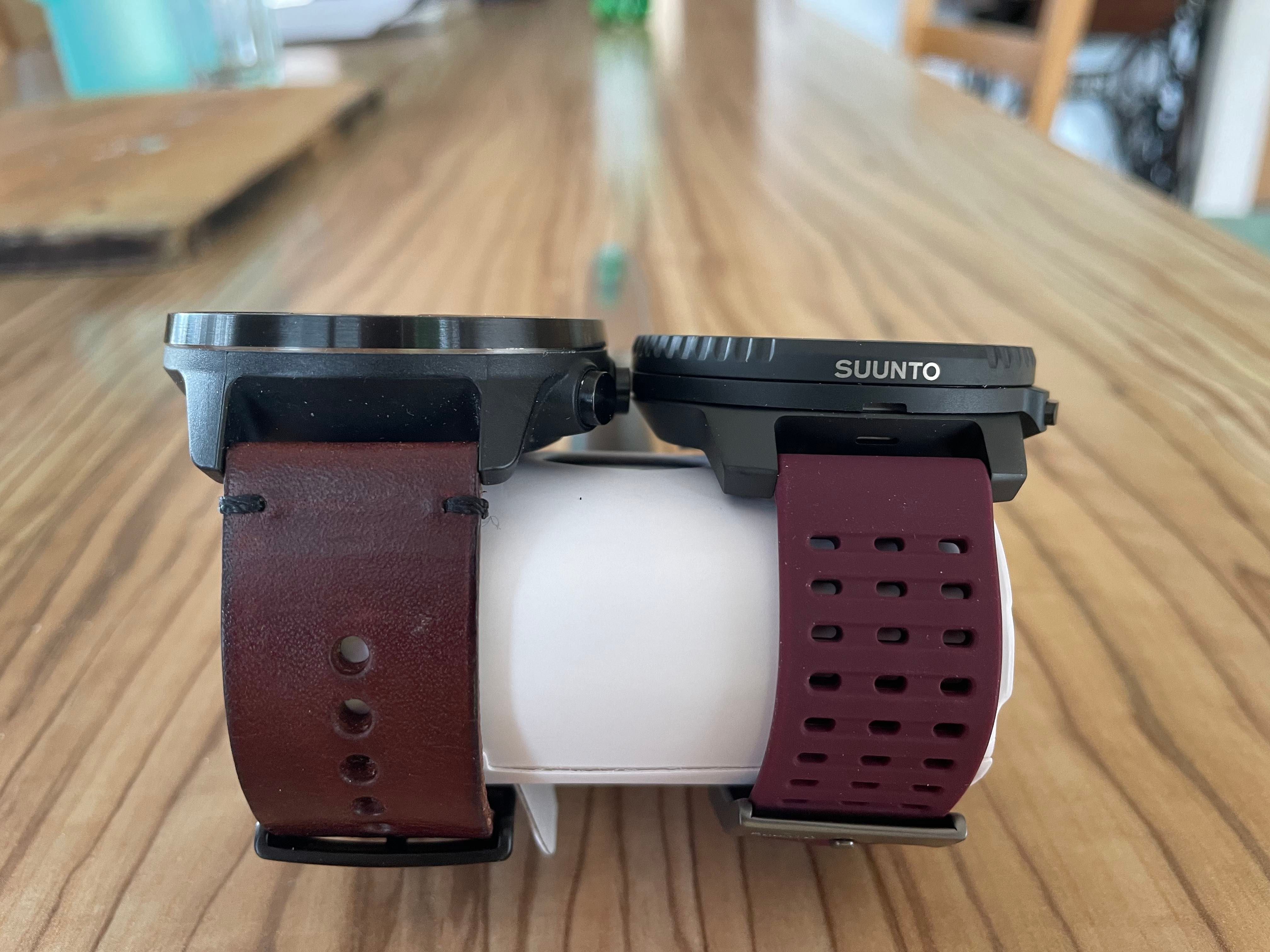
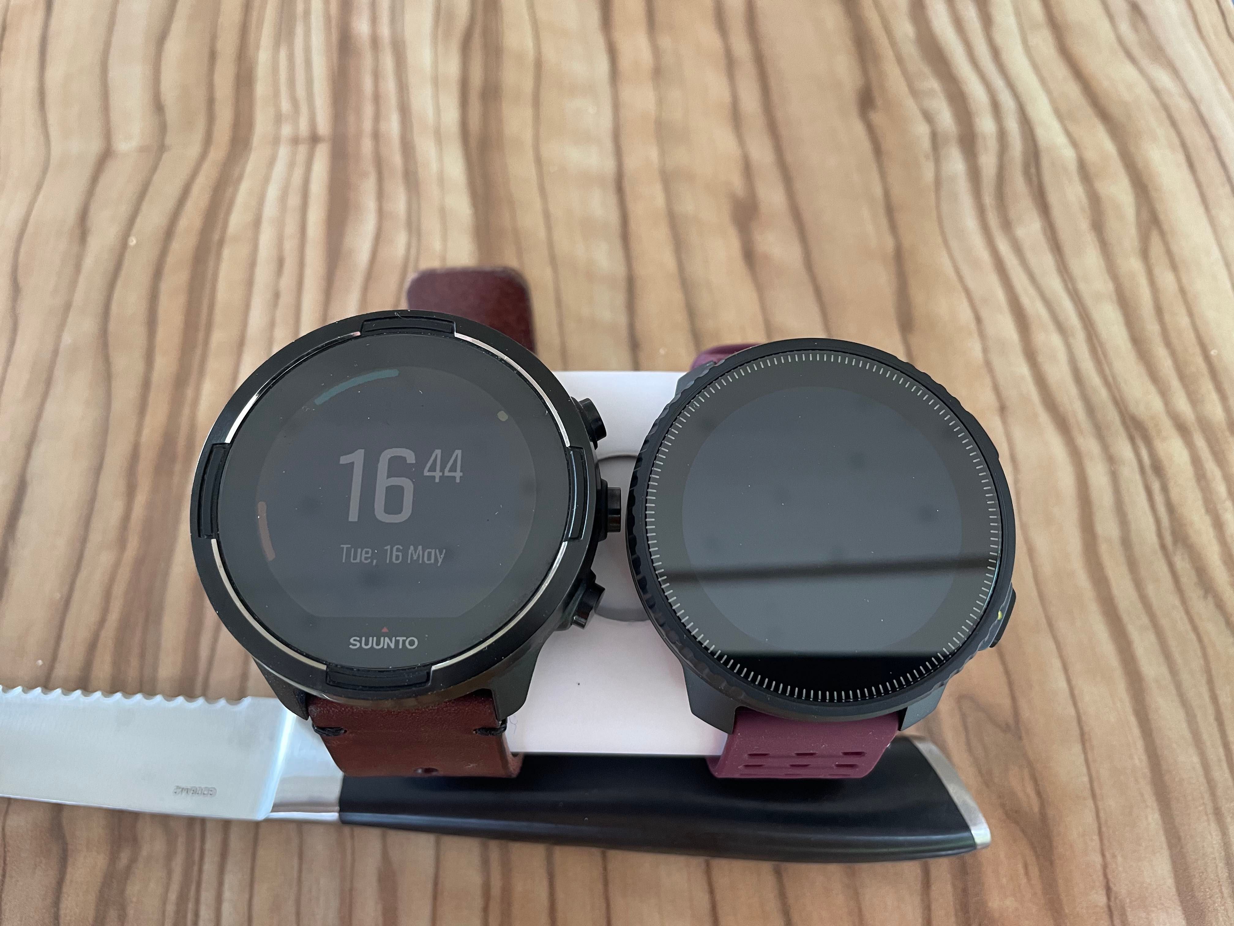
You asked for it
-
 F freeheeler referenced this topic on
-
@Dimitrios-Kanellopoulos I only downloaded one area, around me. I’m in the process of downloading the other two around me, since I live exactly in an area where three tiles meet
-
@Dimitrios-Kanellopoulos had it with 4-5 regions (Upper Bavaria, Tyrol, South Tyrol, Carinthia, Switzerland) as well as with only one (Upper Bavaria)
-
@Miš-Kan Great photos. Can you turn the screen on for the Vertical as a comparison? I keep hearing the screen resolution is so much better than 9 Baro or Suunto 9 PP, but I haven’t seen any real world photos yet to compare.

-
@mikekoski490 said in Suunto Vertical is here:
@Miš-Kan Great photos. Can you turn the screen on for the Vertical as a comparison? I keep hearing the screen resolution is so much better than 9 Baro or Suunto 9 PP, but I haven’t seen any real world photos yet to compare.

Also can anyone do a series of photos comparing to S9P(P) on wrist, height etc please

-
@mikekoski490 said in Suunto Vertical is here:
I keep hearing the screen resolution is so much better than 9 Baro or Suunto 9 PP
Screen resolution is better but then the screen is larger. The pixel density is the same between SV and S9PP. SV should have the next generation MIPS panel though, with improved contrast and brightness.
-
@Brad_Olwin 175/69 here and I am very satisfied with the S9B. Yes it is big but I need a big display, difficult to see the numbers on a small watch when wearing lenses
 So I am very happy that the Vertical is almost as “big” as the S9B
-
@NickK Thanks. I heard the pixel density was also improved. 240X240 vs 280X280 for the Vertical as well (or is it basically just the same because the screen is larger?). Still - would be nice to see some photos from those of you lucky enough to have your Verticals up a running already!
-
@mikekoski490 It’s 1.2" diameter 240x240 for S9PP and 280x280 for 1.4" SV. Of course, in our day and age display “pixels” aren’t necessarily equal physical screen pixels like in the days of yore, but at least on Garmin or COROS side, with a similar progression of resolutions you’d be hard pressed to see more pixels in larger screens. They have more data yes, but the rendering is the same.
-
@mikekoski490 Big difference between screens. Suunto Vertical screen is much brighter.
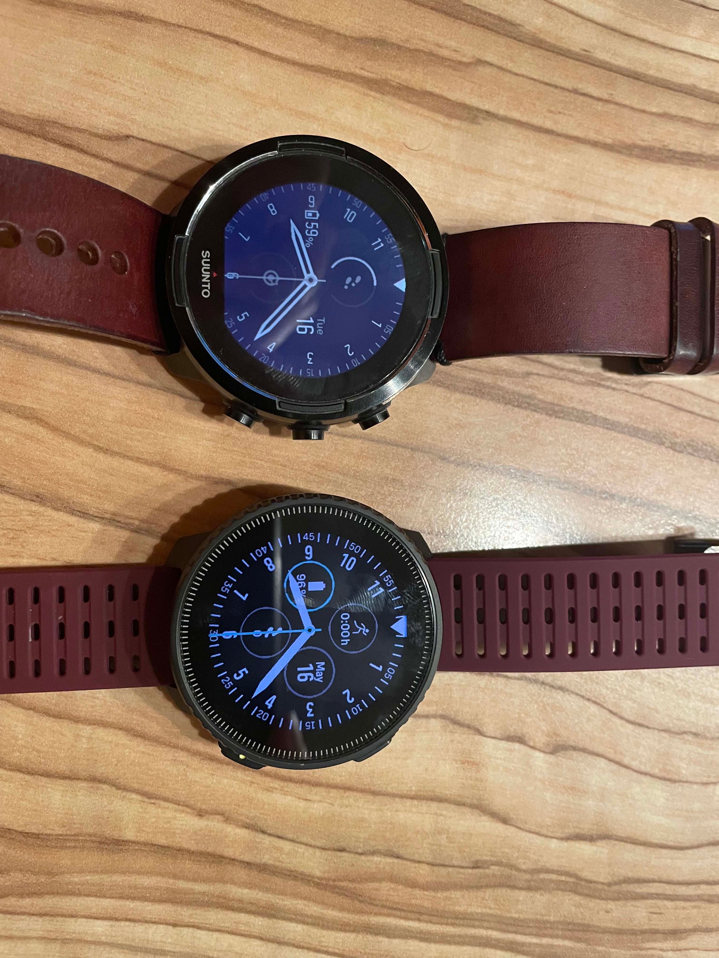
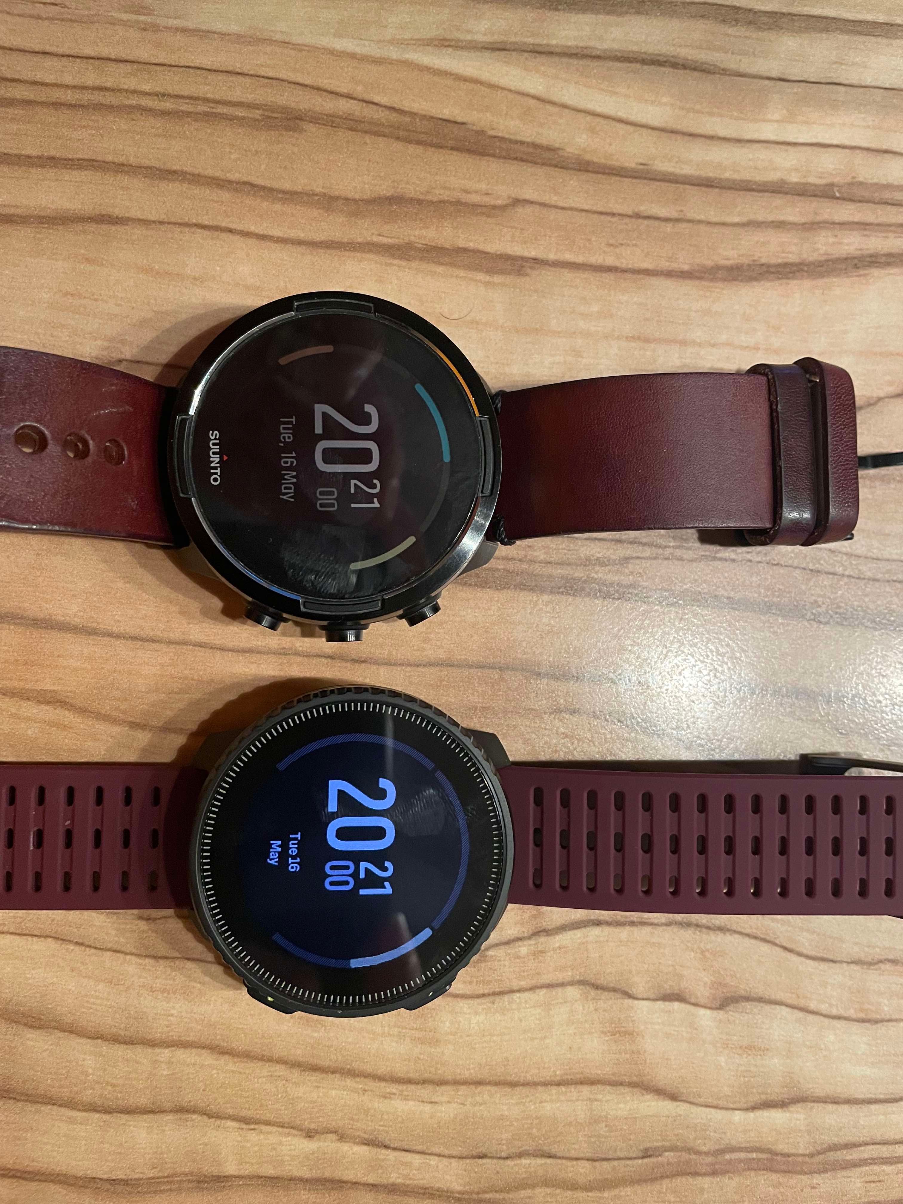
-
@mikekoski490 another pic, during workout. HR zones ring looks funny because it’s so thin and thus pixelated and uneven width (especially top one). It would look better to be wider like zone in use
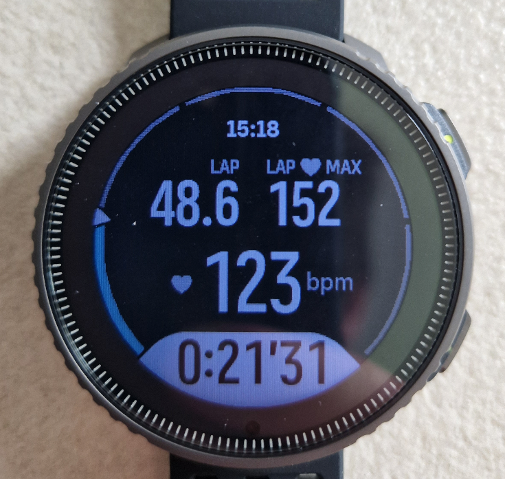
-
@Miš-Kan said in Suunto Vertical is here:
@mikeorbreak Here are some comparison pictures S9B and SV!
You asked for it
Thanks, in comparison the SV really looks much nicer!
-
@Miš-Kan Awesome! Thank you!!
-
@mikekoski490
I was worried about upgrading from A3PS to S9B because of screen readability, but I found the S9B better. then came peak and pro and I’ve had the impression readability was constantly improved. now the Vertical is again even better
-
@Dimitrios-Kanellopoulos hi! I downloaded two regions. I did my first test (walk activity) without issue with maps I also used a route during my test.
I did a second test (walk) with and without route and my maps was empty (pictures below).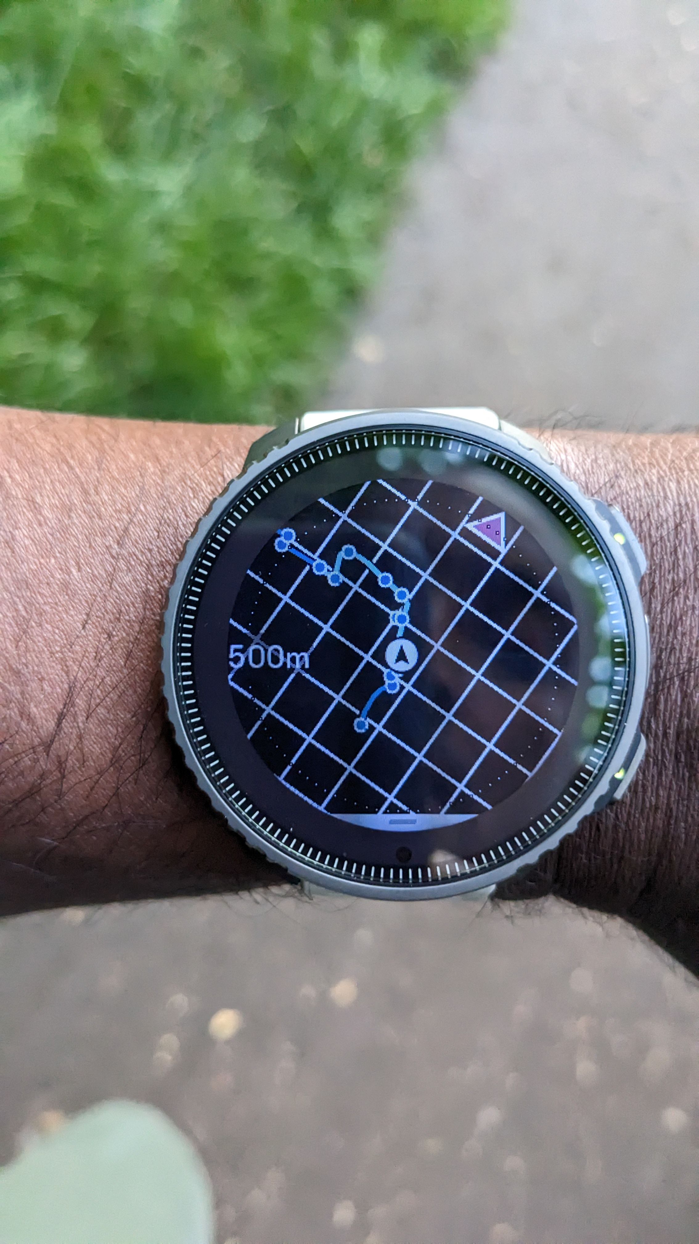
-
@Likarnik said in Suunto Vertical is here:
mikekoski490 another pic, during workout. HR zones ring looks funny because it’s so thin and thus pixelated and uneven width (especially top one). It would look better to be wider like zone in use

Yes, I saw it already in my S9PP review,
When I update the firmware on my SV, the circle is uglier…you can see the pixels are moving at the edge of circle.