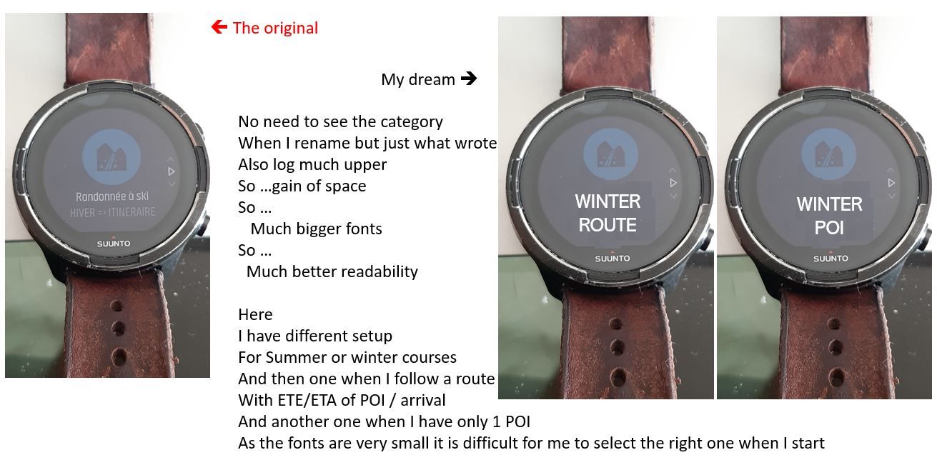
EXERCISES => For a better display when you customize titles
-
When I rename an exercise what is the interrest to continue to display the standard SUUNTO text ???
Zero interrest … if I want to keep it … I could also rewrite it plus mine …So let’s imagine that when I rename an exercise then only my text is displayed … also that the logo is displayed upper… what are the advantages ?
Gain of space ==> much bigger fonts ==> much better readability
On my side I have setup 4 different exercices depending on if we are SUMMER or WINTER, if I have only setup a POI or a ROUTE …
the problem with the current display is that my own text is very small and morever in gray fonts so almost not readableIn Winter for ski touring, I’m interrested to altitude, my speed of climbing, in summer I do not care at which speed I climb
When I have only one POI, then I have a screen with only 3 informations : ETE / ETA and distance to that POI so displayed very big …
in reverse when I setup a Route, then my screen have 7 infos : ETE/ETA/distance of both next POI and arrival and also the current time
In summer I also look to when the sun comes down because the courses can take more than a journey, in Winter generally we are at refuge or back to car around 15 or max 16h so no need to know sunset.
This is why I have different settingsHere an example of my suggestion
