Body resources colored ring
-
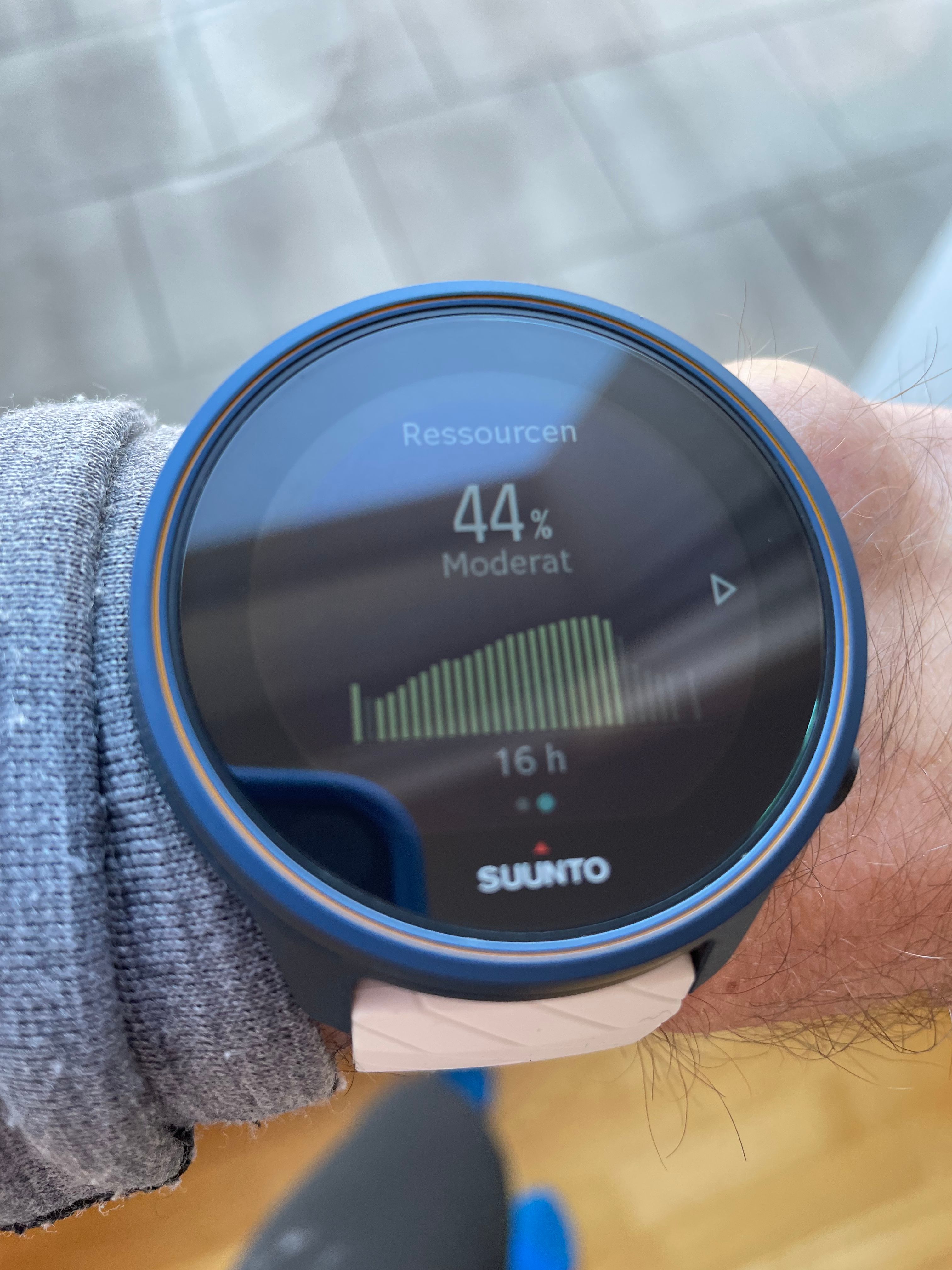
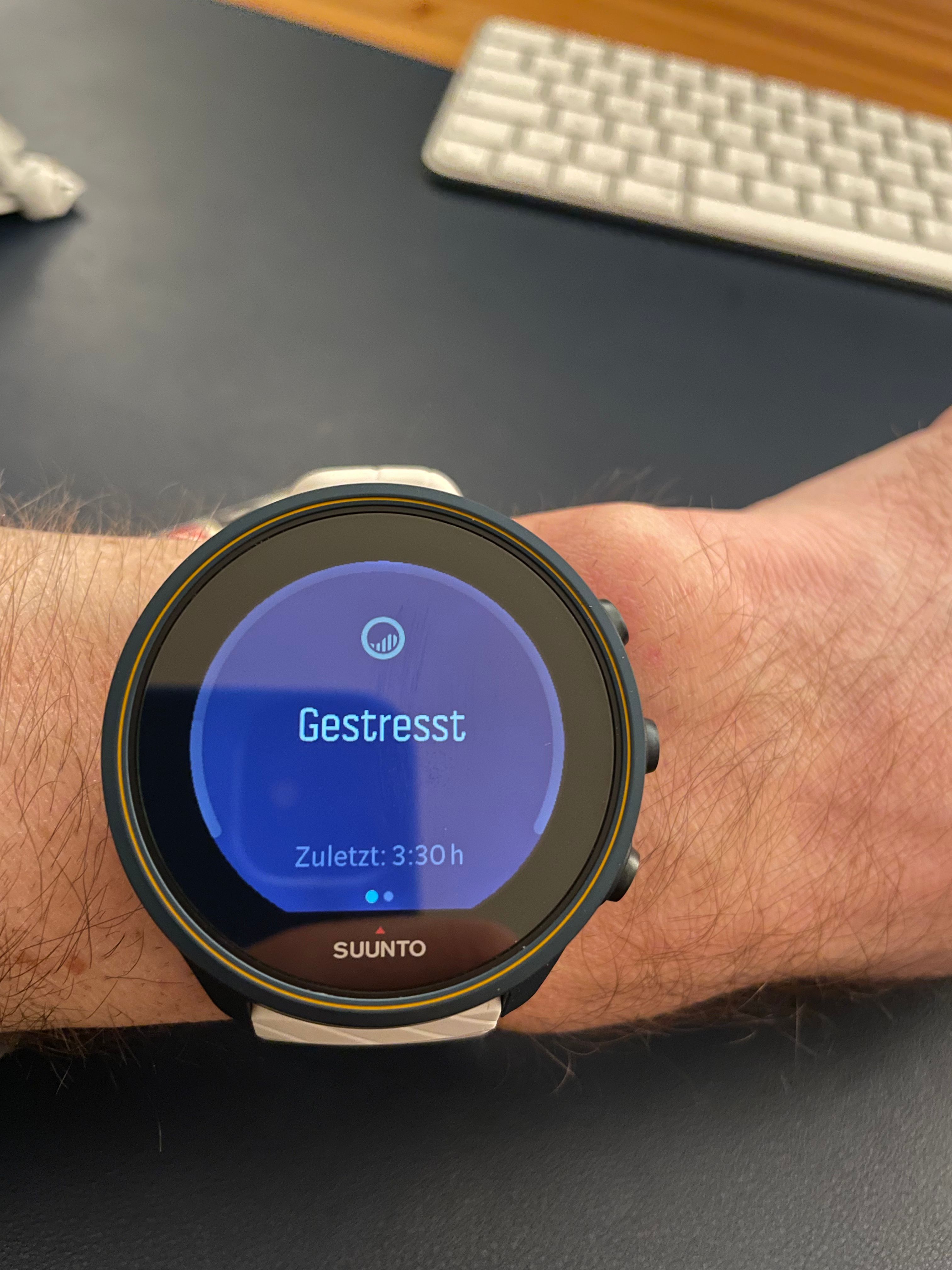
When the resources screen on the watch displays stressed or active, the colored value is not / barely visible.

On this image the value is 44%. One has to look really closely to see it. Is this on purpose? Or am I colorblind? Generally I find the color selection on Suunto watches very good, but this one is strange. I know, it is the same color as in the graph on the second resources screen, but here it simply doesn‘t work.
And even on the second screen, visibility is rather bad:

Also the backlight doesn‘t help.
-
@wmichi I don’t think it’s too bad at all, I am seeing fair bit of reflection on your watch screen which makes me wonder if you are standing smack bang on in front of a large window. Try and post a different angle away from any relations.
-
@binoworld-uk Backlight at Max. 15% resources. The iPhone night mode lightens up the 15% a bit. For me and my wife (both good eyesight) its not visible.

Light conditions don‘t make a difference. The foreground color of the ring is about the same as the background color.
-
@wmichi I too have this, never noticed before.
-
@dmytro It’s the single screen where the used colors are “suboptimal”. Steps, calories, sleep, hr zones in workouts,… all have good contrast. But on this screen, the main graphical information is simply hidden (if stressed or active).
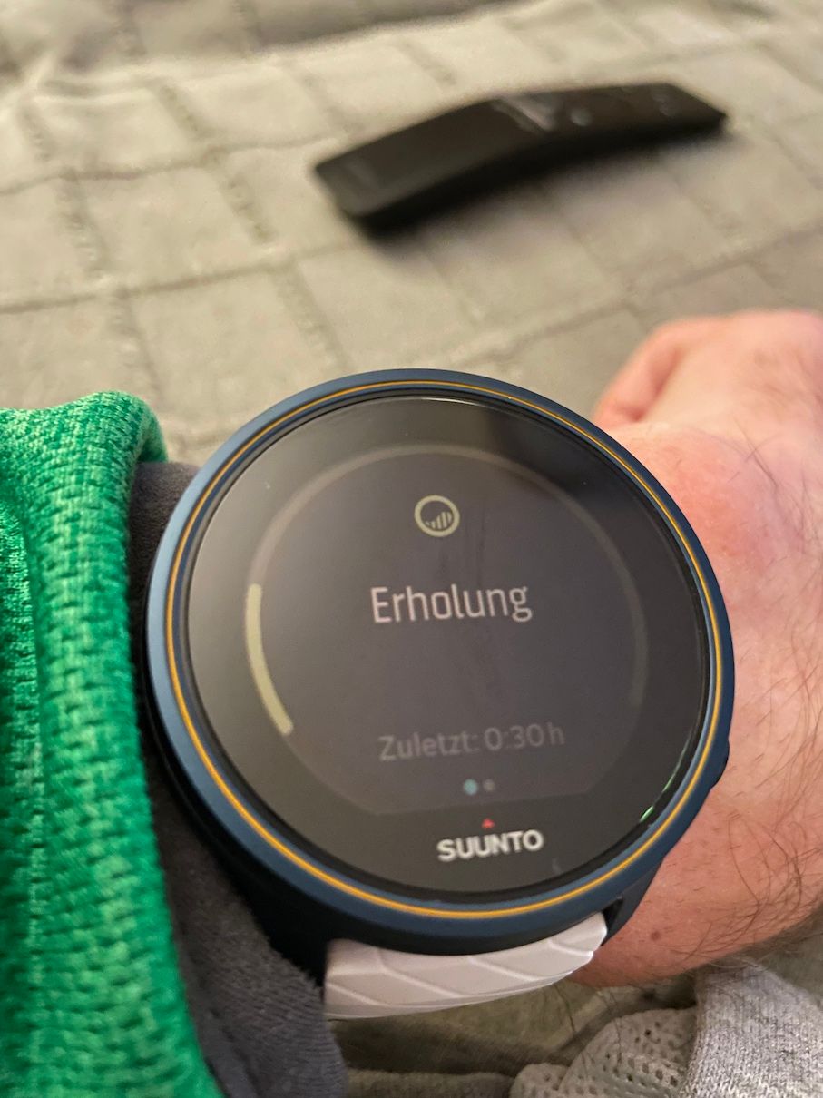
Now have a look at his. Now I am recovering:

No backlight in a rather dark room. Perfectly visible. I hope someone at Suunto will have a look at this and think about the color palette.
-
@wmichi it seems to me it’s the backlight that washes thing out. It’s perhaps lack of contrast, Suunto might be able to improve slightly with an update by given the colours more saturation