Suggestion : in COMPASS => rolling mode to give a chance to secondary information for being more readable
-

Hello, proposal of the day (which was part of a previous discussion) and always on the thema : how to have better readibility of information.
Instead to change the screens, why not to just change the behavior a little bit …
For example :
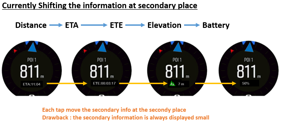
In exercise mode, in the compass, when activating a personalize battery mode, if you touch & tap the screen, you can see ETE ETA, altitude also (BTW thanks a lot to the suunto moderators for having teaching me this)
… but …
These information are treated as secondary (the distance is the primary one) and hence are systematically written in small and gray font in the secondary position … so difficult to read
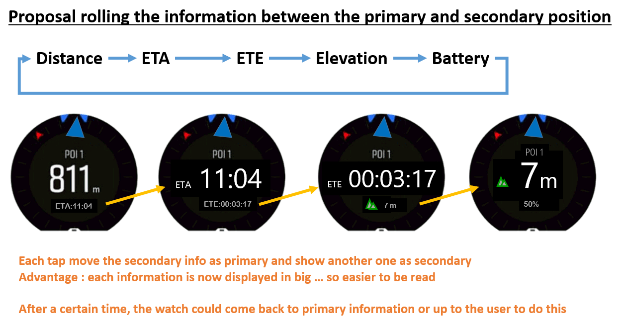
Why not to revisit this and instead to shift these information in the secondary position, suunto is doing a rolling between primary and secondary position …
CURRENTLY IT WORKS THIS WAY

PROPOSAL OF IMPROVEMENT

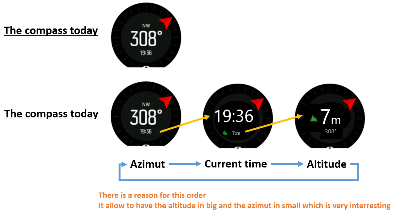
By the way, if in compass mode, there was the altitude displayed

Last but not least, should the touch&tap mode return automatically to a “defautl” position after a certain time on these screen …
My prefered choice = NO
Why ?
If you remember well in one of my post I was suggesting to have a COMPASS view in which we could see the altitude instead of the azimut, because this is a very interresting mode used in the army to navigate on line of altitude in no visibility situations. with this proposal … we have it !!! -
@mister-pyc I don’t particularly like rolling display of information, it’s distracting, but I would like a way of changing information that does not require to have touch enabled.
-
@isazi May be my english is here not good enough.
my idea was … the screen as it is has a primary information which has already a big font, if there is a way so that the different secondary informations can become the primary until I decide to change (so not coming back to a default)
then it gives me the control and the choice.
I can either stay with the azimut, or decide for a certain time to display the altitude instead, or during another amoutn of time the ETE or ETA … my choice …
So as it is my choice, it’s me disturbing myself … so no issue here. -
@isazi I agree with you on your remark without the touch. in the other hand, it has an advantage if the touch was still usable in a locked situation. you take no risk of a wrong action which will result into stopping accidentally the exercise recording. it happened to me due to my glove this winter, hence the LOCK feature is a fantastic one … but … should leave th touch & tape available as this is not damaging in any manner the watch actions