Why a 5 meters test is a good test ?
-
@mister-pyc secondary information is, well, secondary. It’s smaller because it has to be smaller in order to provide more screen real estate for primary information which is therefore larger
")
After all it’s just a watch which goes on your wrist - it can’t be too large as it would be too cumbersome to use during the activity. And things can’t be too large as there will be no whitespace, etc. which will in effect affect readability in negative way.
To me the design team and people responsible for UI are doing good job as things that are necessary to read during the activity with just a quick look are designed to be readable but secondary information may require the user to stop and focus on the watch and this is ok. I believe that until we have HUDs in our glasses that show the data in the field of view regardless of where you look, it’ll have to be the way it is now.
Furthermore, keep in mind that the transreflective technology used in S series (apart from S7) is generally poor in terms of contrast, color fidelity and resolution in comparison to our everyday standard LCDs. It’s really challenging to make things readable in such conditions with such technology. This I believe is the reason why for example bar graphs in S series screens have significant spacing between the lines or everything is simplified (ie. navigation screen where there is only the breadcrumb trail as it’s crucial during the navigation).
This begs for a series of questions in the like: Why can’t we have X or Y information on this particular screen. But after some research and testing you’ll probably get to a conclusion that you’ll rarely use the extra information but the primary one will suffer in one way or another which is a readability and also a safety concert (when navigating I must see the breadcrumb trail but I don’t necessarily need to see my speed, ETA or any other data - if I need it, I’ll switch the screens changing my primaries accordingly).
Also, not wanting to sound like an asshole (seriously) but if you have persistent problems with watch screen readability perhaps it would be beneficial to get your eyesight checked? And I really mean it in an empathetic way as it may as well affect your safety during the activity (ie. mountaineering, running, cycling, etc.).
-
@łukasz-szmigiel said in Why a 5 meters test is a good test ?:
eflective technology used in S series (apart from S7) is generally poor in terms of contrast, color fidelity and resolution in comparison to our everyday standard LCDs. It’s really challenging to make things readable in such conditions with such technology. This I believe is the reason why for example bar graphs in S series screens have significant spacing between the lines or everything is simplified (ie. navigation screen where there is only the breadcrumb trail as it’s crucial during the navigation).
Hello
Few points
Primary and the most important
- for sure and 1000% agree THE SUUNTO DEV TEAM ROCKS !!! I love this watch more and more and more each day I’m using it, so what they did is awesome.
Now …
humm humm … not agree with 2 of your points
-
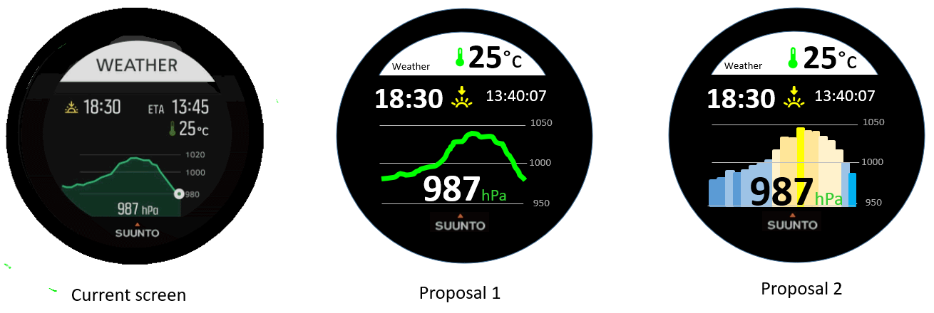
seconday information might be as important : I give you 1 example : in a COMPASS view, instead of the AZIMUT giving you precisely the nbr of degree – wich somehow is redundant even if more precise with the red or blue arrow of the compass – the ALTITUDE which is treated secondary, could be sometime super important,the combination of the arrow giving you largely enough idea about the direction to go and the altitude could allow you a navigation staying on the same curve of altitude which is a very well known technic of old alpinist and teached in army to navigate to certain point in totally cloud a no visibility situatuon
-
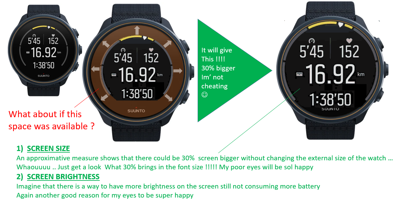
a bigger watch screen … well … it does not mean that the watch will become bigger, not at all
instead … the exactly same watch … but … no more this black useless circle, see below …
I dream of this in a suunto 10 or 11 baro watch …
-
@chrisa try reverse colors, it has great readability on sun.
Suunto Ambit 2, Suunto 5, Suunto Race 2
-
@tomas5
Agreed, so much easier to read with the font being in white on black background -
@tomas5 Thanks! Actually I always use it like you (white on black background) and on the S9Peak it’s very Good contrast
I did the black on white pictures some months back for comparing readability, when I was testing the Fenix against the Suunto. Your black/silver S5 looks really great


-
@chrisa humm the problem here is that in perfect sun, the watch is … perfect … hyper bright being white on black or black on white … in the same spirit, during night, so in the dark the watch is also perfect.
The problems starts when it is early the morning or late evening, , in difficult weather conditions or when the sun does not light directly on the watch … at that moment the small fonts are absolutelly not readable.
Try the same but for example looking in the direction of the sun (of course not looking directly the sun) … you will see the watch is far more difficlut to read -
@mister-pyc yes you’re right. For me it’s worst in the morning when waking up and I have no glasses on - I can hardly see the time
 without pressing a button to activate the backlight . But concerning outdoor readability it’s ok for me. For running or cycling I choose only 3 fields which I can read by just glancing at the S9P and while walking I can choose more fields, since I have more time to look on the metrics. But I would also prefer a bolder font (at least as an option)
 -
@chrisa said in Why a 5 meters test is a good test ?:
I have more time to look on the metric
I see we are the same !!! for me in the morning with the eyes not yet … aligned ???
") it is hyper hard … having said that is it also hard on my computer (but less )
it is hyper hard … having said that is it also hard on my computer (but less )Concerning outdoor activities, you are right that when you do one in a sunny condition and like walking, running or cycling it is perfect … well if I say that Suunto folks will enjoy as they will say we are touching here 90% of the people
, but the problem start when the weather conditions or sun conditions are not optimal … and this is generally when you want to query your watch about direction, weather, ETE, ETA, help or remaining battery… and navigate using it … weather screen … you can have it only when you are inside an exercise as it is a suunto plus screen … so … oooppss (this is why I suggested in another post to have a weather screen also availble as a “classical” one …Ps : I like this forum because except this angry rabbit we have very interresting discussion and exchange of our point of views … and … I progress a lot using my watch thanks to many remaks I received until today
-
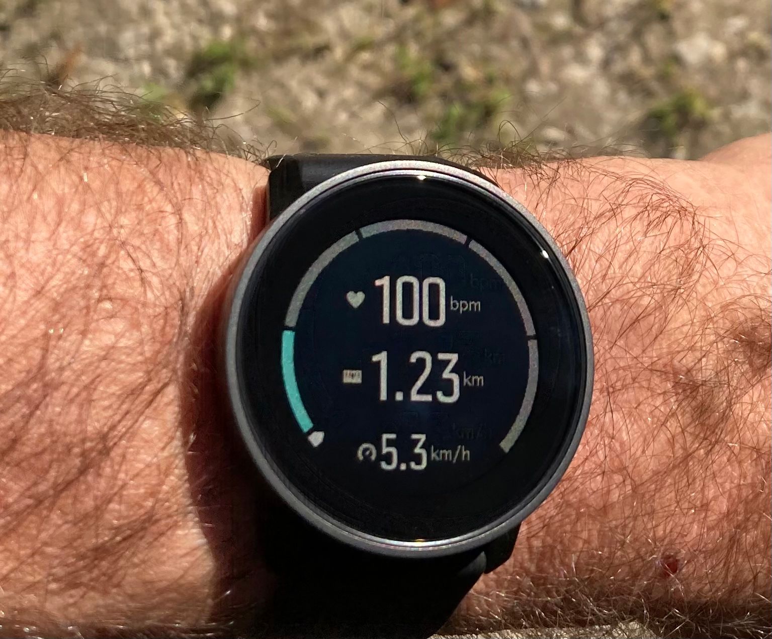
@tomas5 glasses (esp. reading glasses) are not a solution when you do any sports (with possiblity a few exceptions). When you are running or biking, you can’t just reach to your back pocket and put the glasses to check something on the watch. The 5 m paradigm makes perfect sense. If you can see it in o quick one glance, it works; if you have to -read- it, you already lost time.
-
@łukasz-szmigiel very true! One of the biggest readability issue is the_shape_ of the font. This all boils down to usability. Occasionally, we allow to sacrifice a bit of usability for the esthetics, but usability (in this case, readability) is the main point of any UI.