Watch face improvement - synthesis PYC
-

Apologize for those who read my previous posts and comment, it is redundant with some, but I was thinking it is good to put clearly my ideas on paper here to be sure all my ideas were all together and made sense …
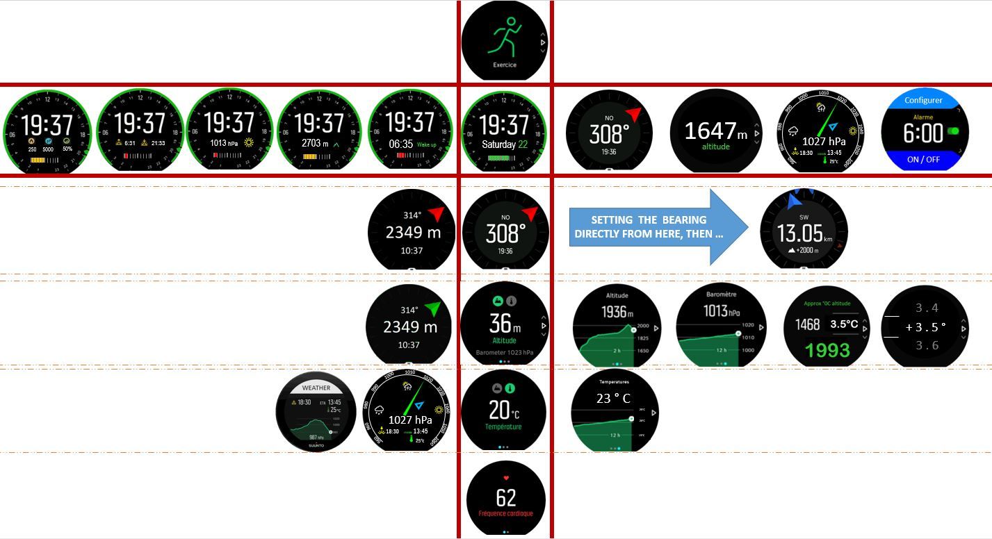
In the above drawing I worked this way
I used the same logic as the watch behave today
The main red rectangles represent the default watch face (at their intersection) and what you can access from here if you click
- on button 1 (the images up in the same vertical axis)
- on button 3 (the images down in the same vertical axis)
- on middle button 2 (the images on the right in the same horizontal axis) = temporary screen the back to the one of main vertical axis
- just touching the screen (the images on the left in the same horizontal axis) = permanent screen in the same spirit and that will remain until you press something
Having said that what differs
-
In the main watch faces,
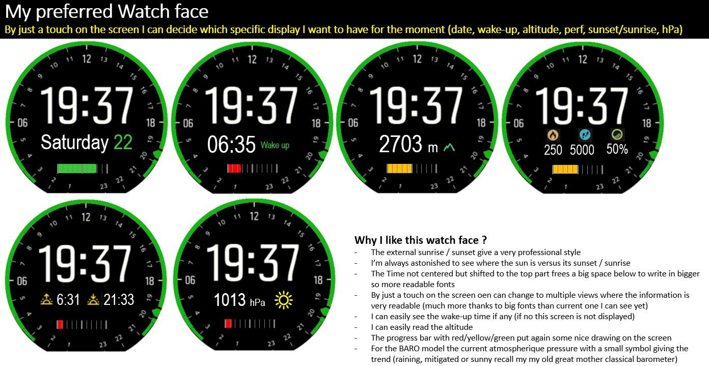
- the time is not centered but on the above part which allow to free a large part and show with bigger fonts the secondary information plus this progress bar showing the battery … you can realize that even is small the red, yellow green changing color of the progress bar give you a good feeling if you need to plug it to power supply or not
- the other watch you can choose and remain permanent allow you to see easily as per your wish the date, or … the alarm or the altitude (in big
 or the pressure (in big with an icon telling if it goes to sunny, cloudy or raining weahter … of course for the BARO ones) the sunset sunrise time … to complement the grapical crcle and its point which I like a lot … and last but not least for those who wnat to see there performance the summary
 - now let’s click on midldle button and much more interresting temporary screen than the only one of today … first the compass, then the altitude, then the weather with a proposed new screen (of course to be improved but which shows not the graph but a needle which going on right say sunny weather and on left raining … then a new screen to see, activate or deactivate in a single button or set the alarm
.
-
in the other screens
- first of all the possibility for users to choose their order – to be set in the APP-- (at least for the ones below) … which allow to find immediatelly the compass, then the altitude, then the heart bead … then the rest which I less use (of course here it is my prefered choice but others could have a different one) . one could tell me that there is redundancy between these screen and the ones I mentionned in the main watch face (compass, altimeter, barometer) this is true but on purpose : in the watch face going on right alow you to have a fast overview of the situation, here these other screens remains permanent until you decide to change what you want to see … so if during 1 hour I want to see the compass or one of its sub view, I will go here, the same for altimeter … etc etc
.
- first of all the possibility for users to choose their order – to be set in the APP-- (at least for the ones below) … which allow to find immediatelly the compass, then the altitude, then the heart bead … then the rest which I less use (of course here it is my prefered choice but others could have a different one) . one could tell me that there is redundancy between these screen and the ones I mentionned in the main watch face (compass, altimeter, barometer) this is true but on purpose : in the watch face going on right alow you to have a fast overview of the situation, here these other screens remains permanent until you decide to change what you want to see … so if during 1 hour I want to see the compass or one of its sub view, I will go here, the same for altimeter … etc etc
-
Looking a little bit more on the COMPAS
- a new additional permanent view from here which mixt at the same time the alimeter and the compass (very interresting when you are in mountain)
- the possibility directly from here to setup a bearing navigation … in such case the permanent other compass view could be also this bearing screen
.
-
looking a litle bit more on the ALTIMETER
- a new additional permanent view from here which mixt at the same time alitmeter and the compass (in fact it is strictly exactly the same than the additional one in the COMPASS section the sole difference is the color of the arrow which is green here instead of red) … why in such case this redundancy ??? just because either being on the compas view or on the alimter view by touching the screen allow you to arrive on the exact same view … why a green arrow instead a red one … well for the fun or the beauty of it … or to remember that you are here within the altimeter group of features whereas when red you were in the compass group of features
.
- a new additional permanent view from here which mixt at the same time alitmeter and the compass (in fact it is strictly exactly the same than the additional one in the COMPASS section the sole difference is the color of the arrow which is green here instead of red) … why in such case this redundancy ??? just because either being on the compas view or on the alimter view by touching the screen allow you to arrive on the exact same view … why a green arrow instead a red one … well for the fun or the beauty of it … or to remember that you are here within the altimeter group of features whereas when red you were in the compass group of features
-
looking to the TEMPERATURE / WEATHER
- a new group of screen … in fact it allow to regroup all what concerns the temperature and allow other extensions
- a proposed new screen that display the current atmospheric pressure (for the BARO models) I prefer mine – not because its mine – even if I like a lot the SUUNTO PLUS weather screen , by the way it could be also provided here so the people who prefer a graph that shows evolution rather than a needle that shows currnet situation can choose … or switch … remember when it is on the left that means a permanent screen until you decide do change by touching …
- having a T° section allow also to add another new graph screen which shows the evolution of temperature … some may say it’'s a gadget … not totally wrong … your body knows how temperature evolves … just could be good to have this and by the way to store this during exercise as T°c could influence the performances
.
-
Just looking on the main vertical axis
- It will be super nice if in the APP, SUUNTO allow us to sort the order of the “functional” screens … I mean the one when you go down … today th immediat next screen is the heart beat but for me it is not the one I will have put … multiple reasons here : 1) when I’m in mountain I do not care so much to my heart beat I care about the altitude,the direction or the weather … so I would have prefered to access these screens fast either temporarly (so why I put them also on the horizaontal axis) or for a long period … if I want to monitor the altitude but not within an exercise. also … the heart beat blocks you during several seconds until the signal is not acquired … so to go to the altitude you have the feeling to be in a sort of glue until the heart beat screen is not ready …
- having the order beign able to get changed, each SUUNTO user can determine which screen they wish to see faster than the other … someone who want to monitor carefully his sleeping time will may be put it immediately accessible by just a move down …
.
And with my dreamed watch face :

Why I like this watch face ?
- The external sunrise / sunset give a very professional style
- I’m always astonished to see where the sun is versus its sunset / sunrise, so I like a lot the portion of cicle showin it on the external of the watch face
- The Time not centered but shifted to the top part frees a big space below
- Secondary information are now displayed in bigger fonts, so much easy to read you can see the altitude, the wake up time, the date, the sunset sunrise, the pressure (for BARO model), the performce … why not the temperature …, if tomorrow there is a submarine model the depth in water etc etc etc etc …
- By just a touch on the screen you can change and keep your prefered secondary information always available
- You can easily see the wake-up time if any (if no this screen is not displayed)
- You can easily read the altitude (also in case you were a ski mask)
- Some may say it is old fashion but personally I like the progress bar with red/yellow/green put again some nice drawing on the screen
- For the BARO model the current atmospheric pressure with a small and nice drawing giving the trend (raining, mitigated or sunny recall my my old great mother classical barometer)
The screen does not look like too overloaded or with too many useless places