Replace Bearing Navigation Instructions With Degrees
-
Suggestion
-
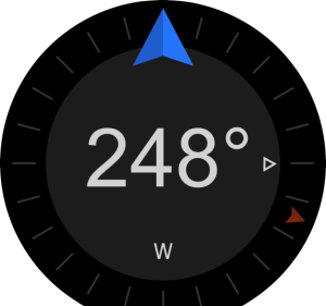
Replace the instructions with the numeric bearing in ~twice its current font size.
-
Possibly replace the (bottom) current cardinal+bearing with simple cardinal (or tap-to-change field … or leave blank).
-
Revise the relevant manual section.
 The wrong font (Arial) … but bigger - you get the idea.
Rationale
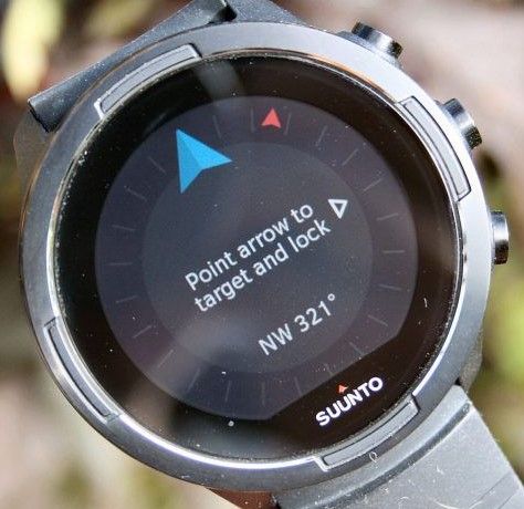
The instructions take up primary visual real estate on a key functional screen (not inactive, like the sleep tracking activation info on the Spartan). Once the functionality is understood*, the instructions are redundant every time they recur. And they recur (and persist) every time.
The arrow is great when you can see your target, the numbers are better when you can’t or when you are just checking the compass while recording an activity. Centered and Big is clearer, both at-a-glance while moving, and in detail for those with older eyes.
Plus, and I may be biased by being used to Suunto’s Sp/Sx interface AND general bearing lock function but …
*The instructions seem unnecessary as the only things one could do with that display are Lock a bearing or go Back. And the middle button (with adjacent arrow or caret [possibly flashing]) is the default for Actions elsewhere in the UI. Upper & Lower soft buttons for menu movement where available (and distinguished by carets) or inoperable (user can’t do any damage). Folk using the watch would almost certainly know this already, having reached that screen.
Possible hybrid alternative
Have the instructions appear once on 1st use and then fade out to be replaced by big bearing. Or recur and fade out every time. But do any Suunto watch function displays have fade/replace? Not worth developing for this.
Splendid job on introducing this feature, Suunto, by the way.
Thanks to @Efejota for the font idea and @Egika for checking current function.
-
-
Brilliant!
-
Very very correct.
Instructions are only necessary the very first time and them when we master the feature they are totally useless and forbid to have better information like you proposed.;
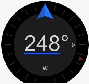
May be just a suggestion here … in case of bearing nevigation setup, undertline
The advantage is that you will visually very easily see the difference between when you are in the process to setup the bearing direction versus when you are just looking to the COMPASS
