-
Hello,
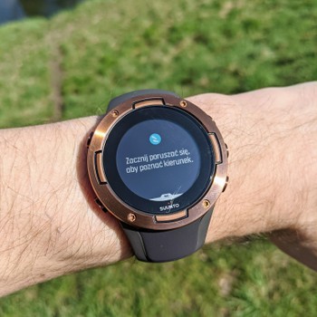
is it only me who thinks that it’s really unnecessary and annoying that Suunto 5 displays info text asking user to keep moving in order to see direction when on active navigation screen?
I understand it’s extra precaution for new Suunto 5 users since this watch doesn’t have the compass.
However I don’t think it should be used past first workout since there is already a UI clue - when watch knows the direction, an arrow is being displayed inside the icon in the center of the screen. When stationary, only the dot is being displayed instead, indicating that the watch doesn’t know the direction. This is enough.
I’d really like to switch off this info screen reminding me to start moving in order to see the direction. It requires me to press the middle button to reveal the path which is quite dangerous when running in hard terrain.
Apart from this little issue - I find the watch really well designed and I believe the readability of data displayed on the screen and in the mobile app is superb and better than what Garmin or Polar have to offer. This is good design and I appreciate it.
Can anyone from Suunto team comment on this?
-
@Łukasz-Szmigiel This has been reported and hopefully a fix will come, Suunto knows about the issue. I have this problem as well.
-
Hello,
Yes it is very annoying.
-
@Brad_Olwin thanks for the head’s up. I didn’t know it was already reported. Great news that it’ll be fixed!
-
Anything new in this regard?
I was hoping last update will fix this issue but it didn’t. It’s super annoying when trail running.
-
@jthomi, thanks for moving this post to S5 related thread.
-
@Łukasz-Szmigiel no news… ?
-
@Sébastien-Fayolle Did you test with the most recent firmware? I have not but I can this week.
-
I’ve tested it with latest firmware. It’s still there

-
@Łukasz-Szmigiel I noticed when using this if I press the middle button the message disappears and I get the route/breadcrumb. I did not test whether the message would come back again if I stood still. Did you try this? I will test again on Wednesday.
-
@Brad_Olwin it disappears and it always worked that way. The problem is - it restarts whenever the screen changes - either by manually changing it or by invoking auto pause or even receiving a notification.
-
@Łukasz-Szmigiel I don’t know if this isn’t already solved for S5, but for Spartan Trainer another huge problem is the fact that you cannot dismiss the message when the watch is locked. The middle button switches immediately to the next screen and there’s no way to see navigation unless you unlock the watch (or move)…
-
@inkognito I don’t know as I’ve never locked the buttons during training as I see no need for it and I switch screens from time to time.
-
Just a friendly reminder that this stubborn bastard is still with us with 2.14.12. What’s funny is that waypoints produced with Komoot don’t help it either as each waypoint notification resets the “dismissed” status of “keep moving…” notification


-
Navigation without built in compass is pain. When moving slowly because of ascend i got this message quite often even when i was walking. I think you need to move at least 4-5km/h to see correct direction. It is not much usable. Compared to Ambit 2S (which had compas) is Suunto 5 much worst.
-
@tomas5 while I think that the lack of compass is somewhat weird, being unable to see direction without moving isn’t that big of a deal in my opinion. The watch gets on track rather quickly and even when moving slowly - you can see your position updating on the screen (even without an arrow icon). Matter of fact - I think that the navigation screen is well designed and very readable in S5/S9. Also I tend to look on the navigation screen quite often when navigating so it works fine for me - I don’t need the view to be rotated in the correct direction all the time.
This is, obviously, considering that I see the actual track and not the “keep moving (…)” notification.
Repeatedly. Over and over again. Up to the point of insanity.
-
@łukasz-szmigiel yes if this message wasnt pop up so often it would be better even without arrow just dot is enough to see if i am on track. Map view is good with a ability to zoom in and zoom out which is great. I was able to switch from message to map view but it must by done manualy by button.
-
Either it’s fixed or I’m hallucinating things. I was unable to reproduce the nag after it was initially dismissed, by switching the screens and cycling back to navigation. Only when toggling pause was it reintroduced (well, ideally I’d like it gone forever but it’s great nevertheless). I’ll have to hit the trails and give it another go to be sure.
-
Nah. Message (ie. notification from phone) resets the nag. I guess “it’s by design” then
