-
@Tim4c But there is always room for improvements so all feedback is welcome
-
@Dimitrios-Kanellopoulos Ok, Thanks and understood

-
@Tim4c The s9 has glonass on the navigation settings and users coming from the SSU are searching for it.
If I can also add some techie reasons that is because on SSU/Spartans GLonass can be changed on the runtime while on the S9 (currently ) only when the chip is fired up (initialized)
-
@Dimitrios-Kanellopoulos Does GLONASS affect battery time on the S9 much?
-
@paradize not much at all. I think on a 100% it should be 2-3h damage if glonass is on.
Sometimes it could even improve (in cases when the watch strugles) but we took the safe side on the estimates
-
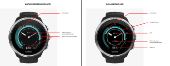
By waiting this update, i was waiting the S9 watchface. I find it’s a really nice one.
But i was expected something a bit different. I give you a picture below with the comparison of what are currently displayed and what i would like…
-
@Tim4c good points let me tranfer those
-
@Tim4c
Well done Tim, I agree with you -
I would like also that clock hands are behind values to be more readable!
-
-
just to throttle this, you should have seen the debates on the test groups when this was first introduced
-
@Václav-Král come on, its my favorite. Take it or leave it

-
@Tim4c said in SSU 2.5.18 - ON AIR:
I would like also that clock hands are behind values to be more readable!
Digital hour?
-
@suzzlo Why not

-
Good job!
What is “Sleep data insights”?
-
@dimangi you can see the details of the prev days of sleep (before you could only see the current)
-
I’ve just seen that instant HR monitor is locking on HR faster, around 10 sec.

-
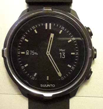
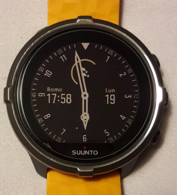
@Tim4c I totally agree with you to see more/different data on the watch screen like and also no duplicate information like twice battery level or sunset information. I think the default watch face you pictured looks nice, but I noticed another flaw: the hour hand is pretty thick. Not a really big problem at some hours of the day, but between 11:00 and 13:00 it can become really tough to read the data field as the color of the text is the same as the hour hand and the text becomes invisible.
-
I like the little update on “chrono” face … there’s only one drawback imho, once in “energy saving” mode the outer numbers are barely readable.
BEFORE

AFTER

-
wow, nicer than before!

