Map Rendering and Trail Visibility after Software Update 2.43.8/.12
-
@duffman19 said in Map Rendering and Trail Visibility after Software Update 2.43.8/.12:
I 100% agree that trails should always be high contrast, either completely white or completely black, no gray. That’s why I use the “Dark” theme which has trails marked as white against a darker background.
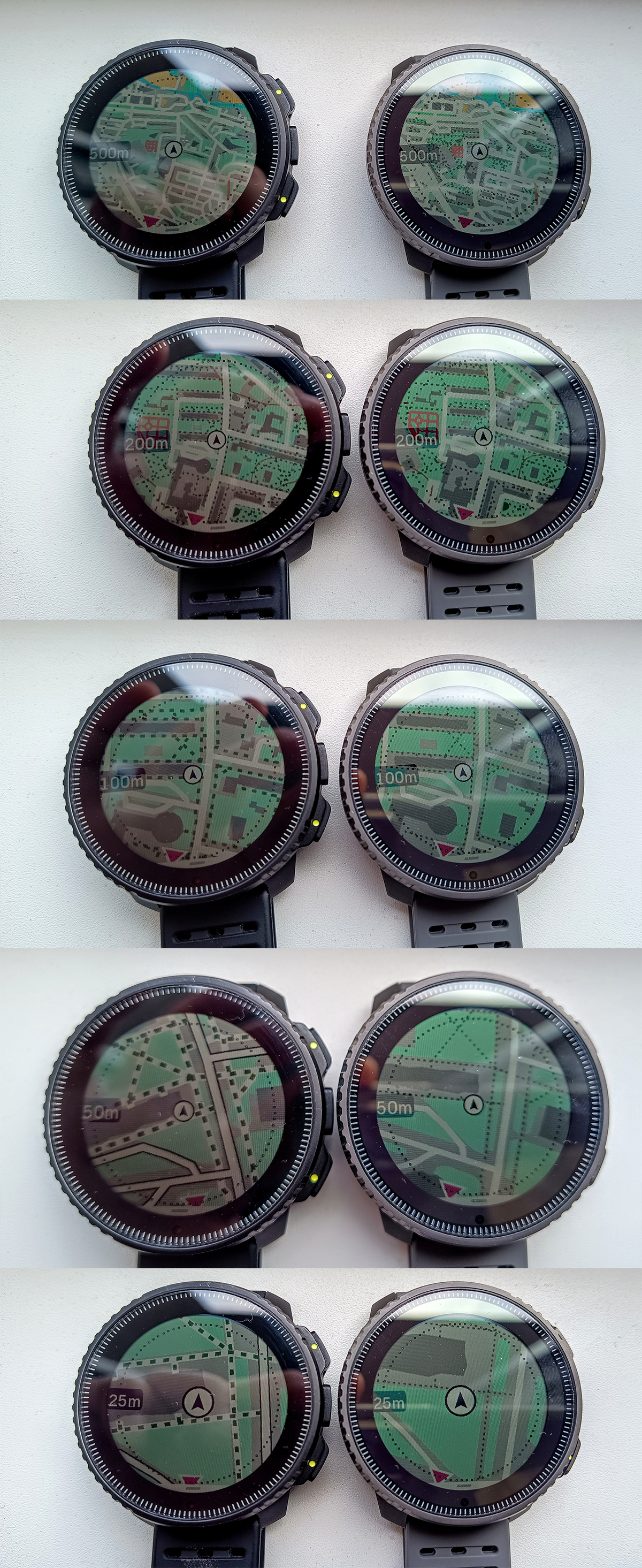
Do you have Vertical? On Suunto Race or Race S, none of the map themes display trails well with a high contrast combination of colors. I think that perhaps maps are limited to the 64-color palette of colors that is available on MIP displays, and on AMOLED Suunto doesn’t take advantage of a much higher number of colors, and mapping of MIP colors to AMOLED colors seems to be poor. For example, the background of the map on the on the light theme is often green (when running in a park or a forest), which is way too vivid.
-
Light theme: trails are usually dark green on bright green, which is a fairly low contrast. I stopped using this theme after the first few tries. Also at some zoom levels (e.g. 0.2 mile) I can still see individual building outlines but no longer can see trails - what these maps are optimized for? Overall this theme looks really nice, but unfortunately it is quite useless for trail running.
-
Dark theme: trails are usually green on dark green background, which is similarly low contrast or perhaps even worse contrast, than in the light theme.
-
High contrast theme: this is what I use most of the time, but even in this case trails are grey on black, which isn’t the best possible contrast. Also, trails are similarly thin to other map themes, which makes them difficult to see at the 500ft zoom level, especially if the screen has finger smudges or if there is a sun glare. Also, I should mention, that restricting trail visibility at higher zoom levels forces me to pan the map more with my fingers, which makes the screen dirty from smudges and makes the map visibility even worse. Normally, I never pan the map, but with this recent map changes I am forced to in order to see what’s ahead!
-
Winter theme: I don’t even understand why Suunto bothered to add this theme at all because in my opinion it is completely unusable. Trails are displayed as light grey on slightly lighter shade of grey. The contrast is so low I didn’t realize that trails are displayed at all until yesterday when took a picture of my watch and enlarged it on a laptop. Maybe it is supposed to show winter trails such as backcountry ski or snowshoe trails.
-
-
@sky-runner Sorry, yes, I have a Vertical and that’s what I am referencing. I didn’t realize that the themes were that different between the two watches.
-
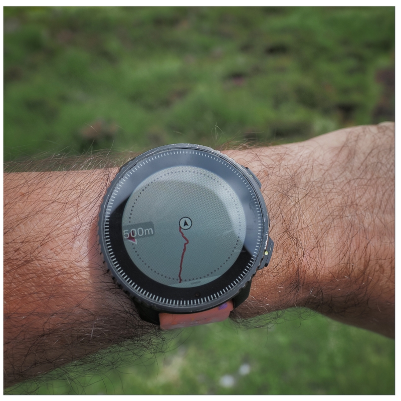
@sky-runner That dotted circle is the best feature that I have ever seen on an outdoor watch. It makes it much easier to see the distance from actual position than the small scale at the bottom on other watches. Suunto: never ever think of removing that dotted circle. Thx:)