Inconsistent ZoneSense Data?
-
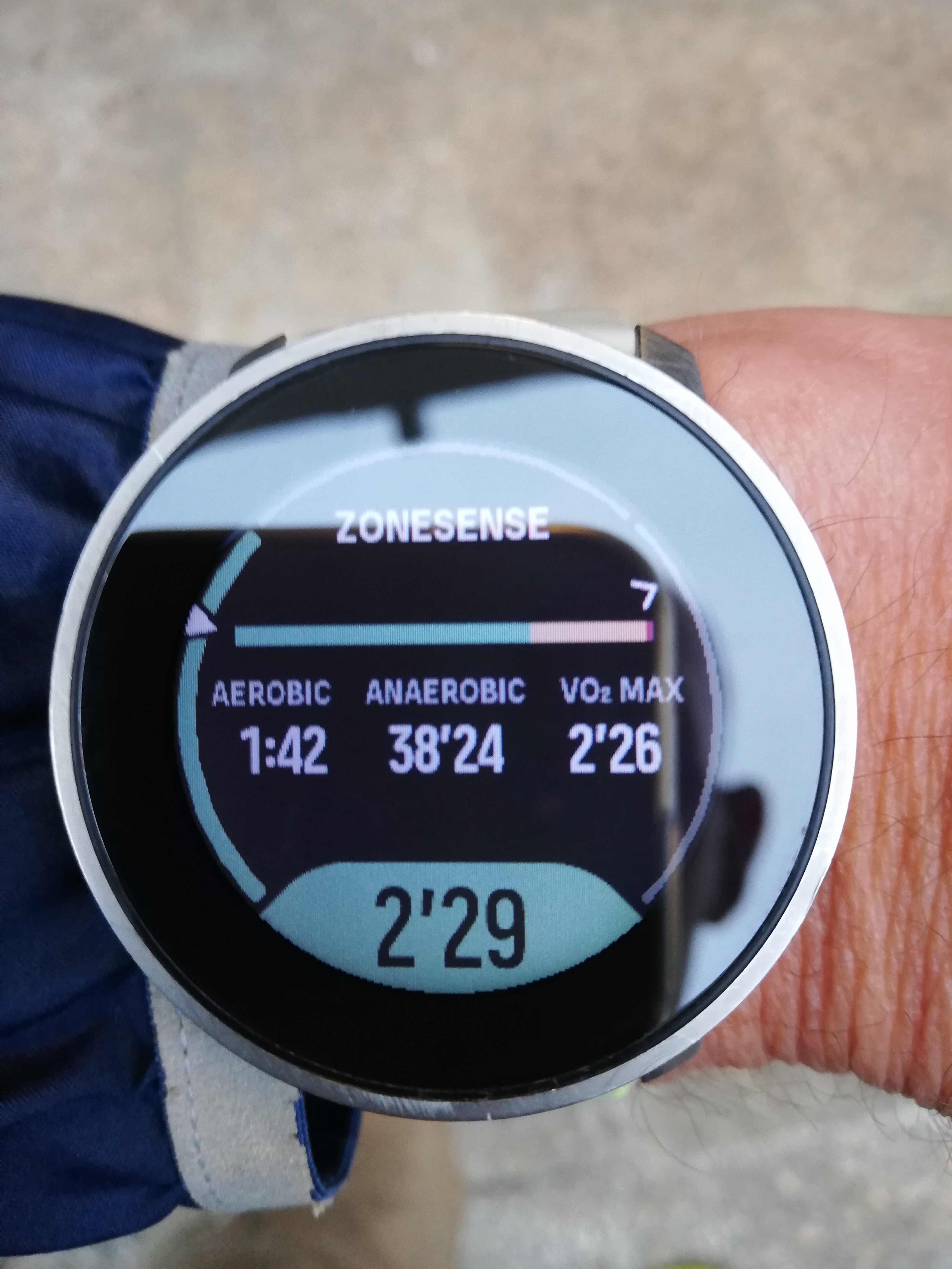
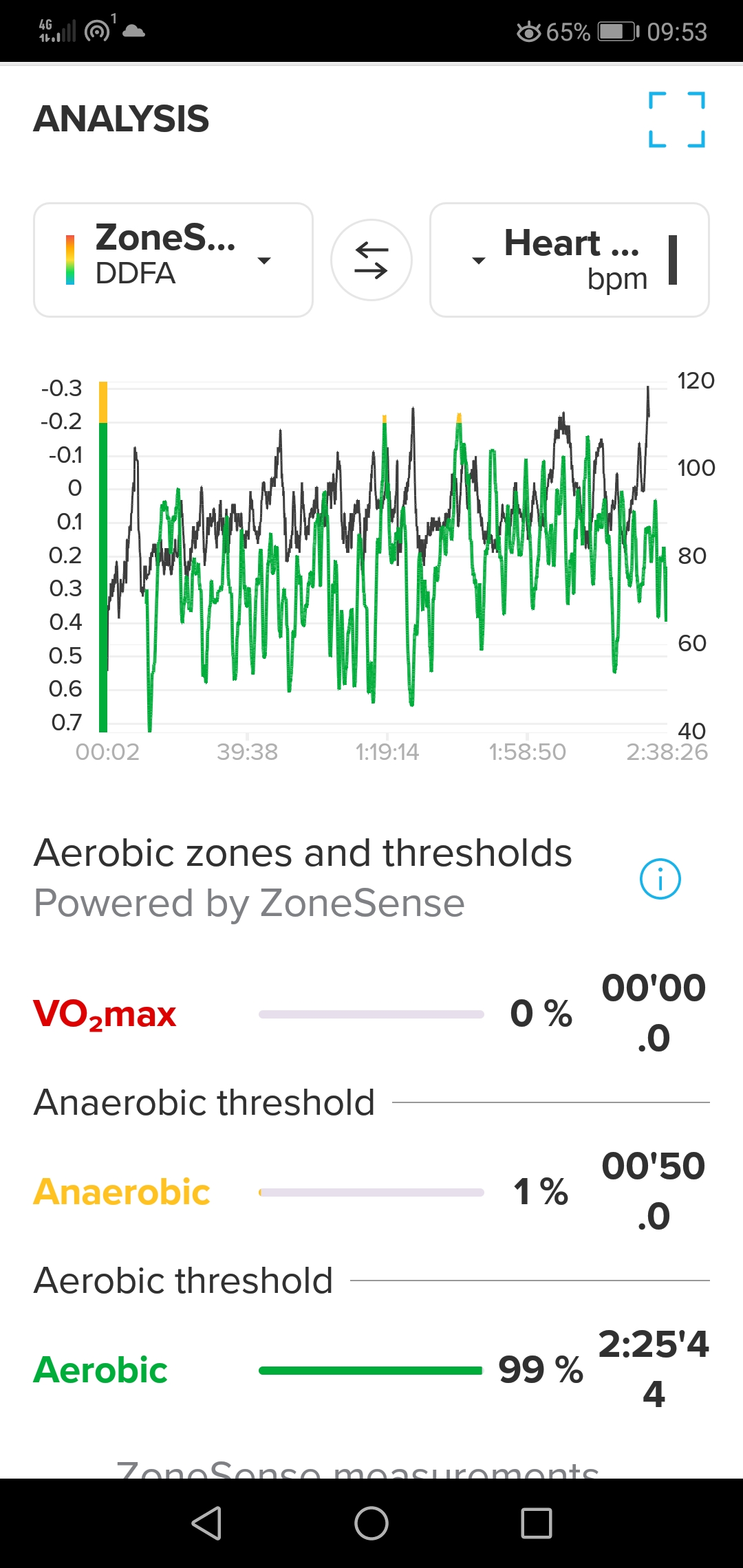
I’m having a difficult time understanding the difference between the real-time data provided by ZoneSense on my S9PP while training and the post-training data provided in the S+ app. Here are 2 pics of this morning’s session.
Real-time at end of session:

S+ Analysis:

Why is there a considerable difference between the real-time data on my watch and the post-training data in S+? It was a fairly easy hike and the S+ data seems to be pretty accurate while the real-time data is totally off. Am I missing something?
-
@Dareo hey Dareo
 i am personally think the same thing. I see very often that the real time data is timely very slow to show it correct in the watch. I believe that in my opinion there is a real time difference from 45seconds up to 1 minute and more in real time. Switch with the right button on top between the different screens in the ZoneSense Display. I find it really helpful to see actually pace and actually heart rate in the ZoneSense Display. When you know your treshholds you better can think about the visualisized ZoneSense graph while Training. Then you See better the Timeline difference.
Hope it helped for you. -
@GiPFELKiND Thanks for the feedback. I do toggle between the ZoneSense displays on the watch to get more useful info, but the summary face appears to be totally off. This is quite annoying because I sometimes head out with the intention of getting x% aerobic, y% anaerobic, and z% VO2 Max, and I’d like to be able to track that real time. The way I have the HR limits for the 5 zones configured on my watch zone 2 = aerobic, zones 3+4 = anaerobic, and zone 5 = VO2 Max (zone 1 is just warm-up & cool-down easy peasy stuff). So when ZoneSense came out I thought it would be great to have a simple screen that presents the 3 zones that I care about. I’ve used the “HR Zones Duration” app but the text on the screen is too small for my old eyes to read while training and sweating, plus it means having to do the math to get the sum of zones 3+4 which I’d rather not have to do. I can accept a bit of a lag in the watch showing the real-time data, but for the watch to say that I’ve been in the anaerobic zone for 38+ minutes when in reality it was less than 1 minute just seems a bit off for me.
-
@Dareo the time wich is visual in the down / middle place (sorry for my Englisch) IS only the “new” time you spent in the actually Zone. Under the graph (Green, yellow, Red) is the zone time summary. If you reach another zone the time in the down middle place began from 0time again. But it will be added in your summary
-
@GiPFELKiND That I understand, and I find it very useful. Perhaps it’s just wishful thinking to expect the summary data for the 3 zones to be more or less accurate taking into account a little bit of lag. (Don’t worry about your English. Es ist viel besser als mein Deutsch.)