SOFTWARE UPDATE 2.35.34 Q2
-
@Tami999 said in SOFTWARE UPDATE 2.35.34 Q2:
Now everything is static.
Tapping and holding opens the widget linked to the data.
-
updated smoothly right now

quite impatient to check the new features!
Thanks!
-
Forgot to add the speed improvements on the UI.
-
@Dimitrios-Kanellopoulos and you forgot to add the data tooth in the map view

-
@TheGlassWolf yes later on. Due to dive capabilities we want the device to sail smoothly now.
-
@Egika yup. Added
-
 G gizmo referenced this topic on
-
@Egika said in SOFTWARE UPDATE 2.35.34 Q2:
@Dimitrios-Kanellopoulos and you forgot to add the data tooth in the map view

What is this? Please

-
@Mff73 open the map view with a route loaded and you’ll see the navigation information in a data field at the bottom. just try it

-
@Egika
I am in a sofa, I clicking everywhere to dig into this, didn’t thought Yet, of navigating a. Route from where I am.
Sea kayaking schedule this afternoon, let see.New pause menu, added to new lock button feature is nice. It won’t make us run quicker but

 .
.
Let’s try all these in the field. -
@The_77 said in SOFTWARE UPDATE 2.35.34 Q2:
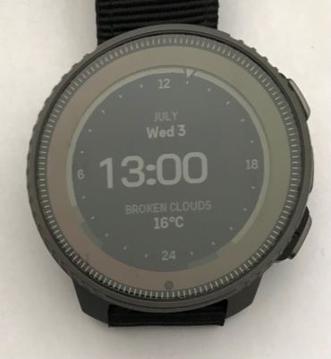
Unrelated feedback on this new watch face - be nice if the hours/minutes were moved to the centre when the seconds disappear after a minute or so. Just not as pleasing when the time is left shifted.
Equally low-grade gripe:
Along with that centering, the numbers could use some kerning. And the Vertical’s oblate separator dots don’t help:

-
Should we able to zoom in/out the altitude graph of a navigated route?
I see +/- near upper button, but quick click doesn’t do anything, and long click is opening multisport switch
-
 E EzioAuditore referenced this topic on
-
@Mff73 i’m following a route right now : short clic on +- switches from whole route (the same as before) to « guidance »
Don’t know it it is related to route guidance, but map fluidity is erratic
[edit] : same erratic fluidity on map screen with « petit poucet » instead of following route
Also distance to next turn indication on map screen is really big. No possibility to hide/show ? -
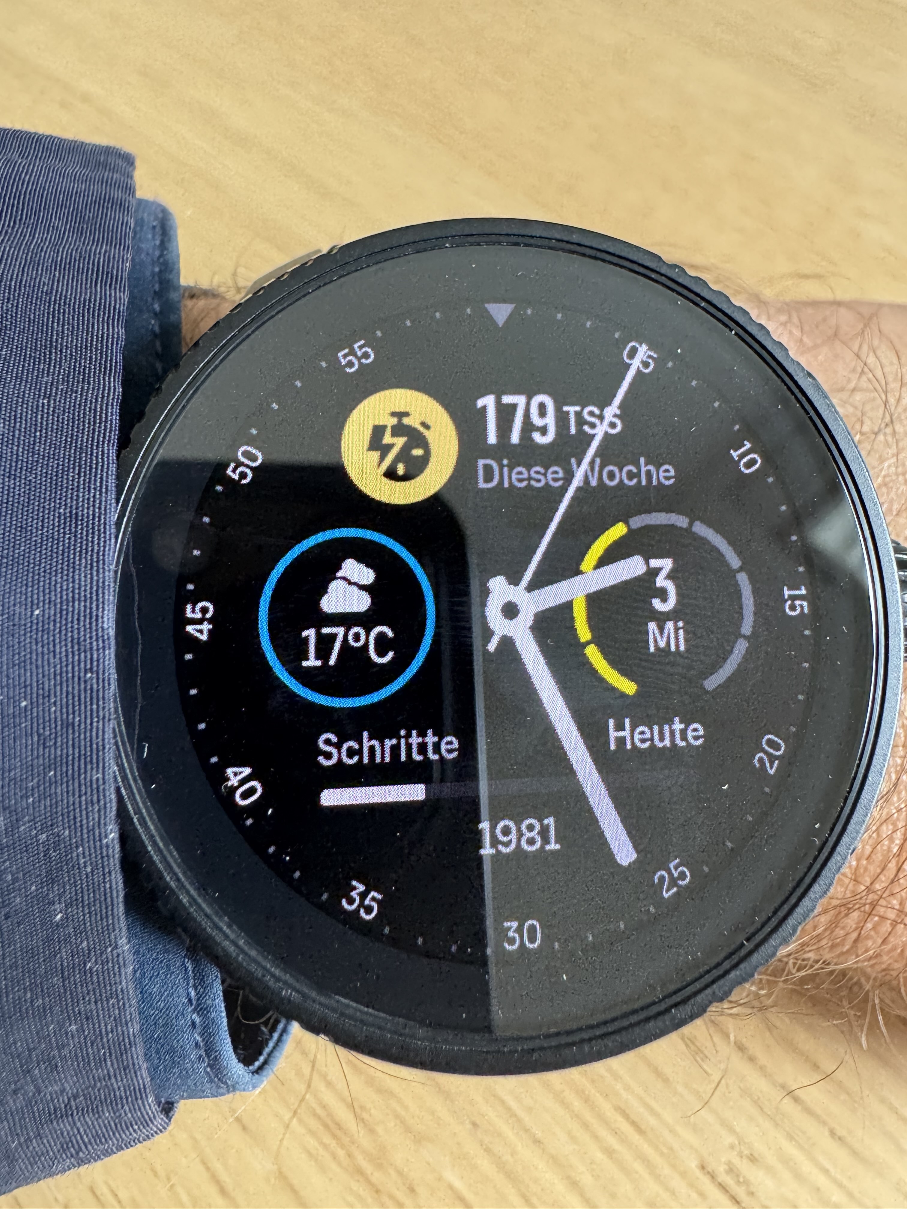
@Dimitrios-Kanellopoulos @isazi Longpressing a complication now opens the full screen view of the corresponding widget. Unfortunately this does not always work. Maybe once out of 5 tries on the Race. And if it works, it takes about 4 to 5 seconds. I am currently using the new analog watch face. Can anybody else reproduce this?
-
@wmichi said in SOFTWARE UPDATE 2.35.34 Q2:
@Dimitrios-Kanellopoulos @isazi Longpressing a complication now opens the full screen view of the corresponding widget. Unfortunately this does not always work. Maybe once out of 5 tries on the Race. And if it works, it takes about 4 to 5 seconds. I am currently using the new analog watch face. Can anybody else reproduce this?
yes. and known issue
-
Can you please tell me what the yellow bars around the date represent. Thanks

-
@Patrick-Löffler-0 said in SOFTWARE UPDATE 2.35.34 Q2:
Can you please tell me what the yellow bars around the date represent. Thanks !
Is is the day of the week. 1=Monday, 2= Tuesday, 3= Wednesday
-
@Egika Thank you very much.
-
UI speed improvement is very noticeable on the Race. It was more than good enough before, but now we can fly through the widgets without any stuttering. Great Job!


-
Great updates. So pleased to be able to lock the screen while paused.
I will never be on board with horology’s use of the word ‘complication’ though
 , especially when smartwatches can be prone to the other sort of complication.
 -
zoom seems to be up to 25m on my Race
by the way, what does it mean “data tooth during navigation”?