SOFTWARE UPDATE 2.35.34 Q2
-
@Stefano-M64 said in SOFTWARE UPDATE 2.35.34 Q2:
Complications (unfortunate name choice)
…can not blame Suunto for it as that is an industry standard term https://en.wikipedia.org/wiki/Complication_(horology)
-
@cheetah694 said in SOFTWARE UPDATE 2.35.34 Q2:
The modern approach in user experience that at least Apple currently sticks to
well … let’s talk about system settings on macos …

-
@isazi I appreciate you reporting this issue to Suunto. As I see it, and as I have discussed it with @Egika and @Brad_Olwin too, it hinders the user experience and does not obey either logic or functionality.
I understand, as you say, that it is necessary to share UX in order for behavior to be stable and consistent (which I value very positively). But that does not mean that the solution adopted is the best. In fact, it implies an “inconsistency” in the way it operates depending on the type of screen.
For me (although I can understand that other people have different needs) the short press of the top button (which is the most natural gesture of all) should perform the same task on all screens (and on all watches): display the menu stop/pause. And “reorder” other secondary functions, if it was necessary, for example, multisport.
I don’t know, I don’t think I’m wrong, correct me if you see it differently.
Hopefully, as you say, this is made coherent with a future upgrade. (Now it’s not)

Special mention is the fact that long press the center button is the equivalent of “BACK” in Suunto language (99% of situations). But precisely, on the navigation screen, it is the other 1%, and does something else different than in the rest of the screens and menus.
Therefore, if you have the navigation screen active (which, to make matters worse, is available by default) it is like a kind of “wall” that any ball bounces off.
This is not logical and reinforces my argument of a need to reorder certain functions.
-
Hi from sunny Cyprus! After some fiddling and adjustments to my previous set-up, I have to agree that this is a nice upgrade. Thanks very much to all involved.
For me navigation interface is much improved (waypoints in the “tooth” for example):
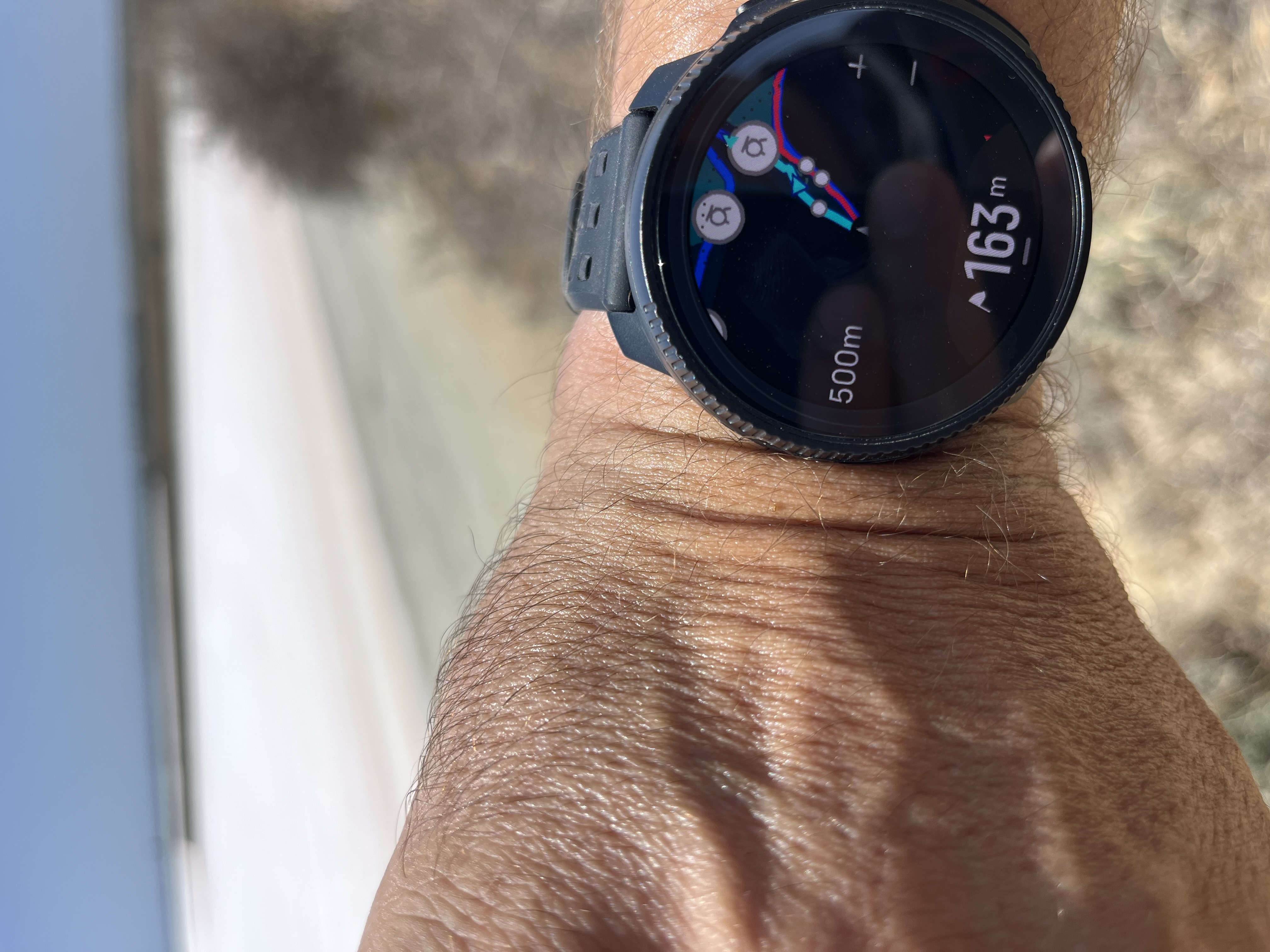
So far my only gripe is that the weather Complication does not alert me when the watch is out of sync with my phone. It would be useful to have some kind of alert, instead of showing the wrong temperature.
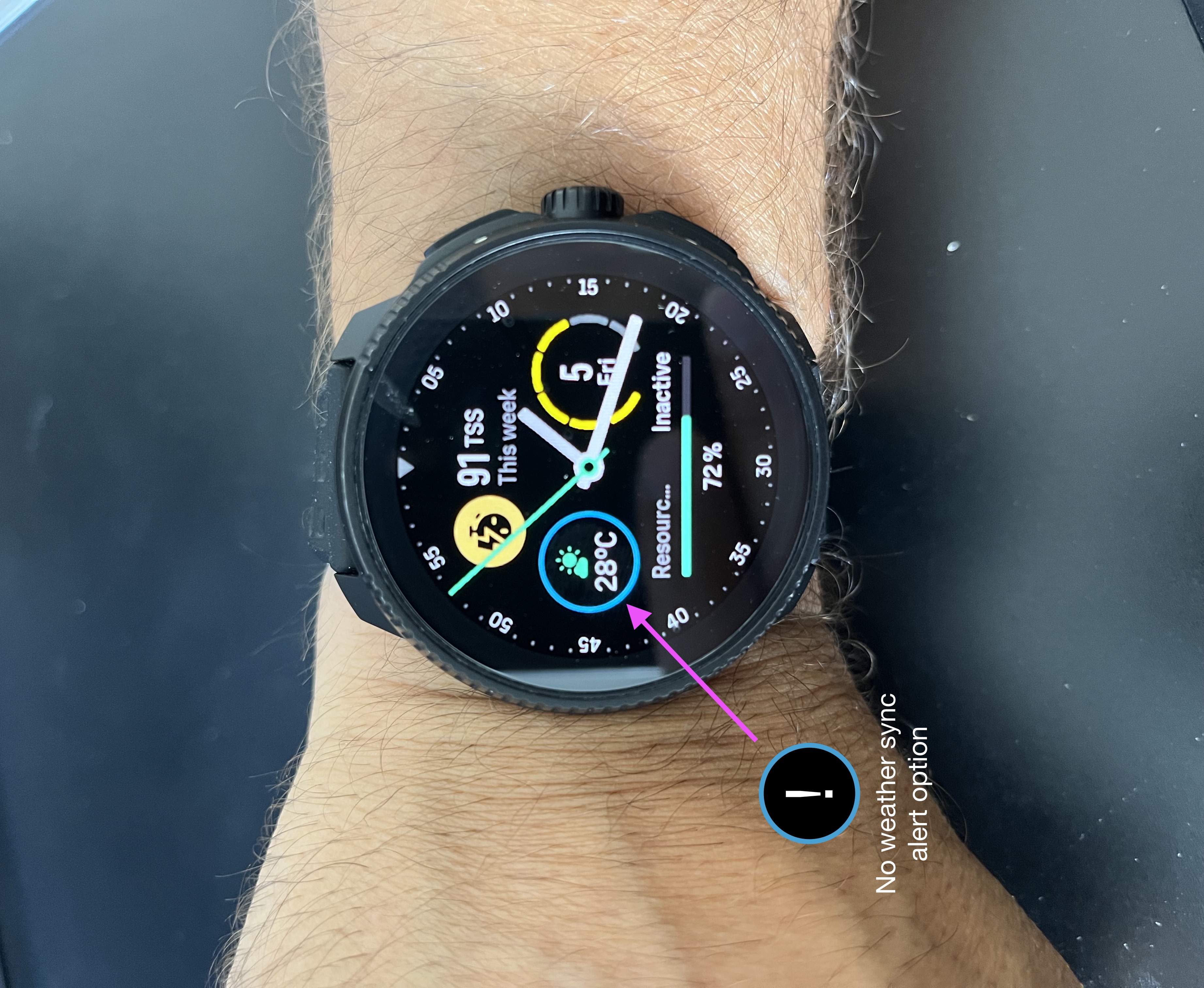
But otherwise, so far, so good.

-
@twekkel ah! thanks, everyday there is something to learn!
-
@enriqueescoms I agree with you here. The crown on some watches and not on others should enhance the UI not change it. So essentially with the crown there are 3 buttons. If the crown is not rotated it is a button.
If I am an avid Suunto user and don’t like sleeping with my Vertical but need it for crazy 100-200 mile races or multi-way events I bought a Vertical. Recently I am so happy because now an updated 9PP (the Race S is released)! Now I have a daily and for most workouts a watch I wear almost all the time. So comfortable for sleeping.
The problem: In Navigation mode to switch to the Climb graph or elevation overview in the Vertical I use a short upper button press. Not on the Race S! I have to use the crown. Every time I am using a route on the Race S I push the upper button to see the climb and it doesn’t work.
One example of the differences in UI. I too would rather see them consistent. But I would rather have all the improvements and live with the UI changes. Perhaps future upgrades require the design as it is now. I do not know. -
I noticed that daily overview doesn`t show all the burned calories right way. From the log I can see that 551cals were burned during todays excercise, but overview shows only less than 500. Same happened yesterday, but not before fw update. Same information can be seen also from SA.
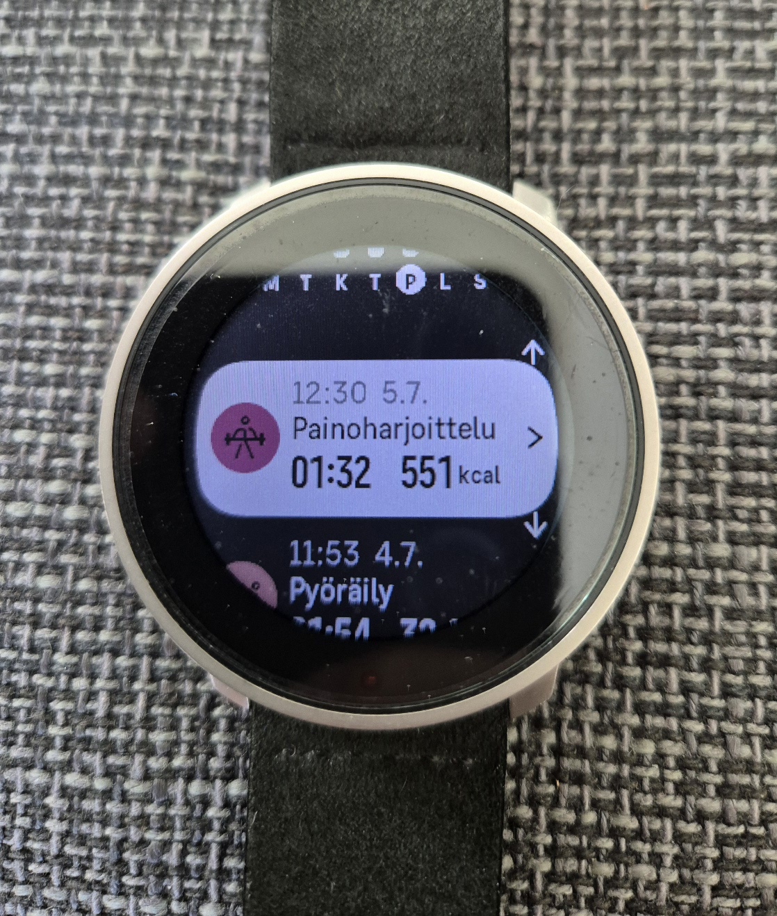
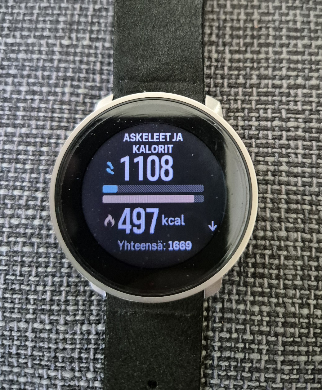
S9PP.
-
This seems like an easy problem to solve. All the data fields are already there, so just let the user select which ones they want to see in the configuration screen. When they tap the watchface, it should scroll through the data they care about.
This is a signature feature of all Suunto watches I have owned in the past 14 years. To just discard it like they did in this update is infuriating.
-
@Tieutieu
i also used the tap to display and i like that far better than the new complications. has anyone found a fix to the non functioning timer? when i try to set a custom time it just keeps going back to 0. -
I just started timer on the watch and had nice surprise.
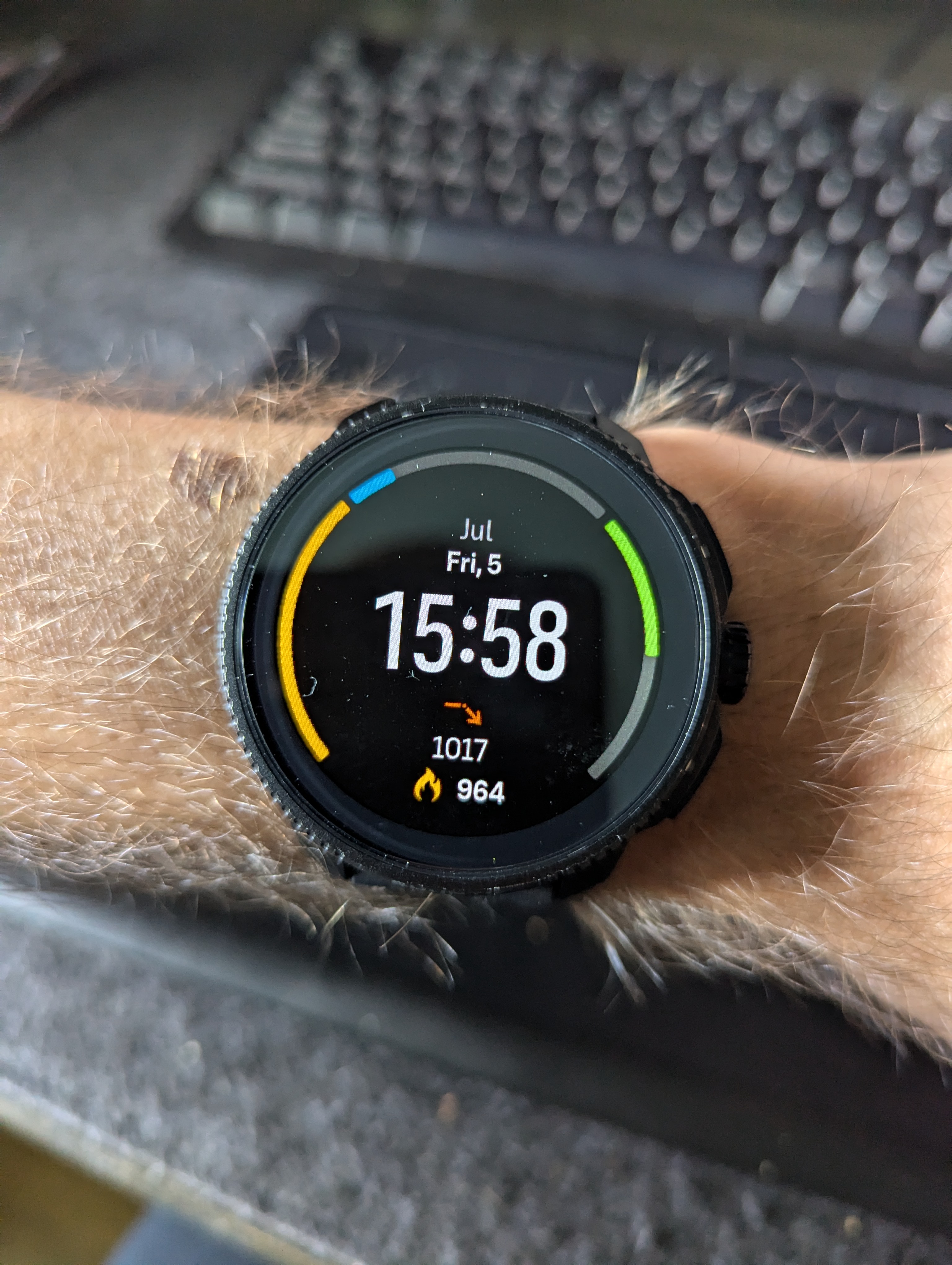
This is my WF, but when you start timer outer ring and bottom complication switch to timer
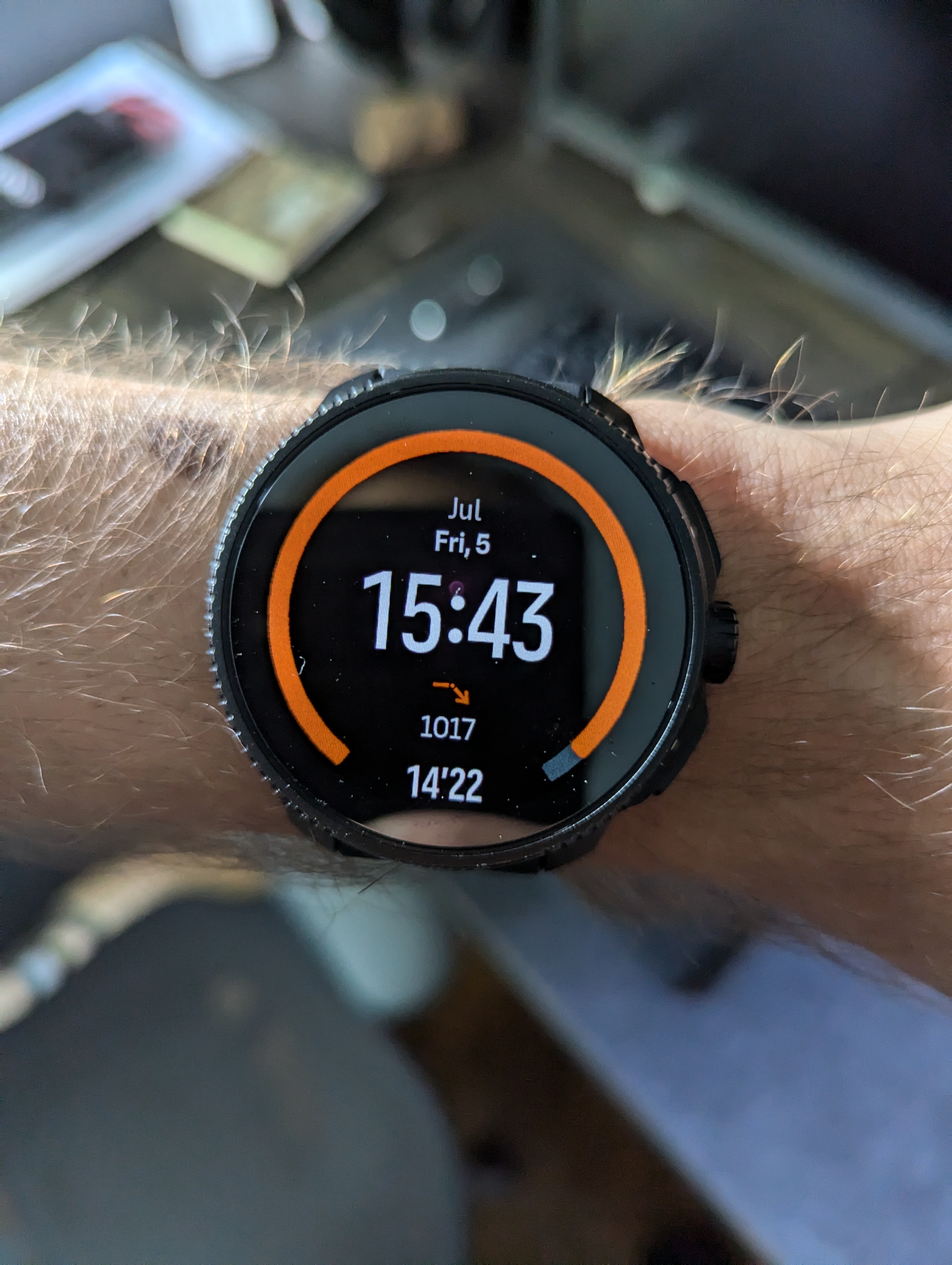
Really nice detail
-
@Brad_Olwin I’m glad you share a similar point of view in this aspect.
For me it’s something important enough for Suunto to think about working on a hot-fix.
-
it seems that since last update:
lost tactil for sometimes, like the watch was hanging somehow.
i did notice battery drainage again . i list 20% in 2 days. i have registered ~5hours ouf outdoor exercise. i think the drainage is too much.
in watch mode I am loosing 5% or more a day.Very happy about the update, climb mode is extremely cool. may be a even better integration with the map (display the new tooth display with the color of the current climb…)
new watch face, better fluidity etc.I may do a soft reset. just to be sure i don’t have a process in back ground draining the battery. may be the new watch face and complications combines cause more battery drainage?
thank you
-
@Antoine-Lancrenon
As said before, check the backlight option … even if I have no idea of what watch you have
-
@Sebastian-Wagner-0 said in SOFTWARE UPDATE 2.35.34 Q2:
@duffman19 said in SOFTWARE UPDATE 2.35.34 Q2:
Navigation:
- Turn-by-turn notification timing still hasn’t been updated. You still receive a notification for the NEXT turn when at the CURRENT turn. Can anyone explain the reasoning behind this??
great question. maybe we get an answer. i hope that will get fixed in the future. turn-by-turn at the moment is because of this not very useful.
the rest of maps, navigation, routes is great and i like it very much

today i had the opportunity to test the new climb guidance. i really like it. i think in the future it would be great when the segments are more acurate, some rising segments are classified as flat. and more segments for long climbs were perfect to have more differentation between steep parts , slight gradients, middle gradients etc.
great ne feature
some words to turn by turn. like @duffman19 wrote, you get the notification for the next turn 20m before you are at the current turn. that is confusing.
does somebody know why it is this way? and or if this will get addressed in the future?
@isazi @Brad_Olwin @Dimitrios-Kanellopoulos @Raimo-Järvi @pavel-samokhathe rest from turn by turn is great.
so if you get the notification 20m before the current turn, in form from a countdown for the current turn and then after the turn the information about the next turn it would be perfect. like in all other navigation systems for example google maps.great update
 super new features
  thx suunto
 -
@Sebastian-Wagner-0 this is known issue
-
@pavel-samokha
Thx for your answer and thx for your commitment and work

-
@sartoric i have a solar vertical.
backlight is off since day one, good suggestions for others though.sincee than, I have restarted the watch, will see.
-
I ‘may’ be in the minority but on the prev firmware I hardly ever tapped the little icons to switch through different data on an hourly or daily basis.
I find the current update with the added options and detail loaded in much much better.
@JimUSGA said in SOFTWARE UPDATE 2.35.34 Q2:
This seems like an easy problem to solve. All the data fields are already there, so just let the user select which ones they want to see in the configuration screen. When they tap the watchface, it should scroll through the data they care about.
This is a signature feature of all Suunto watches I have owned in the past 14 years. To just discard it like they did in this update is infuriating.
-
@mikekoski490 I initially didn’t like the change on the watch face. But a couple of days in and I’ve got used to it.
For me it is a minor thing anyway. The other improvements, particularly the count down to the next waypoint on the map is excellent.Excellent upgrade Suunto.
-
Speed limit for autopause is still to high since last update (Q1/2024). For this reason, I have to turn off this function for ski touring and trail because the movement speed is too low during steep climbs with many turns during these 2 activities.
Related to this, does anyone know what the speed indicated on the watch is? By that I mean, are only longitude and latitude taken into account or also elevation? Because I was moving flat at the same speed indicated by the watch as when going up a steep slope and I had the impression of being stationary.A suggestion for improvement: Would it be possible to deactivate step-by-step route tracking directly on the watch? I often want to deactivate this function when recording because the directions are not necessary throughout the route.