SOFTWARE UPDATE 2.35.34 Q2
-
@isazi said in SOFTWARE UPDATE 2.35.34 Q2:
@Łukasz-Szmigiel I’ll be sure to report it to Suunto tomorrow, if it’s not already known.
Please also report about the possible to stop/pause from the navigation (or altitude) screen on SR. Thank you.
-
@JonasLarsson said in SOFTWARE UPDATE 2.35.34 Q2:
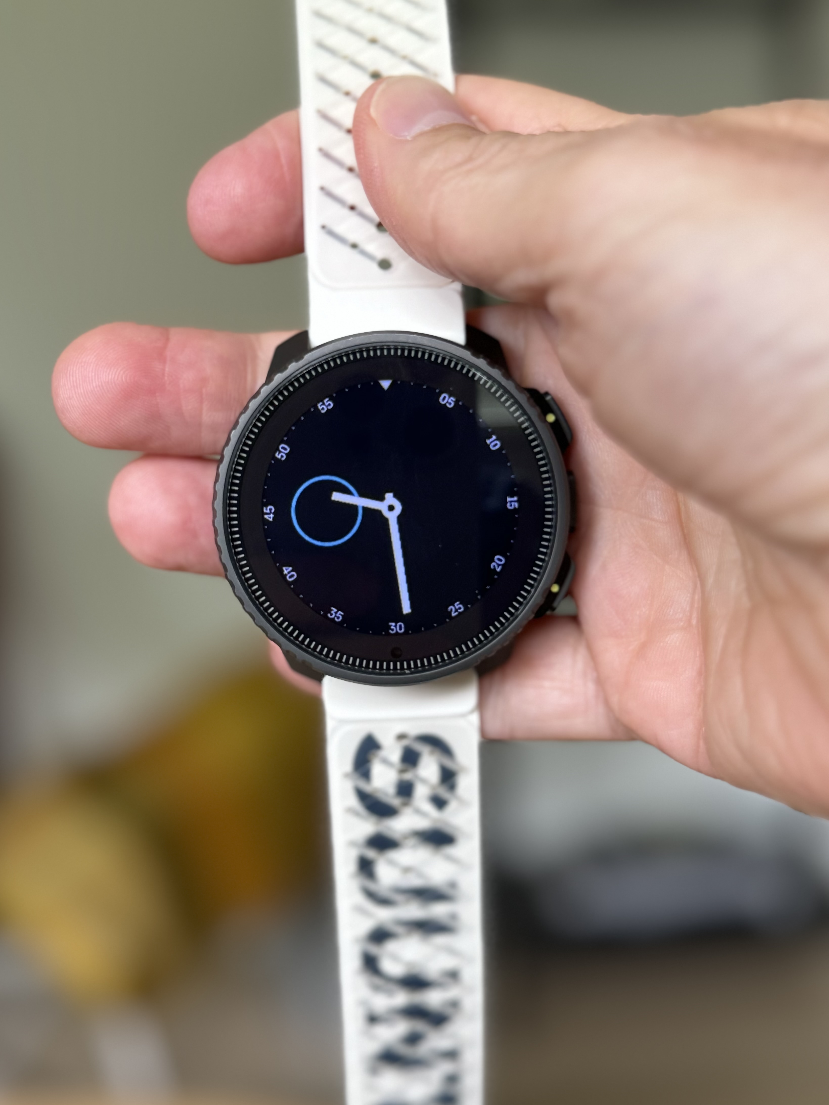
I think the real problem is that the blue circle exists in the first place, whether there is a complication in it or not. Is this a design choice? Why is it blue? Why only on the left side? Why doesn’t it adapt to the Accent Color? I don’t think any other watch faces have this permanent element. It looks like a placeholder that was left in by mistake.
-
-
I really like the update. Some bugs as mentioned, but that’s okay. And compared to others, i also like the new way of “static” complications. There is even a watchface with continuously shown second now! So the watch face stays in 1s-refresh rate all the time (let’s see about the battery impact :D)
To those people missing the cycling through complications: i guess, for that there exists the widget overview list (scrolling downwards). Where even the order and what is shown are configurable, compared to the fixed list by tapping complications. So the new way makes a lot more sense from a UI perspective: Watchface shows only the most important things at a glance. If you want more info and actually interact with the watch, use the widget overview list
-
@isazi said in SOFTWARE UPDATE 2.35.34 Q2:
@Sturgis you need to configure a long press action to be “lock screen”
Thank you for your fast response!
In settings I just have the option “Tastensperre” (key/button lock) for that long press action. This function will not only lock the (touch) screen, but also locks all the buttons. There is no “lock screen” option for my SR.
-
@Sturgis that is the intended function of the lock function in daily mode
-
@Egika said in SOFTWARE UPDATE 2.35.34 Q2:
@Matúš said in SOFTWARE UPDATE 2.35.34 Q2:
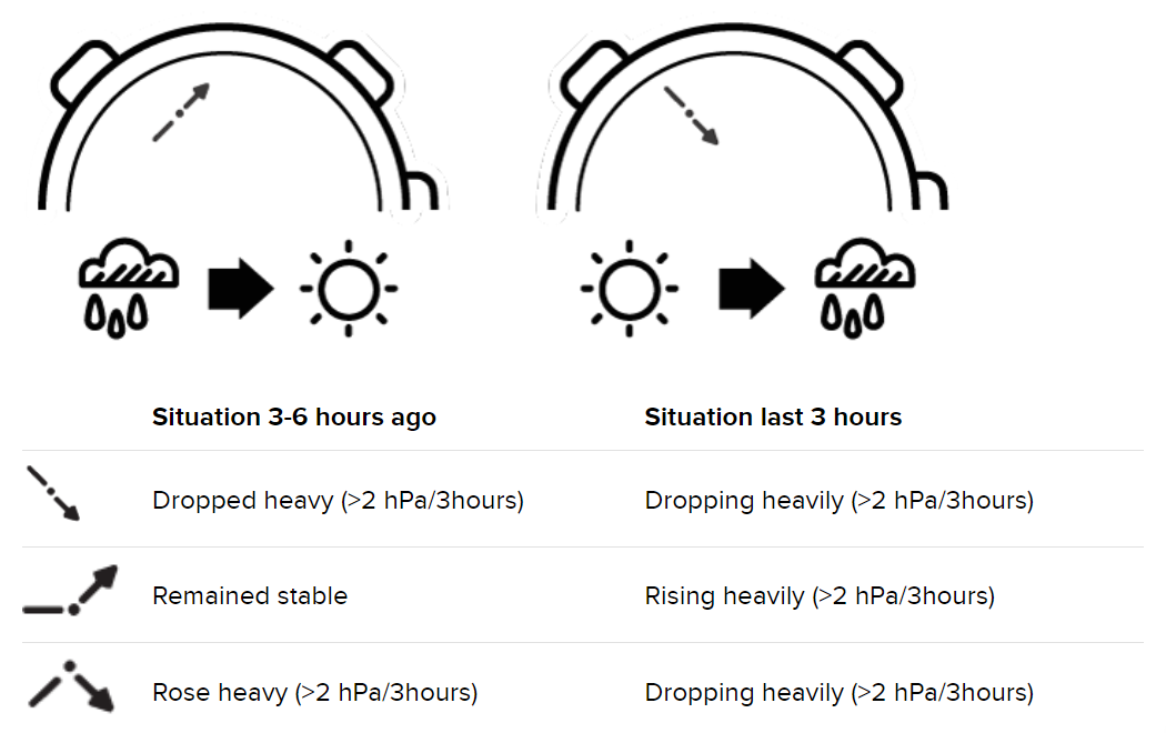
@mikekoski490, @pilleus, thanks for your feedbacks, but I was referring to the “minimal” barometric trend as below (my fault, “bad” question, “poor” answers…
 ).
).
Yes, I have it for example here:
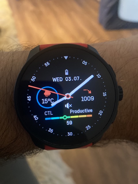
Its my favoriet. 🤩
-
@MKPotts said in SOFTWARE UPDATE 2.35.34 Q2:
Could you share your understanding of the intended function of the top button when in the navigation screens in the 9PP?
In order for the middle button to work only for cycling the screens, the zooming must be moved to a different button. Top button seems ideal as the bottom one invokes options and the top is now used as zoom switch in the vertical navigation.
So I believe that holding the top button while on the navigation screen should invoke zooming options, as previously holding the middle button did.
I’m not sure about the pause, thought.
-
@isazi said in SOFTWARE UPDATE 2.35.34 Q2:
@Sturgis that is the intended function of the lock function in daily mode
Ohhh okay. I thought that there is a lock for the touch screen in watch mode.
Thanks for clarification that.
-
-
Should it be possible to zoom in/out the altitude graph of a navigating route with the crown at the SR?
Nothing happens when I rotate the crown there.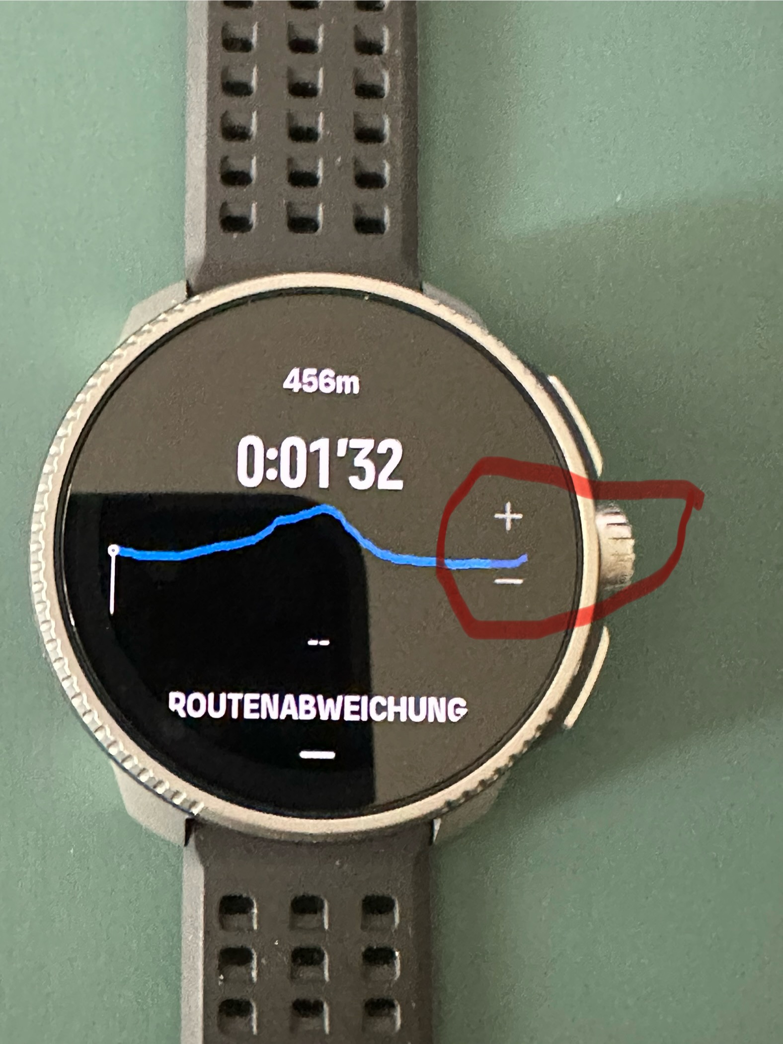
-
@Sturgis Customize > Bottom shortcut
-
@isazi I noticed that I can customize with complications and try to do it, but it was not possible to customize it as the old one. I have to choose between having the compass or having the sunrise/sunset, which is my main complaint, in the previous watch face I could have both functions which made it look really awesome… In the end it is just that, how it looks, but feels like a downgrade in the end
-
@Michal-Postupalski said in SOFTWARE UPDATE 2.35.34 Q2:
@Sturgis Customize > Bottom shortcut
Thank you!
-
My SR didn’t log any sleep data after updating the watch last night. No sleep report this morning. Sleep tracking and HRV logging settings are on and haven’t changed after the update. After the update itself I have rebooted the device by holding the upper button for 12 seconds.
-
@Tami999 i found the same graphical bug with this circular watchfaces + sunset/sunrise on my 9PP.
Ugly black lines on the circle:
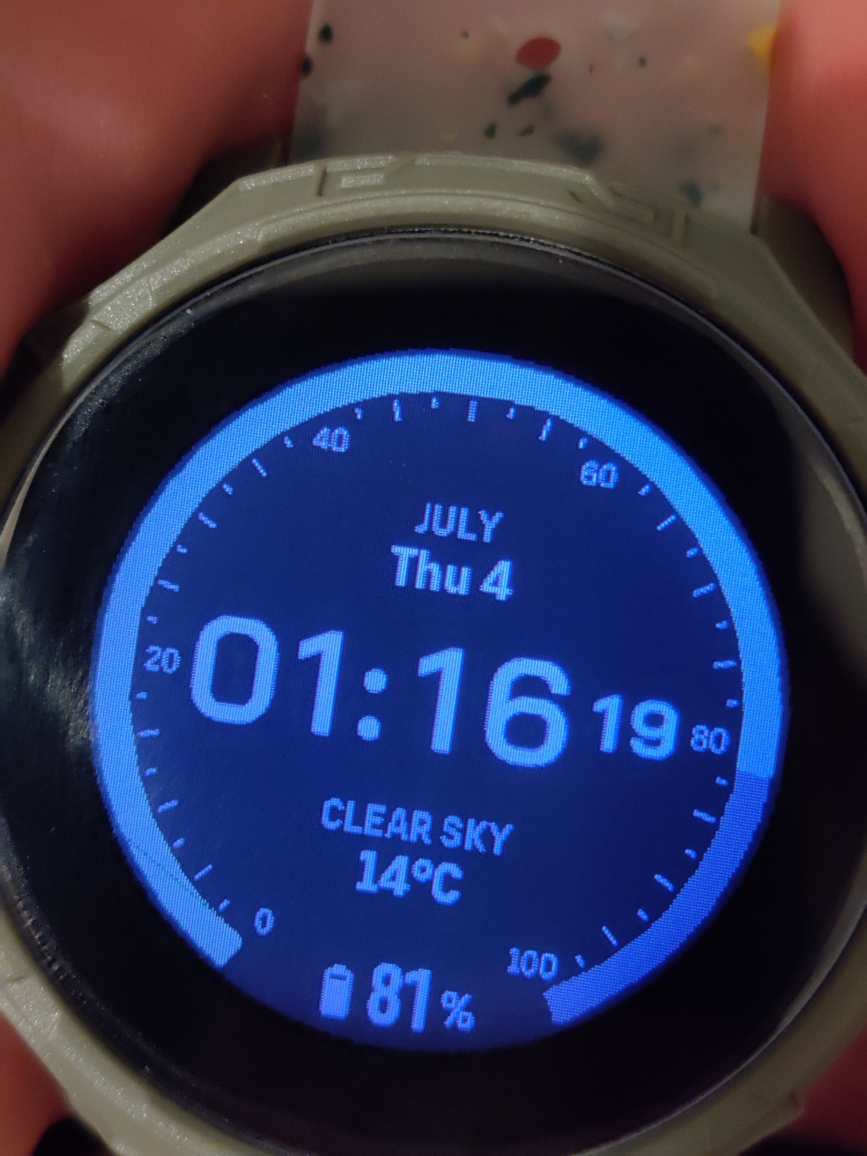
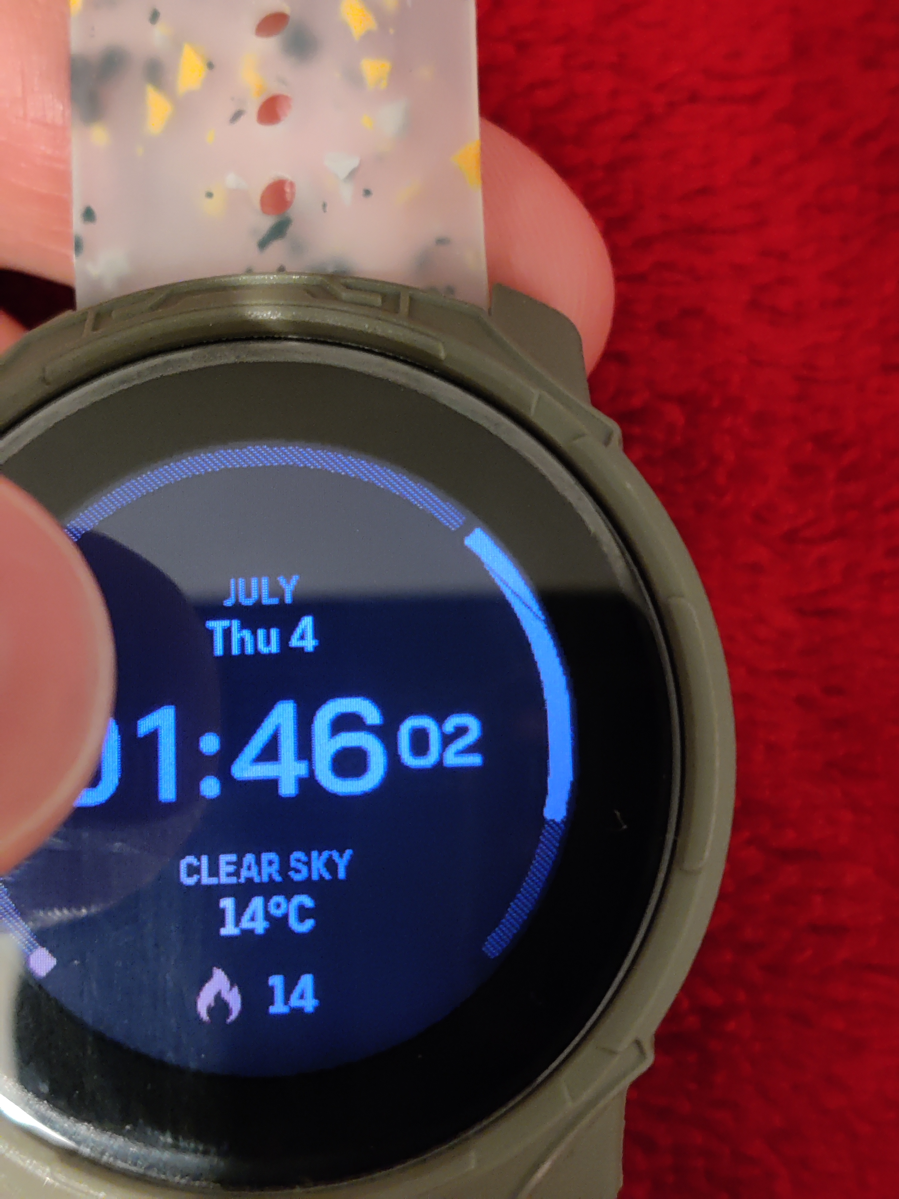
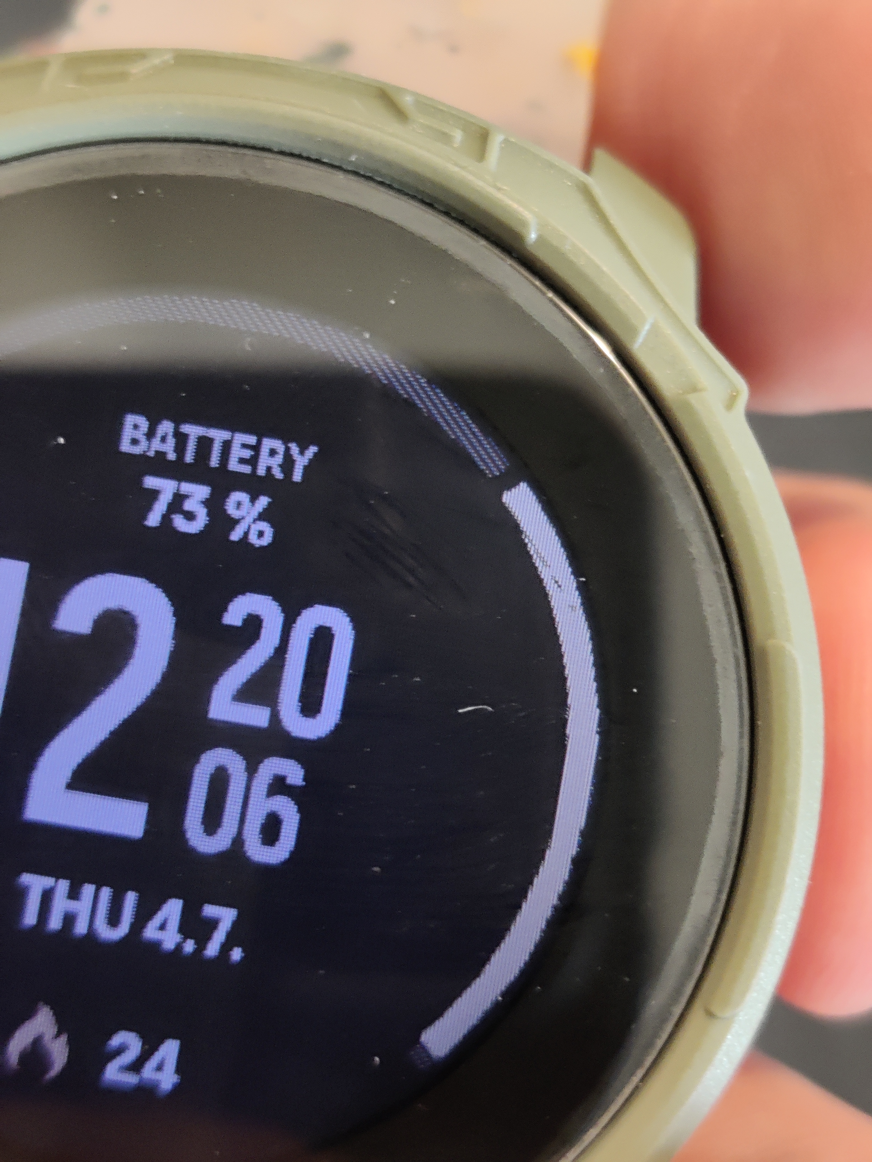
They are not always there, but appear at certain percentage values.
-
@steoreggia One of my favorite watch faces. For me, the substitution of it with something else is a step back.
-
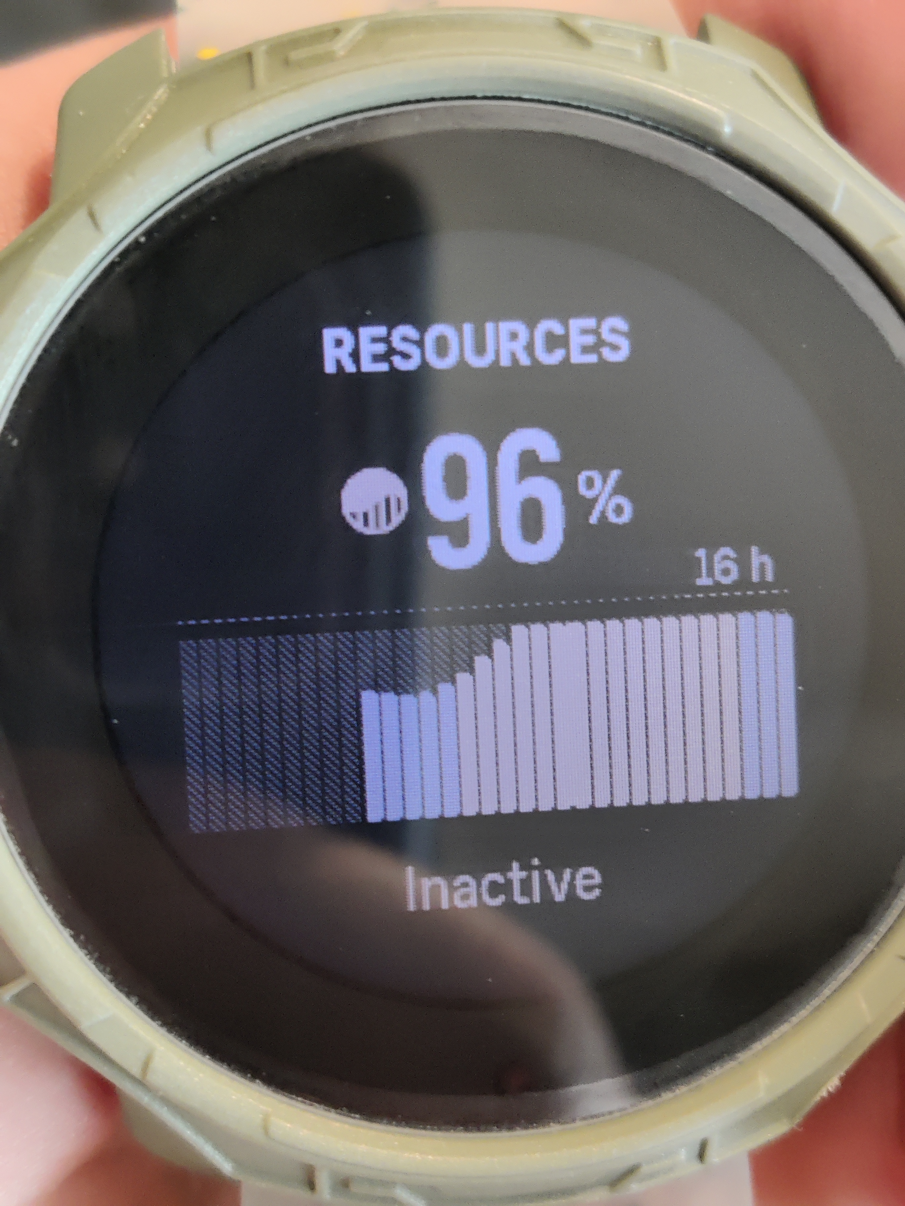
Also, graphical bug here in resources on 9PP - line chart bar merge together
-
For my taste, the new way of changing data complications on the watch faces are cumbersome. I’d rather they didn’t change it.
-
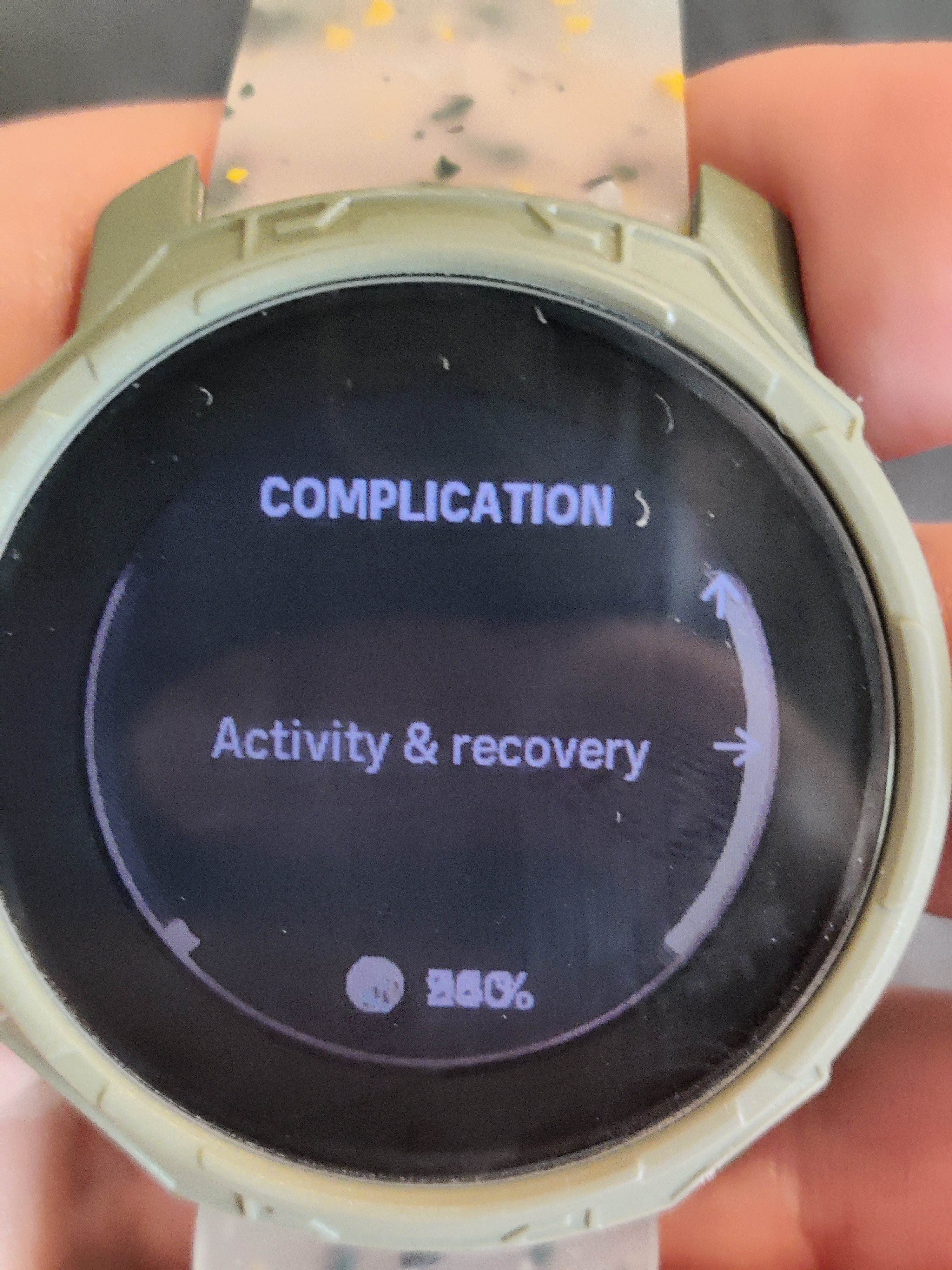
Another graphical bug on S9PP. In “complication” menu with “activity & recovery” option steps, calories and resources values are overlapping.
