SOFTWARE UPDATE 2.33.12 - Q1 2024
-
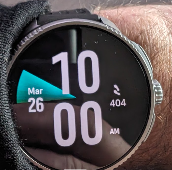
@Mitch9 Just SR. Here is a photo about 30 minutes later…the wedge has moved around the face slightly.
-
@mikekoski490 I think it is the time? It shows the hour hand on a analog watch with a faded effect behind. Thats my guess anyway,

-
I just did a bike ride. GPS acquisition and precision was amazing. Usually at the start of te exercise gps was all-around the place. Now, I just waited for green arrow and stated, I was in a rush, and GPS was spot on.
One weird thing, I had my watch on suunto bike mount, I was on performance mode with always on display enabled and my screen was constantly black. I had to press middle button to wake it. New feature? It didn’t do that yesterday. Any ways to make it always on while on bike mount?
Thanks
-
@mikekoski490 it is steps, when you reach your daily steps goal the quadrant is filled with color.
-
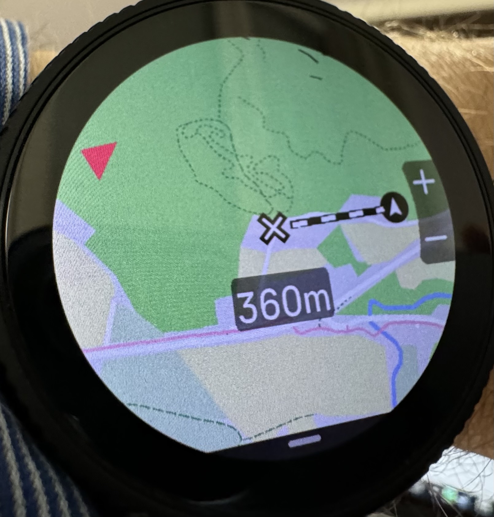
@gerasimos As someone who uses my Race to navigate what is often difficult terrain, I was excited to learn about the ruler feature, but I can’t seem to find it—nothing seems to have changed on the map screen, even though I have the “ruler” turned on in settings. What am I missing? What is it supposed to look like?
-
@mikekoski490 I thought that it was related to the step counter and how close you are to your daily goal, i.e., it would complete the circle when you have reached your goal.
However, in the two pictures that you shared the number of steps is the same but circle is not. So that’s that theory out of the window.
-
@logger You need to enable it from the Navigation Options (lower button while in Map mode). It’s the last option
-
@logger If you select ruler from map screen menu and then move the map with touch screen, ruler should be visible. It’s showing distance from your current position to where ever you move the map. Seems to be working for me.
Love the update, good work Suunto!
-
@Mads-Hintz-Madsen it is steps according to Suunto. As for the fact that the wedge moves, that’s based on time.
-
@Frederick-Rochette for me it has definitely improved. Tested it today and it was a huge improvement compared to previous version, but still a few spikes.
-

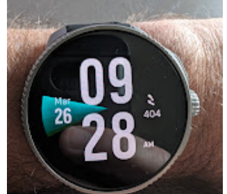
It’s a shame that the steps complication of this watchface is not customisable on SV. It’s possible on older watchfaces. Especially that the two others seems to me really ugly …
-
@Kramble said in SOFTWARE UPDATE 2.33.12 - Q1 2024:


I like that watch face, simple and big for my aging eyes. I just wish it had second instead of steps


 ️
️ -
@Audaxjoe I really like the huge numbers, for me if it didn’t have that rotating wedge and the complications were configurable it would be my go-to watchface
-
@MikkoKartano Thanks, I had it turned on but didn’t realize it was only showing when I move the map, which I hadn’t tried for some reason.
-
While the improvements to the watch are nice (barring watch faces… Suunto please open up to external contributions!), I really appreciate the shorter time it takes to sync with the phone. And is it just me or now it looks like I do not have to open the app after an activity to sync it. The phone immediately gets it when the activity ends.
Thank you Suunto!
-
@logger personne n’a de problème avec la mise à jour de l’application suunto ? Sur iOS ? La la montre ne se connecte plus même avec un master reset ,suite le seul ?
-
I’m using the new analog watchface, really like the cleanness and look of it although there’s plenty of space spare that at least one field could have been added onto it (option to show battery level or day & date for example). Also on that watchface it would have been nice to be have the seconds hand showing all of the time as it would do on a mechanical watch, but hey small niggle and personal preference
Will get out for a run later today hopefully, but it’s good to see that the OHR isn’t flashing anymore when you don’t have HR enabled during an activity; that can only be an extra little bonus for the battery life
One thing I’ve noticed is that I now have to turn the Navigation to Off before I start an activity, looks like it always reverts back to breadcrumb which it didn’t do before. I don’t really want or need that screen unless I have uploaded a map to use. I thought it would have just defaulted to whatever you had it set it for the last activity, but oh well
With regards to the UI lag, TBH I never really experienced much on the previous version but it definitely feels nice and responsive now. All in all well done and thank you

-
I noticed this kind of “glitch” does anyone noticed the same?
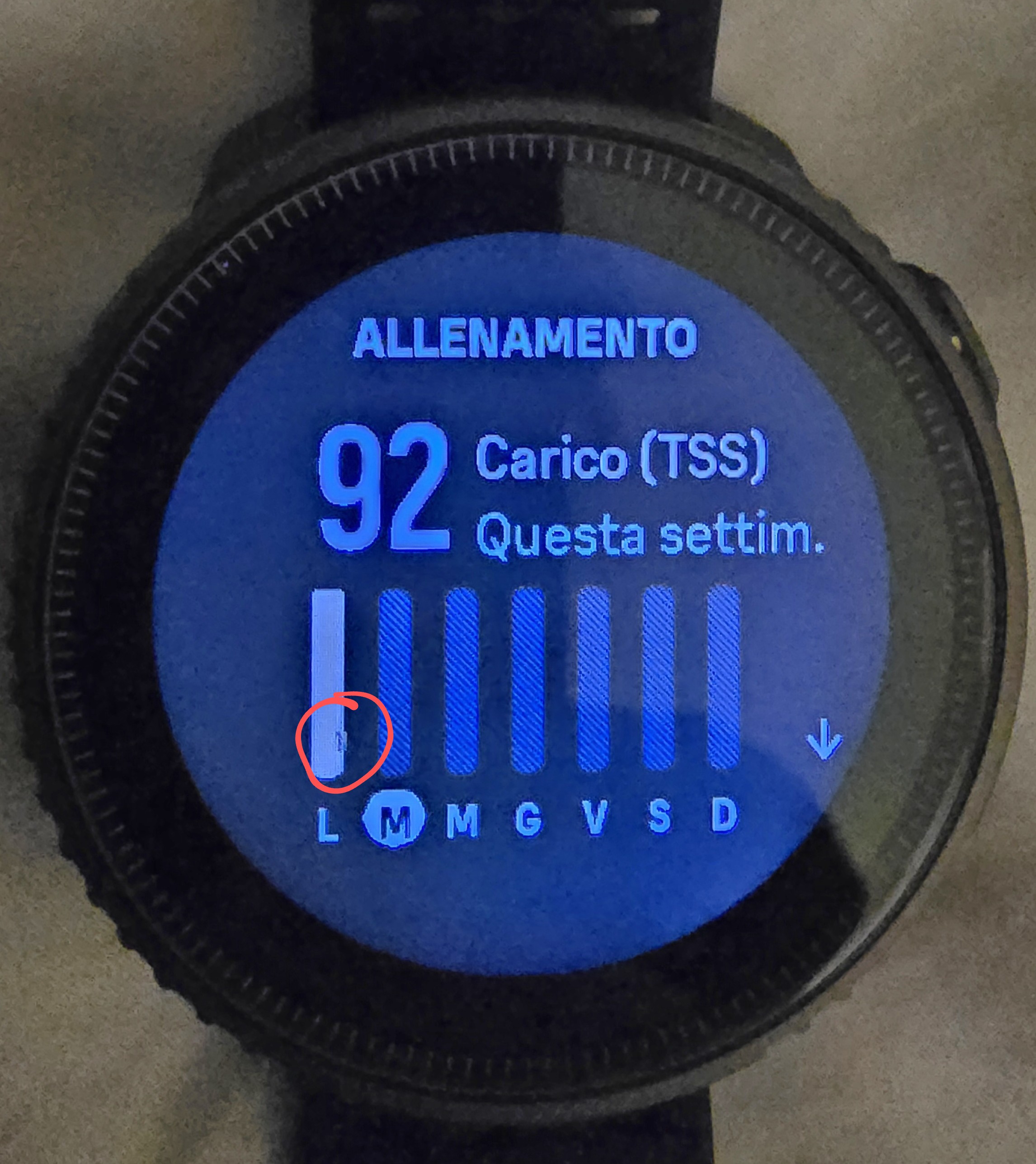
Nothing serious but… -
Overall seems to be a good update! I love the reminder to start the activity
 ️
️@Dimitrios-Kanellopoulos do you know if the function of showing the whole route/track during an activity by tapping navigation screen will be brought back?
Thanks!
-