Try here my suggestions for a SUUNTO 10 BARO Adventure edition
-
@bulkan
Hop hop hop just to setup the expectation correctly and not to create too big ones
For the moment what I’m doing : I’m just creating in powerpoint all the watch face as I was wishing them to be with minimum change versus the current SUUNTO 9 (so normally what I will suggest is reachable with not big efforts) so slight improvement (of course from my perspective) …
then …
for each whatch face in PPT I shoot a screen shot …then …
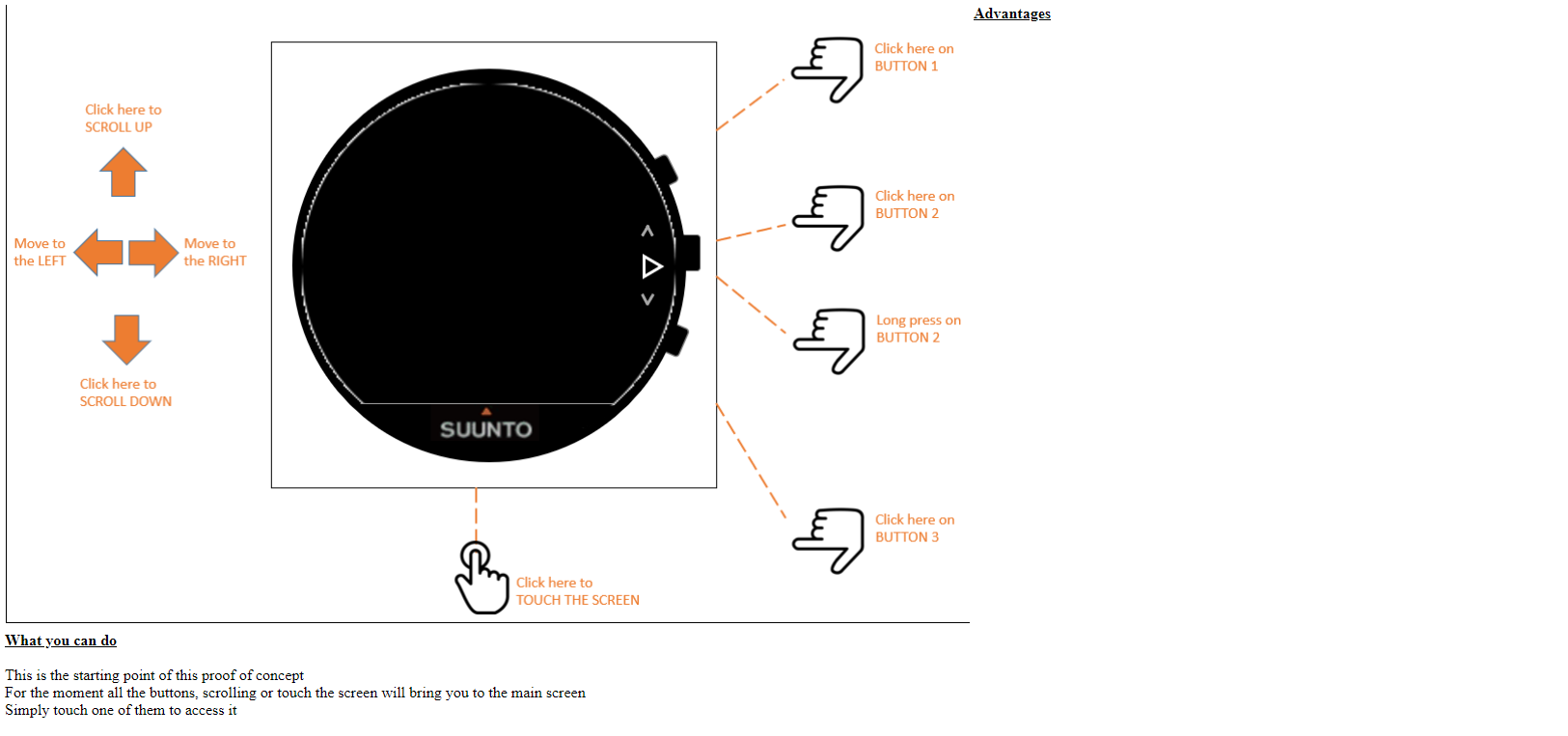
I just manage in javascript the possible button clicks to shift from one image to another giving you the feelign that you are in front of a watch … but with not a real SUUNTO watch simulator working … just a mockup of screen shots representing watch faces …Still …
it gives a good feelign about my ideas … and for each of them I comment them to indicate what I do not like so much and what I propose and their advantages.May be if I have more time I will then create a real watch with real screens animated instead of images …
For example … the very first screen is this one just explaining the buttons area you will be able to click

-
I placed a ZIP file here :
https://drive.google.com/drive/u/0/folders/1qO1tHRsbtlLLoegdxkzYumxCrV5oiZp_
Please if someone could let me know if he was able to download and get it .
What you will find inside …
There are some HTML files, some screen shots that represents my proposed whatfaces and a Powerpoint which I used to build them …
Although if in the index.html file there are some javascript to allow the transition between the several whatchfaces, there is absolutely nothing that could endanger your computer. I’m a responsible and respectable person.
When you will have donwloaded all somewhere on yoru computer, you just have to click on the index.html file and normally you should see a first screen that represent an empty watchface from where by clicking on the place that represent a simulation of your actions on buttons you should be able to navigate from one screen to another
This “simulation” is far from being finished, there are already some incoherencies which I noticed and large place for better documentation but normally it works the exact same way as a SUUNTO S9 BARO so you should nto be lost …
Take your watch and compare with my proposals … I hope you will see some interrest.
One more point … sometimes … move back by 3 or 5 meters from yoru computer and see if you can continue to read my screens … it is a good example of what you will have with my proposals … normally you should still be able to read all teh informations …
-
@mister-pyc
what I like most is the rearrangement of the screens when I scroll down. I don’t need HR at first. Altitude would be more important for me. But I think this is very very individual and hence should be customizable IMHO… we’ve requested this couple of times
What I missed a bit in the last couple of months is an alti graph in the activity. It shows the breadcrumbs but could also record the altitude. For me it would be useful, maybe for others, too?!
I remember you requested information when you are at the summit. This is already available when you follow a planned route. You can setup the field ETA, estimated time of arrival. I don’t use that as I pretty roughly calculate that on my own and don’t really need it more precise.
-
@freeheeler Yeah, the ability to rearrangement of the screens and altitude graph in the activity would be great!
-
he he !! so I assume you were able to download and look at it … great … soon what I will do I will pay for a hosting for my code so that no need anymore to download but anyone will be able to access directly … some people might feel risky to install something from someone they do not know on their computer
On the screens on scroll down, my ides is : if SUUNTO guys were offering in their Mobile App : 1) more screens 2) the capacity to chose on our own the sort order that we prefer, then depending on our center of interrest anyone could use his own perference,
personnaly hte heartbeat will go down because my way to use the watch is compass, altitude, weather … then the rest … I do nto look to my heartbeat when I walk in mountain … my body tell me when I’m in the red zone …
…
but some other people might be more focused on their sleeping time, their global performances … so will move up these screen to be much faster to accessConcerning ETA / ETE … get a look to the exercises …
in the TREKKING Route/walk, I propose also enhancements such as : a COMPASS which could remain as main watch until I decide to switch back to the classical main wathface and inside the compass the capacity to see altitude, ETE, ETA, atmospehric pressure … just by touching the screen …
in the TREKKING Route/ski, I propose this ANGEL mode when you are at more than 200 meters from yoru planned route and the watch is no more your friend, shunning you and telling you nothign anymore …Concerning yoru alitgraph, tell me more about it, what will differ from the graph on altitude that we could already have ? … as a mountainer Im always super interrested in all what concern vertical ascent informations … so what I have missed here ?
-
@pavlas
hello … just to be sure … you were able to download … this is what I guessed also from answer from freeheler … but just to confirm this.Not sure I catch the point on Altigraph which also freehheler was talking … wher did you saw it in my screens … (just tell me the sequence of action from main screen so I will arrive to it)
If you meant a graph on altitude in exercice so in Excerices screns EXCURSION - No POI/No route (action = scroll up - button 2 - scroll down) … this screen is already existing and can be setup from Mobile App … what was missing here was more the SUUNTO PLUS weather screen that you cannot setup from Mobile App but you are forced to add when you start the exercice by selecting a suunto plus screen … which has 2 issues : 1) if you forget … you will never have it … 2) it requires a lot of actions to get it … so lost of time when precisely you start your course and yoru friends are already waiting on you

-
@suzzlo Hello Suzzlo I placed it in my google drive making it accessible … after the title of my post is not super mraketing oriented
 … i know the title cannot be changed, I do not want yet to recreate another post … …
In coming days I will try to buy some space on an hosting place such has planet hoster … or others … (if you have a good oen recommanded I’m interrested) so it will avoid people to download … personnaly I do not like so much to dowloand from someonbe I do not know …
When I will have this tell me what is the best from yoru point of view so that some people could come to my proposals and engage discussions among all of us … should I recreate another post and refer to it in this one, so we say this post is closed ? …
-
@mister-pyc said in An animated proposal of all my ideas to come soon .....:
Concerning yoru alitgraph, tell me more about it, what will differ from the graph on altitude that we could already have ?
the graph we already have is only active when navigating AND only refers to the planned route. I rarely use navigation but would like to see the graph same as the breadcrumb track as I record an activity.
Possible use case is less of an adventure thing, but more for repeated hills (since the hill counter automatically counts hills even I don’t consider them hills)… my example: I do intervalls by running or on the bike and would like to do several different hills… my brain stops working properly when above 165 bpm and I might be stupid, but I keep forgetting to count at some point if I had a graph I would see how many of what ascents I have already done
…it is some kind of a structured workout but rolled up from the other side…
despite that: it’s simply great value of information when we see a graph what’s behind us
-
@freeheeler
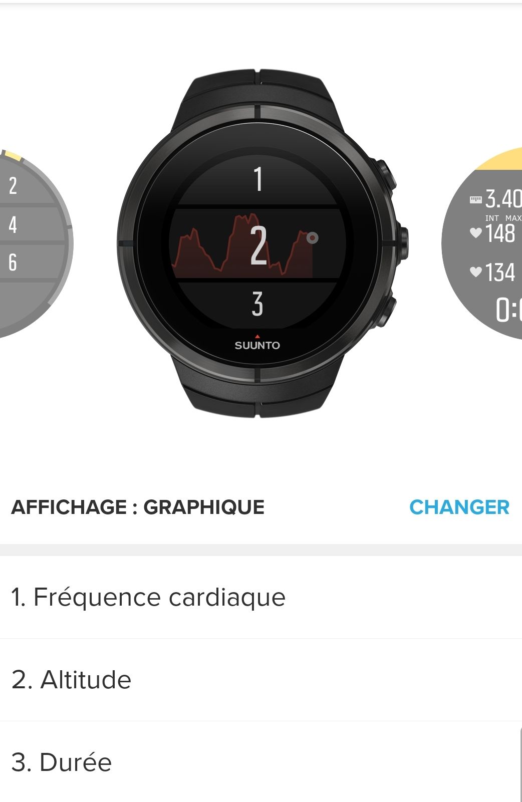
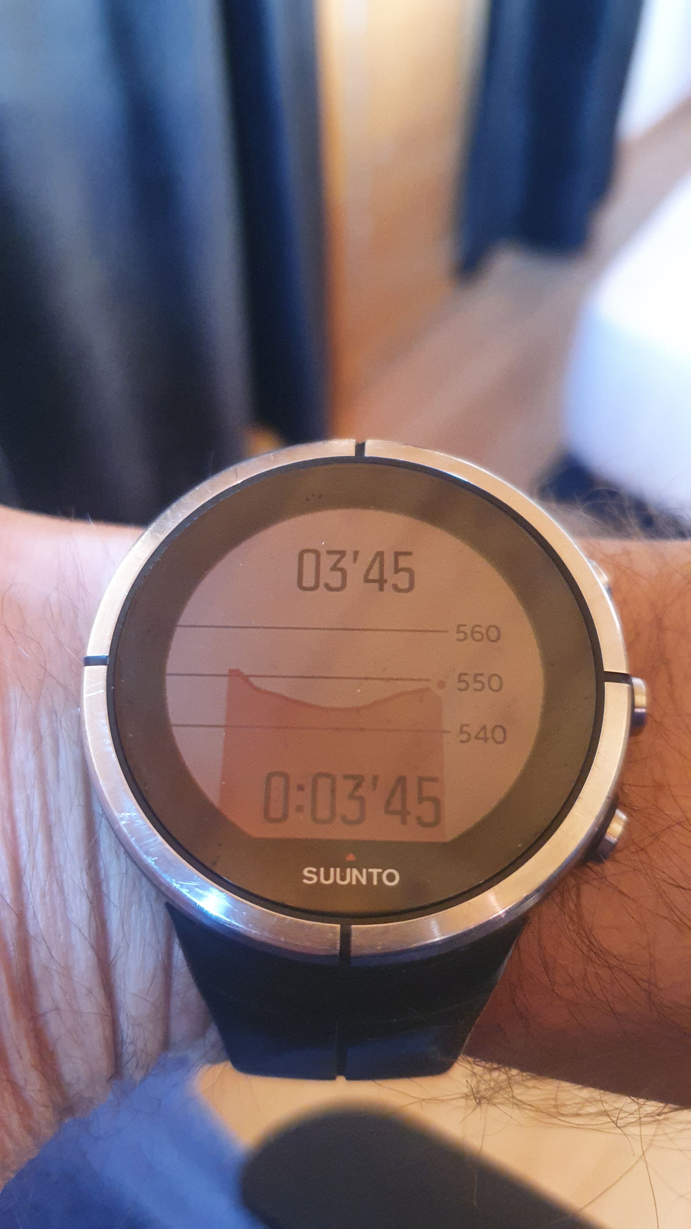
You can add a graph, for altitude or HR in custom sport mode.
But afair, this graph only shows latest 5min of activity.
Other posts exists on this graph topic (long time ago I guess)

-
@freeheeler but you can easily add a graph with altitute. Just not 2 graphs (HR + altitude for example) at the same time.
-
@mister-pyc Yes, the altitude graph can be added, but it’s red and has properties like the HR chart. So it shows the last 5 min or so?
The altitude graph showed the last two hours or so and it’s green. I think the altitude graph is in the preset modes. But in custom modes can’t be added. -
@pavlas true! This needs to be improved!
-
@pavlas
Altitude graph can be added in custom mode
It is red graph
And it well show only 5min.
Test ongoing

-
@mff73 When I bought a Spartan Ultra 4 years ago, I wrote to Suunto support that there was no option for “green” altitude graph in custom modes. I was used to it with the Ambit. Unfortunately it is still not possible.
BTW, with Ambit it was possible to rearrange (turn off) some of the screens in watch mode. -
@pavlas thank you! I have just reported this one to Suunto as well.
-
@mff73
Thank you, I saw that graph was possible but from the presentation in the setup menu I did not understand it could be alti, too. I thought it was only HR.5min alti graph does not really make sense to me

-
@pavlas
just for my understanding Issue is color of the graph ? you would prefer green instead of red ?
@freeheeler
a lot of discussions were made about these 5minutes, which doesn’t make too much sense for anyone at that time neither. -
@mff73 Nooo
 it might as well be white (but that’s probably too racist). I probably spelled it wrong. It’s not about color. It’s about the length of time it takes to display it. 5 minutes is a little short for an elevation profile
-
@freeheeler
OK got it !
It’s a good idea, effectively you are right it is only active when you are in an exercice.
Personally I was not thinking to use a graph outside of an exercices, because I feel normal to activate some extra features such this one through an exervices when I need them … may be having it always somehow active might consume some battery as it suppose to capture all the data always but no more only during exercice … -
@mister-pyc
no that’s not what I meant. I wrote that the graph I wamt is only there when navigating. I would prefer having it in an excercise, without navigating. similar as it excists but only for a time span of 5min… this should be as long as the activity lasts. outside of an excercise it is not necessary IMHO.