Why a 5 meters test is a good test ?
-
@tomas5 Humm I disagree.
2 reasons here-
I recently compared a GARMIN Fenix 6 with my Suunto 9 Baro and what I observed is that the Garmin fonts are bigger, still the screen is exactly the same
-
These big fonts already exists on the Suunto, try the watchface I was showing here, then just tap the screen to change the second info to display, you will see that the altitude is in a medium font already ~2x bigger than the second timezone time … and … the date displayed is even bigger ~4x time
Now … to display a time it is a 4 digit information (2 for the hours and 2 for the minutes), … so … the display of the time is already a 2 digits information which is centered … just put the hours and the minutes the one above the other and you get it naturally …
Im’ not kidding just look it is even bigger to what I suggest
All is possible in IT
Driven by you fear you stay on the ground, driven by your dreams you fly -
-
@theguyfromthesummit One think is sure … I hope the next Suunto 10 Baro
") will have a bigger and far much brighter screen like we can find on some watches still with a correct autonomie.
will have a bigger and far much brighter screen like we can find on some watches still with a correct autonomie.
It could be a very big marketing argument here. -
Hi. Correct me if I’m wrong but it seems you have been able to manually go in and adjust the font size, boldness etc. So would this not actually be solving your problem?
I personally wouldn’t want the big lettering, I like things how they are now and have no issues at all reading them (I am in my mid 40’s so maybe my eyesight hasn’t started to deterioate yet). Just yesterday I was out running in the hills in the dark and could see all of my data fields while bombing down hills no problem. I can’t think of any instances where I would be trying to read my watch from a couple of metres away let alone five metres - it’s either on my wrist or not

I do like what you have done with the weather screens at the top of the thread, but for me it no longer looks like Suunto. It looks like I’m looking at a Garmin or COROS, obviously just my 2c. Thanks
SV Titanium Solar Forest
-
no no no !!!
It is a painshop work on, my computer just to illustrate my dreams
I just took a screenshot and then did all the job on my computer with a old paintshop tool + powerpointBelieve me … there are conditions where large fonts are very interresting. as I just wrote in another post (here https://forum.suunto.com/post/88448)
today I was on sea in conditions : 30 knots, waves 1 meter, navigating back during ~20 minutes in a zodiac from a first kitesurf course … I tried during approx 5 minutes to setup an exercise with a POI on the nautic center, jsut for the pleasure to see the compass working …
well … it was mission impossible … i never was sure about whith POI I was looking currently as it was too small, too dark and with wind and sea spray in the face …
we are not always in perfect conditions and these are these ones we should considere -
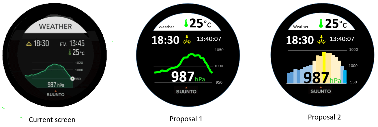
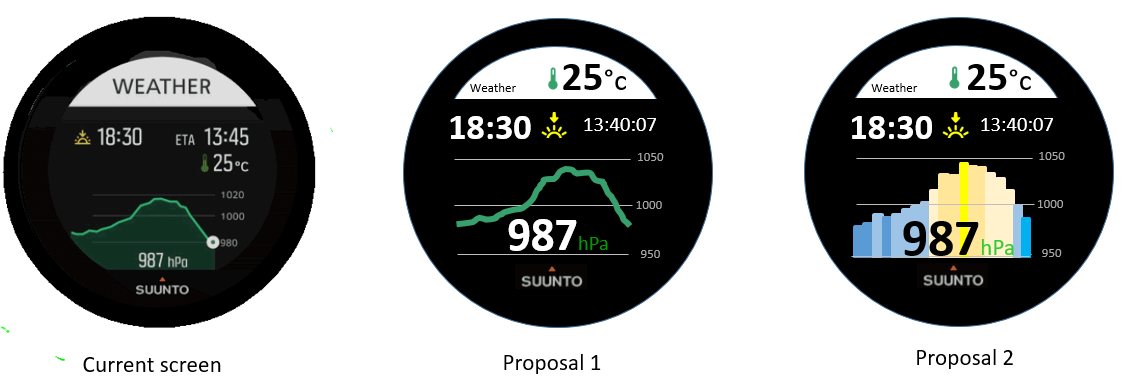
@miniforklift concerning the weather screen … if you find proposal n°2 too much garmin or coros oriented … in that case what about proposal n°1 which is just a reorganisation of the pure suunto display with bigger fonts and a stable graph axis. ???
Im’ just trying to get an allied -
@mister-pyc
Yes, for the weather I do think your Proposal 1 is an improvement although I’d prefer to stick with Suunto’s original choice of green colour. Nice job
SV Titanium Solar Forest
-
@miniforklift hop hop hop … the color does not matter I took the classical green of a powerpoint curve, for sure it could be the suunto one
the most important here is that the weight of the line is too small currently making the readibility some times difficulthere the same proposal 1 with a more suunto green color
for the graph and also the small thermometer.By the way on my watch I noticed that I see only the curve but not the “light” green below the curve, hence why I did not reproduced it in my screen shot
-
@miniforklift After having tried it again just now, I agree that the bargraph is more coros or garmin oritented but it has an additional advantage the more it goes into yellow the more you are in anticiclonic situation, the more it goes into the blue the more you are in a depression situation … so it is super east to catch the trend.
Hence why I still prefer the proposal n°2 … if we were havign a watchface configurator may be it could have been an option of the screen so both of us could have been happy -
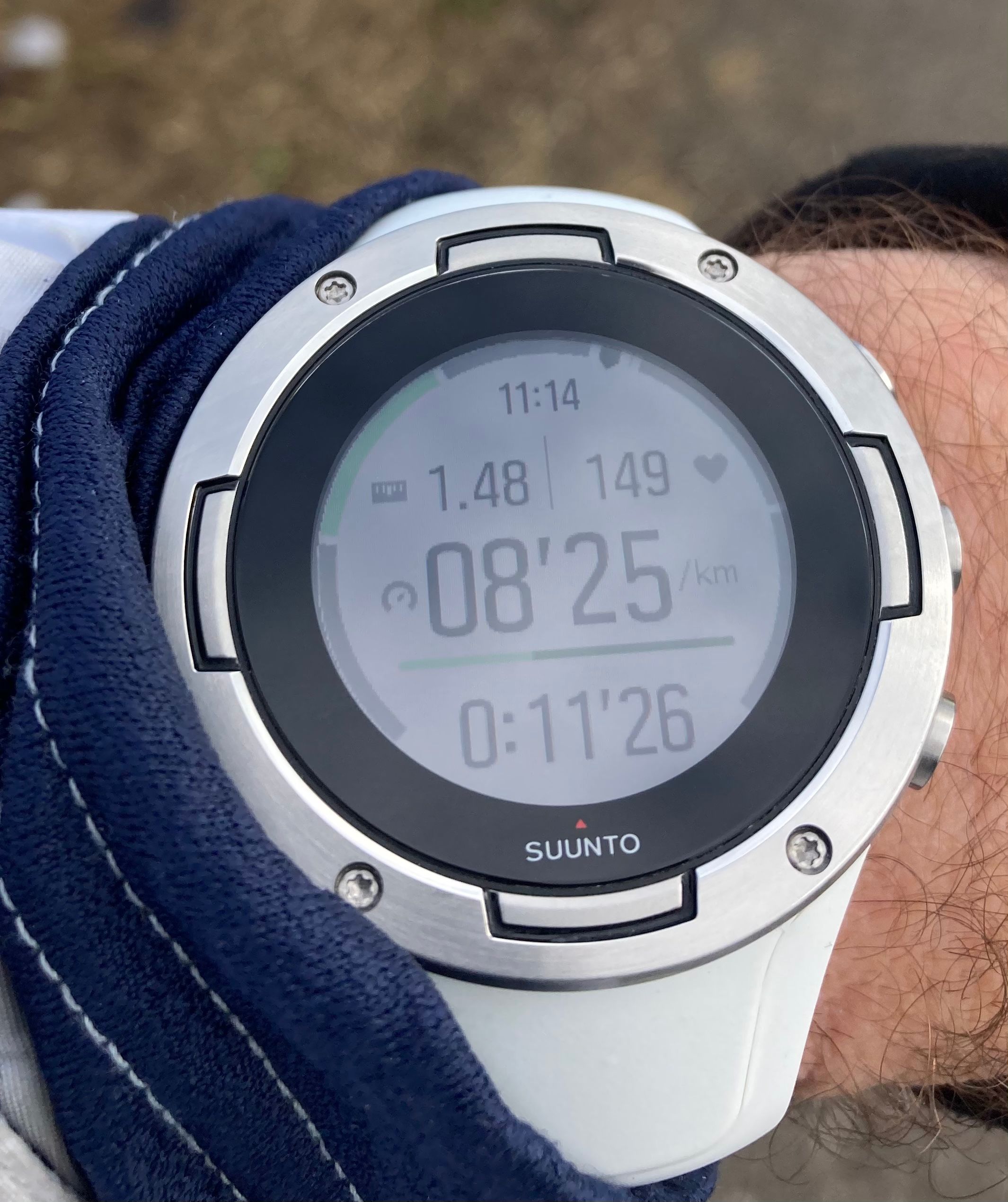
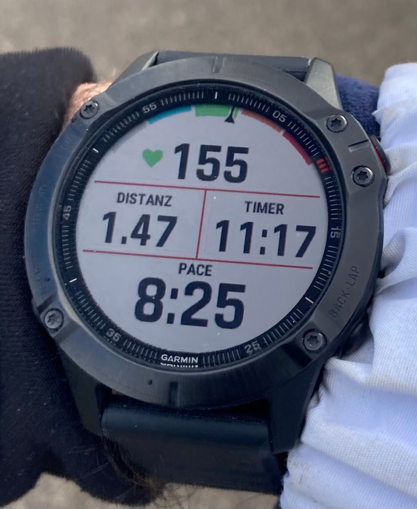
@mister-pyc I agree With you, that some small changes would have a big impact on readability. Comparing the Fenix 6 (Not x) some months ago to the S5 - besides having a bigger screen diameter of 1.3 to the S5 with 1.2 - same run, pictures taken within a few seconds , (Garmin right, Suunto left wrist) you can see that the much „bolder“ fonts are much easier to read
Currently Race I
-
@chrisa Despite I do not want to do any marketing to Garmin or Cronos. I’m just a Suunto 9 baro user, which by the way I like a lot and hence I’m faithful to this trade, I should confess that this is a perfect demonstration of why biggest – even fat – fonts are far better.
The target should be the readibility of info, hence efficiency.
Even Garmin could have put bigger font … removing Distanz and Time text which after few hours of use you will know by heart or put a small gif to represent than which btw will avoid any translation …All is possible in IT
Driven by you fear you stay on the ground, driven by your dreams you fly -
@mister-pyc although I understand your concern, I would say that if I was a product manager or engineer I would not likely think of looking at the device at 5km distance, because usually it is a much higher distance than the one of the regular use.
-
@andré-faria Hello Andrea, May be I did not wrote enough correctly or you did not catch my point.
When I was talking about 5 meters … it was not too look the watch !!! but to look the screen demo that you could do of a watchface.A 1920*1080 computer screen is more that 21 bigger than the 320x300 suunto screen. If you forget this and you draw a screen on your computer, you may have the feeling that you did something excellent … but when you transfer your screen to the size of the watch and you go into normal conditions (not perfect ones that happen at noon sunny time) then your screen is becoming not so good.
Do again the exercise. move up to the post where I put the current suunto plus weather screen and my 2 proposals, display this on your computer, then step back from 5 meters and see what you can see … do you still see the suunto graph … me no, do you read the sun set time and its ETA or the temperature … me no …
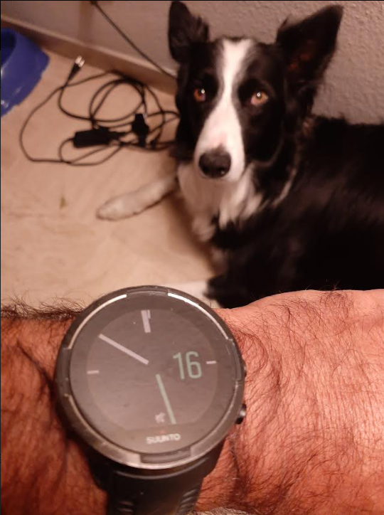
tomorrow I will post a photo of this screen in a real sailing situation … you will see, this screen which has genius feature is becoming almost unreadableAll is possible in IT
Driven by you fear you stay on the ground, driven by your dreams you fly -
@andré-faria An additional reply …
This is when I was discussing with a Suunto boy that I realize this …
We were discussing the Suunto Plus Safe screen and he posted in his reply a screen short of it with this beautiful skiers …
When I saw it, firstly I was thinking … WHAT A BEAUTY !!! WHERE IS THIS MARVEL WITH THESE 2 SKIERS ON MY WATCH !!! then I look to reality … the screen shot was displayed on my 1920x1080 pixels screen whereas the watch has for the moment a 320x300 … so ~21 smaller …
Where the screen was a pure marvel on my computer, the same on the watch screen will have been a unreabable toy.
By the way … this safe screen even if simplier is also not easy to read, I will propose some suggestion here one day
OK Suunto boys and girls will finish to hate me, forced to read all my texts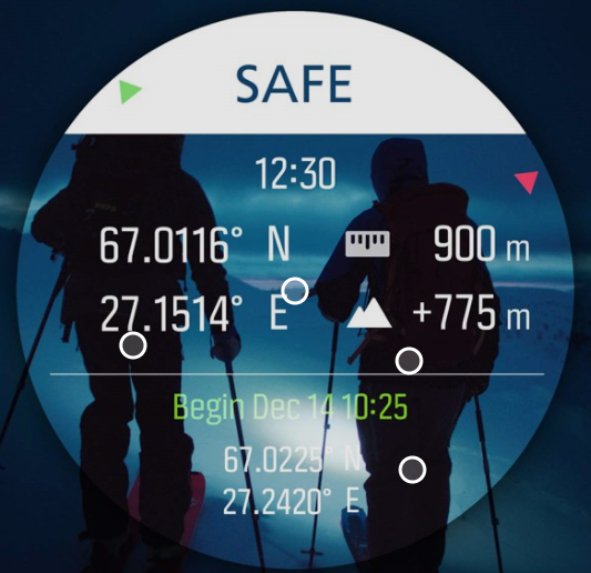
-
@mister-pyc well, if we’re getting technical, pixels may be of a different size, so it’s not a fair comparison. A fair one would be to equate the object width(e.g. watch screen)/distances to screen or monitor. In case of optimal distance of the watch to the wrist ~ 40cm and a watch width of ~ 3.3cm, we get a ratio of 0.08. In other words if one to do 5m test, the watch mock-up on the monitor should be about 40cm.
But, I think this still isn’t a fair comparison, since not everyone sees as good at longer distances, as at short ones.
However, I see your point!
I, personally, am lucky to be able to see my so s9 screen no problem, it would be cool though to be able to trigger a bigger font for the whole watch somewhere in the settings. -
@mister-pyc I actually sold the Fenix some months ago and stayed with the Suunto
 . But I really would like to have the bigger fonts of the Garmin (and how you propose: some small icons describing the function). Perhaps that’s an option in further firmware updates.
Currently Race I
-
@chrisa said in Why a 5 meters test is a good test ?:
@mister-pyc I actually sold the Fenix some months ago and stayed with the Suunto
. But I really would like to have the bigger fonts of the Garmin (and how you propose: some small icons describing the function). Perhaps that’s an option in further firmware updates. -
@dmytro Good to see we are in sync. I see many users who are on the same feeling that bigger fonts is interresting, so it might be possible that Suunto dev team take this in consideration. There are many screens in which this is possible.
PS: on the technical standpoint, although you are right … the truth is in the middle, a computer screen is far much brighter and illuminate much much more a screen, this is not a pure size aspect but should be taken in consideration, hence why I said 5 meters.
Honestly have you done the test with my proposal. the interresting aspect of the test is that I did not cheat I was proposing 2 alternative screens having the same size as the suunto plus weather one, also with same colors (OK I admint I took some freedom on the bar graph …
)
So … are you able to see the info of the suunto one ? are you abel to see the info on my proposal ?
the result will be exactly the same on the watch itself …All is possible in IT
Driven by you fear you stay on the ground, driven by your dreams you fly -
@chrisa Hello Chrisa see my other posts there are also some other exemples where some other screens could be reorganized so that with exact same behaviors and fields we could have a better readibility
-
@mister-pyc also, another thing I’ve noticed is that Garmins screen itself has a better contrast and seems to have less reflections => better visibility.
I took my lenses off and gave it a shot. I can still see everyone watch face, but yours are definitely more pain free. But I would probably still go with the original because it isn’t more aesthetically pleasing, I don’t know if suunto could achieve this with a bolder font. Still, I acknowledge that some or maybe most of the user base might be better off with larger font. -
@dmytro
so … mine are not aesthetically pleasing !!! I’m chocked :-):-):-)
humm it is just to give a direction. I don’t have the real suunto fonts on my computer and also only the official fonts … but I will try to search for some interresting ones which are more condensed and at the same time bold …
I repeat : it is just directions to show what could be possible … after for sure with better fonts, perfect alignment … it could be even better …
PS : althought teh proposal 3 is not Suunto oriented as they do not have such bargraph with almost no space between each bars , the proposal 1 is “just” a reorganisation of their screen minimizing the space lost so gaining space to enlatge information and make it more readable … btw … like Garmin is doing
Hello! It looks like you're interested in this conversation, but you don't have an account yet.
Getting fed up of having to scroll through the same posts each visit? When you register for an account, you'll always come back to exactly where you were before, and choose to be notified of new replies (either via email, or push notification). You'll also be able to save bookmarks and upvote posts to show your appreciation to other community members.
With your input, this post could be even better 💗
Register Login