S9 Watch faces
-
As we can see, there are lots of views and truth be said will be difficult to make happy everyone. One likes only the way it is, another with more than one screen and different info… At the end, if there is somehow a customisable menu where each one can decide, maybe we would not have this discussion, picking your watch face of preference with its more or less fields chosen before activate that watch face and as well as sport modes, choose one or more screens.
I guess is kind of sport modes menu what we are talking about and would be that easy to get?
Only same or few more different watch faces designs I’m sure will make a huge difference.
By the way, one thing I can say I’m kind of missing is the sea tides with its high/low timing, which would be great to have along with actual sunrise/sunset.
Maybe most people will not even think about but I’m sure there are lots of Suunto surfers, kite and windsurfers around. -
@rhustox said in S9 Watch faces:
sea tides with its high/low timing
Hello my english is too limited … could you tell me what is : sea tides with its high/low timing … may be posting a picture and highligting it …
Few remarks (will be redundant with other post I already made nut just to get a sunthetic view here)
- Let’s first put on the table what is really fantastic : your SUUNTO logic is awesome
- 1.a going UP & DOWN ==> to select a big feature
- 1.b going RIGHT -> RIGHT -> RIGHT ==> to select different screens specialized a given feature
- 1.c touching the sxreen ==> keeping the screen as it is but just changing the kind of secondary information to display
- 1.d a long press on the middle button with a contextual menu for that screen and specific options here
-
from what I dream you are really not so far … most surely it is not a high revolutionary whish – at least me – I hope … your watch design is already super mega awesome. I’m more in favor to display less at a time, but bigger to ease the reading and use the above 1.c to just change which secondary information I wish to see now
-
Some times the RIGHT RIGHT is not used as its potential could be …
For example the RIGHT on main screen is here poorly used and just going to a very empty black screen with just the date and battery which could have been access much better if you were letting me choose in the APP some screens from a sort of a catalog
For 2 and 3 … see my post here : https://forum.suunto.com/topic/6692/my-prefered-watch-face-if-i-could-developp-it?_=1625494686817
- May be a FULL Light Theme … now that I tested it in the exercise view I realized that despite it give less a warrior style, at least I can see much better the small info.
…
Honestly … even if we are all demanding you … we should recognize that you are not so far from perfection … and it’s an IT guy who tell you this.
last rq that I hope will please you … I was a little bit unfaithful with you as I bough a GARMIN forerunner 625 to my wife (sorry for that, … but because she wished to run with music) … Well , well well, between your approach and menus and them … there is no more than 5 seconds to give the winner and by far, you approach is much much better and continue to work with no additional difficulty even if you add some screens.
Very well done guys !!!
-
Hey @pierre-yves-colle I don’t know if this was a reply for my earlier text but yes, this menu logic is looking great and easy to use.
About the sea tides… Might be marée marine?

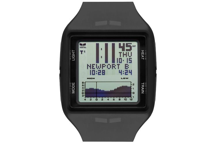
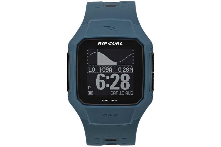
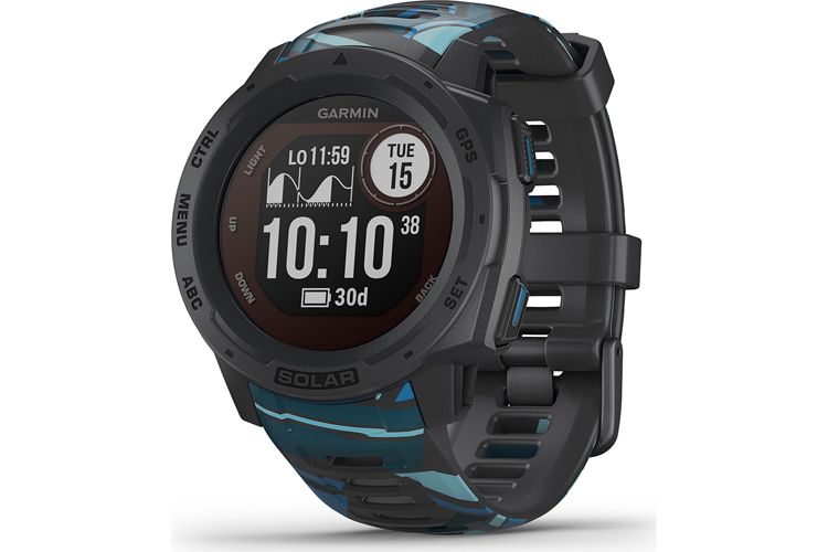
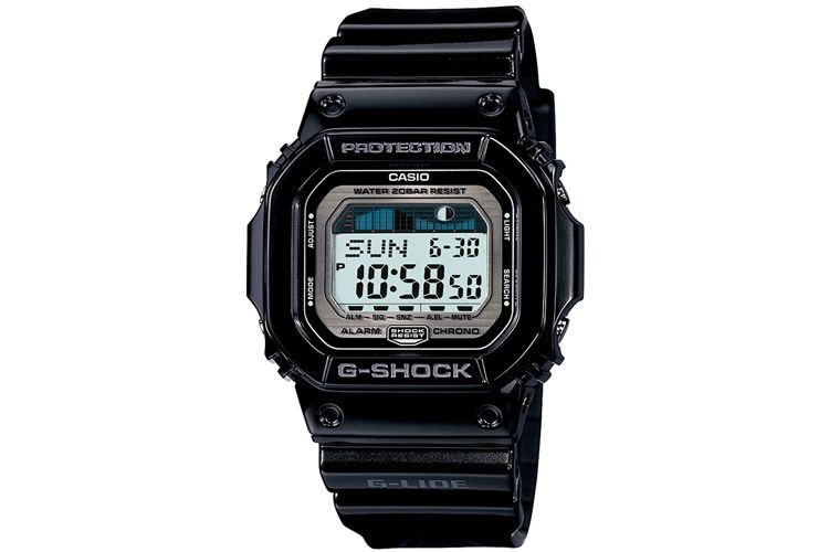
I’m sure you know what this is. High and Low should show the time were the sea level is in the highest point and the lowest point.Not only surfers take that info so seriously but sailors, fishermen and other sea lovers like divers focus their activity timing on the restricted sea and moon activity.
Here are few examples for everyone to see how easy and fun would be having this on our S9 and S9B. These are ‘surf’ watches because of the sea level info.
-
@rhustox
they’re comnected and synced thru magic seaweed, right? would be nice if suunto would extend their partnerships in that direction, too
maybe the favourite surf spot swell height and wave quality would be asking for too much, but the tides would already help -
@freeheeler said in S9 Watch faces:
@rhustox
they’re comnected and synced thru magic seaweed, right? would be nice if suunto would extend their partnerships in that direction, too
maybe the favourite surf spot swell height and wave quality would be asking for too much, but the tides would already helpActually I don’t know exactly which brand does or does not use magicseaweed.com service, RipCurl’s surfline.com is also used in these kind of watches, a deep search should be done to know better.
As you said, maybe it is too much asking for all that right now but I’m sure that somehow there’s an easy way to link major cities and famous surf spots tides to get the readings from.
I’m quite familiar with surf-forecast.com as well and as many others, they must get the data from official forecast stations, so shouldn’t be a big deal getting it.Hopefully as Depeche Mode’s songs say: ‘It’s just a question of time’ that Suunto listens to our modest proposals, then we ‘reach out and touch faith’.

-
@rhustox
Hello Rhustox … another suggestion but here may be much much more to do … still could give a possibility to the people to propose and to other to vote …
Do you know this site : https://customstudio.atomic.com/
Here anyone can design his own ski cover and the people can vote … or the guy could order itSo I was wondering (and may be you already have this kind of tools at yout side to test soem design before to implement them) …
if you were havign a sort of a “proof of concept tool” in which we could
setup a logic of screens
the starting point being the default clock … from here we can either put screens above (so in case you scroll up or use button 1), below (so in case you scroll down or button 3)… the from any of these we can also add screens on the right of them (so in case you click on middle button 2) , or above (a little bit special here : it is in case you touch the screen) … or below (also special here it is in case you long press the midddle button)
and
for each screen, we can take from a catalog any of the objects you can manage today, place it in the screen, choose the color, also the positioning and the size …
then …
many people could submt their throuhg not as sentences but as something which is visible to all … and the others could criticize it … telling what they like (so to be kept) or dislike (so to be improved) …
then 2 possibilities …
Either it need to go by you for REAL implementation in that case may be only the 2 five could be retained … or … from this POC application I could decide to change my own watch … and in such case it is the POC application which will get sync with my watch and I will have my own personalized designed…The beauty of that …
you give the power to the users …
it is even better than the GARMIN where … of course they have tons of watch faces that you could get … but no-one of them is indeed your onw personalized one that you and only you though and want … for your own reason.It is super complex for sure
but super dynamic
and in any case strictly only your controls are available in the catalog with may be some constraints in case of conflicts … -
@rhustox said in S9 Watch faces:
Suunto listens to our modest proposals
Why be modest? Grab all you can. “Everything counts in large amounts”.
-
Hey @pierre-yves-colle I don’t really get your point here honestly.
Also the website you linked seems like does not work, at least for me isn’t loading even after several minutes open…Last night after dinner I spent one hour organizing my sport modes screens with its info. In some way if what we are talking about here (at least from my view) could be so easy as that, our watch watch-faces would be as personal and unique as our sport mode screens.
Easy app configuration watch faces with one or more screens available from one button push with its features and loaded to our watch faces menu. As simple as that with an example taken from Suunto’s site screen: How do I customize (Watch faces) sport modes
Okay, taking the graphic proposal from @Pierre-yves-Colle and my suggestions of sport menu-like app configuration for new and customisable watch faces, here it is the visual example of how watch faces could be edited from each user’s app ending in a colorful and very interesting variety of designs and fields possible in every S9 available.
*Note: the yellow spot is where I did make some changes from the original image from Suunto’s site.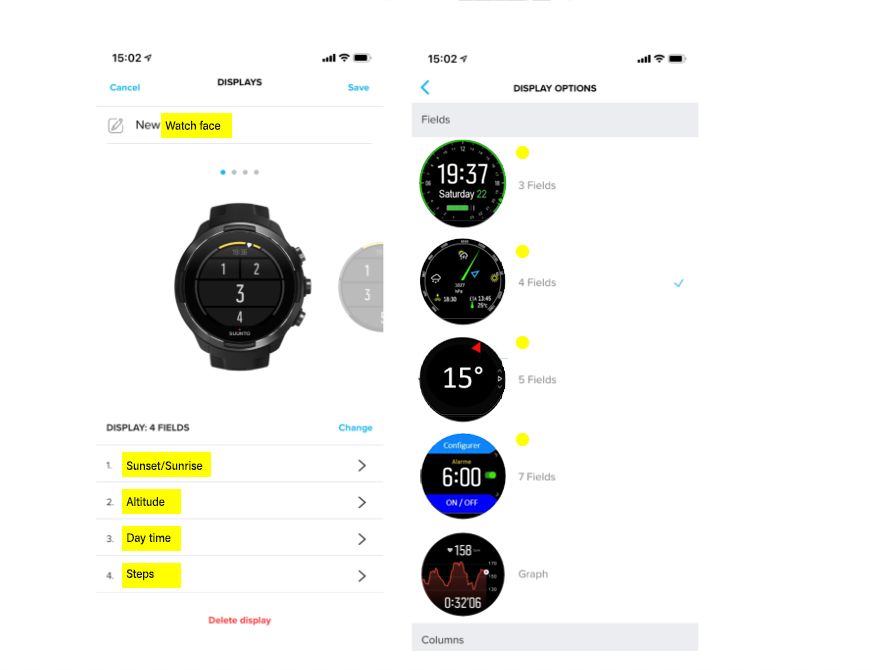
@Fenr1r you are right, these are a wolf’s modest proposals

-
@rhustox said in S9 Watch faces:
g my sport modes screens with its info. In some way if what we are talking about here (at least from my view) could be so easy as that, our watch watch-faces would be as personal and unique as our s
WHAOOOOOUUUUUUU !!!
Well well well … I love you !!!


If in the APP we could have a such catalogs of watch faces that we could decide by ourselfs to assemble then any SUUNTO owner could choose … in a reasonable and controlled by SUUNTO catalog and personalize his watch for the sports; activities or just way of thinking he wants…
I wil try to elaborate on this a proposal and a post …
Just one point …
For me it is not only the exercise view that should be “customizable” but the full watch …For example … the sequence you have shown in your picture I dream to have it available at any time from the standard default clock screen
So you will then ask me …
What is the interrest to have exerices view ???
Humm because there are some exercice watch faces which make sense only during an exercises … like the 3 fiellds, 4 fields, 5 or 7 fields adapted to a specific activity or the other screen …
also some other that could be hidden during an exercice … it is not the righr time to setup an alarm …
Last but not least when you are in an exercise, having the capacity to lock is excellent you do not risk to stop the exercise by inadvertance in the middle of your climbingThere is a beautiful path for some small but I’m convinced very appreciated improvement if SUUNTO teams coudl consider our suggestions …
they are not so far from perfection in fact … -
@pierre-yves-colle One thing that just came to my mind and I’m not sure because I did not tried it… When in a sport mode like running, hicking or so, are you able to see the compass?
Because it is not available in sport mode screens. In watch mode I know that going from up (scroll) with upper button you easy get into Navigation (scroll down) > Compass but no other options while in the middle of a sport perhaps or do I not know how to?
Anyway, would be amazing if Suunto staff members would give us some clue of what they think about these improvements for the actual S9 and S9B and if so, myself and I’m sure other users like you @Pierre-yves-Colle will be so happy to put them together in sort of serious scheme and see how this would work perfectly fine.
To summarise:
1- New and editable watch faces gallery
2- Watch face menu like sport modes
3- More visible field options to these faces like:- Compass
- Sea tides with High/Low times
- Chart option (elevation, temperature, sea tide…)
- Zoom option for visual impaired
- Light and Dark modes?
- HR average
- … (what else?)
4- Everyone is super really happy

-
@rhustox
my two pennies? …these are biiig steps… I mean… BIIIIIG steps!!!
seriously, I like these ideas and I also would like to have my sport modes backed up …and something else I already forgot about again…

-
@rhustox
Hello
Please could you look to my post :
https://forum.suunto.com/topic/6654/a-additional-screen-in-personalized-view-targetting-mountain-activities?_=1625640251475It is exactly what I realized concerning the COMPASS.
For me the COMPASS should be a screen that you can add in the exercises ones and in such case always available … if there is a POI our course, then the compass will have this BLUE arrow pointing it … but if there is NO POI set, still the compass is here and just show you the north and allow you to point a summit to very for exemple its name on a paper map.This improvement I’m sure is super easy to do.
-
yes for sure having a WEB application simulator of watch face is an big adventure
But imagine the result and benefit …
you and me … and all the people in this forum could “develop” some proposed watch face selecting in the SUUNTO library components the one they want, placing as they wish and with the size color that they want, propose their on chain of screens throug the 3 buttons, the touch on screen or long press on middle button …
then put some text to explain why they did it this way, what they like …
and then some other to vote or to bring a positive criticism …
After … it brings 2 possibilities …
Either SUUNTO decide to control completly and limit the nb of watch face available (because it cannot be loaded such dynamically but must be part of the upgrade package) … in such case tehy could just get inspired by the proposal they will see … even better … they can setup for exempele 10 SUUNTO proposals resulting of all what they see and ask feedback byt hte community … then brign to their wath 1,2,3 … 5 or the 10
Or … there is a possibility to be dynamic … and … to have the user bringing his own watch face he has designed throuhg exproting this SUUNTO Web App simulator “file” and loading it in its watch.
The beauty here is that you give the power to your users with still you to conrol deeply the library components … so you bring us the garantee that we will not import silly components from stupid guys delivering wtch faces full of bugs … you master completely the components, the sole part that you leave free is how they are assemble, sized, colorized, chained … + some standard screens where theis is no customized (paramters for exemple)Oh yes it is a BIIIIIIIG BIGGGGG step
But what a result …
I will be astonihsed if this take place to see how it will be spoken by the journalists, media and people … because it is only positive : :
Being IT in sales & Marketing during 16 years I can already imagine the pitch
SUUNTO GAVE A SAFE FREEDOM CUSTOMIZATION TO ALL THEIR USERSOk I dream … but I promise I have not smoken strange things

-
@pierre-yves-colle
the point is: we are suggesting tiny little improvements and it takes ages or even until eternity before they get implemented.
if you ask for an entire strategy swap, my rookie assumption is: well, maybe not by the end of the day -
@freeheeler
Oh yes this is for sure.
There is a huge difference between having the possibility to add COMPASS screen into exercise screens which here should be a couple of hours of work … and having a WEB watch face simulator …Now if it takes ages brining the compass into exercise screen which BTW seems not only something I noticed being missing but some others have also reported then for sure there is a problem.
-
@rhustox said in S9 Watch faces:
When in a sport mode like running, hicking or so, are you able to see the compass?
@Pierre-yves-Colle proposes a more comprehensive solution but at the moment …
Breadcrumb screen -> Options -> Bearing Navigation will provide an integer degree compass*.
(*Stops Route/POI navigation and could be clearer.)
-
@pierre-yves-colle said in S9 Watch faces:
@rhustox
Hello
Please could you look to my post :
https://forum.suunto.com/topic/6654/a-additional-screen-in-personalized-view-targetting-mountain-activities?_=1625640251475Just love the idea and I’m hoping we can have all these new functions very very soon!!!
-
@fenr1r said in S9 Watch faces:
@rhustox said in S9 Watch faces:
When in a sport mode like running, hicking or so, are you able to see the compass?
@Pierre-yves-Colle proposes a more comprehensive solution but at the moment …
Breadcrumb screen -> Options -> Bearing Navigation will provide an integer degree compass*.
(*Stops Route/POI navigation and could be clearer.)
I can see, will try it and see if I get what I think

-
@rhustox
Incredibelly super marvellous …
you will make my journey … or my year !!!

 if you deliver them
I hope having not make things to sophisiticated and just respecting yoru own logic
… and I’m a 9 BARO owner … so do not make me the trick / joke to release this only in a PEAK one but not on a 9 BARO … otherwise … send me a PEAK for BETA testing … or reward for ideas


Just one point : have you noticed that i added a graph on temperature ?
the look & feel is the same it is may be “just” the acquisition of T° data regularly to put in place … but it could be nice to see the trend … may be a gadget here … or… if it is during an exercise could be interresting to capture and see if the human performances are not influenced by the temperarures -
@pierre-yves-colle said in S9 Watch faces:
@rhustox
Incredibelly super marvellous …
you will make my journey … or my year !!!

 if you deliver them
I hope having not make things to sophisiticated and just respecting yoru own logic
… and I’m a 9 BARO owner … so do not make me the trick / joke to release this only in a PEAK one but not on a 9 BARO … otherwise … send me a PEAK for BETA testing … or reward for ideas


Just one point : have you noticed that i added a graph on temperature ?
the look & feel is the same it is may be “just” the acquisition of T° data regularly to put in place … but it could be nice to see the trend … may be a gadget here … or… if it is during an exercise could be interresting to capture and see if the human performances are not influenced by the temperaruresHey, please don’t get me wrong, I’m a plane user with the same needs and concerns on having better options on my watch as you or any other Suunto’s user. I wish I would be in some kind of Suunto dev or design team but rather I’m quite far from headquarters or even with high quality engineering skills to apply for.
My proposals are only as a user, it’s been long long time since being in the international sports career and even being an active sports person my wish is to be heard from Suunto and with luck get all these options available for everyone to enjoy.Sorry if I sounded differently. My design and marketing skills helped me somehow focusing the ideas I have putting them together as improvements to capture in a graphic form to be understood.