S9 Watch faces
-
@pierre-yves-colle the dev team is not the one deciding or designing

-
@dimitrios-kanellopoulos said in S9 Watch faces:
@pierre-yves-colle the dev team is not the one deciding or designing

Outrageous! Although, if the design skills of my dev team are anything to go by, that might actually be a good thing
 . Let’s just say it sometimes looks like we’re trying to bring Windows 95 back into fashion.
 -
@aleksander-h you can’t be a master in everything and it seems that design and development are two totally different realms, apparently. Trying to explain certain technology limitations to a designer or particular design decisions to a developer… Been there, done that. Not the best activities to participate in during a day

-
I know I know … I’m an IT leader … It’s like when you play this super old DONKEY KONG game … we need to reach the BOSS

-
@pierre-yves-colle
I was referring to the Suunto version of this watchface and the problems I am having with.
Your approach is awesome! -
Good and healthy frist thing to know for everyone is if Development, Design and Direction Suunto teams are happy with these proposals, new ideas and user improvement needs.
If so, see how they can make it to get the best from us as users and because of that see if those ‘requirements’ are taken seriously, on hold, are viable right now and/or on coming updates or perhaps never…
As @Pierre-yves-Colle mentioned, all ideas that one brings for good and with real interest and hard work to make these products better may well be taken from Suunto like the brand little developer/embassor/whatever you want to call it name, in order to put in that improvement ‘thanks to…’ as part of users needs and demands. And having little benefits would be a great deal, like new products, models, etc. This is something I’m sure Suunto will count on as we all know in the Internet era with powerful social media we see lots of embassors and we all know this is good for every brand.
Out of the contract thing, may be something one can take as a part time hobbie putting that beta firmware and or even upcoming hardware as well to the toughest conditions to make the new improvements and products come to life. So would be great, wouldn’t it?
Then if so could come to life, of course I would love to take part of, but I got to confess first of all is having Suunto’s response to the first and second paragraphs here, otherwise we may be losing our time bringing ideas, having long conversations to end up on nothing. Sincerely it is the way I see it.
Suunto brand, fingers crossed this works for you!
-
@pierre-yves-colle I love this idea!!! tks
-
@rhustox While of course not speaking for Suunto, I can tell you that this forum has been founded exactly to do, what you are commenting on: To gather user’s ideas and opinions.
In the beginning it was all about the new Suunto App and Dimi has spent days to gather the contributions, evaluate them and report them back to Suunto product management.
The voting function has been the tool to “like and support” an idea.
I am very sure that priorization of the development of app features has been largely influenced by these reports based on user input from this forum.Now recently the forum has been opened to watch discussion (it obviously proved almost impossible to limit the discussion to the app, while the more important product are watches). So I guess, that watch feature suggestions are welcome and can be voted for as well and will find their way to the responsible product manager eventually.
Their task is it to get the big picture. Not listen to individuals that shout loudest.
Keep on producing and discussing your ideas. They will be heard for sure. -
@egika said in S9 Watch faces:
@rhustox While of course not speaking for Suunto, I can tell you that this forum has been founded exactly to do, what you are commenting on: To gather user’s ideas and opinions.
In the beginning it was all about the new Suunto App and Dimi has spent days to gather the contributions, evaluate them and report them back to Suunto product management.
The voting function has been the tool to “like and support” an idea.
I am very sure that priorization of the development of app features has been largely influenced by these reports based on user input from this forum.Now recently the forum has been opened to watch discussion (it obviously proved almost impossible to limit the discussion to the app, while the more important product are watches). So I guess, that watch feature suggestions are welcome and can be voted for as well and will find their way to the responsible product manager eventually.
Their task is it to get the big picture. Not listen to individuals that shout loudest.
Keep on producing and discussing your ideas. They will be heard for sure.Oh, thanks for the info!
I did not know this and really sounds interesting!
Will take some time on new watch face ideas and see if a merge of different proposals can end up with new and powerful results! -
@rhustox just remember that the forum is only one of the channels Suunto have to collect feedback and ideas. And it’s probably not the largest, as you may imagine there are more people with Suunto watches than users in this forum. Also the forum is English only, and this already exclude part of the population. You may get surveys on the Suunto app, they are very important for Suunto to collect feedback.
-
@egika
I like your answer on the big picture and to not listen to individuals that are the loudest.
This is exactly the spirit a such place could bring.
We should put our ideas on the table, also explain and justify why so that people can catch their reason and criticize them
After it is SUUNTO to consider what they think is strategic and bring the biggest benefits to teh largest possible with the less effort … not so easy.
Also as said by @Rhustox all this make sens if we are not speaking just in the wind but there is someone on the other side of the line who will see all our points as an advantage to make even better.
As also he said … Suunto brand, fingers crossed this works for you! -
@isazi
Hello Isazi
I tried in the past through multiple angles … trying also to post my ideas on some facebook pages or sending them directly to Suunto support … but I was facing to be not heard …
here … it is a SUUNTO.COM page, so I guess that there are some people of SUUNTO Dev team who just observe and accumulate ideas
After …
for sure in IT all is possible but it is a matter of time / money / effort / priority / choice …
beign now a little nit old I’m still a kid with this watch so I continue to dream to Santa SUUNTO Klaus


Let’s just bring ideas and reason why, then there are I’m sure super expert at SUUNTO side to take these ideas and to do even better.
I work exactly this way at my side with my own IT team. … and guess what … I’m very often astonished to see that when I put an idea on the table which kept much simplier even if I was thinking more ambitious … it is the people of the team who counter propose something much better …
So what I put on the table, I’m sure SUUNTO team will do even better
-
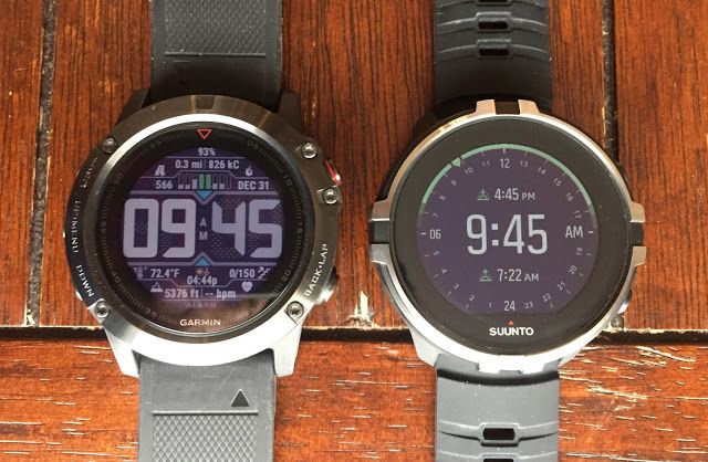
Browsing a little I took few minutes reading a review on Suunto-Garmin comparison from 2018.
The post is quite interesting and for the matter I’m concerned of which is as this post name says, the watch faces designs on both brands difere as much as we can imagine. While Suunto is focusing on minimalist and fine designs, Garmin is doing quite de opposite making the most of its space kind of Casio’s classic style, I mean too much stuff in there.
Honestly, I think that a lot could be done regarding more useful info as proposed and knowing that between little and much is the good measure I’m sure there is a lot to gain, for both parts, people like me who are interested in having more at one sight and for visualy impaired as well.
Here is the image I take as an example of how good ideas could come to a good port.
-
@rhustox
the watch faces both go in line with the general design philosophy of the companies. Suunto is nordic nice and simple with few beautiful details and Garmin is completely overloaded somewhat military style
-
@pierre-yves-colle said in S9 Watch faces:
I work exactly this way at my side with my own IT team. … and guess what … I’m very often astonished to see that when I put an idea on the table which kept much simplier even if I was thinking more ambitious … it is the people of the team who counter propose something much better …
I think you do it exactly how a a good leader should work - being open for everything that comes. I made the same experience (being a principal) with my teachers and often the best proposals come from our very young people, who just started their career. In martial arts we call this “beginners mind” - somebody who’s mind is “empty” often has an more unbiased view on the things! therefore (working in a school) we sometimes even ask our very young students (like 6 to 10 years old) how they would solve certain problems we face and boy, some of their ideas are hands down brilliant 🤩. Perhaps that’s an idea for the IT companies too

-
@freeheeler said in S9 Watch faces:
@rhustox
the watch faces both go in line with the general design philosophy of the companies. Suunto is nordic nice and simple with few beautiful details and Garmin is completely overloaded somewhat military style
Totally agree, two opposites and so many possibilities to take as example of how to or not to.
My proposal ideas are not of breaking any design or brand style at all no even thinking of copying of following any brand ideas either. The point is to improve our experience as users and by that as a matter of fact Suunto will become better in different ways as said, user experience, being loved for this watch capabilities and at the end being a real good and interesting product I guess.
Offering a larger array of watch faces with the option of upload/download them from your Suunto app instead of having them all installed in your watch, and all those watch faces being able to be customised by each user in the same fashion of ON/OFF button we already have, in the Alarms menu for example, will bring nearly endless possibilites of watch faces that anyone can have at their own taste.
When you activate your prefered watch face and after choosing the color, something like this would follow:
Date ON/OFF
Sunset-Sunrise ON/OFF
Altitude ON/OFF
Steps ON/OFF
Calories ON/OFF
Sleep ON/OFF
Recovery (ON/OFF
Last 7 days ON/OFF
Battery % ON/OFF
Moon ON/OFF
…
Keep all info* ON/OFFAs many good and available options come to your mind

Perhaps only 5-7 tips could be active at the same time. That is what Suunto teams have to see and decide if it is possible or not.*Another interesting option as in some watch faces some info disappears after 10 sec. Someone may just want to see it after pressing the button.
By the way, sorry I did forget to share the link where I have taken the picture from, if someone is interested on the reading about this comparison: https://www.roadtrailrun.com/2018/01/comparative-review-garmin-fenix-5x-with.html
-
@rhustox said in S9 Watch faces:
Browsing a little I took few minutes reading a review on Suunto-Garmin comparison from 2018.
The post is quite interesting and for the matter I’m concerned of which is as this post name says, the watch faces designs on both brands difere as much as we can imagine. While Suunto is focusing on minimalist and fine designs, Garmin is doing quite de opposite making the most of its space kind of Casio’s classic style, I mean too much stuff in there.
Honestly, I think that a lot could be done regarding more useful info as proposed and knowing that between little and much is the good measure I’m sure there is a lot to gain, for both parts, people like me who are interested in having more at one sight and for visualy impaired as well.
Here is the image I take as an example of how good ideas could come to a good port.

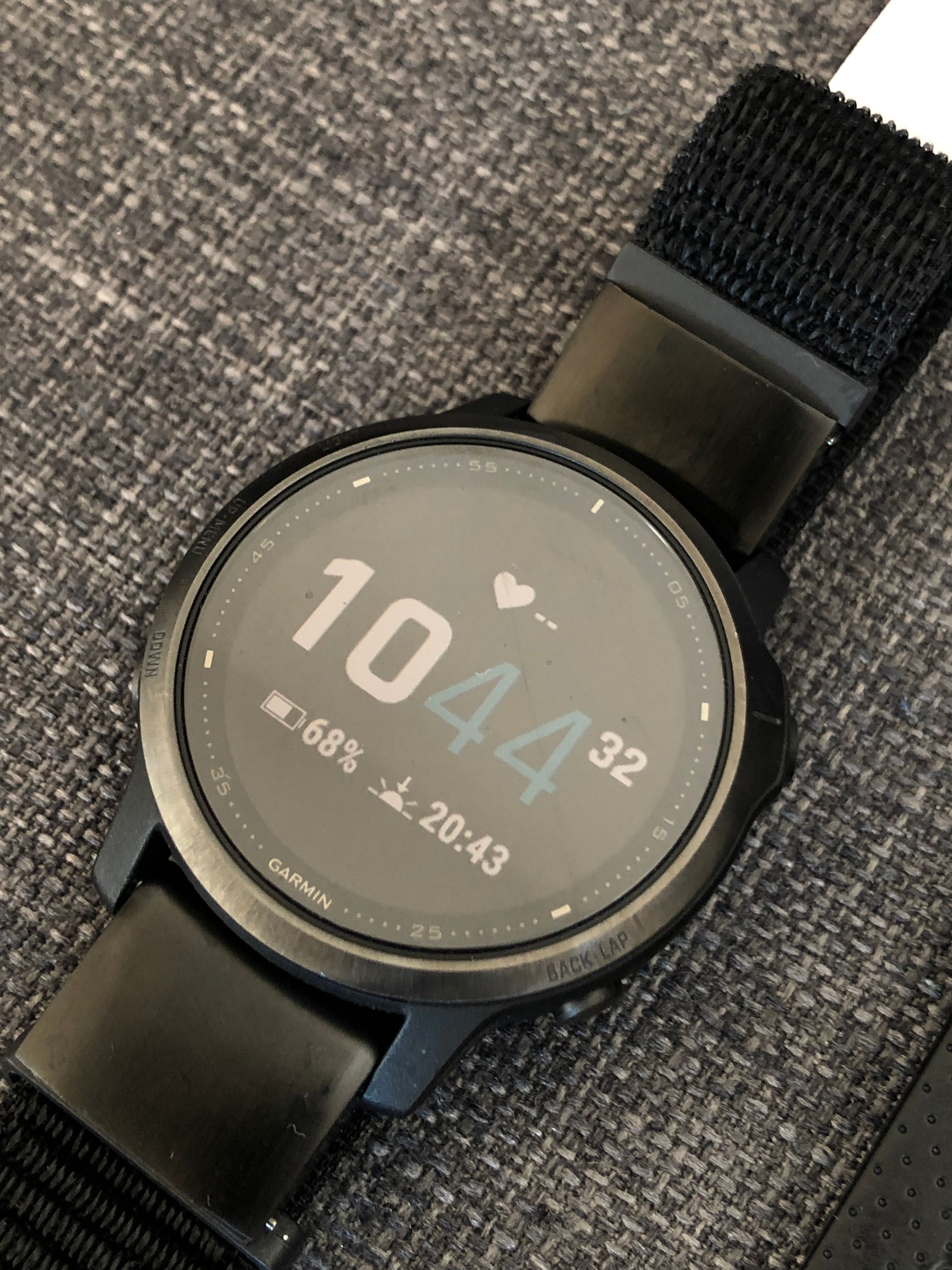
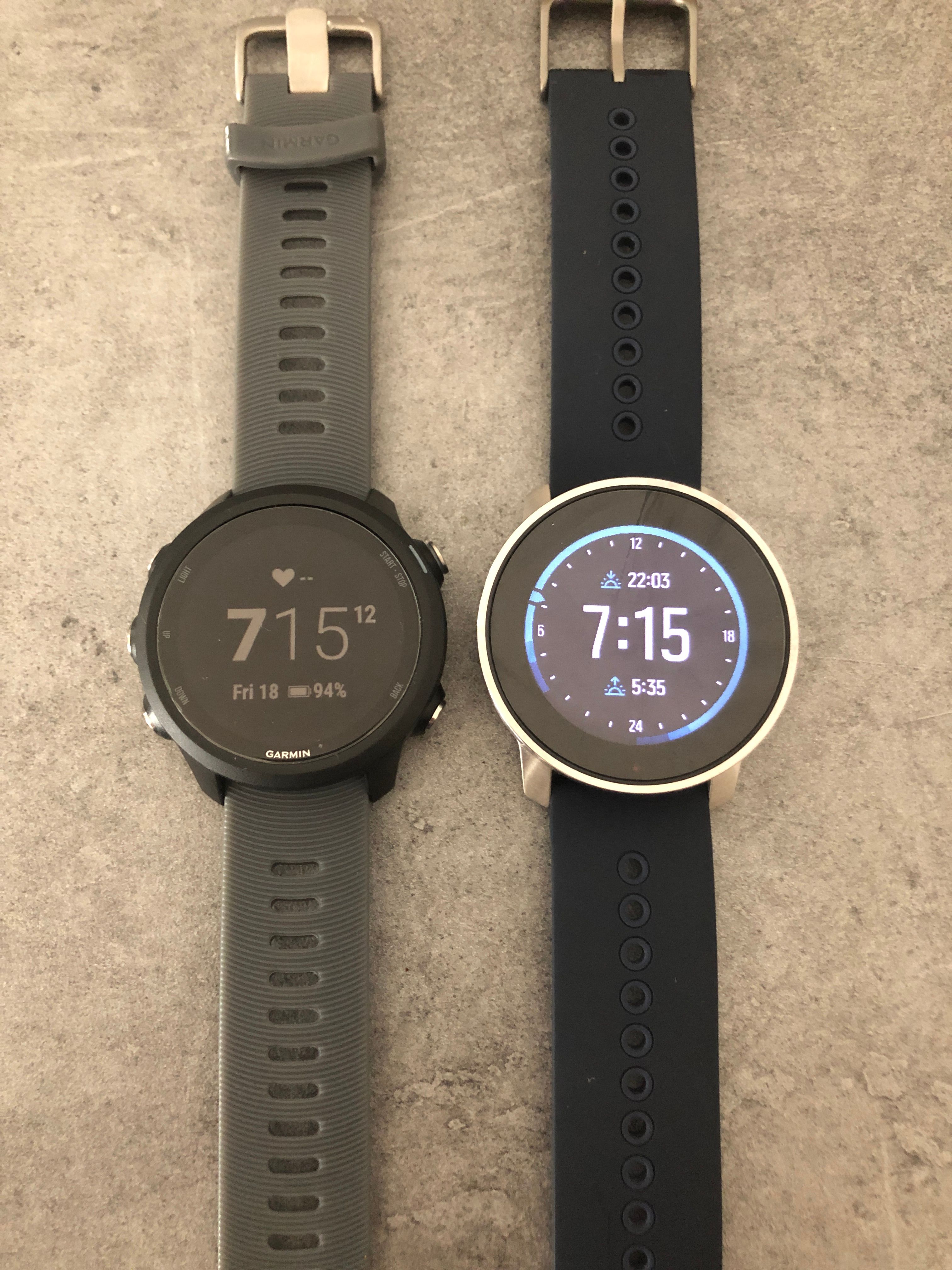
In defense of garmin, they can have more stock minimalist watchfaces with “enough” (for me) data fields that are customizable.
That for me is ideal. I don’t need fancy watchfaces with zillions of data fiels. I just need to be able to choose what data fields I am viewing in a watch face.
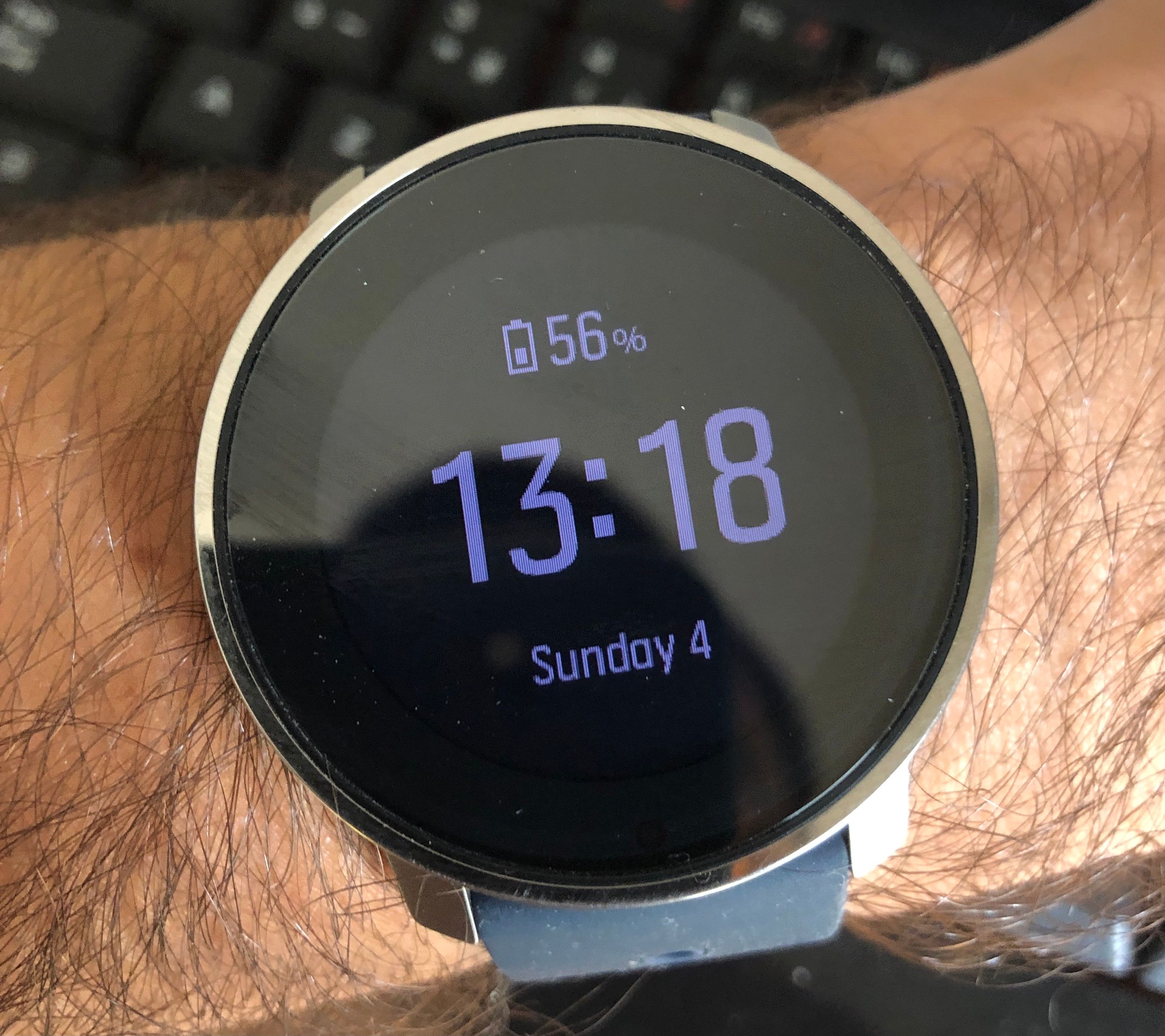
What I find a bit annoying on the S9P today, is that some watchfaces have some data fields and other watchfaces other data fields.
You can’t get (at least that I know/understood after reading the manual) two different watchfaces with same data fields (ex: battery, day of the week, sunset time).
That is for me the “issue” with this watch face (which I like the most)
-
@andré-faria That is exactly what my suggestions are and the reason of this post.
Completely ignoring if S9 and S9B against S9P have some watch faces in common, as I’ve seen so little of the latter only in this forum and browsing a bit about it.
Would be great under my little understanding of programming if this is possible. Taking for granted that these devices are not the old displays like the Core model and with a little experience on graphic design I know that that would be possible and having personal preferences when to choose which info I want to see in each watch face or at each moment, comes to mind that Suunto would do a great job if could make it happen.Imagine not just a personal taste, preference or need but a customised watch face from a base design for each one to choose.
One would love to have his/her Suunto loaded with many fields and as much info as possible. Another one would keep the minimalism to its fullest. Imagine just doing this thing the same person in different occasions, once wearing casual or sport look with cool watch sport face style, then same day going to the office on a business meeting and wearing it as minimal and stylish as you like.
Isn’t that everyone’s dream? From my point of view, I think so.

-
Well it confirms my feeling … the GARMIN screen with too many information … is just … abslutellynot readable at all at the end …
It make me confirm my love to SUUNTO approach … and why if I propose new screens the ideas is not to add many information at the same time but better to use the touch on the screen to move from one screen to another where their are multiple secondary information possible
-
Maybe I’m in the minority but I simply want a few options for uncluttered, easy to read watchfaces that are customisable to a degree. I don’t want or need the choice of tons of different watchfaces and I don’t particularly have any desire to swipe through different screens to acesss more information. It’s a sports watch for athletes not a smart watch!
FWIW my daily wearer apart from my prized Rolex is usually a chronograph of some sort - visually appealing, easy to read and uncluttered. My Magrette is a good example:
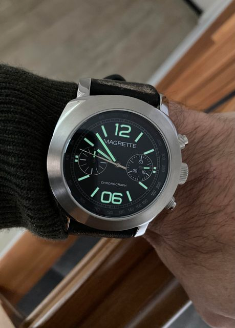
Point being is I want to look at my wrist and be able to quickly see along with the time and date just a couple of fields that are important to me. Being into watches I love simplicity and elegance, and for the most part I really think Suunto stamps it’s authority over the other brands in this regard.
If I were wanting anything to be implemented into the watchface it would be being able to select the ‘Recovery time’, I’d much rather have this on my watchface over daily steps