Running Economy
-
Today I started exploring the Running Economy app for my running activities.
First, I have to say that seeing two fields with identical name and different values in SA is confusing, and they both probably require an explanation of what they are (as we see on other fields such as EPOC, for instance).
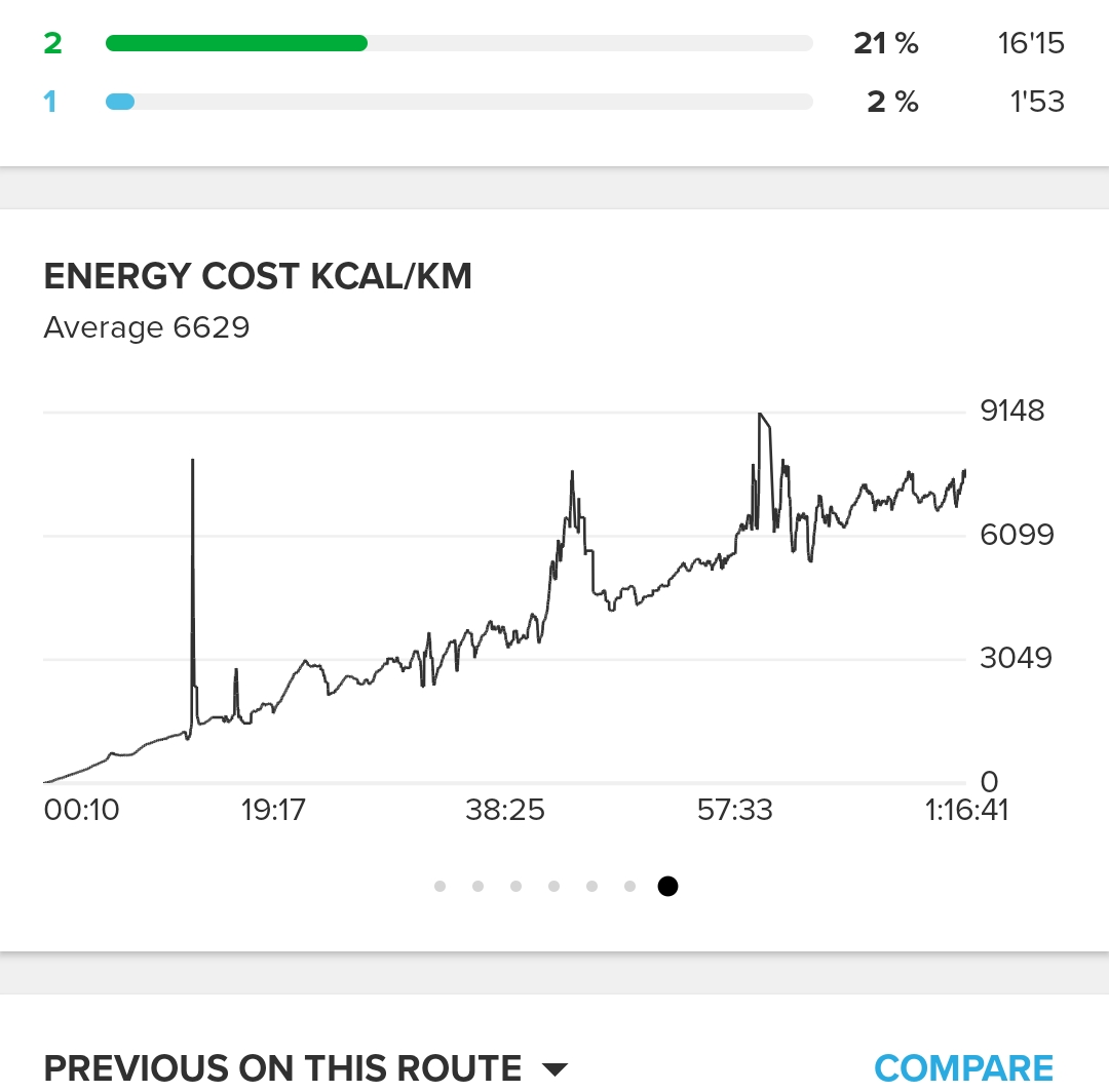
What is even stranger, is a value of 3,892 in the field “RunningEconomy Avg energy cost kcal/km”! Does this mean that I spent on average 3,892 kcal per kilometre? It seems incredibly high
-
@Francesco-Pagano You can check “Energy cost kcal/km” chart and there you will see that they clearly made a mistake in calculation. They probably forgot to subtract some linear base

This is one of mine:

I reported that more than a week ago directly in the “SuuntoPlus Store”. Not sure if that really went through though…
-
Let’s see if @NeaLuu have some time to check this

-
I had a run today and have the same chart with such bonkers estimations.
My observation is that there’s too much data on the screen (and the current hr is very hard to read as it’s dark red) to be useful while running.
Why not get a simple, large and clean chart with approx 3 minutes of data to have an easy way of knowing if the economy is going up or down by a gentle and quick glimpse on a watch?
Or an indicator if the economy is rising, flat or dropping (the ring could be used for that).