What do you expect from the next update?
-
@Fenr1r This one is already available, minus the compass info. I assume the lack of pixel density on the SV prevents this added feature.
-
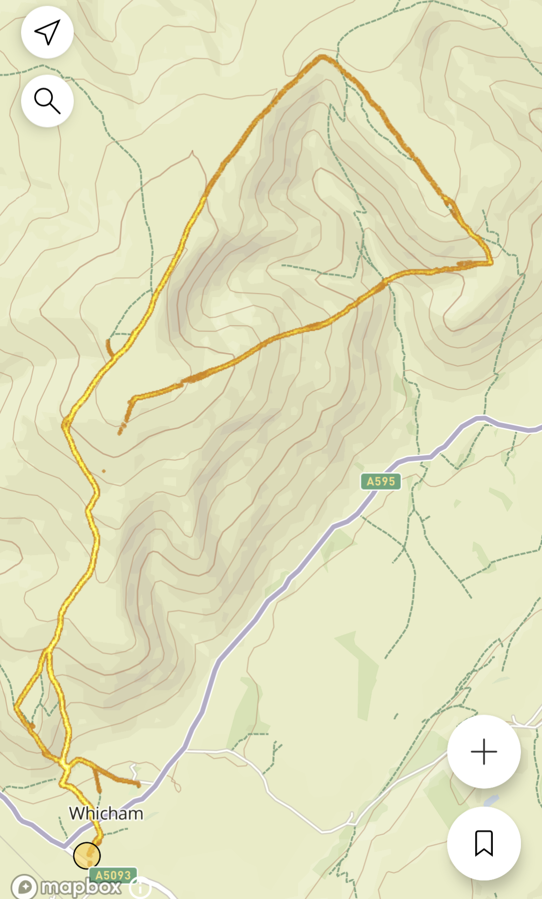
@Frederick-Rochette this is more idle curiousity but since I don’t think it’s currently on the vertical, a heatmap layer that can be toggled on top of the map.
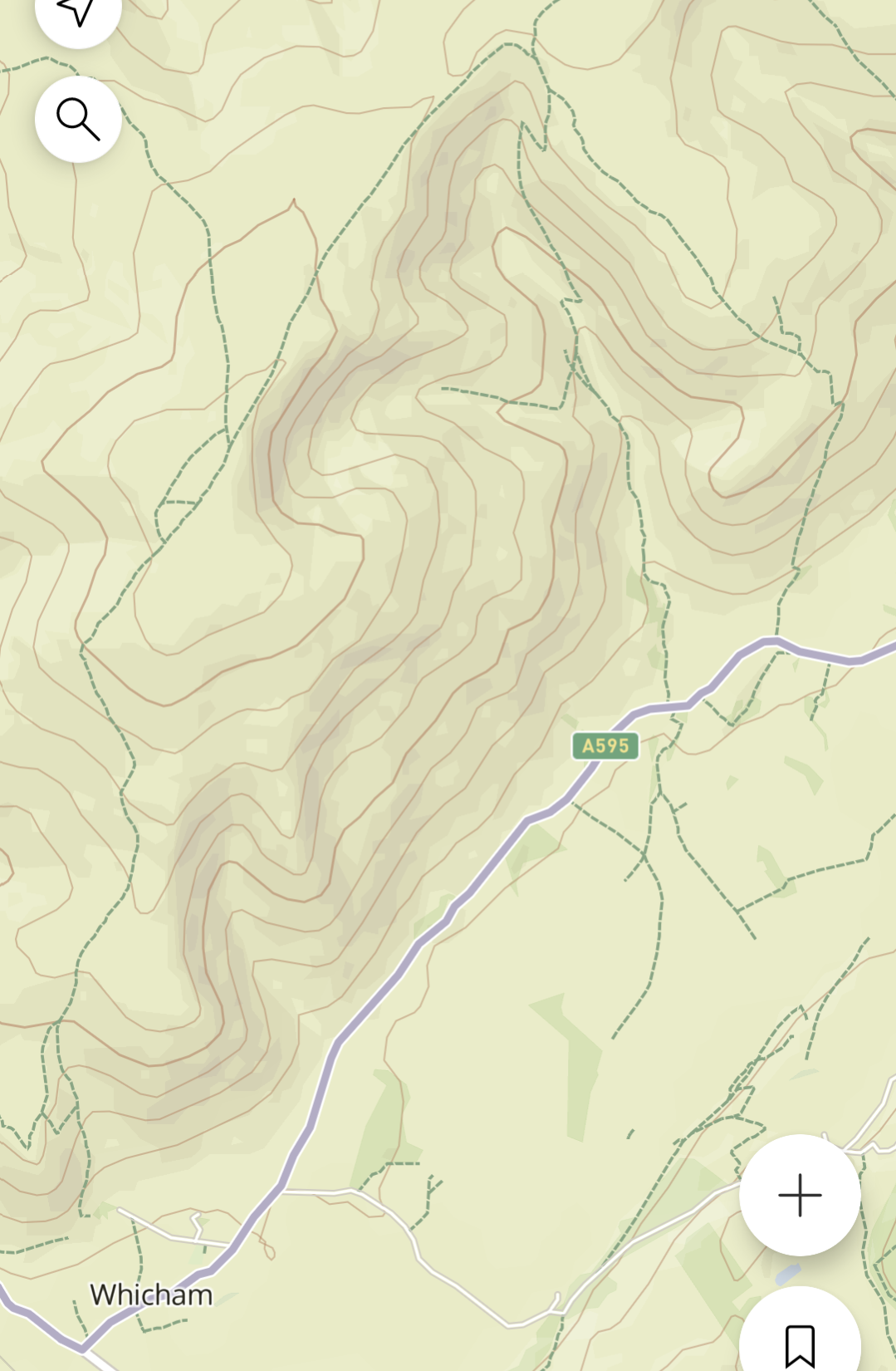
Don’t expect it, but would be oh so useful. I run in enough places where there are classic race routes that you’d never know exist on OSM.
Obvious illustration : Black Combe just OSM

And with heatmaps

-
@duffman19 said in What do you expect from the next update?:
@Fenr1r This one is already available, minus the compass info. I assume the lack of pixel density on the SV prevents this added feature.
I assume the different display technology prevents the compass to be shown in Vertical all the time.
The full display in Race is not always on. So the additional power needed to power the magnetometer does not make a difference.
Vertical display is always on. A constantly powered magnetometer would eat the battery in small time. -
@Egika Ah, yes, that too! Good point. Just like the second hand disappears after a minute. Anything to save battery!
-
I wouldn’t have thought the compass N indicator needs to be seen all the time to include that face. It only needs to appear when the watch is roused by button press. And then vanish like those seconds on other faces.
The Vertical’s compass widget (& thus magnetometer) appears to keep going for some time (always?) after the screen dims or powers back up very quickly after the screen is fully woken and scrolled.
Unless the problem does lie with the pixels.
-
@Fenr1r
Maybe the main “issue” is that that face need to be reworked to be used on SV (compass and seconds disappearing) as it wasn’t designed for AOD -
@sartoric
Yup. Exactly the reworking I’d appreciate if viable. “Expect” would probably be overstating it. -
In the main watch face of SV at the bottom, I would like to choose with tap the altimeter curve (actual view) or barometric pressure curve. It would be best.

M
-
As an runner with less than perfect close-in eyesight who does not want to or cannot wear glasses when running (and I can’t be the only person like this) I need the ability to set up a single data field screen that shows data (for example, time of day, lap duration) in large characters. The Vertical is a great watch (display, feel, ease of use, battery life) but having a minimum of 3 data fields per screen is, to me, a weakness that could be easily fixed.
(I had originally written the following but see now that I can set a timer before a run and the timer will be available during the run, although it requires a button press to re-start it.) Also: the ability to set a reminder ‘alarm’ (through vibration) that repeats every, say, 20 or 30 minutes, during an endurance run.
Thanks.
-
@GKnoll said in What do you expect from the next update?:
As an runner with less than perfect close-in eyesight who does not want to or cannot wear glasses when running (and I can’t be the only person like this) I need the ability to set up a single data field screen that shows data (for example, time of day, lap duration) in large characters. The Vertical is a great watch (display, feel, ease of use, battery life) but having a minimum of 3 data fields per screen is, to me, a weakness that could be easily fixed.
(I had originally written the following but see now that I can set a timer before a run and the timer will be available during the run, although it requires a button press to re-start it.) Also: the ability to set a reminder ‘alarm’ (through vibration) that repeats every, say, 20 or 30 minutes, during an endurance run.
Thanks.
Legibility of the display is really, really important!
-
@GKnoll this is one of the main reasons I had to go back to a Garmin
-
@wakarimasen said in What do you expect from the next update?:
@GKnoll said in What do you expect from the next update?:
As an runner with less than perfect close-in eyesight who does not want to or cannot wear glasses when running (and I can’t be the only person like this) I need the ability to set up a single data field screen that shows data (for example, time of day, lap duration) in large characters. The Vertical is a great watch (display, feel, ease of use, battery life) but having a minimum of 3 data fields per screen is, to me, a weakness that could be easily fixed.
(I had originally written the following but see now that I can set a timer before a run and the timer will be available during the run, although it requires a button press to re-start it.) Also: the ability to set a reminder ‘alarm’ (through vibration) that repeats every, say, 20 or 30 minutes, during an endurance run.
Thanks.
Legibility of the display is really, really important!
In fact, at that point, where I have become accustomed to functioning with certain bugs and feature limitations, I only ask of the developers:
MUCH LARGER TEXTS SIZE!!! please

-
@David-l said in What do you expect from the next update?:
@GKnoll this is one of the main reasons I had to go back to a Garmin
Sorry to say it out loud, but my Forerunner 955 is much clearer in this respect. -
The first thing I expect ad soon as possible is to fix the bug which hides the first part of the track from the watch display during activity recording, which is simply unacceptable for a watch paid 800 euros. Immediately after also fix the display which turns off after battery charge and requires several time to come back. So, instead of inventing new features, what I suggest is to concentrate on bugfix
-
@fobissss I have never encountered that problem

-
@fobissss
you can be sure that Suunto knows about both issues. and you can be sure they do not ignore them.
the uncertainty about priority and success to find the root cause remains. -
@Frederick-Rochette dual power, cycling & live tracking.
-
This is actually not a watch update, but a map update, but when will contour lines be restored?
Months pass and still silence, and there were assurances that it was only temporary.
Additionally, it is impossible to download new maps without first updating the previously downloaded ones, which will become useless to me.
-
@peegee said in What do you expect from the next update?:
- Possibility to choose another widget by swiping in opposite direction.
Why not swiping through as many widgets as you please? Much like
- the touch screen functionality as well as the middle button afford,
- in the training mode faces (that you can compile and customzie on the mobile app),
- the watch OS of the older watches had it,
- it is suggested in “how to customize your widgets” on the SV,
- it used to be before it was changed to a lengthy scroll with an unnecessary layer of depth to get your information…
Just saying…

-
I really wish Suunto team could add this, would be so useful for me.
Option to change UI scale in widget list. Like now i can see two options when button down pressed once. I see pulse, and weather. If i want to see more info i need to press down button few more times to scroll down and see other widgets. It would be cool option to change scale from 100% to 75% or 50% for example.
Just like in internet browser by holding CTRL + scroll mouse roll. Just by one press down button I could see current weather, pulse, altitude compass or something, everything would be just smaller. No need to press down button few times. I think its also very easy to implement.
