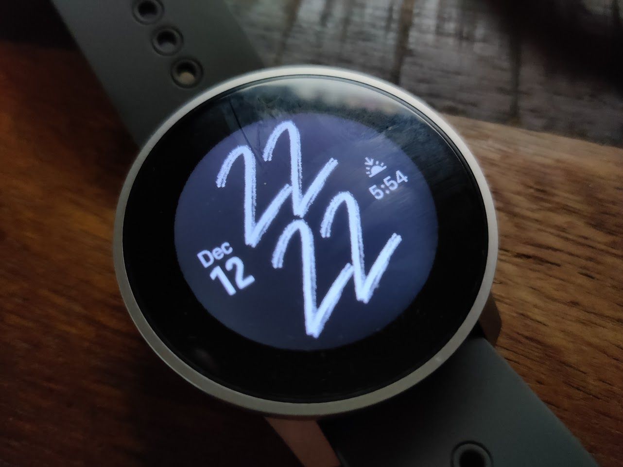
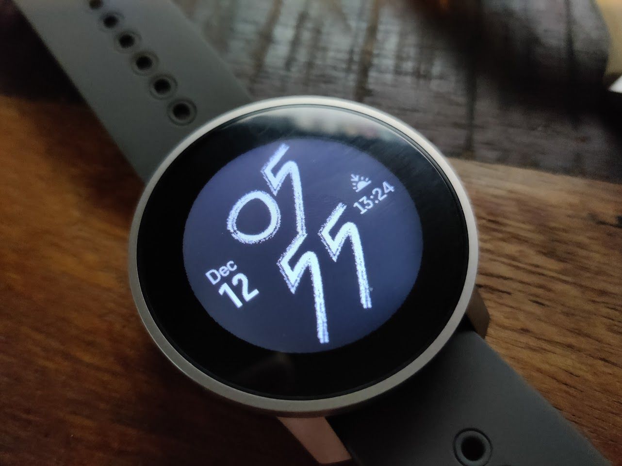
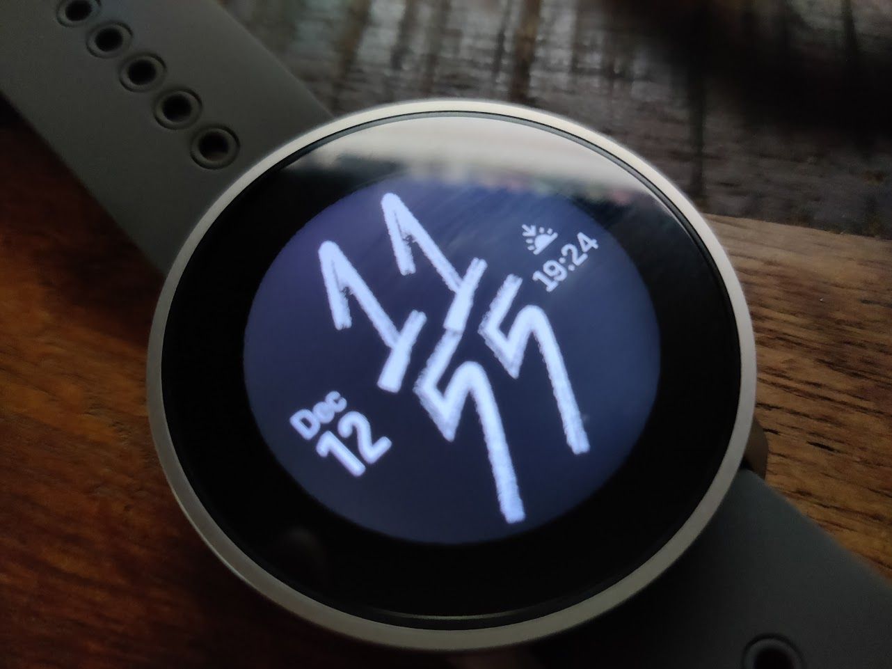
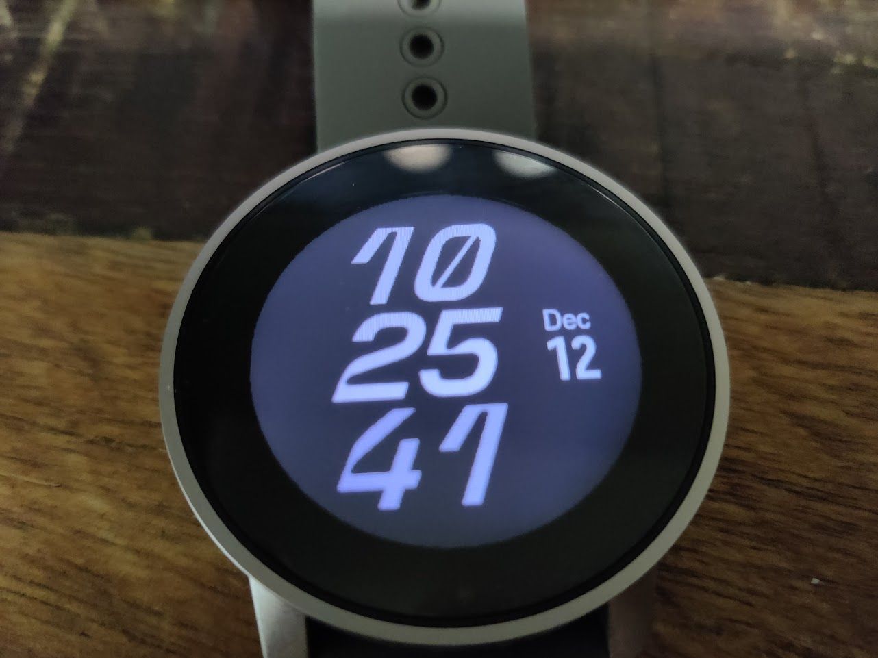
S9PP review from a non-target audience
-
@A Former User said in S9PP review from a non-target audience:
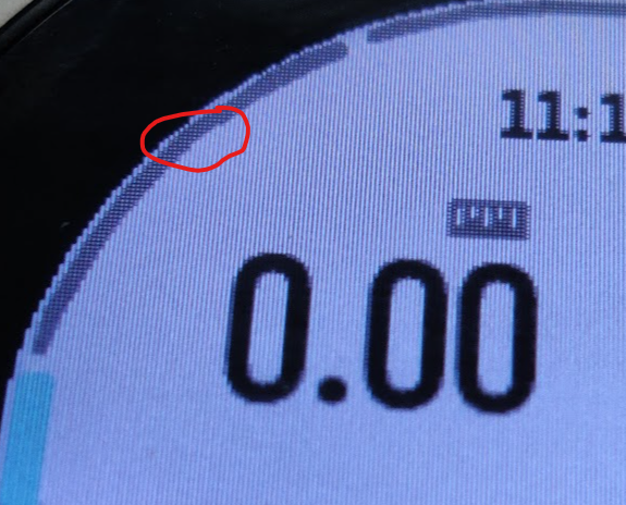
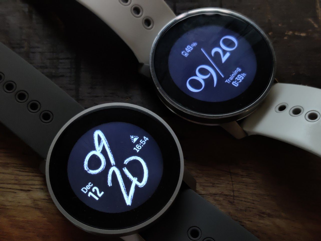
looks more as toy or watch from automates for 5eur…BEZEL is huge and irrational, no sense at all…(well it would have sense if they as GARMIN used this huge BEZEL for solar cells…but NO)
The Fenix7s, which is a similar size, has a similar ratio of display to watch size. Not for solar, for GPS.
-
The bezel discussion is really stale.
Suunto recent watches do not have a smaller display compared to the overall size of the watch, in comparison with competitor products; but the design choices to leave all of it “visible” and unmarked makes it look bigger. It’s a design I like, but quite clearly most people don’t and then assume that the display is smaller than it actually is.
-
@A Former User as others have mentioned: The bezel is a matter of it being clean, which makes it look larger. I think that DC Rainmaker had an S9PP review in his YT channel when he actually measured bezels in Garmin, Suunto and Coros and they all are about 6 mm thick.
You can enable touch in custom sports mode when choosing custom battery mode. Although I agree with you that it’s strange that custom modes remember some settings and some don’t (auto laps are remembered, but not battery modes or S+ apps).
I believe there’s plenty to do in regard to new S9PP firmware and UI. We’ll see.
-
@Łukasz-Szmigiel the UI is being actively developed. It’s new and not perfect at first, still I find it a big improvement compared to the past.
-
@isazi I agree, it’s better, more responsive and in general, more legible (although not everywhere) but at this moment it looks as if it was mainly ported from the old one. Which makes sense, considering that S9PP is the first watch using this UI.
-
@isazi said in S9PP review from a non-target audience:
@Łukasz-Szmigiel the UI is being actively developed. It’s new and not perfect at first, still I find it a big improvement compared to the past.
Ok, I see, as the old UI is not perfect, so we created another not perfect UI right?
-
@zhang965 perfection is not for us, only the almighty is.
-
I thought I’d some of my feedback here on a few items above. Just to balance out the discussion. Believe me, I have a lot of negative feedback too but my POV:
@A Former User said in S9PP review from a non-target audience:
Doubles
yes they have Alarms and watch face both in Settings and lower button menu, but also settings is under lower menu…whay we ned middle button at all? you can save middle button complete since ppl will probably use touch screen in most casesI actually like having the alarm available in the quick/lower-menu. It’s nice to be able to quickly set the alarm as needed. I also like having the watch face in the quick menu as I frequently switch between the analog at work to the outdoor one as needed.
It also makes sense for those settings to be present in a general settings menu. It wouldn’t make sense for them to be removed from there. Hence the duplication.
Re: the music controls, fair enough. I actually don’t bother with music on my runs but funnily I’ve used the music controls at my workplace when I’m away from my desk
 lol
lolSome of this is just Suunto understanding what we/users need and calibrating those settings. But just to add the above notes because I actually support certain things as they are.
Compas
Why is re-calibration needed every time is used? On my Ambit 3 I made it last year once, and never again since
I feel there’s a bit more to it here. I upgraded to S9PP from an A3P as well. Can you guarantee that your compass was accurate through that year? I understand there are some issues with compass requiring recalibration after charging etc. but I’d rather have my watch detect and tell me when something is wrong or if it detects a condition that could have caused something to go wrong. Lack of feedback is not always a sign of everything being OK
 BTW, the S9PP compass rated accuracy is only down to 5º (on website) which isn’t exactly high precision tool.
Why I can not start a training using touch display, instead of using buttons, but all other parts of menu I can??
I also prefer not to have touchscreen for “critical” actions like these. I intend to use wear this ice climbing and skiing with gloves and in wet conditions, so a button for those items is definitely better. I do feel like the buttons are a bit too small compared to A3P with gloves but once winter is truly here in Ontario I’ll know for sure.
Design
looks more as toy or watch from automates for 5eur…BEZEL is huge and irrational, no sense at all…(well it would have sense if they as GARMIN used this huge BEZEL for solar cells…but NO) and they are covering 25%-30% of displays for FUN
And how this should be outdoor watch…this will not survive my 1 month training in outdoor (swimming, CX-cycling) or working in wood where I fall at least 2-3 times on the ground, or smash watch against some hard surfaces…it looks so fragileTo each his own re: styling. My only wish is that the glass wasn’t flush against the watch case. I’d love a slight guard like the A3P had. Even though the glass is super strong, it’s still a nice thing to have. Plus the current glass edge will pick up reflections at some angles.
Re: durability, it’s passed MIL-STD 810G so I feel OK with what I can throw at it: https://www.suunto.com/Content-pages/military-tests-for-suunto-9-peak-pro/
https://www.youtube.com/watch?v=MBTezcxaJi0
Watch strap
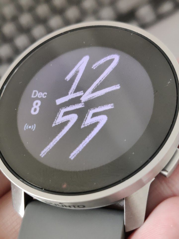
what is wrong with silicon watch strap, after a 3-4 hours working in clean office it was covered with dust and X particles ? (see picture…it just looks dirty=, cheap and unhygienic!!I’ve been wearing mine 24/7 since I received it late October (except for a few days when i was sick…) and mine has no such issues. I’ve also worn it when sanding dusty 3D prints on my workbench and haven’t see it attract anything more than A3P did.
 I don’t believe there’s a design flaw but YMMV
 -
@isazi said in S9PP review from a non-target audience:
@zhang965 perfection is not for us, only the almighty is.
And media controls
-
@A Former User said in S9PP review from a non-target audience:
Design
looks more as toy or watch from automates for 5eur…BEZEL is huge and irrational, no sense at all…(well it would have sense if they as GARMIN used this huge BEZEL for solar cells…but NO) and they are covering 25%-30% of displays for FUN
I know bezel talk has been done to death, but it’s something I do consider when buying a watch. The comical size of the FR 935 and 945 bezels are one reason I didn’t upgrade to them back when I was with Garmin and instead came to Suunto with the 9 Baro (proportionally a smaller bezel-to-screen size ratio).
Now that I’m wearing a 9PP, I’ve surprised myself at how much I’m not bothered by the bezel in person. It looks worse in photos than it does in real life. My only wish would be for Suunto to have put their logo on the bottom part of the bezel rather than on the side of the case. I think that would’ve looked sharp.
-
@TrailEyes said in S9PP review from a non-target audience:
Suunto to have put their logo on the bottom part of the bezel rather than on the side of the case
Funny enough, I remember quite a bit criticism of the logo being put on the front of s9b.
-
@DMytro I suspect on the 9B, the unhappiness there was because it was done in a way to use up a bit of screen display real estate, so the top-to-bottom proportions were shorter than the left-to-right ones. I think there’s enough bezel on the 9PP to put the logo on the face without infringing on the display.
-
@Umer-Javed said in S9PP review from a non-target audience:
I feel there’s a bit more to it here. I upgraded to S9PP from an A3P as well. Can you guarantee that your compass was accurate through that year?
yes, using it at least 4 times a week, always came to destination
@Umer-Javed said in S9PP review from a non-target audience:
I also prefer not to have touchscreen for “critical” actions like these. I intend to use wear this ice climbing and skiing with gloves and in wet conditions, so a button for those items is definitely better.
critical action is to start a training over display instead button??? wtf :)) well :))) I hope you take care more serious your own security and you don’t play with watch buttons during a climb…but hey you will not believe, I start my training before I really start my training, and since I don’t do climbing, I would like to use touch display for that functionality, simple like that
@Umer-Javed said in S9PP review from a non-target audience:
Re: durability, it’s passed MIL-STD 810G so I feel OK
they can write what ever, imagination is for free as well a believe
@Umer-Javed said in S9PP review from a non-target audience:
I’ve been wearing mine 24/7 since I received it late October (except for a few days when i was sick…) and mine has no such issues
that does not help at all
-
@TrailEyes said in S9PP review from a non-target audience:
I know bezel talk has been done to death
well, lets see if I will adjust to that next days/weeks , at moment it just hurts my eyes
-
@A Former User said in S9PP review from a non-target audience:
critical action is to start a training over display instead button???
The middle button is also used to switch screens in activity. When using gloves or having wet hands, using touch screen is problematic.
-
@DMytro said in S9PP review from a non-target audience:
The middle button is also used to switch screens in activity. When using gloves or having wet hands, using touch screen is problematic.
sure, this is not a problem ,and I do understand it… however… if we do “need” to accept double functionality on music,options,etc…why would be a problem to have this …for us who train in dry conditions?
Or at least or additionally they could remap upper key (one key to start,pause,stop) instead of menu, deleting a log is already available under logs, this is also duplication
ahh…new thing, Timer Alarm (not checked wake up alarm) is so silent that I need really to bring the watch near to my ears to hear it…and I am not so old (I guess)
-
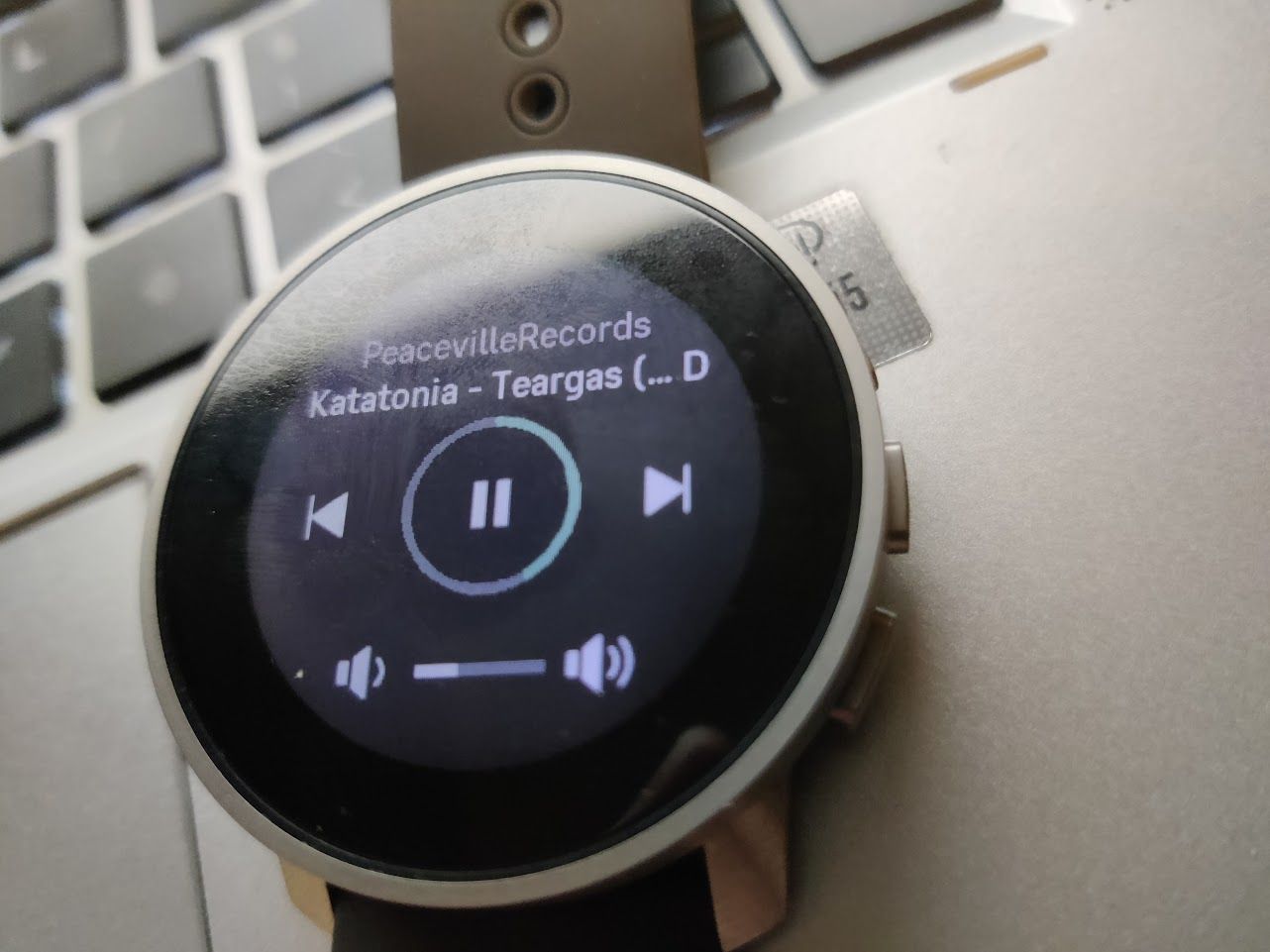
I used the fantastic media controls today,
when I see this UI, I thought the middle button, which is close the NEXT icon, will be used to swtich music.
Guess what, the middle button is the only button which does nothing…
-
@A Former User said in S9PP review from a non-target audience:
@DMytro said in S9PP review from a non-target audience:
The middle button is also used to switch screens in activity. When using gloves or having wet hands, using touch screen is problematic.
sure, this is not a problem ,and I do understand it… however… if we do “need” to accept double functionality on music,options,etc…why would be a problem to have this …for us who train in dry conditions?
Or at least or additionally they could remap upper key (one key to start,pause,stop) instead of menu, deleting a log is already available under logs, this is also duplication
ahh…new thing, Timer Alarm (not checked wake up alarm) is so silent that I need really to bring the watch near to my ears to hear it…and I am not so old (I guess)
Security is perspective, I think the good way is to create a setting to enable/disable touch screen for sport.
Security is very perspective, my ex girl’s safeword was schneckenkuchen, I’m almost dead about hundreds times. - it’s not safe at all!
-
It looks like it’s the post to bash the s9pp.
My only problem with this watch is that there no new shiny flashy stuff. I had a s9b, it’s the same but smaller. And with a longer battery life (that’s the real new thing for me).
But that’s what we want, no ? We go to the menu, two or three buttons press later, you start your run or whatever session.
You end your session and 20 seconds later it’s on the phone, 1 minute later it’s on Strava.
I dont care about the little detail and you should not care too, it’s “just” a thing to track some numbers. And I think this watch is really good for this, especially since you need to charge the watch every two or three weeks.
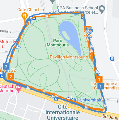
ps : I run sometime in Montsouris, watch your left !

-
@Kowalski said in S9PP review from a non-target audience:
It looks like it’s the post to bash the s9pp.
My only problem with this watch is that there no new shiny flashy stuff. I had a s9b, it’s the same but smaller. And with a longer battery life (that’s the real new thing for me).
But that’s what we want, no ? We go to the menu, two or three buttons press later, you start your run or whatever session.
You end your session and 20 seconds later it’s on the phone, 1 minute later it’s on Strava.
I dont care about the little detail and you should not care too, it’s “just” a thing to track some numbers. And I think this watch is really good for this, especially since you need to charge the watch every two or three weeks.
ps : I run sometime in Montsouris, watch your left !

nono, you don’t understand what I’m talk about,
no no, S9pp is totally different than S9B, it’s not only smaller, longer battery life.
and no, it’s not a problem with just more click on button, it’s a perspective from a user who changed his watch regular.
If you only want track some thing, use your phone.
And I don’t run in montsouris… there are too many rats…real rats…
