Update time in Europe?
-
@scott-gibson if you add the sleep tile it’ll ask you to enable sleep tracking.
-
@isazi thanks so much
-
@egika sorry for the delay, yes, exactly the same and solved like @olymay said in Update time in Europe?:
I had that, a reboot of the watch sorted it

-
@scott-gibson said in Update time in Europe?:
An someone please tell me how I “enable” sleep tracking I can’t find it anywhere on the watch itself?
Took me a while to figure out I needed to add a tile. Not very intuitive.
-
Sleep tracking is unreal! 1% battery for 1 hour of sleep tracking. It uses more battery when I leave it at desk overnight
 Great job Suunto team!


Now to finally add a external HR support and we have a perfect watch over here

Btw, something is weird with resources, so please clarify. I had like 70% and then new day started and it dropped down to 20ish%. Why is that?

-
@egika I had to reboot the watch
-
@metalmi Because you get up and move

 .
. -
@metalmi said in Update time in Europe?:
Sleep tracking is unreal! 1% battery for 1 hour of sleep tracking. It uses more battery when I leave it at desk overnight
 Great job Suunto team!


Now to finally add a external HR support and we have a perfect watch over here

Btw, something is weird with resources, so please clarify. I had like 70% and then new day started and it dropped down to 20ish%. Why is that?

I’m guessing (just guessing here) that the resources are probably not very accurate the first day or two as it won’t have enough information to go on? Maybe that drop was the resources calibrating itself?
-
@ianarg said in Update time in Europe?:
@isazi yes it changes colour and brightness as the sun sets. Really clever, I love this watch face. Not sure how much of a battery hog it will be though?
I had a mind blown moment when I realized this. At first I though, well it’s an ok watch face. Then I realized that the hour circle is supposed to be the sun, and then I realized why it didn’t show a number for all 24 hours. Then I felt dumb for not realizing before
 .
.This is definitely now my new favorite watch face!
-
@aleksander-h said in Update time in Europe?:
@ianarg said in Update time in Europe?:
@isazi yes it changes colour and brightness as the sun sets. Really clever, I love this watch face. Not sure how much of a battery hog it will be though?
I had a mind blown moment when I realized this. At first I though, well it’s an ok watch face. Then I realized that the hour circle is supposed to be the sun, and then I realized why it didn’t show a number for all 24 hours. Then I felt dumb for not realizing before
 .
.This is definitely now my new favorite watch face!
Me too! I thought it was annoying at first as it seems like the digits need a thin dark outline on them to help them stand out against the bright background…but then I approached sunset and ‘kaboom’ !!
Love the little ‘24hr dot’ (although would like it SLIGHTLY larger - I think from other UI decisions also, the people who work at Suunto all have really good eyesight!?)- you get a real glanceable sense of, “if I want to go out for an evening run, I need to go ‘now’ to get back before dark”, much more clarity than simply having access to a sunset/sunrise notification.
It would be really cool if the daylight background changes with the weather also! (maybe it does, it was sunny here yesterday).
-
@nigel-taylor-0 said in Update time in Europe?:
(maybe it does, it was sunny here yesterday).
Same here. Blue sky and sun. Would be cool if it did take weather into account.
-
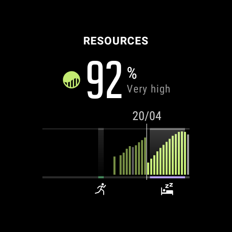
In the Resources display, should the Active, Inactive & Stressed times be different shades (similar to how recovering is green) ??
As it is, the graph feels like “Recovering vs Everything Else” - its difficult to get a proper context of the other categories across the day…seeing them tagged in the graph would surely be a better approach than simply having the list of numbers? I think just other shades of grey would help with comprehension - maybe it should be…>
Active - Grey as-is
Inactive - Lighter Grey
Stressed - Red
Recovering - Green (as-is)The graph in the app should also carry the “activity icon” (where you’ve done a workout) and “sleep” icons along the y=0 axis, just as it does in the Watch tile.
That would enable a glance which differentiates ‘active’ (I assume this is just general ‘moving around’ and causes resource drain) from ‘activity’ (an actual workout) - they’d show grey in the chart, but you’d get the little icon and a short line along the bottom tagging your runs/cycles etc. -
@nigel-taylor-0 said in Update time in Europe?:
Active - Grey as-is
Inactive - Lighter GreyI feel this is already differentiated with the running man icon and the dot under the bar it applies to.
Stressed - Red
How would one define if a bar should be red or not? We will always have some degree of stress surely? I feel stress would be better off as its own tile showing how stressed we are throughout the day.
-
@nigel-taylor-0 resources go up or down. Green vs gray. Stressed and active and inactive can all be at the same 30min interval that each bar represents
-
@dimitrios-kanellopoulos i only have activity, steps and calories in my diary .

Ist there a difference between the IOS and Android App?
Where are these icons (sleep, rescources etc) hiding?Thanks for your help.
Suunto 7 with the new update and IOS App
-
@julian-neher in the home screen, swipe left for the daily view, then click on “Today”.
-
Is there actually a plan to update resources and sleep tracking algorithms on S5/S9? That would be cool.
-
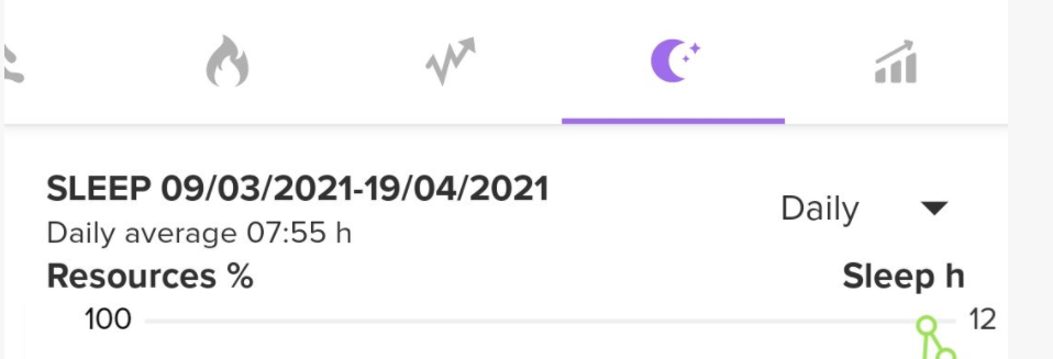
@isazi okay there i can watch the diagrams (heartrate etc.) for the actual day. But i want to see the heartrate diagram for the last few days? is this possible? Like the sleep diagram in the screenshot from @Dimitrios-Kanellopoulos further above.
-
@julian-neher tap on a day in the calender (the colored bubble)
-
I’m really liking the update so far.
I compared the sleep tracking last night to my Withings Sleep Analyser and it was within a few minutes for the total, and the HR was almost identical for max and min. Very impressive.
The things I would like…
A more detailed breakdown of the nights sleep. It’s nice to have x% deep, x% REM, etc, but I would like to see WHEN those periods happened. The Withings can do this and whilst it’s essential, it can be handy to see if and when anything affected my sleep during the night (has helped me make changes in the past).
Also, when I woke up this morning, I was awake and moving around (checking phone, getting dressed etc) and when I went to check my sleep on my watch it asked me to confirm I was awake. Does this mean I have to manually tell it I am awake each morning? Or is the watch simply learning my patterns?
If I have to manually change it each morning then I will often forget to do this and means it will be useless to me.(Strangely, I actually had a really bad night sleep last night yet both my Withings and Suunto said I had a great night and should expect to feel energised today - I don’t, I feel tired and rubbish! Further proof these things should be taken with a pinch of salt and not relied upon, they are more indication and trends i think)