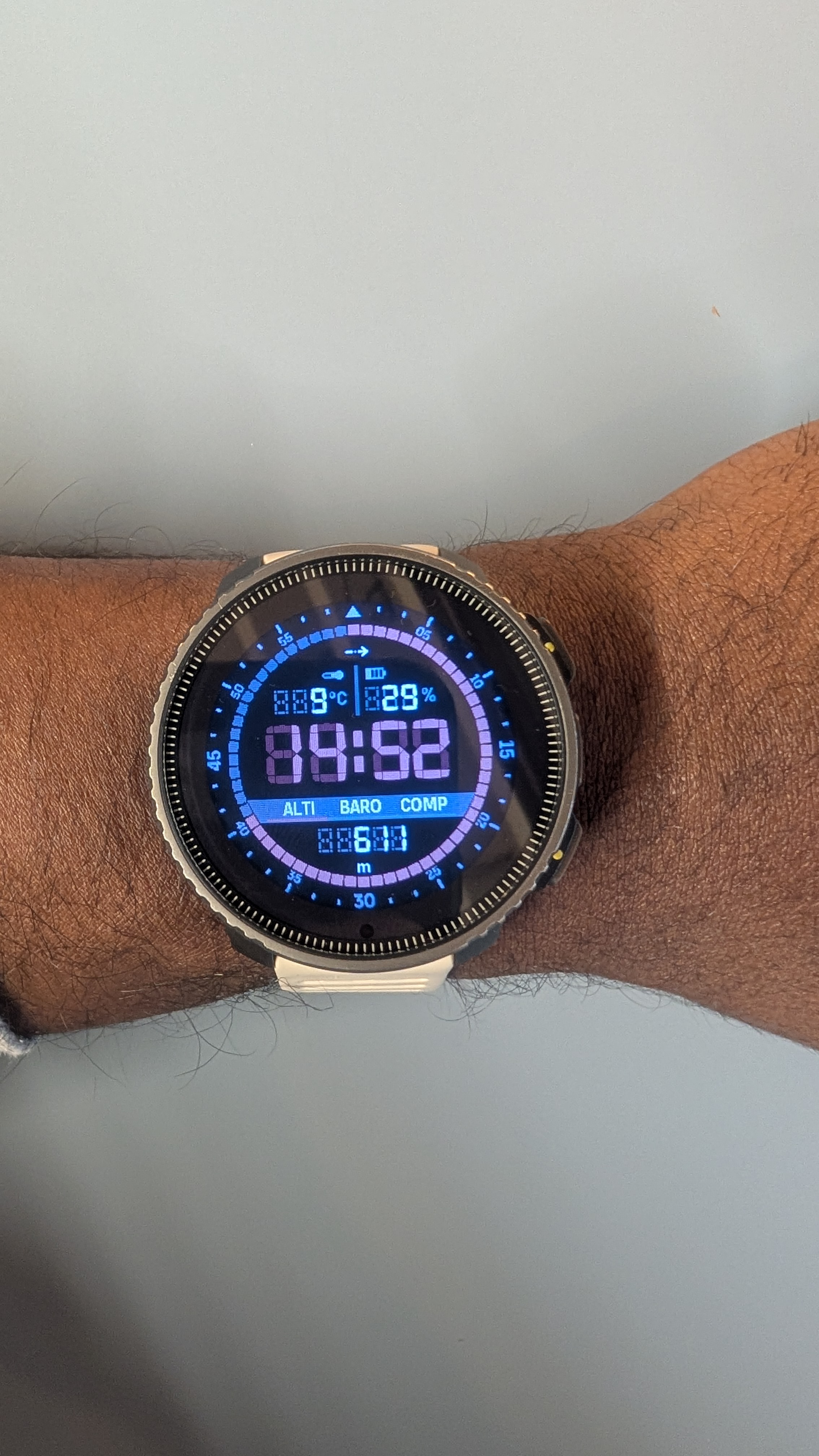
Vector watch face - tone down digital shadow
-
Nice watch face
") ! had severel generations of vector watches and they were great!!
! had severel generations of vector watches and they were great!!But could you tone down the digital shadow? It is i little bit difficult to see the time actually.
-
@Stefan-Kersting That’s on the V1, right? On the V2 the ‘shadow’ is good
-
@Horizontal_2
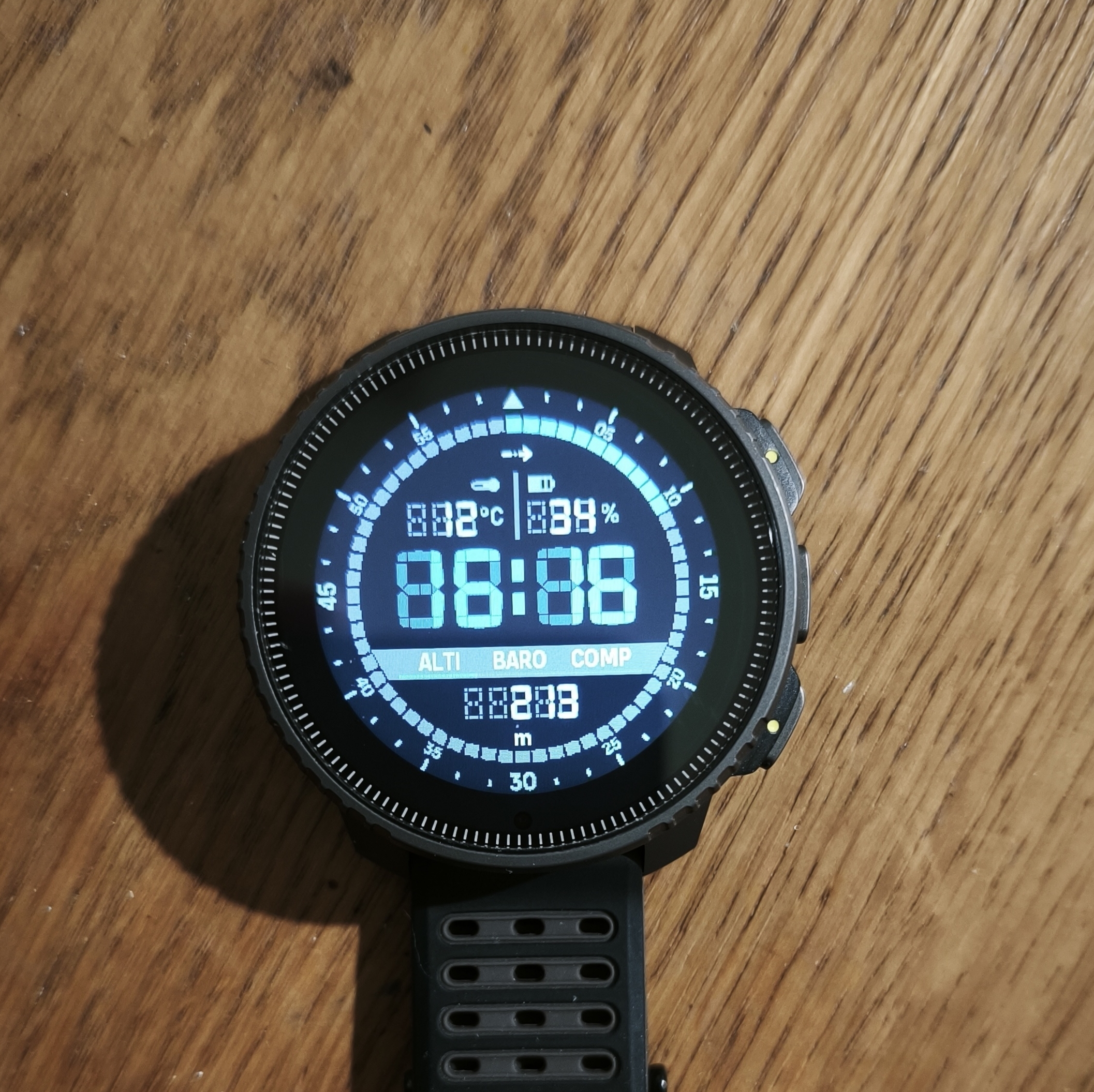
v1 MIP is also very bad, unreadable. -
@Horizontal_2 yes, right
-
@Stefan-Kersting agree not so easy to read
-
@Wilson75 It’s interesting to do something “retro,” but you can’t display it on an old screen

-
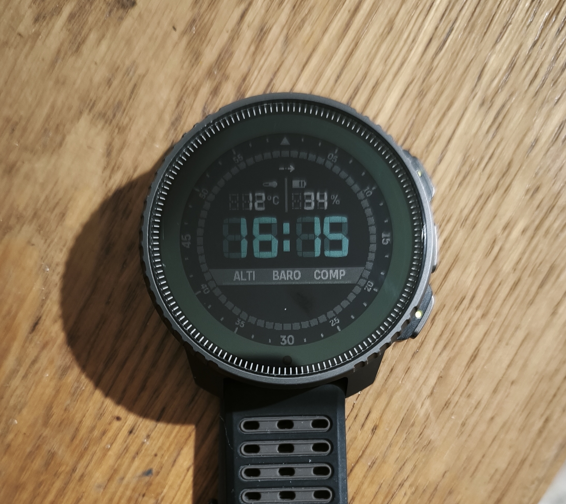
Same… ON / OFF (a little better with off backlight)
-
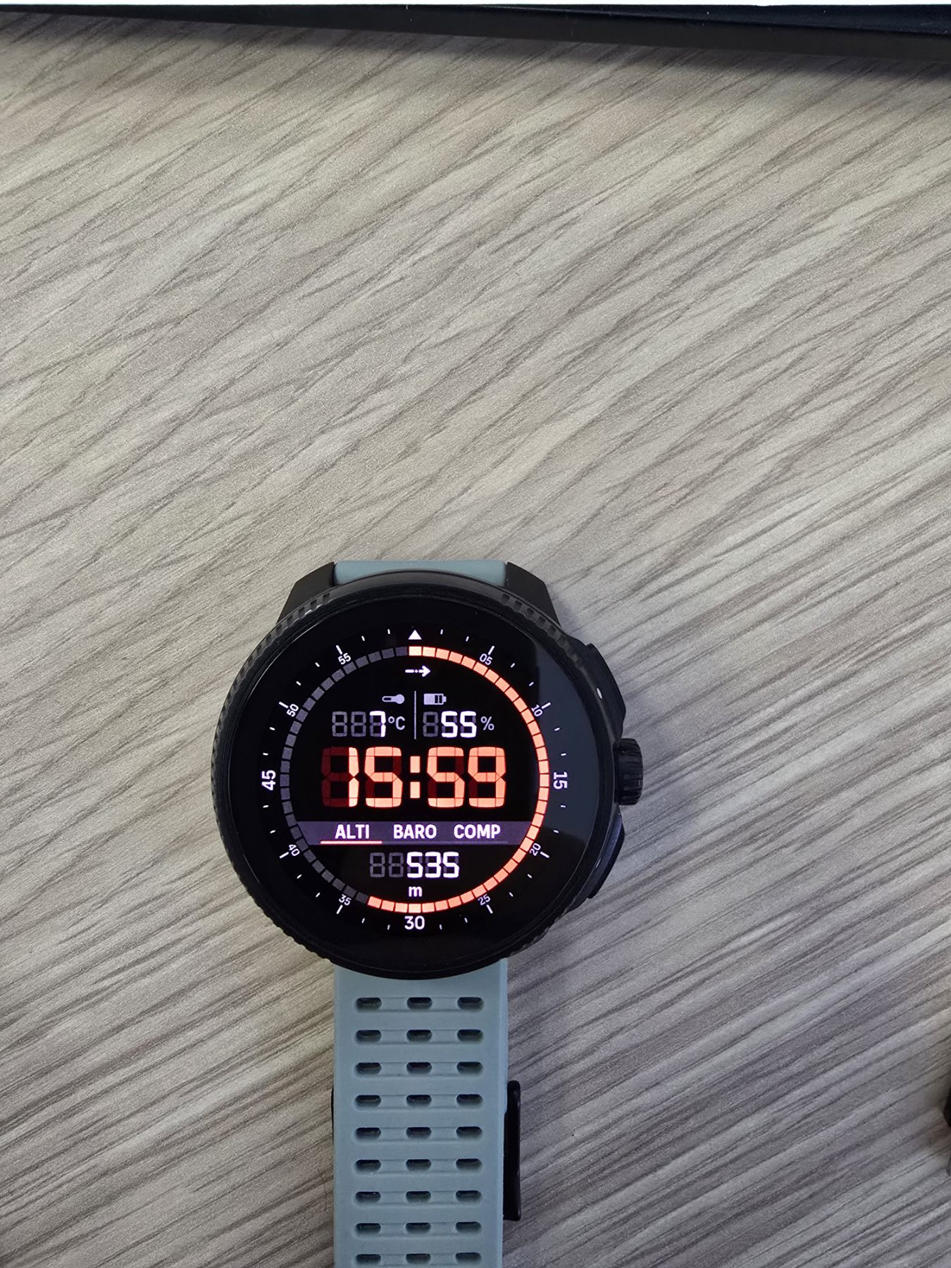
On Race it looks beautiful!
-
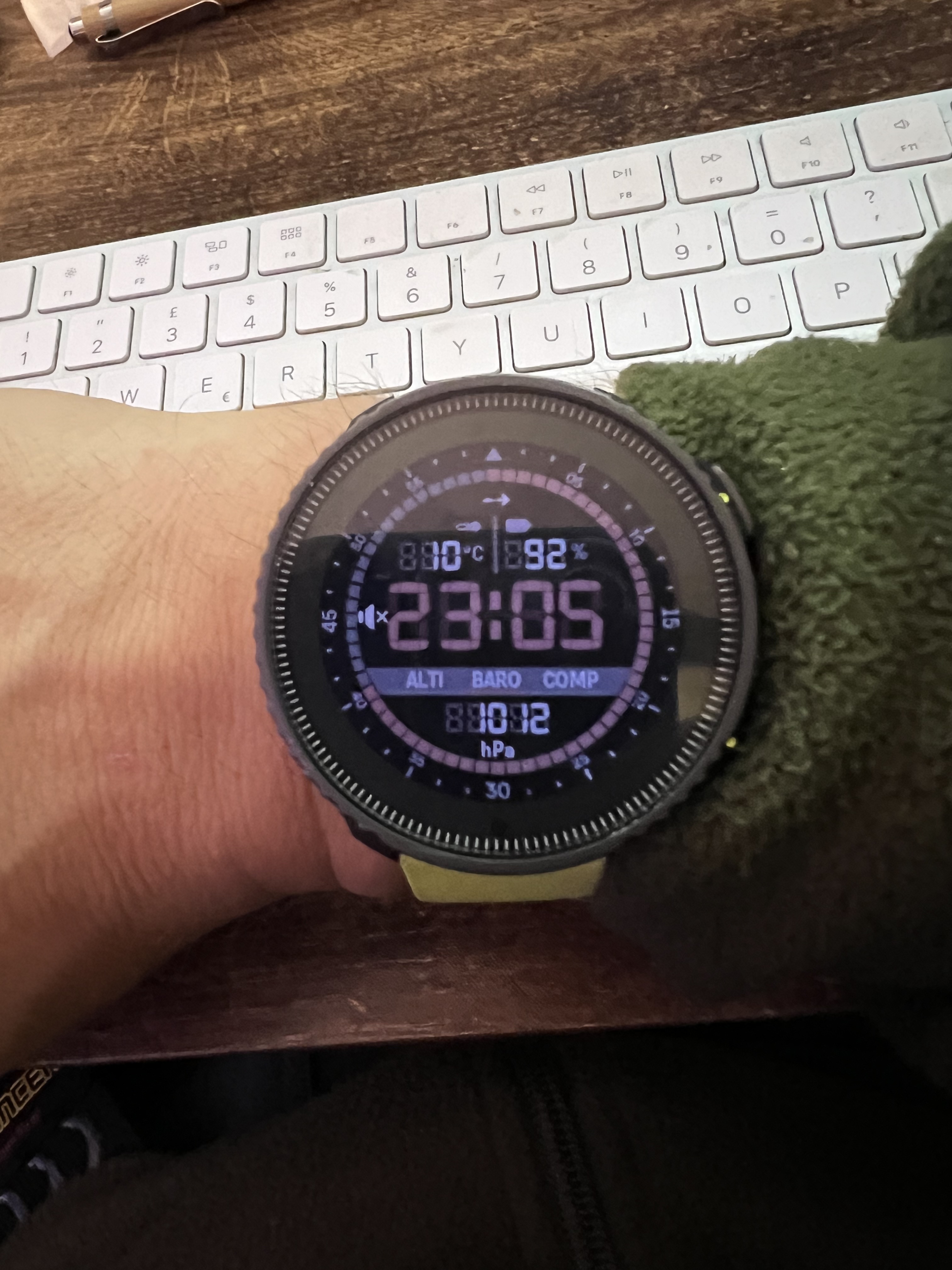
@Prenj Hello on v1 the compass alti and barometer data disappear after 30 seconds?
-
@ggrego Yes, none of them work in standby mode.
-
@ggrego said in Vector watch face - tone down digital shadow:
@Prenj Hello on v1 the compass alti and barometer data disappear after 30 seconds?
Only time is shown when display is in “always on display” mode
-
@Prenj Ok thank you it’s a shame

-
@ggrego it’s one of the better AOD designs
-
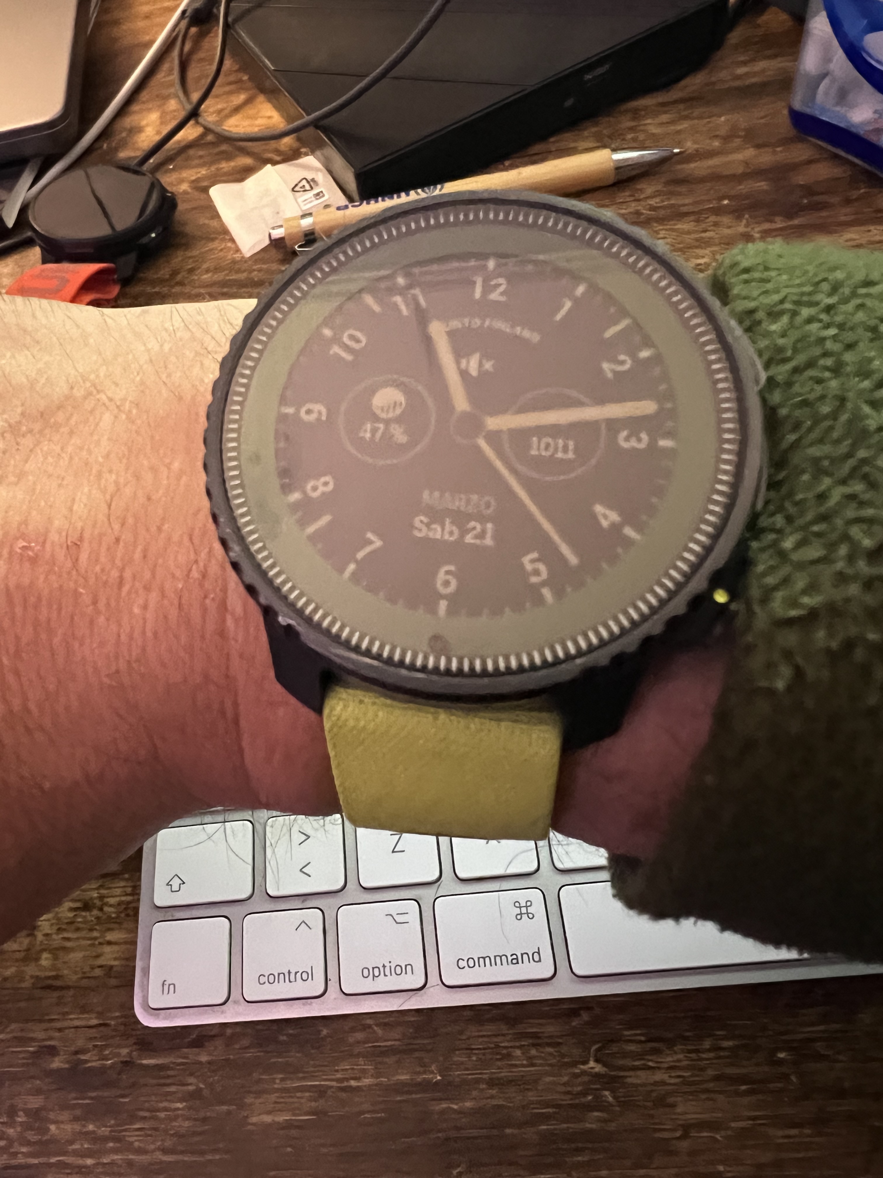
The only thing missing for me is the date.
Somebody know what means the Little arrow on the top of the Watch face ? -
@Tony-Monteiro baro trend
-
we are aware of the contrast issue on V1 and looking into solutions.
-
I like it very much on my 9PP, if you solve this contrast issue, I will be even happier -
it’s a watch face designed for AMOLED displays (developed for the Vertical 2 90° edition), I find that it still looks very good even on the older MIP displays of the V1.
Although on MIP I prefer analog hands.
-
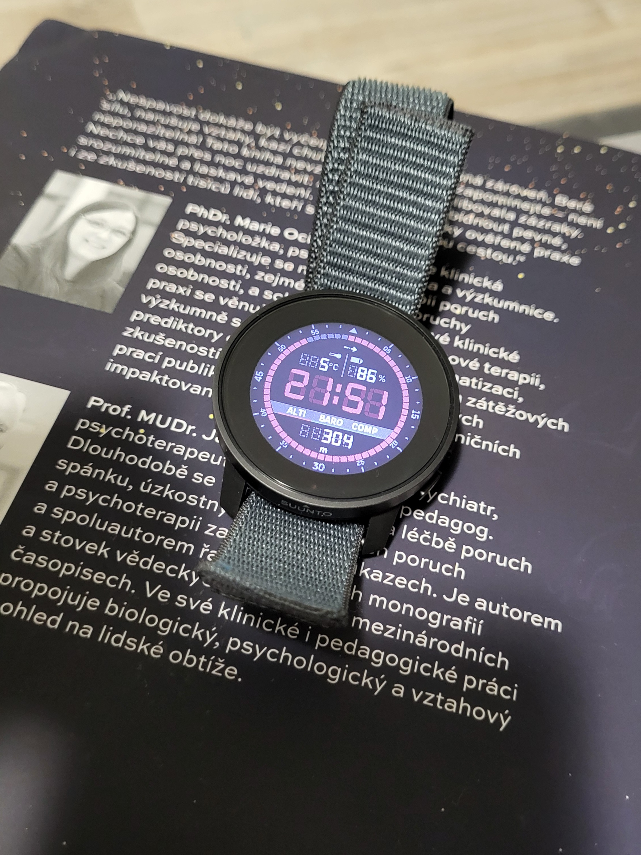
Hello, I noted that today only: why on the Vector wf the units of both temperature and battery are dimmed (as their small icons above), while the one on the bottom field (alti, baro, compass) isn’t?
I think it’s a bug, since all should be clearly visible!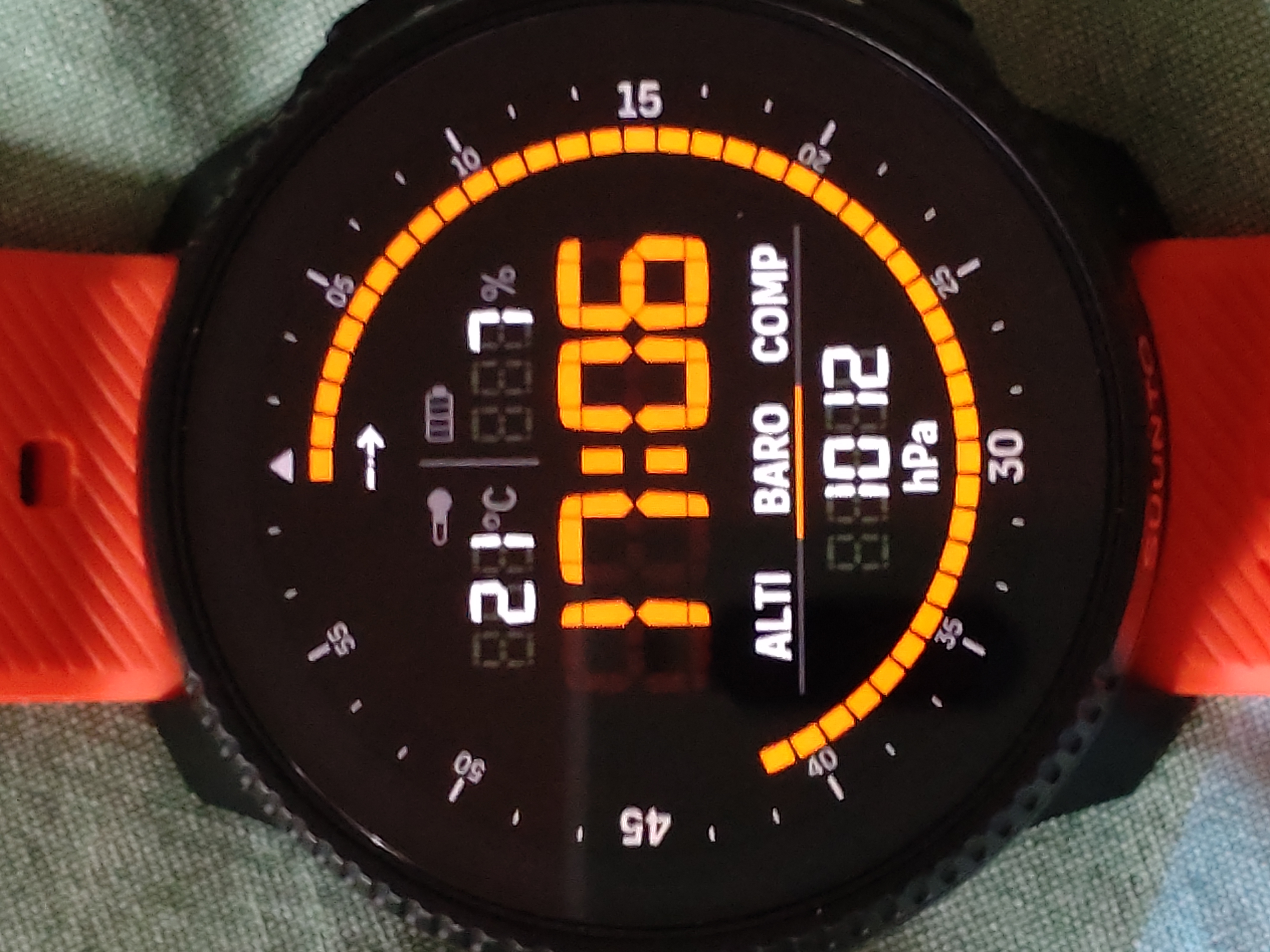
-
@Stefano-M64 said in Vector watch face - tone down digital shadow:
I think it’s a bug, since all should be clearly visible!
I don’t think it’s a bug (but I am not Suunto) - but my thinking is
The top icons/data is fixed > can’t be changedHowever, you can switch between “Alti” - “Baro” - “Comp” by touching the respective data.
What could make sense, if only the setting that’s acrive (Baro in your case) is highlighted - but that’s solved by the underlining of the Data-icon
What I would wish for in this watchface is that you can change the shown complications - at least in the upper part of the watchface
Hello! It looks like you're interested in this conversation, but you don't have an account yet.
Getting fed up of having to scroll through the same posts each visit? When you register for an account, you'll always come back to exactly where you were before, and choose to be notified of new replies (either via email, or push notification). You'll also be able to save bookmarks and upvote posts to show your appreciation to other community members.
With your input, this post could be even better 💗
Register Login