Watch faces for less able eyes
-
@pacuro sorry, but none of the watch faces shown are looking good IMHO.
Race S
-
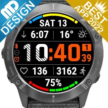
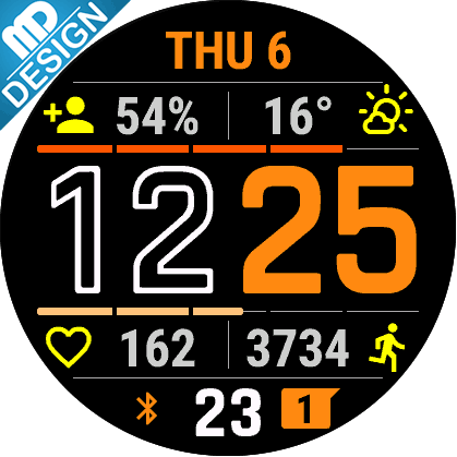
@2b2bff I regret some of my choices so I’ve removed them, but the ones left show how complications can be legible and not tiny fonts all the time.
-
@2b2bff said in Watch faces for less able eyes:
none of the watch faces shown are looking good IMHO
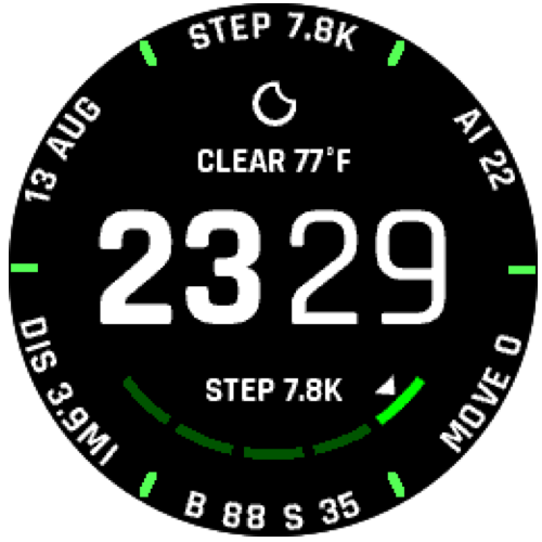
And this is OK. Above watch faces are just samples of what are the possibilities. I think this thread is not about one proper vision of simple watch face. I and probably others too need some watch face which is not another one with weird big font clock and two or three ultra tiny font complications. Are not there any regular medium font? I hope suunto is going to make watch faces creating open.
-
@pacuro That is exactly my point! Sure make the time bold but it doesn’t have to be massive at the expense of complication fonts.
Come on Suunto, you can do it!
-
@Steven-Hambleton this is one reason why I moved back to vertical 1 from Amoled since the watchface when dimmed the font are outside in sun unusable with today’s small fonts.
Hello! It looks like you're interested in this conversation, but you don't have an account yet.
Getting fed up of having to scroll through the same posts each visit? When you register for an account, you'll always come back to exactly where you were before, and choose to be notified of new replies (either via email, or push notification). You'll also be able to save bookmarks and upvote posts to show your appreciation to other community members.
With your input, this post could be even better 💗
Register Login