New watch faces - who wants these?
-
Other than that I personally found vast majority of watchfaces in Garmin ConnectIQ store is ugly and poorly designed.
They typically have one well designed watchface per new model and that’t it. And then thousands of copies of that in store and just lots of ugly faces.
I really like Suunto goes not that way.And I’m not fun of spending resource on doing just one time gigs, but those Christmas/NY watchfaces they are surprisingly nice. But ofc not a replacement for year round watchfaces, those new will come as well. But slowly and well designed.
And who knows, maybe third parties can make their own watchfaces for Suunto in the future…
-
Nihil novi sub sole. Want Garmin? Get Garmin. Otherwise, let people have fun.
I don’t want or need those new watch faces, but no one is forcing me to use them. Some people like them.
Despite how sports watches are being marketed - I believe most people who buy them don’t do sports at all or do very little of it.
-
In the end, this is a matter of preference and a tradeoff between functionality and bling bling, and Suunto has sadly opted for the former above all. Even so, most of the watch faces could do with a bit of a bling bling without sacrificing the functionality (maybe a bit of battery life because of the extra pixels used). Now, especially the qualities of the Amoled display are mostly wasted, and even the ones that try to use some color get it mostly wrong - let alone having some nice shading, 3D effects or other subtle graphical details in them. There’s very little excitement and adventure, only boring blocks and lines of single color. Even those few complications offering preselected colors only really work well with certain, limited accent colors. It seems like the MIP displays dictate most of the decisions behind the faces. Let’s hope all this will change next year as we hopefully see even 3rd party faces and Suunto upping their game.
-
While I personally don’t have any need for a Christmas tree on my watch, the last thing I would want is for Suunto to start copying Garmin’s design language, for the industrial design of the watches themselves as well as for the watch faces. One of the main reasons I’ve been using Suunto watches for almost a decade is that the design is pleasing, understated, and minimalist, especially with the newer generations of watches. In comparison, Garmin (to say nothing of Coros, who is even worse) makes some of the ugliest watches and watch faces out there. Your mileage may vary, of course, but as someone else here said—if you want a Garmin, get a Garmin, and let Suunto do their Suunto thing.
-
If you don’t want them… don’t use them… I buy Suunto watch because it does what it is intended to very well. Sure I may rotate/change a watch face here and there but it’s not impacting my love of the watch or the functionality.
-
@daffydzar I don’t think you should be voted down. C’mon folks. But I like the XMas and New Years watch faces. I do not like Garmin watch faces, too complicated, small fonts and downright ugly. I prefer simple and uncluttered. That is why I prefer Suunto and the Modern Analog my favorite.
-
My kids think it’s awesome that my batman watch (because it has a flashlight on it) now has a Christmas tree.
Pretty awesome little surprise and surely not the only watch face planned for the next year
-
You’re never going to please everyone all of the time, I think if having lots of choices for watchfaces is something that’s important to you maybe Suunto isn’t the best option. Overall I like what Suunto does with theirs; there are some that I will never use (the new Christmas ones come to mind), but there’s usually always close to half a dozen that I like to rotate. I’m quite old school so I prefer the analog versions - one thing I have asked for in the past and would like to see is the option to keep the seconds hand displayed
I’ve had Garmin, COROS and all of the other brands and for me Suunto’s watchfaces just look classier with enough customisability to have displayed the metrics you’re wanting to see. Good job guys

-
@Egika blue is awesome also on my wife’s S9pp

-
@MiniForklift Coros’ watch faces are BRUTAL
-
A new regular watch face would have been nice and not four for christmas and new year.
But what i really like - and I would like to have that for all the other watchfaces - is that the „new years fireworks“ Shows the Date also in always on mode. Please Suunto give this feature to all watchfaces.

-
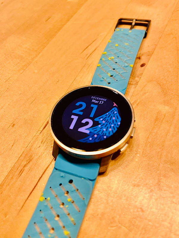
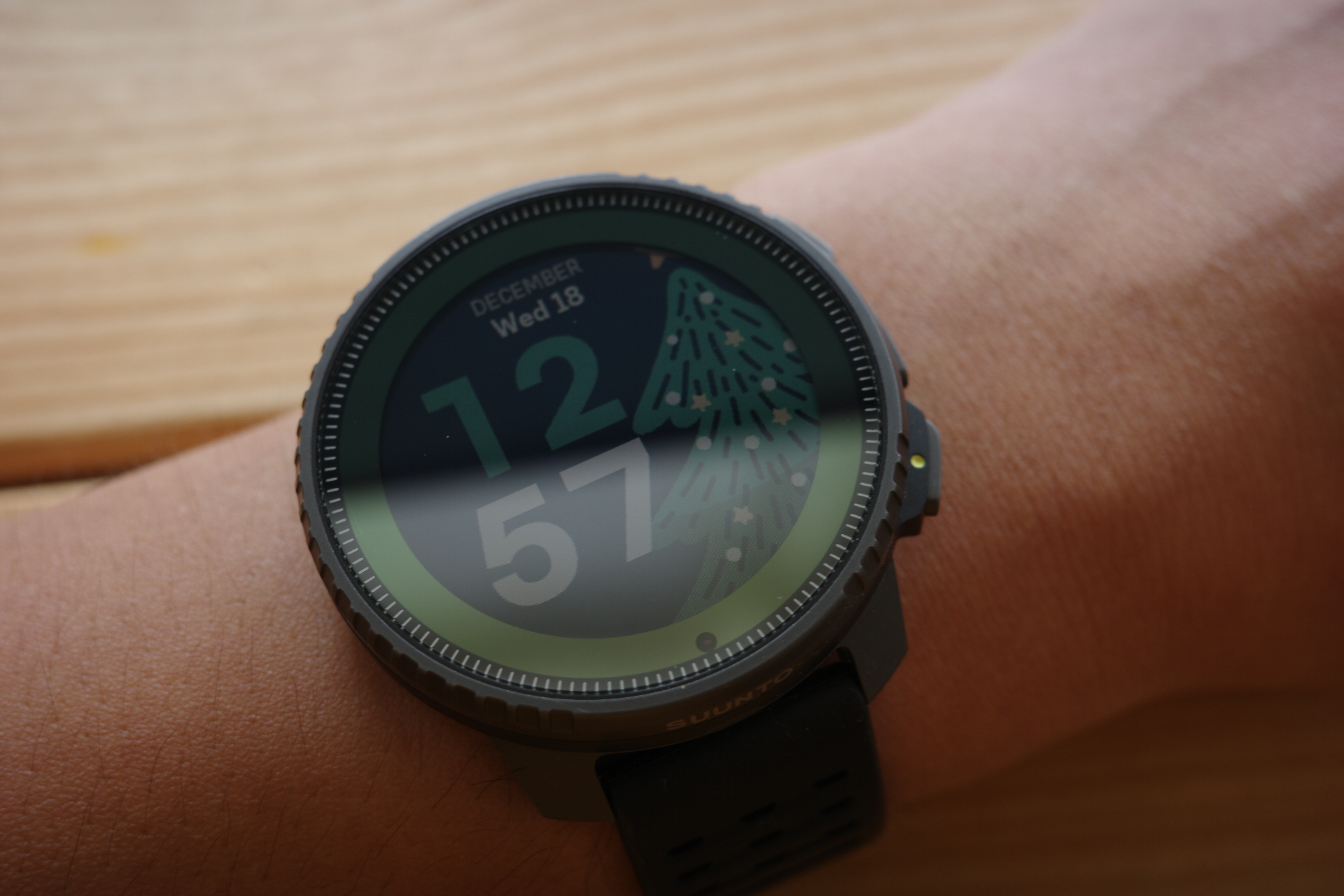
The new festive watchfaces are a nice surprise!
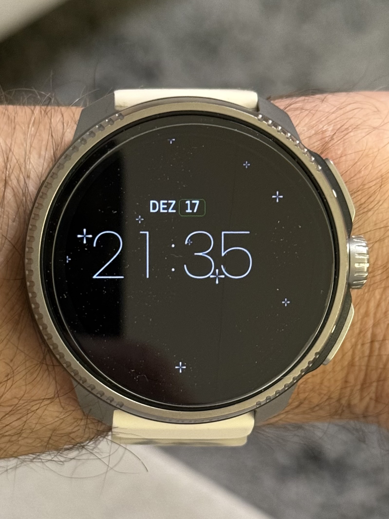
I personally like the christmas trees’ Always on mode, it reminds me of neon lights - maybe inspiration for future watchfaces? Clean lines with a pop of colour!
I don’t dislike the current watchface selection and love the simplicity of some, but i do believe there is some room for improvement, namely:
- Polishing/fixing jagged lines in some watchfaces (especially analog clocks).
- More complications on Watch faces.
- More use of colours - why have a vibrant AMOLED screen if most elements are black and white and better suited for MIP?
- Accessing widgets when long-pressing complications, why is this feature still buggy and not fixed?
In the future i hope third-party watchfaces is available, i think it will not only provide us all more options, but it will also increase Suunto’s audience such as consumers, designers, etc.
-
Warm & festive!
I was using Modern Analog face watch which is the perfect watch face for me to have both compact datas + analog clock. After switching into the Christmas Tree face can really take a rest from datas on wrist


-
@Bastienhere said in New watch faces - who wants these?:
The new festive watchfaces are a nice surprise!
I personally like the christmas trees’ Always on mode, it reminds me of neon lights - maybe inspiration for future watchfaces? Clean lines with a pop of colour!
What is so special about the Always on mode?
-
@Mitch9 the energy saving standby screen with just the outlines of the graphic.
-
I isazi moved this topic from SuuntoPlus™ Store on