Update on dive mode screen
-
Hi,
During the dive it is not convenient to press buttons looking for information that is hidden from the diver.
An updated layout screen in the dive mode including: current depth (included), max depth, dive time (included), NDL (included), tank pressure and temperature would be great.
Suunto ocean has a big OLED and the dive mode has a lot of empty space on the screen. I’m sure it is possible to include a lot of information.
I know that some information can be found in the switchwindow, but it is not the best way to present them. An all inclusive screen is the most appropriate choice.
-
If possible through customization, that would be great. Otherwise I would not harm the simplicity and clarity of the screen with to much info.
SME-ML / Solution / EON / Cobra / Cobra3 / D6 / D6i / 7 titanium
-
@jwil02 I understand your point.
It is a powerful computer, we can have both screen types and a third one fully customizable.
The current screen is a lot simple, the diver must be focused on diving, not on searching hidden information in the watch.
-
More information on the screen helps a lot. This review mentions about the screen layout.
-
Another review. Again the reviewer mentions that the dive mode screen needs an update.
-
Suunto D5 includes more info on the screen than Ocean:
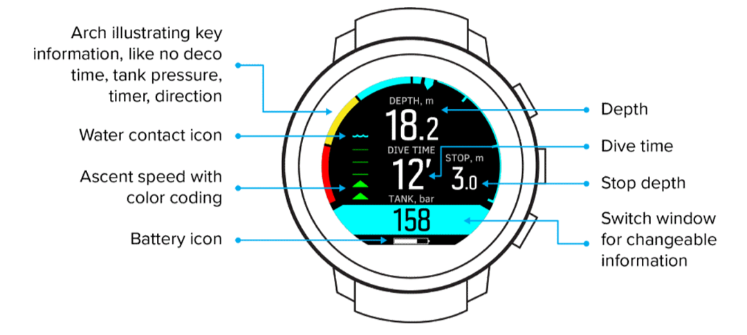
Suunto D5 - 8 info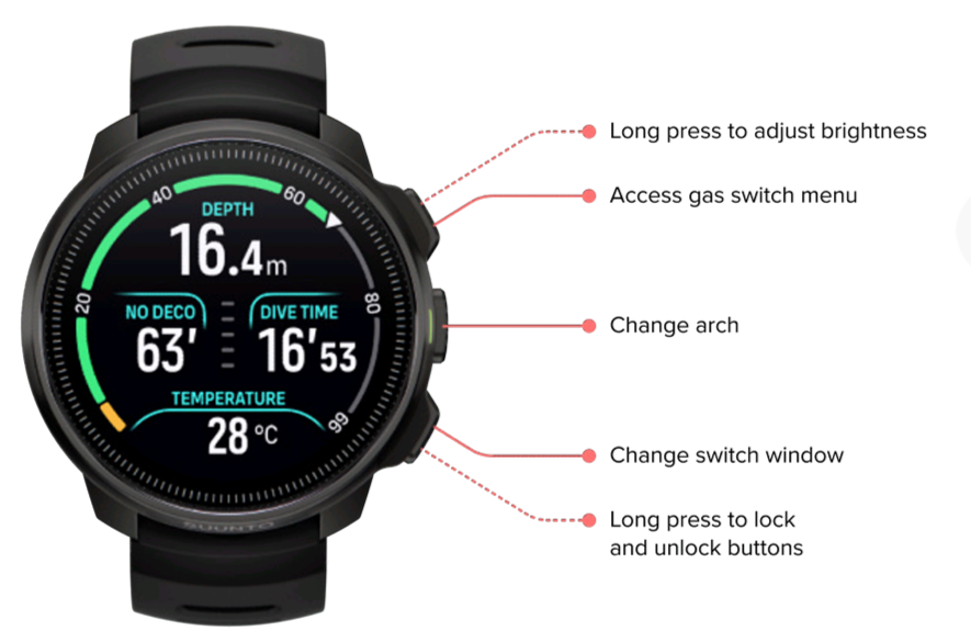
Suunto Ocean - 5 infoAn advanced screen, not so beautiful, but having 9 or 10 selectable info would be amazing.
-
Just a screen suggestion for an “Adv Screen”. I’m sure suunto layout designers will do the magic:
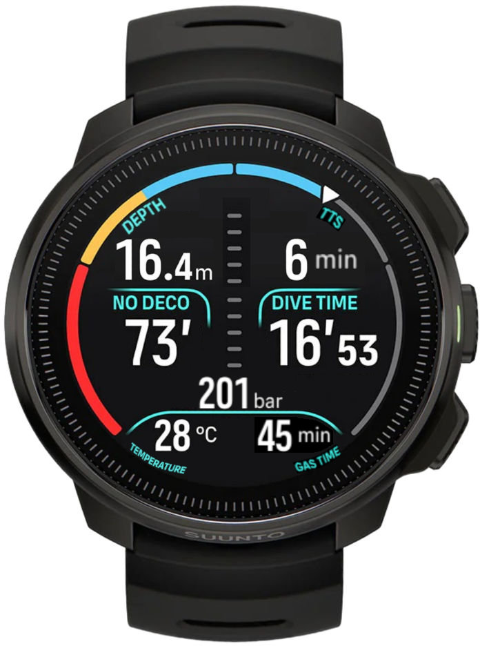
Basically, we have 7 boxes (at least 4 customizable by the user) additionally we still have ascent speed and the arch (able to be switched by the user).
With this simple update it is possible to have 9 info on the screen. For divers it is a lot, as our main use is not to increase our sport performance, but to prevent health issues.
-
Another review that also says that the dive screen needs to present more information.
-
@diogao13 said in Update on dive mode screen:
Just a screen suggestion for an “Adv Screen”. I’m sure suunto layout designers will do the magic:

Basically, we have 7 boxes (at least 4 customizable by the user) additionally we still have ascent speed and the arch (able to be switched by the user).
With this simple update it is possible to have 9 info on the screen. For divers it is a lot, as our main use is not to increase our sport performance, but to prevent health issues.
This is a really nice mock up.
I’d happily live with this as a single screen.
With the buttons, one changes the arch, one the left field, one the right field, and a long press on any changes the brightness.
What I would like in the config is to turn off the data points that I don’t care about.
-
I agree, this would be great! Just don’t forget to include the compass in those button functions!
-
All reviews mention about the lack of customizable dive screen
-
D diogao13 referenced this topic on
-
@diogao13 said in Update on dive mode screen:
Just a screen suggestion for an “Adv Screen”. I’m sure suunto layout designers will do the magic:

Basically, we have 7 boxes (at least 4 customizable by the user) additionally we still have ascent speed and the arch (able to be switched by the user).
With this simple update it is possible to have 9 info on the screen. For divers it is a lot, as our main use is not to increase our sport performance, but to prevent health issues.
This would be a great watch face, please Suunto go ahead on that !
-
D diogao13 referenced this topic on
-
I’m also finding diving with the Suunto Ocean difficult due to the design of the dive mode screen.
- I have air integration, and need to have tank pressure always visible.
- I need to always have compass heading displayed, and it should show a visual north indicator like in regular compass mode.
- I would like the ability to mark / save a heading (the outer ring / arch area would be ideal for this). Shearwater Teric does this really well.
To achieve this I’d like to have multiple fields in dive mode that I can configure to display the information that I need for that dive – I’d be fine doing this in a pre-dive settings screen to keep the dive mode itself simple.
Cycling through all the bottom window options is very cumbersome. It’s particularly problematic when I have the heading displayed and someone asks me for my remaining air as it’s taking too long and leading to a stressful situation. I am spending too much time looking down at the watch, cycling through options and often overshoot.
For any information display area that is changeable in dive mode, I’d like to be able to configure which pieces of information are available for being cycled through to reduce the number of presses. Again this could be configured pre-dive.
I do love the Suunto Ocean as an activity watch, but it is frustrating as a dive watch and I would not recommend it with the current software. I’m considering selling it. I hope the software can be improved.
-
G garethm referenced this topic on
-
Waiting for the next update

-
@garethm I have the same issues with lots of time wasted scrolling through the bottom of the screen to find my air tank pressure and the compass, while having to scroll through many metrics that I don’t need or use. It would be great to turn off the metrics I don’t want or customize the main screen so that I can view the metrics I need at all times. I also echo the request to save a heading on the compass. We often run line transects on a specific bearing, and it would be nice to have a visual indicator of how far to turn left or right to regain the proper bearing, as was possible in the D5.
I look forward to a software update that allows for this customization of the dive screen. -
@ogillot thank you Suunto for this update but we really miss the dive screen with seven parts !!! It’s a deal breaker for me and even if I prefer Suunto, I would have to switch to Garmin MK3
-
Il manque la personnalisation sur l’écran plongée oui, comme sur le Teric shearwater. A vous de jouer monsieur Suunto
 .
. -
@Topette49 it would make sense to speak English in an English forum. Nobody who isn’t French will understand you. You can use google translate or deepL to easily translate between English and French. That way, we can keep the discussion senseful.
-
@Flops There is no customization on the dive screen, yes, like on the Shearwater Teric. It’s up to you, Mr. Suunto.
Voilà.
-
@Topette49 thank you - merci beaucoup.
And yep, that’s an issue I’d too love to be addressed.