SOFTWARE UPDATE 2.35.34 Q2
-
@The_77 said in SOFTWARE UPDATE 2.35.34 Q2:
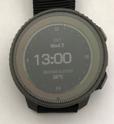
Unrelated feedback on this new watch face - be nice if the hours/minutes were moved to the centre when the seconds disappear after a minute or so. Just not as pleasing when the time is left shifted.
Equally low-grade gripe:
Along with that centering, the numbers could use some kerning. And the Vertical’s oblate separator dots don’t help:

-
Should we able to zoom in/out the altitude graph of a navigated route?
I see +/- near upper button, but quick click doesn’t do anything, and long click is opening multisport switch
-
 E EzioAuditore referenced this topic on
-
@Mff73 i’m following a route right now : short clic on +- switches from whole route (the same as before) to « guidance »
Don’t know it it is related to route guidance, but map fluidity is erratic
[edit] : same erratic fluidity on map screen with « petit poucet » instead of following route
Also distance to next turn indication on map screen is really big. No possibility to hide/show ? -
@Dimitrios-Kanellopoulos @isazi Longpressing a complication now opens the full screen view of the corresponding widget. Unfortunately this does not always work. Maybe once out of 5 tries on the Race. And if it works, it takes about 4 to 5 seconds. I am currently using the new analog watch face. Can anybody else reproduce this?
-
@wmichi said in SOFTWARE UPDATE 2.35.34 Q2:
@Dimitrios-Kanellopoulos @isazi Longpressing a complication now opens the full screen view of the corresponding widget. Unfortunately this does not always work. Maybe once out of 5 tries on the Race. And if it works, it takes about 4 to 5 seconds. I am currently using the new analog watch face. Can anybody else reproduce this?
yes. and known issue
-
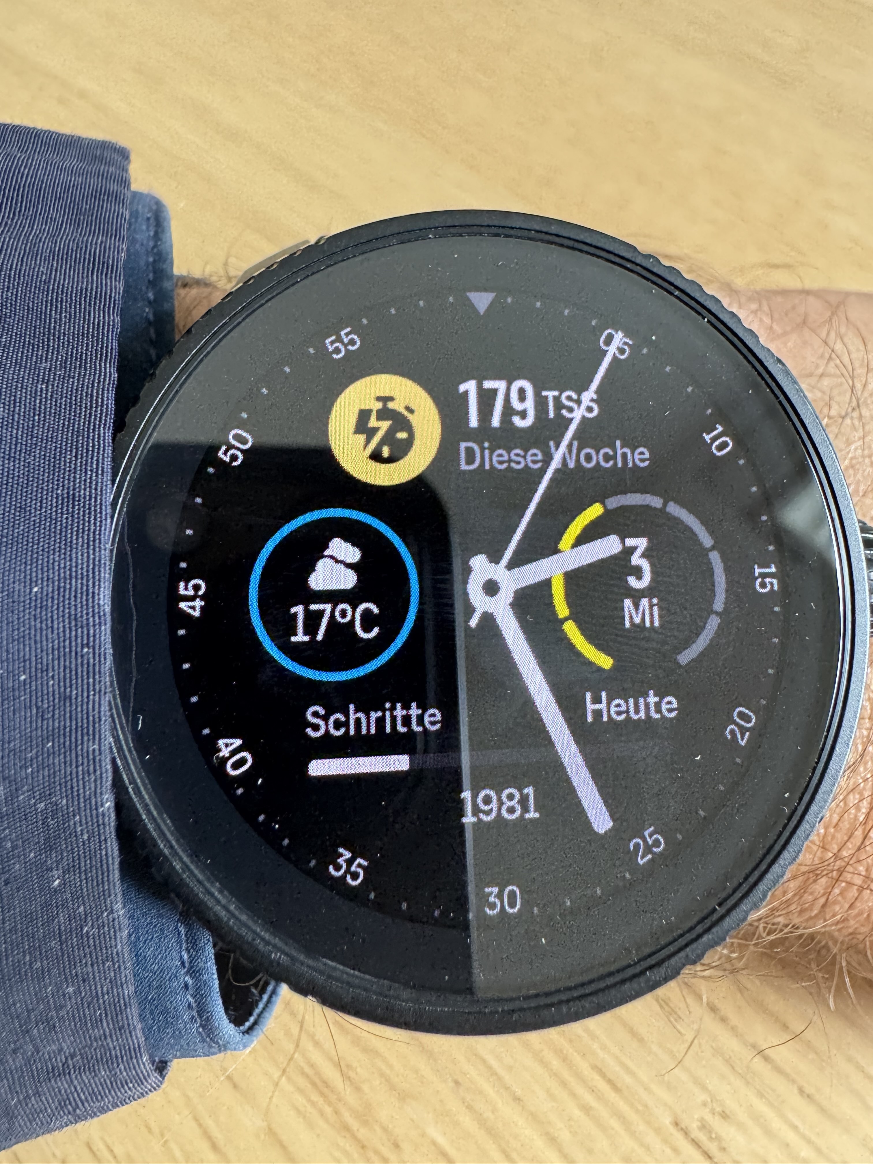
Can you please tell me what the yellow bars around the date represent. Thanks

-
@Patrick-Löffler-0 said in SOFTWARE UPDATE 2.35.34 Q2:
Can you please tell me what the yellow bars around the date represent. Thanks !
Is is the day of the week. 1=Monday, 2= Tuesday, 3= Wednesday
-
@Egika Thank you very much.
-
UI speed improvement is very noticeable on the Race. It was more than good enough before, but now we can fly through the widgets without any stuttering. Great Job!


-
Great updates. So pleased to be able to lock the screen while paused.
I will never be on board with horology’s use of the word ‘complication’ though
 , especially when smartwatches can be prone to the other sort of complication.
 -
zoom seems to be up to 25m on my Race
by the way, what does it mean “data tooth during navigation”?
-
@Stefano-M64 It means you will see distance to next waypoint in navigation or distance to turn at the bottom of the screen. (The tooth).
-
@Stefano-M64 said in SOFTWARE UPDATE 2.35.34 Q2:
zoom seems to be up to 25m on my Race
by the way, what does it mean “data tooth during navigation”?
Read thread; https://forum.suunto.com/post/147345
-
OKKEY! thanks to both!
-
Thanks for the update.
It’s great to see that there’s ongoing effort on optimizing GPS, HR readings and also on battery, where’s an area that Vertical and other watches are already the best on the market.
The enemy of the good is the better as we say in Greece.
I tried the customisation, I ll miss the toggling feature for the mini widgets but I can live without it.
It would be nice though that the new ones (like Resources) would be as colourful and shiny as the old ones (the CTL, HRV etc). Right now on my Vertical I am using the watch face introduced with the Race and prefer the CTL over the Resources one just to have some colour, although data-wise I would prefer the Resources one. Also don’t like the three dots solution for spacing. Maybe an icon or just the status of “Inactive” etc would do.
Fingers crossed for bug regressions

-
Just did the update, I was on the december FW until now because of AoD management on 2024 Q1 FW. Didn’t do any exercise today, but will try it more.
- Ui speed is really noticeable, good job.
- FINALLY display management per exercise
- Love the new WF customizations and complications
- Auto map recentering is great. I really didn’t liked double tap to recenter.
- New pause screen is good addition
Good update, SR is now more complete sport watch. I will go for a bike ride afternoon to try climbing features.
-
P pavel.samokha referenced this topic on
-
Great job Suunto!! Excellent update with a lot of very nice features. Have not tried all yet but that I saw was really good.
Changed my watch face and now I have the baro on the display. Nice feature for outdoor enthusiasts. And I like the new zoom factor on the map! Gonna try the other features on a bike ride this afternoon

Hoping for the power nap feature with the next update

Keep on running like this

-
Is there any page where we can see all available watch faces and available complications per watch face?
-
Great job, Suunto! Thank you. My watch is now not only sport watch but more smart watch. I will definitely order Suunto Race S for my wife.
I will not repeat what I like, could you pls continue with improvements (e.g. active complication on watch face could navigate to widget with detailed information after one tap. Like weather icon - tap - weather widget)
-
I’m quite impressed by the many improvements!
the ability to move forth and back across the displays was exactly the feature I missed more while hiking during my past vacation, having to cycle across all of them just to go to the previous one was really nasty. Also having the navigation information now shown on the bottom is great!I urgently need another vacation for testing purpose

As a personal taste, I find the yellow segments indicating the days in one of the complications contrasting too much with the chosen accent color, maybe in a next update they could follow the accent color as well.