SOFTWARE UPDATE 2.35.34 Q2
-
Ok, this may be easily one of the best updates ever to happen to a Suunto watch because of so many QOL updates and features.
Cycling screens back and the navigation issue
I was personally super happy when I heard that it’d finally be possible to cycle back through screens during the workout.
There can be as many as 7 screens during the workout, and cycling through them if you just want to see what’s on the next one is very cumbersome and discouraging to actually use the features available in a Suunto watch.
When I had S5, I used to set up the data fields in such a way that my most-used screen was next to the navigation. It was very useful as I could switch back and forth between the navigation and the data screen I used the most or cycle back another time to see the data fields I rarely used (like ETA, sunset, etc.).
So I was super happy to see that I’d be able to use the same strategy with S9PP. And then I tested this and was disappointed that after so many adjustments that had to be made in order to allow for the back-cycling to work - the navigation screen still invokes the zoom controls when holding the middle button.
This is confusing - to say the least. It seems as though it’s possible to cycle back from any screen, but breadcrumb navigation.
This seems like an easy fix, though (from the UI perspective): Move zooming to the top button. Not only will it allow for cycling back screens, but also will be in sync with the revised vertical navigation screen, where zooming in and out of particular zones is done with the top button.
The only thing that’ll suffer from this change is multi-sports mode, which can be accessed from any regular data screen regardless.
No frills pause
There isn’t much to say about this, really, as it should have worked like this since the dawn of times. Why was there a screen with random data being rotated and not the actual data fields, painstakingly set up by the users? I’m glad that the old pause screen is gone.
Climb guidance
Oh, looky! The Let Me Disable This Useless Screen (abbreviated hereinafter as LMDTUS) got a shiny new update and isn’t that bad anymore!
I can find it useful, especially that it doesn’t require an S+ climb app to produce similar data during the workout. And it somewhat works as a zoom feature, which will be handy for long routes, where the default view of LMDTUS looks like a ridiculed comb.
The only thing I’ve noticed is that there’s no control over what becomes an uphill or a downhill. Perhaps, in the future, different profiles could be added in the route editing screen in SA that would adjust the weighting of hills so that more or less areas would be interpreted as actual climb sections? By grade or by length?
And hey, why can’t LMDTUS be disabled? Is it glued to the navigation or what?
Complications
I feel like a superhero, being able to set both the actual weather and the barometric trend on the same watch face.
It’s also great that not only simple temperature is available, but also precipitation and air quality. I can already taste the upcoming winter’s air while observing grains being harvested on today’s bike ride. Mmmm smells like plastic. I guess I’ll stay at home today.
Strangely, there are still limitations, like the lack of a barometric chart on the 9PP, but I suspect it was decided that it wouldn’t be readable and there were no resources to optimize it for readability.
Emojis
Call it dumb, but let’s face it - we all use it, and it’s a part of modern communication. Way better than a sad square. Or squares. Or more squares. Or… Is this broken squares? Because it certainly feels like broken squares.
Yeah, the fewer squares, the better.
Screen lock in watch mode
I have no use for this, but I always wondered - by seeing how often and vigorously it was requested - why it took so long to implement?
-
@Łukasz-Szmigiel said in SOFTWARE UPDATE 2.35.34 Q2:
Call it dumb, but let’s face it - we all use it, and it’s a part of modern communication. Way better than a sad square. Or squares. Or more squares. Or… Is this broken squares? Because it certainly feels like broken squares.
Yeah, the fewer squares, the better.
Disagree.
They’re hip. (Here. There. Everywhere.)
-
@Łukasz-Szmigiel I would think that not being able to go backwards from the navigation screen on S9PP is a bug and will be fixed, maybe using the same controls as the Vertical
-
@duffman19 can’t find them outside the video, it looks Suunto internal graphics, also hope they will be on the website but the updated documentation is also well made
I however think graphics are easier to understand

-
Surprised to not hear @freeheeler celebrate screen lock in time mode is live, some months back, he was being so annoying about it
 (in good way
  )
) -
I would think that not being able to go backwards from the navigation screen on S9PP is a bug and will be fixed, maybe using the same controls as the Vertical
What do you think about it’s no possible to stop/pause from the navigation (or altitude) screen on S9PP?
-
@isazi that would be great! How it’s implemented in Vertical?
-
@herlas yeah, he must be as happy as I’m with back cycling the screens

-
@Łukasz-Szmigiel said in SOFTWARE UPDATE 2.35.34 Q2:
How it’s implemented in Vertical?
Long press on middle button.
-
@Łukasz-Szmigiel top to zoom, middle to move backwards/forward, bottom for navigation settings.
-
@suntd yes I miss that too. It’s quite annoying tbh
-
@isazi this seems obvious. I was worried it somehow wasn’t addressed. Hope it’s really a bug and will be fixed soon. Thanks for the insight.
-
I’ve read a bit here and I’m not sure if anyone noticed this in map
The menu icons aren’t shown correctly after long press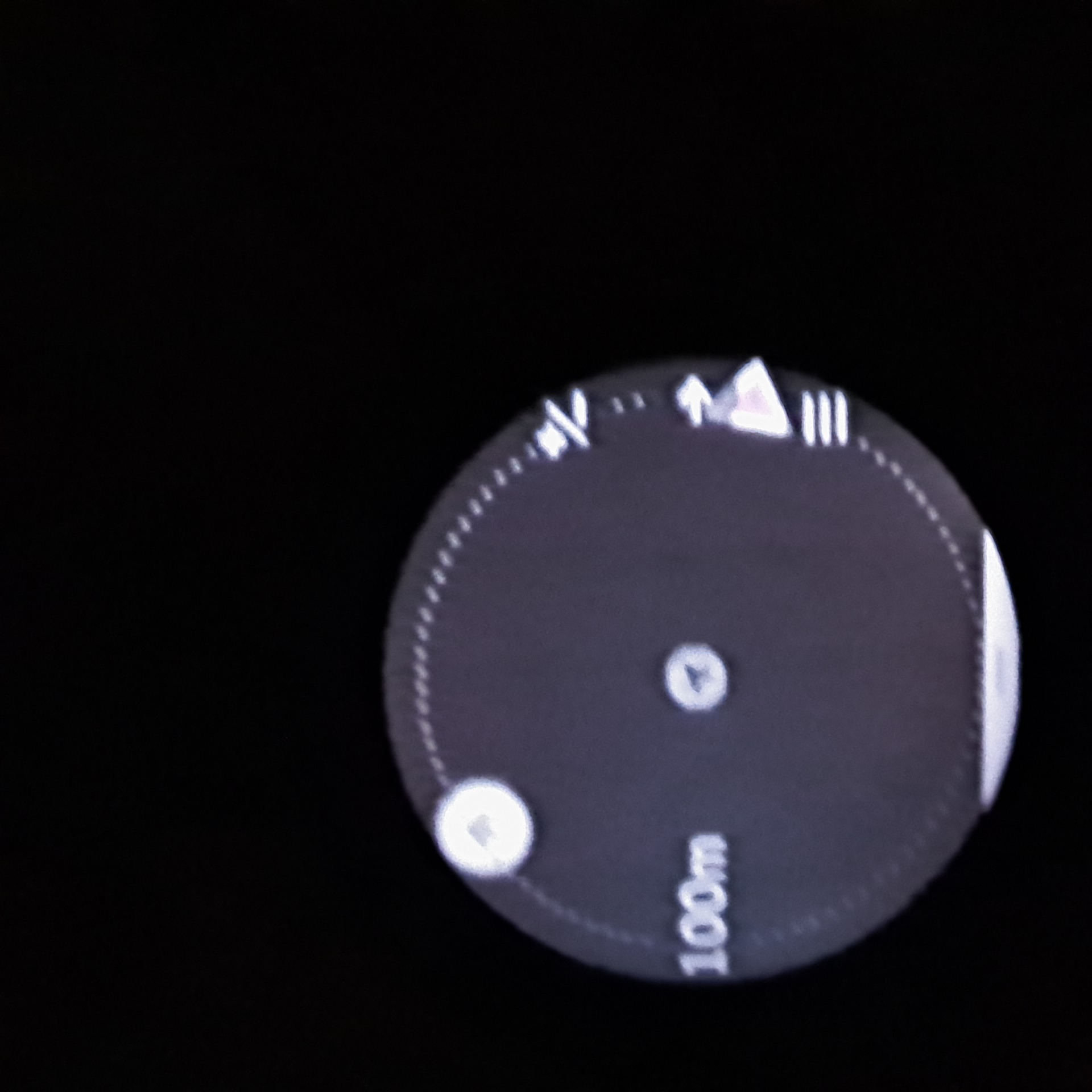
long press
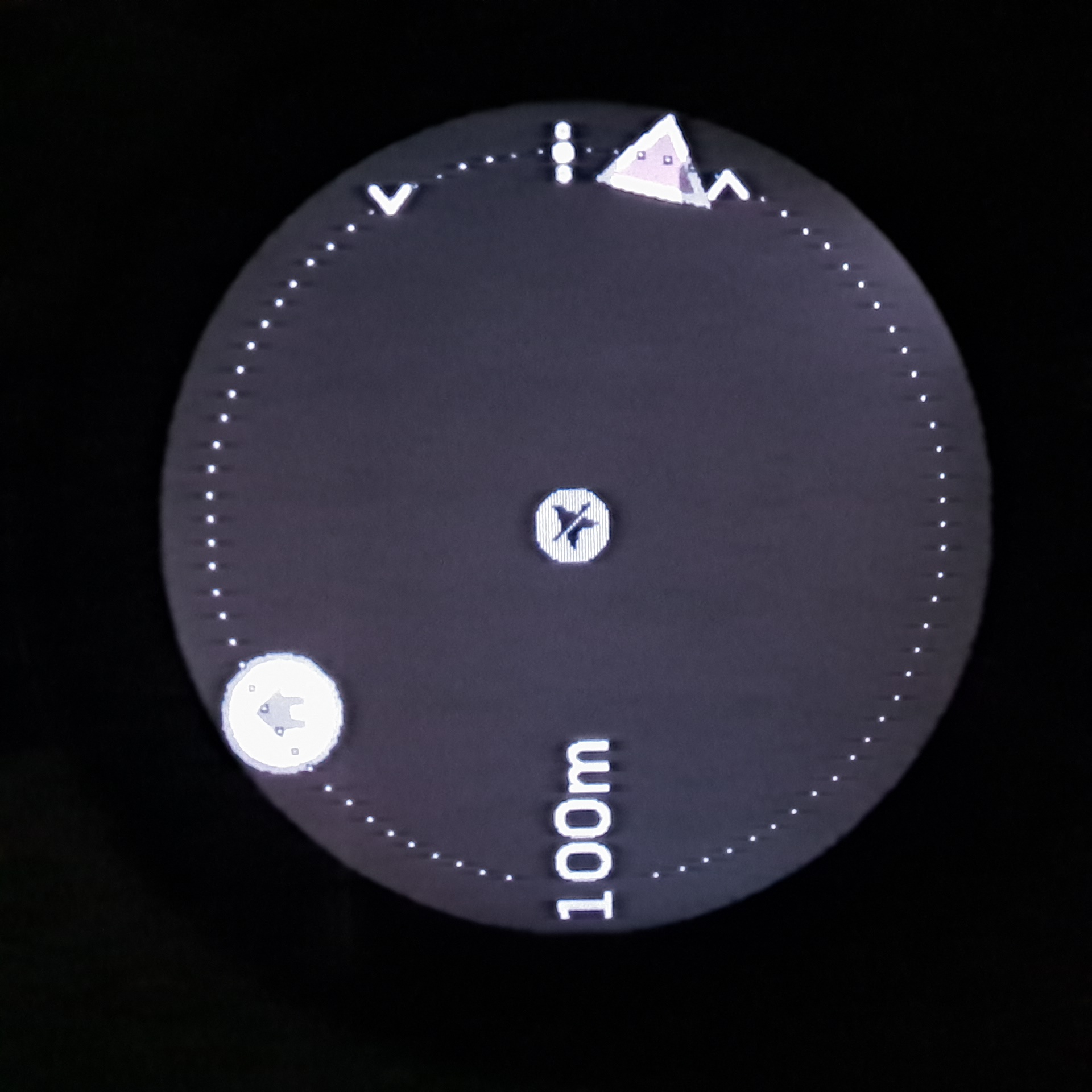
click on top button,
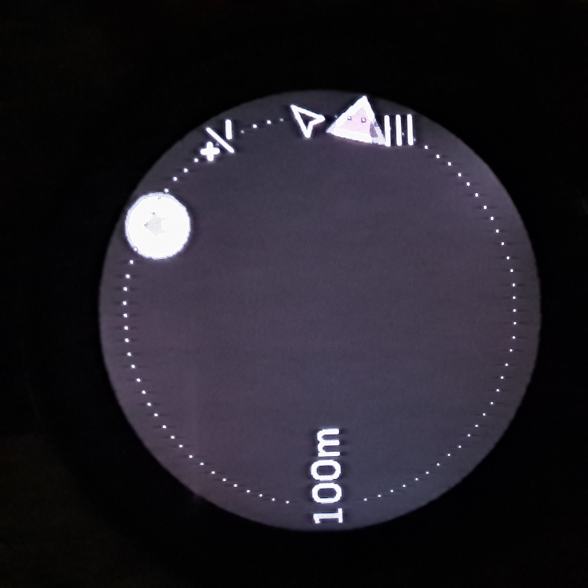
the menu is reverted to the previous state (almost, check the GPS arrow) but it still moves the map, as it should
-
@Łukasz-Szmigiel I’ll be sure to report it to Suunto tomorrow, if it’s not already known.
-
@sartoric said in SOFTWARE UPDATE 2.35.34 Q2:
I’m not sure if anyone noticed this in map
The menu icons aren’t shown correctly after long pressI can confirm this behavior. Also happens when trying to scroll up and down using arrow buttons and when using the touchscreen to scroll. However it does not happen when + and - are next to the top and bottom buttons (long press -> middle button -> middle, button). Seems most interactions with the map return it to the default button state. Makes using the maps with buttons only nearly impossible.
-
@isazi thanks, I appreciate it.
-
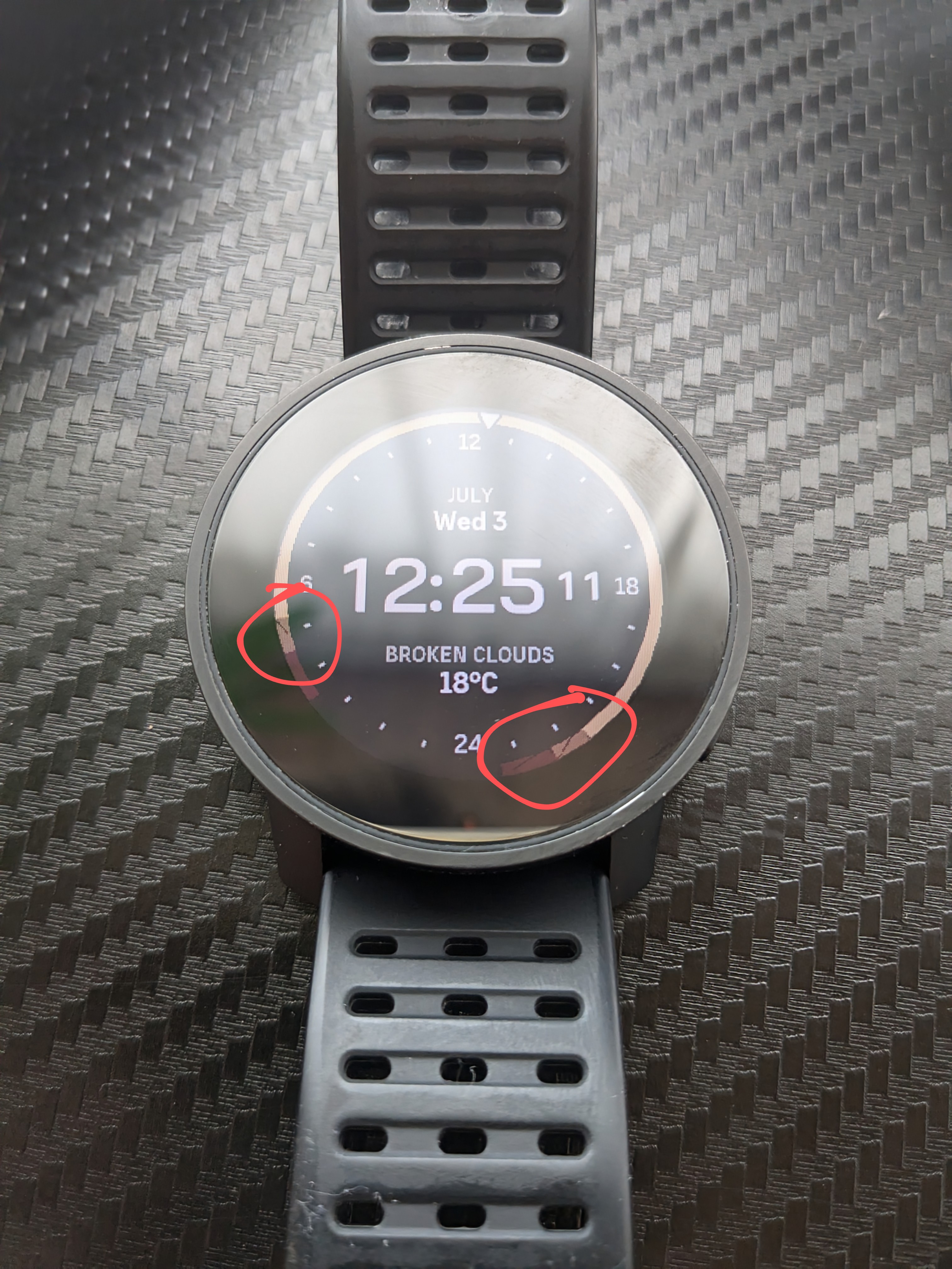
I had same bug on this watchface, with this kind of glitch on sunset bar. (not my photo)
Also noticed meters are missing from altitude. (first pic not mine, took from internet)
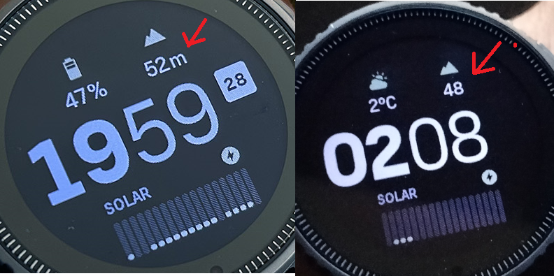
I would say its one of best/coolest Suunto update so far!
-
@Tami999 Tip: sunset doesn’t mean darkness

-
My suunto vertical freezed and was difficult to control. I just sent log.
-
@maszop said in SOFTWARE UPDATE 2.35.34 Q2:
@Tami999 Tip: sunset doesn’t mean darkness

I mean these graphical glotches when You zoom in photo.
