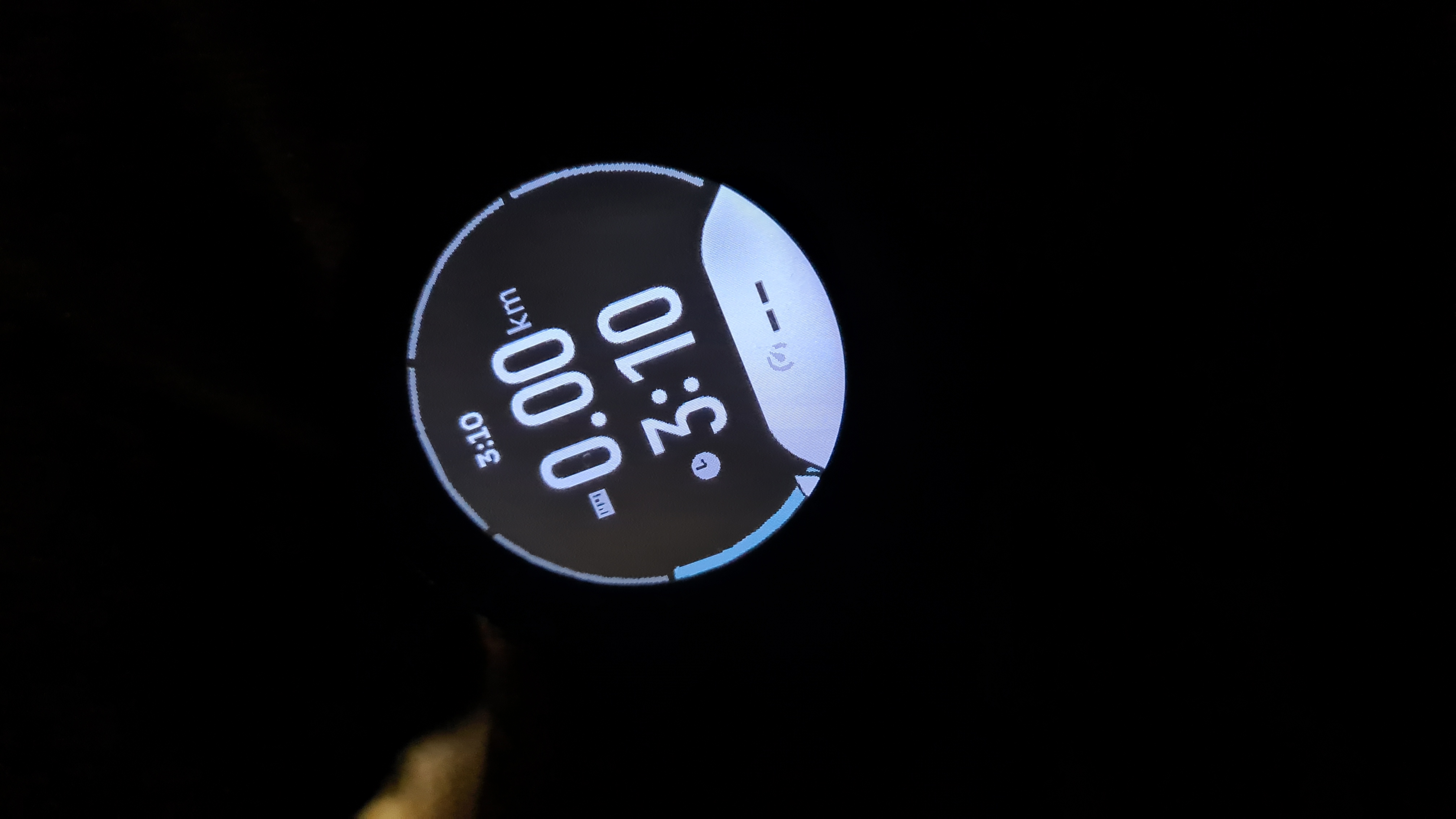
I'm going blind: I need bigger fonts!
-
One the main reason I switched from 9 Peak Pro to Vertical.
-
@enriqueescoms I updated from the Suunto 9PP (probably going by case size my fave Suunto) to the Suunto Race (much larger screen size) both because of the amoled screen for improved readability, and also bigger font size because Im getting close to 60 lol. I would still like ‘some’ of the watchfaces to have secondary data a bit larger, and also the clock in the upper part of the screen in sports profile is mostly un-readable to me without glasses (which I dont need for working out - running/trail running/cycling etc).
-
@enriqueescoms I dont think I agree that age related degeneration of eyesight is an ‘accessibility issue’, especially when generally eye glasses or corrective lenses work? Maybe you are just joking…

-
@mikekoski490
I hope it’s a joke -
I somewhere suggested to add an option tochange UI scale , like to add it to widget list. For me I need 2-3 click down button from watchface to see all my info, like weather, steps all numbers and fonts are big (vertical) would be cool to change it from 100% to 75% for example. For You it could be 100->125%. I know we have watchfaces but they not allow to have all info and in some points u need to choose if u want (for example) weather or battery level. I think it would be easy to implement.
For now we can see 3 widgets on screen at the same time when scroll down. I would like to see maybe 5 but just with smaller font. One shortcut button on vertical (middle button) is cool but could be more helpful in that way. I already set most-used/viewed widgets from top list to the bottom

Its already much better than in default interface when we had to press button X times to get widget we want, or swipe screen <- and -> so many times

-
@mikekoski490
For hour in sport mode, there is a dedicated data field available for customization.

-
@mikekoski490 Of course, yes, I’m joking a little. Well, I rather laugh at myself, rather than cry.

-
@Tami999 Yeah, it´s a great idea.
-
@mikekoski490 Yes, I have really considered it. Furthermore, the Race is a watch that I love on all levels. But its size is excessive for my small wrist.

-
@Mff73 Thanks! Yes, Ive thought of that but it bugged me to waste a data field for ‘time of day’ when its embedded already at the top of the watch.
-
@enriqueescoms
did you try the Race in real life on your wrist and checked the sharpness of the screen?
I find it very comfortable and despite me having big wrists I would say it would be a good compromise between size and your benefit of a bigger and sharper screen -
There was an update for the s9pp that improved the fonts as much as possible. It’s not possible to just increase a font size especially in sport modes.
There is a sport mode customization and a Suunto plus that allows to fix this issue.
However I am not sure if the request is for sport modes or just generic.
-
Yes please to larger fonts. Eyes starting to lose up-close focus and my arms aren’t getting any longer. I have an interim solution: I found a product called “Hydrotac” on Amazon that are stick-on (to glasses) magnifiers that I have cut down to a very small size and have stuck one on the bottom of my left lens of my sunglasses. If I look down at my watch through that little “sticker”, I can read my watch! Ideally, the watch would have adjustable font sizes, but for now this is OK.
-
@Dimitrios-Kanellopoulos
Regarding the font size
The suuntopuls “big numbers” shows three data fields. It would be very nice if it would be possible to determine in advance what data it will show. For example, I don’t want to see the time on this screen. It’s more interesting to see a pulse - in addition, giving the option to add three suuntoplus screens will help a lot in using this screen and more. Two other data screens are very effective -
Am I the only one who’d like slightly smaller fonts with the bigger margins instead?
-
@Łukasz-Szmigiel In my particular case it is not so much about the size of the fonts of the data fields, which with their size/space ratio gives a clean and orderly appearance.
It is mainly due to the rest of the size of other texts. Such as the time itself, turn indications, notifications, structured work texts, those of the new altitude section screen, etc.
Because statically and on the couch, okay. But running, cycling or whatever, with the reflexes, the oscillations and so on, they are almost impossible to read.
-
@enriqueescoms well, it is certainly hard to have one interface that suits small and larger watches.
There are places - like in the new vertical navigation - that reading the grade while having the watch mounted on the handlebar is unlikely when in motion.
It seems as if the tooth at the bottom was super large but the area in the top - very small to accommodate all the data.
There is a large disproportion between the two.
Perhaps it’s going to be improved in the future as it’s the very first public version.