Watch Faces - we need new
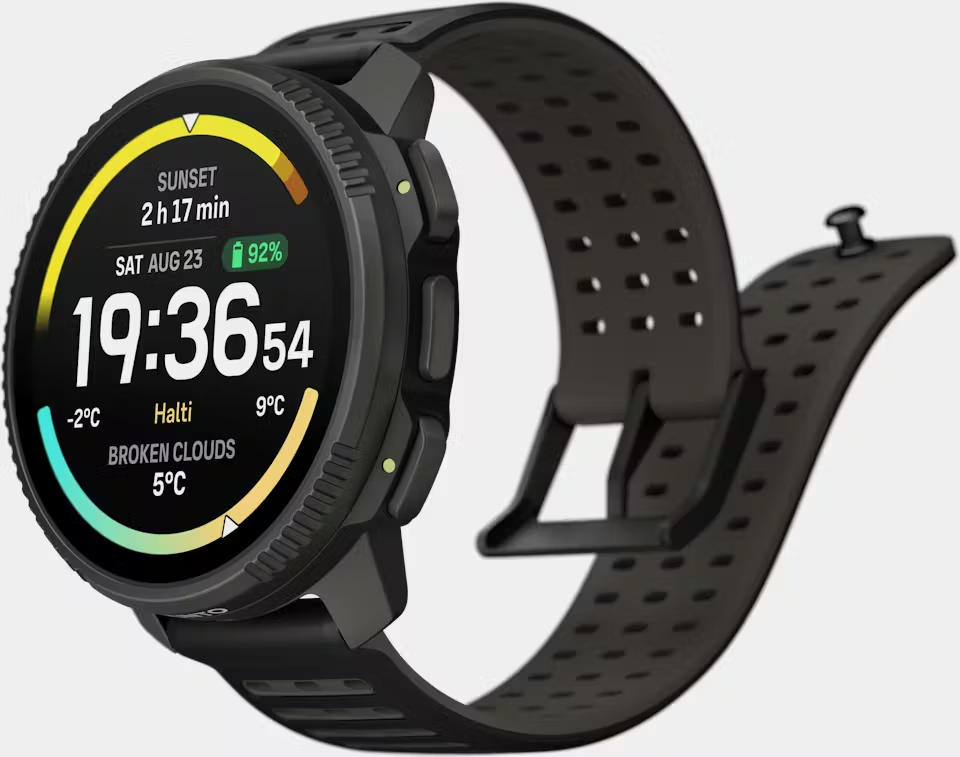
-
@vinc14 i imagine that now when there is kind of “store” with watchfaces in suunto app and we can choose one to install to watch. There must be some universal API that this watch faces are using. I hope one day suunto will open it to public, provide some tools to develop them. Than comunity can handle it and provide hundreds of watchfaces.
I know some will say that bad watch face can cause problems, battery drain, crashes maybe. But proper API would prevent 99% of priblems. And than still suunto can allow to users to publish comunity watchfaces with some tag that is comunity watch face and state that comunity watch faces are not covered by warranty and customer support.
And i hope same for Suunto Plus apps.
-
Sorry to disagree, I don’t need new watch faces.
More specifically, I prefer that Suunto developers focus on developing new functionalities and bugfixes in watch/app.
If they release a SDK so 3rd party people could develop new watchfaces, I will be happy to use new ones… but since only Suunto devs can do them, I will prefer they focus on new functionalities/bugfixes
BR
Ion -
@suzzlo totaly agree with this. For me current watch faces are enough, but i would like to try develop own if it was possible.
Suunto Ambit 2 > Suunto 5 > Suunto Race 2
-
I used to be in the camp of „there are enough nice watch faces“. But lately I wanted to turn my Race S into a dress watch. So, I need a watch face that is elegant and tuned down. The only one that fit the job is Simplicity Analog. But I think it could be more elegant with more realistic looking hands or so.
So, yeah. Room for improvement…
-
@Tomas5 Okay, so how does wfhub.net design and sell its own watch faces? Couldn’t we create our own watch faces using the Suunto app without knowing any software?
history:
Suunto Vertical 2 titanium Black (new:) )
suunto vertical solar titanium
suunto 9 baro
suunto ambit 3
suunto ambit 2
Suunto Smart Heart Rate Beltsuunto App: apple iphone 14
-
@safari to add, there should be more flexibility in the complications.
We can design or modify the activity displays in the Suunto app; so should be the watch faces.
-
@safari how should i know, thats question for suunto devs.
-
Personally, I like minimalist watch faces without dynamic animations that just drain the battery + some data statistics like steps, calories, date.
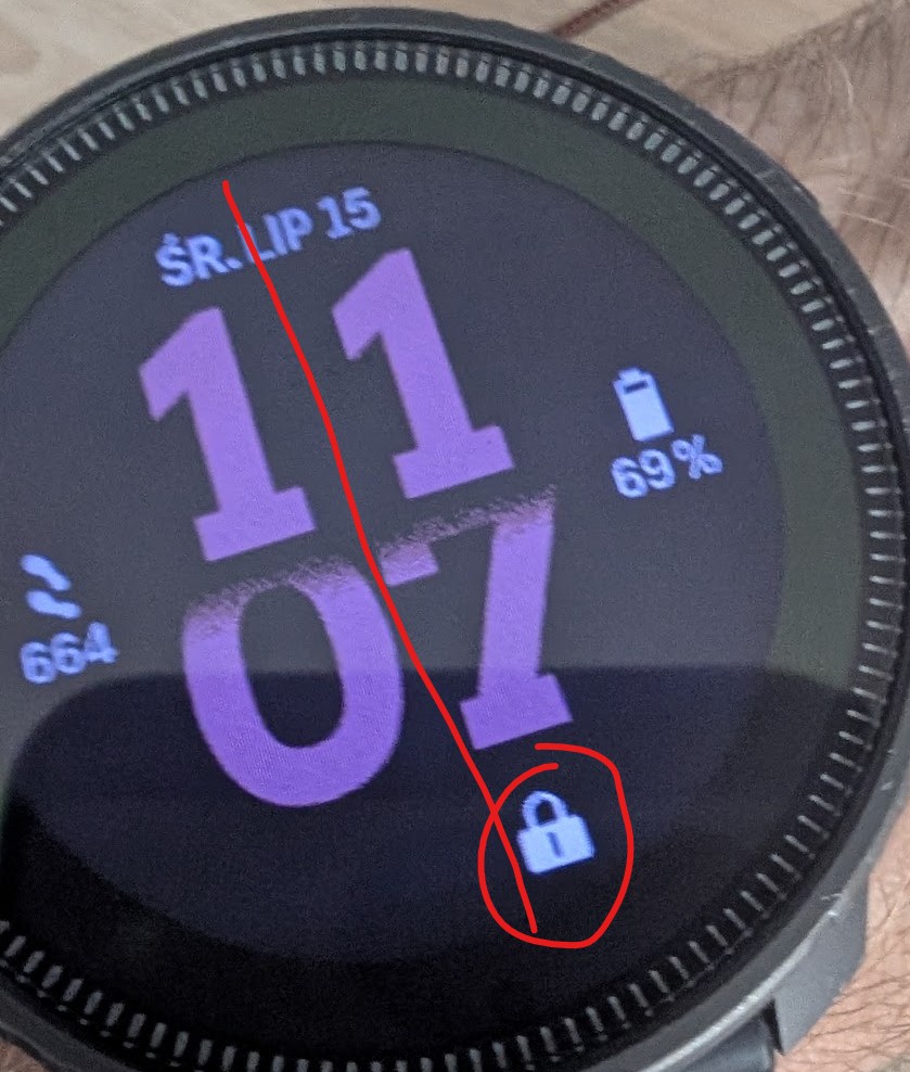
I’m using this V1 watch face, but who knows why the lock icon isn’t in the center! XD Why is it designed so poorly?
-
@Adrian.S Just guessing, that the room on the left is reserved for some other symbol. Like the storm warning or similar.
Until we know the answer I would not call it poorly designed. -






Hello! It looks like you're interested in this conversation, but you don't have an account yet.
Getting fed up of having to scroll through the same posts each visit? When you register for an account, you'll always come back to exactly where you were before, and choose to be notified of new replies (either via email, or push notification). You'll also be able to save bookmarks and upvote posts to show your appreciation to other community members.
With your input, this post could be even better 💗
Register Login