Python Model using FIT files to model watch analysis and display
-
When working on the Aerobic Guide it became clear that it would be difficult to verify the app solely through on-watch testing. To get better confidence and faster development I developed a Python model that could replay FIT files from older runs.
The elements of the test bench are:
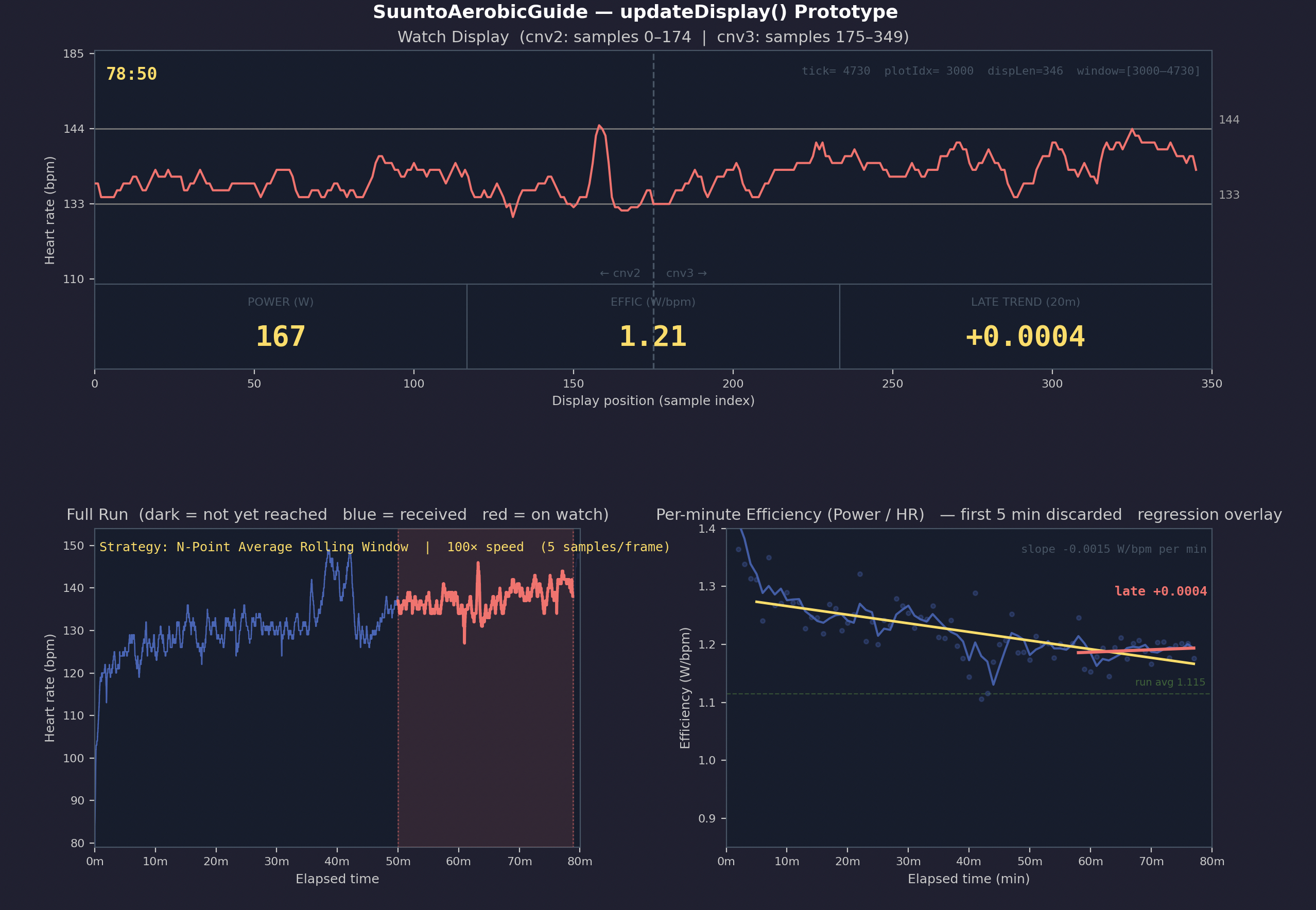
- Top chart — models the watch HR chart
- Dashboard strip at the bottom of the top chart — showing power, efficiency, and short-term decoupling as they appear on the watch
- Bottom left chart — shows the HR data for the whole run; the highlighted area is what is currently shown on the watch
- Bottom right chart — shows the 1-minute efficiency data (blue), full-run decoupling (yellow), and short-term decoupling (red), allowing visual comparison between the two decoupling approaches
How the Python model was used
Runs were selected from intervals.icu in three categories: good, middling, and bad. The FIT files were downloaded and converted to JSON.
I first modelled the HR chart display strategy. A 5-point average was found to provide a sufficient time span (29 minutes) to evaluate drift, or short-term increases in HR due to a hill.
For the dashboard strip the focus was on early indication of situations where you should slow down or stop. I found some runs where the HR chart by itself did not give a strong enough signal.
A good example is a recent bad run of 80 minutes.
Subjectively described:
- Felt very weak from the start; was not sure I would be able to complete the run, and managed only through force of will
What the model showed:
- Continuous hyperbolic decline of efficiency, no plateau reached, late slope still negative
- The HR chart showed only a modest excursion above Z2 — a situation that would not trigger concern on its own. The efficiency data told a different story: the body was not responding well and showed a continuous decline throughout.
Other observations
- All runs examined started with a high initial efficiency, around 1.4
- Good runs were characterised by a rapid downward trend to about 1.2 within 5 minutes, followed by a stable state
- Middling runs often had a longer decline to lower efficiency levels but still managed to reach a stable state
- Bad runs never found a stable state
- In bad runs the initial decline may last 20–40 minutes. A full-run decoupling figure is then dominated by that initial drop, making it misleading. Later stages may show zero decoupling or even an upward slope — this is why the standard full-run decoupling may provide the wrong indication.
Conclusions
From these tests the short-term decoupling metric was selected and implemented on the watch. I am still evaluating whether this approach provides the right early feedback.
The Python model allowed faster iterations than testing on the watch alone, and is an approach I would recommend.
Hello! It looks like you're interested in this conversation, but you don't have an account yet.
Getting fed up of having to scroll through the same posts each visit? When you register for an account, you'll always come back to exactly where you were before, and choose to be notified of new replies (either via email, or push notification). You'll also be able to save bookmarks and upvote posts to show your appreciation to other community members.
With your input, this post could be even better 💗
Register Login