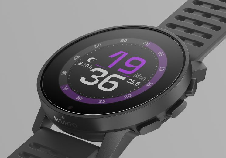
New watchface - AeroSport
-
@dulko79
 Fixed, thanks
 -
installed! it looks great, thanks!

-
@pavel.samokha
These types of interfaces don’t mean much to me.
But thanks anyway.
I like interfaces where I can access multiple data when I raise my arm and look at the screen. In classic, classic analog (it would be great if it was colored like rangelands analog) and in sport, of course athletics. -
@pavel.samokha Sorry for the OT, but are there complications planned for the Vertical Week WF?
🔺Vertical All Black
ex:
Ambit2 Black
Ambit3 Peak Sapphire
Spartan Ultra Stealth Titanium
S9B All Black
Ocean All Black (for testing only)
>>> YouTube Channel <<< -
I like this one very much. Seconds circle is great idea. Kudos for updating watchfaces lately! Very cool.
-
@Pavlas planned, but can’t say when
-
It would be nice if we could costumize the ring.
-
I love this watchface! kudos Suunto
-
I like the watch face itself, but I have to admit I don’t like how it looks when only time in always on mode is visible. The shifting of numbers is very aggressive. Other watch faces have more subtle positioning. Just my 2 cents.
-
@timecode said in New watchface - AeroSport:
The shifting of numbers is very aggressive. Other watch faces have more subtle positioning.
that should be related to the fact that this wf has big numbers, so you need large displacement to not overlap the same pixels
-
@Stefano-M64 sorry, I mean the numbers when the watch face is NOT fully on. When only the time is shown. These numbers are smaller than the actual numbers on the face when it’s activated.
-
Why the name AeroSport?
Doesn’t show the accelerometer, horizon and compass, or does it?")
-
@Ecki-D. Aero should be the name of the font
-
@pavel.samokha Could you add a picture of the watch face also in passive phase to My watchfaces in the app and plus store? I (and probably many others) select the watchface partly based on how it looks when inactive. Especially is the time easy to read from a distance.
-
@pavel.samokha thx! the second ring remains gray on Vertical no matter the accent color. Is this intended?
-
Do I need to update the watch firmware in order to see the watch faces on my android phone Suunto app? As of now, I do NOT see any watch face option displayed on the Suunto app (store). Thanks!
-
@Outdoorsy which version do you have ?
-
@sartoric Watch firmware is 2.33.16. App is latest a of today.
-
@Outdoorsy not sure if 2.33 is a typo or not, but there’s no way the watchfaces would work with such a old firmware
-
@isazi Thanks. I thought so.
The firmware version is correct. I stopped updating it and the watch has been pretty stable for my needs. Also happy with the basic watch faces and complications, but I wondered if firmware & faces are tied together.
Hello! It looks like you're interested in this conversation, but you don't have an account yet.
Getting fed up of having to scroll through the same posts each visit? When you register for an account, you'll always come back to exactly where you were before, and choose to be notified of new replies (either via email, or push notification). You'll also be able to save bookmarks and upvote posts to show your appreciation to other community members.
With your input, this post could be even better 💗
Register Login