K14 face updated?
-
@pavel-samokha said in K14 face updated?:
@Antoine you mean that after update customization resets?
On my vertical i have still the wrong “rotated 9”.
Then, for K14 face, I have choosen (in suunto vertical parameter) blue color and complications like % battery, date instead of those available in suunto App watch faces for K14 face.How to just update the good “rotated 9” ?
-
@Antoine can you show? On vertical 9 is perfectly correct for me
-
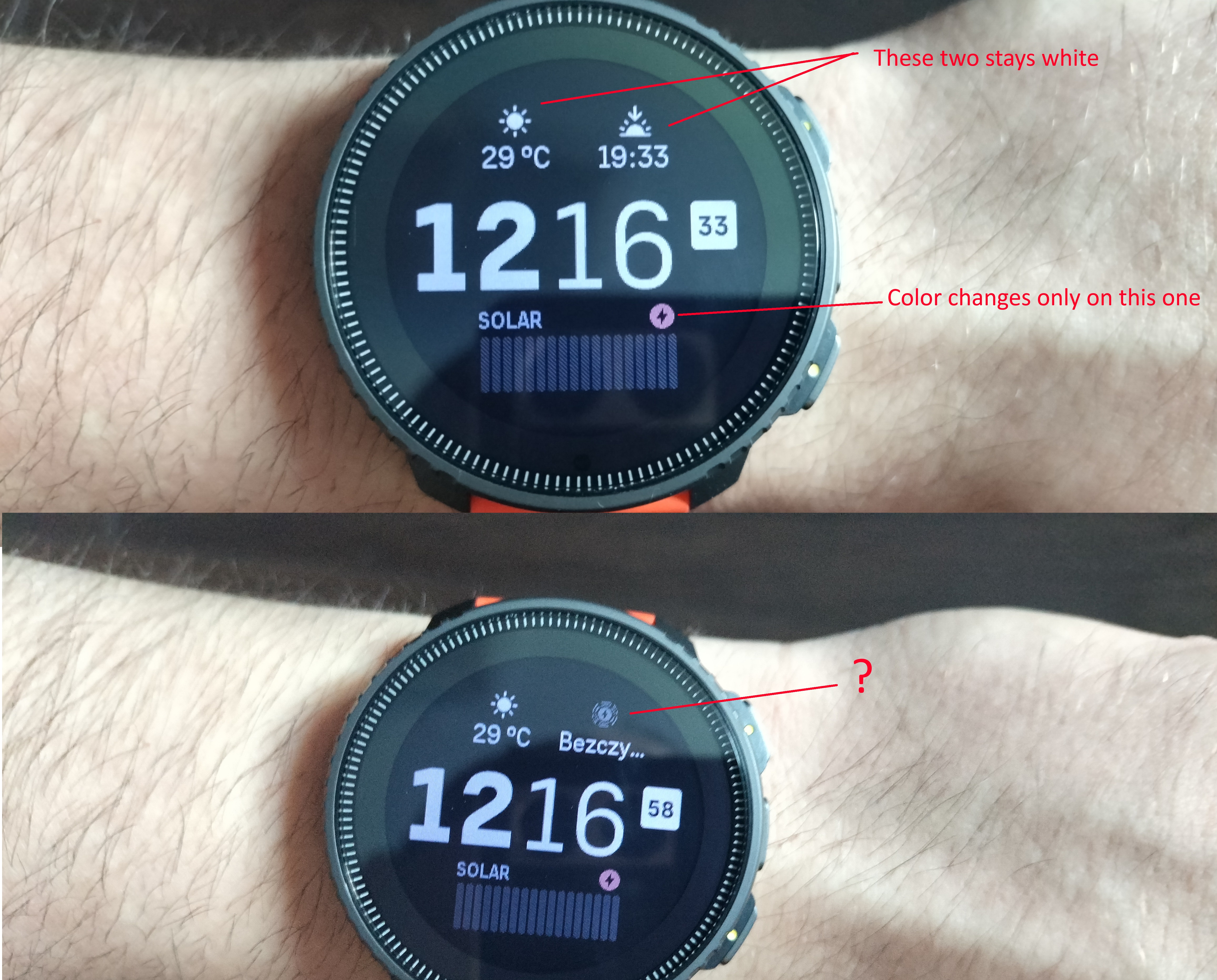
@pavel-samokha Will Vertical watchface go back to previous version please? (Or new one that works like old one) with changing small widgets color (always white, changing accent color doesnt work, works only on biggest widget), and bring back old solar widget look?.
-
@pavel-samokha said in K14 face updated?:
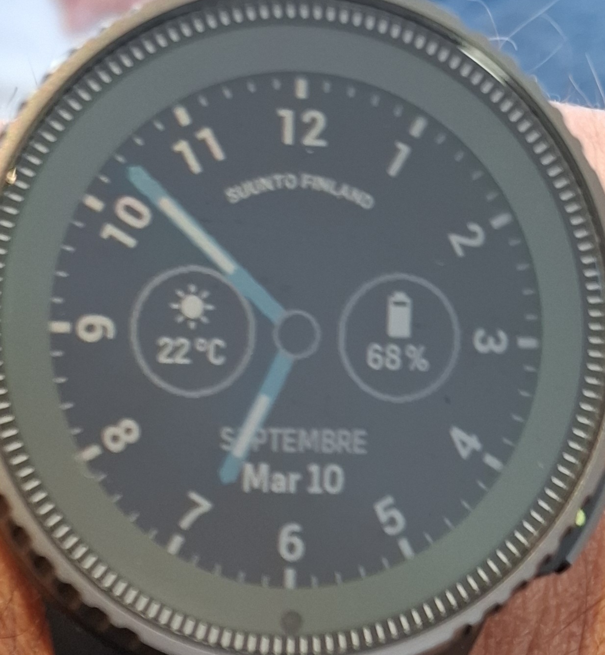
@Antoine can you show? On vertical 9 is perfectly correct for me
-
@Antoine
And? What is not correct?
-
@Tami999 can you avoid going off topic?
-
@Tami999 please write your requests to separate topic, it’s not related to K14 Watchface
-
@Antoine it looks correct to me, that’s how 9 should be rotated
-
@pavel-samokha
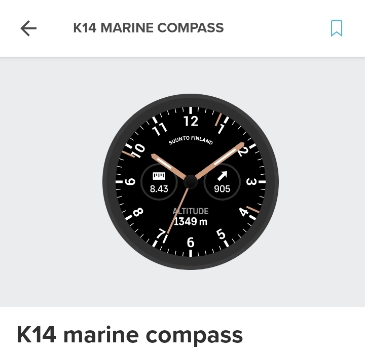
Maybe because it is not like displayed in the app?
-
@Mff73 said in K14 face updated?:
@pavel-samokha
Maybe because it is not like displayed in the app?

Yes like that it looks okay. On our watches the 9 isnt in the Position as in this Screenshot. Looks like a 6 and not like the 9
-
@Mff73 the image in store is wrong, true
-
But indeed all that is confusing, not sure numbers changing direction is right at all. I’ll ask
-
@pavel-samokha It is in line with all the other analog watch faces.
My personal preference however, would be non-rotating numbers -
My favourite watchface at the moment!
-
@pavel-samokha said in K14 face updated?:
@Stefano-M64 it was updated. Unfortunately we don’t have some built-in way to show updates in S+ store
maybe just a different badge in the watchfaces list?
-
@pavel-samokha
Having quarters hours vertical could also free some space for complications -
@Mff73 said in K14 face updated?:
@pavel-samokha
Maybe because it is not like displayed in the app?

Yes, good answer
 . That was my remark. Indeed, it is not the same dispay (rotation) of the “9” in suunto app and in the watch. But true, the wrong dispay seems to be in Suunto App not in the watch.
 -
Regarding how to rotate the 3 and 9: on technical drawings, text should be readable from the bottom or the right side. That would mean that the 3 should be turned around. See the first picture on https://en.m.wikipedia.org/wiki/Engineering_drawing – it shows the diameter dimensions should be read from the right (put your head on the left shoulder).
A watch face is not a technical drawing, but I find it quite sensible. For a more general discussion see https://graphicdesign.stackexchange.com/questions/143242/how-do-you-decide-the-text-direction-when-written-in-vertical-direction
-
correct, a watch is not a technical drawing.
So many watches are using all upright numbers:
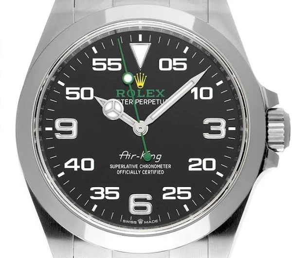
If numbers rotate around the center, then this is the watchmaker’s standard:
