Watchfaces in S+ store
-
@far-blue said in Watchfaces in S+ store:
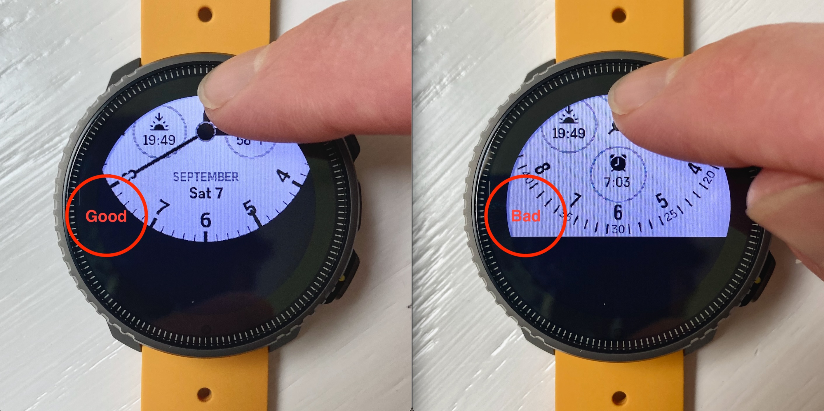
@The_77 it’s very hit&miss for me but it does also work on the Race S. The smaller complications are particularly tricky to get to work. I found if I press a bit harder - I assume that results in a large touch surface trigger and less moving around of my finger on the screen - it works about 70% of the times I try with the smaller complications.
Thats exactly what I was thinking

-
@far-blue said in Watchfaces in S+ store:
@The_77 it’s very hit&miss for me but it does also work on the Race S.
That also works on the Race, thanks!
-
@morm1 I use the Modern Analog watch face. On the right I have the Sunset/Sunrise complication on the left the height, below steps.
When I first unlock the scree by pressing the right button and then hold one of those complications I end up at their detail screens. Its an SPP9 Titanium. -
@TitaniumDave That compass complication was great but I never really used it - thougt it might drain the battery faster and couldn’t decide sunrise/sunset or compass.
-
@The_77 I actually had the date complication active, for date there is obviously no detail available. Now I changed to the altitude complication, with this it is also working for me.
But yea, rotating the complications by tabbing once and jumping to their details by tab and holding would be perfect!
-
@Ecki-D It seems, not all complications got details. With alti it works also for me…
-
I like the new, more vibrantly colored complications, but I would like to be able to choose their colors. I can’t make blue, yellow or violet work with my orange accented watch faces. Orange, red or white or even a bolder, darker yellow would be better. I’ve said it at least twice now on this forum but I’ll say it again with an addendum. We need to be able to choose the colors of every element/complication on the watch face. The addendum to that is, instead of having an accented and a white version of certain complications, we could have just the white version that we can then color any way we like. As it is now, there are complications with colored icons, or colored text, or colored progress bars, or all three. Nowhere is there the option to choose what is colored and what color I want it to be. I have a feeling Suunto is moving in that direction, but only time will tell.
Also, on the topic of complications, please don’t frame them on the watch face. Take the new arrow watch face. I can’t use it without complications because there are two round, grey frames on the watch face. Why can’t the complications sit on top of the dial, or why can’t the frames come and go on demand. Some watch faces do this, please make them all do this? Your design language is a bit scattered.
Also, I love the branding on the K14 watch face. I wouldn’t mind seeing simple branding on more faces, the name, motto or red triangle.
Oh, and don’t get me started on the timer. Honestly, the way it works now, I question why it’s even available. It’s all but useless. Try cooking and timing three separate pans with it. But again, it’s a backup after my kitchen timers, phone, etc.
-
Oh, and don’t get me started on the timer. Honestly, the way it works now, I question why it’s even available. It’s all but useless. Try cooking and timing three separate pans with it. But again, it’s a backup after my kitchen timers, phone, etc.
What is wrong with your timer? Mine works well, I set the timer and I can see the timer occupy a complication on the watch face, which I think is a brilliant implementation.
-
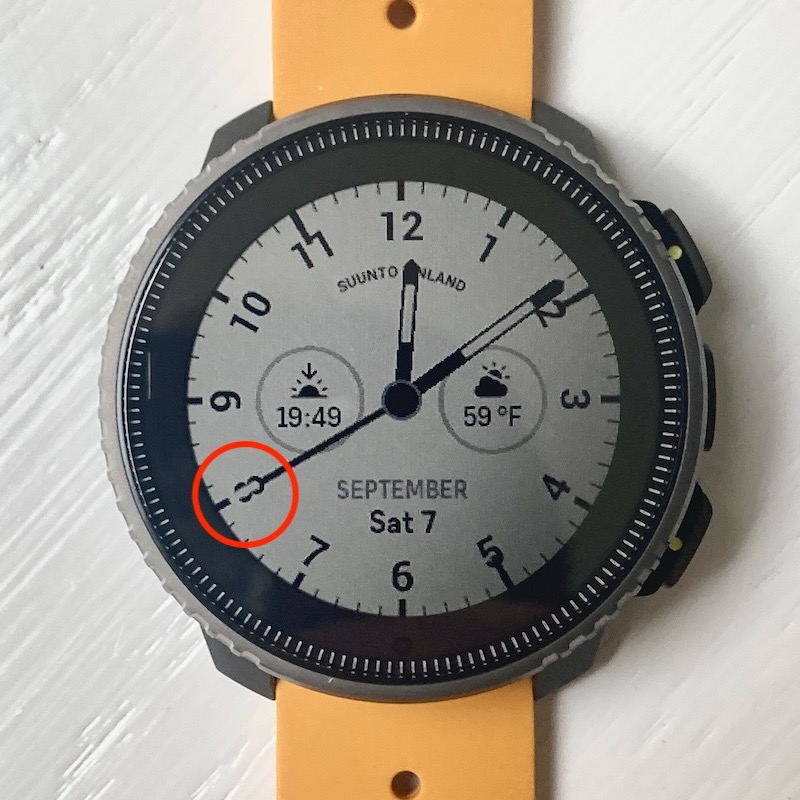
Small issue with the “K14 marine compass” face:
With accent color “Contrary,” the tip of the second hand remains white against the white background, so it effectively disappears and makes the numerals disappear as well.

The tip should probably be black.
Also, can I make a request for more light-colored watch faces for the MIP users? We used to have a few choices, now just one per watch face. I understand AMOLED and all that, but if you’re going to offer one option, why not 2 or 3 with some color?
Edit/Also:
The masking around the “Classic analog” watch face with “contrary” color is missing. I’m pretty sure it was correct before the update.
-
@Brad_Olwin For a pure sports setting, the implementation is great, but not brilliant. Beyond that it’s lacking.
First, I can only set one timer. I have many instances when I need to set multiple timers.
Second, the stop watch doesn’t do splits. What?
Third, the timer or stop watch take over a complication slot when they are running.
Fourth, I can’t have a timer and stop watch at the same time.
Finally, there is no meaningful indicator when the timer reaches zero. It gently counts down the last 10 seconds. Why doesn’t it alarm with a vibration like the alarm clock? I often need a timer in noisy environments.
It just seems to me like the timer is not designed to stand alone, it’s meant to be used in conjunction with something else, like another timer or a phone timer. What I often find myself doing is a workaround, I set multiple alarms to ring in 10, 20, 13, 17, etc minutes. If the watch has a “timer” why am I using the alarm clock as a “timer”? I’m sure I can’t be the only one.
-
@TitaniumDave said in Watchfaces in S+ store:
Second, the stop watch doesn’t do splits. What?
Seriously. The stopwatch and timer seem like an afterthought. Is a stopwatch even a stopwatch without a lap button?
-
P pavel.samokha moved this topic from The Lounge on
-
P pavel.samokha locked this topic on
-
Topic is locked.
If you have further question/suggestions about watchfaces, please create topics in new category https://forum.suunto.com/category/56/suuntoplus-watchfaces