Graphical analysis of suuntoplus app data
-
In recent updates, many watch apps have been added that show different data, for example -
- Ultra Walking
- Climb
- Burner
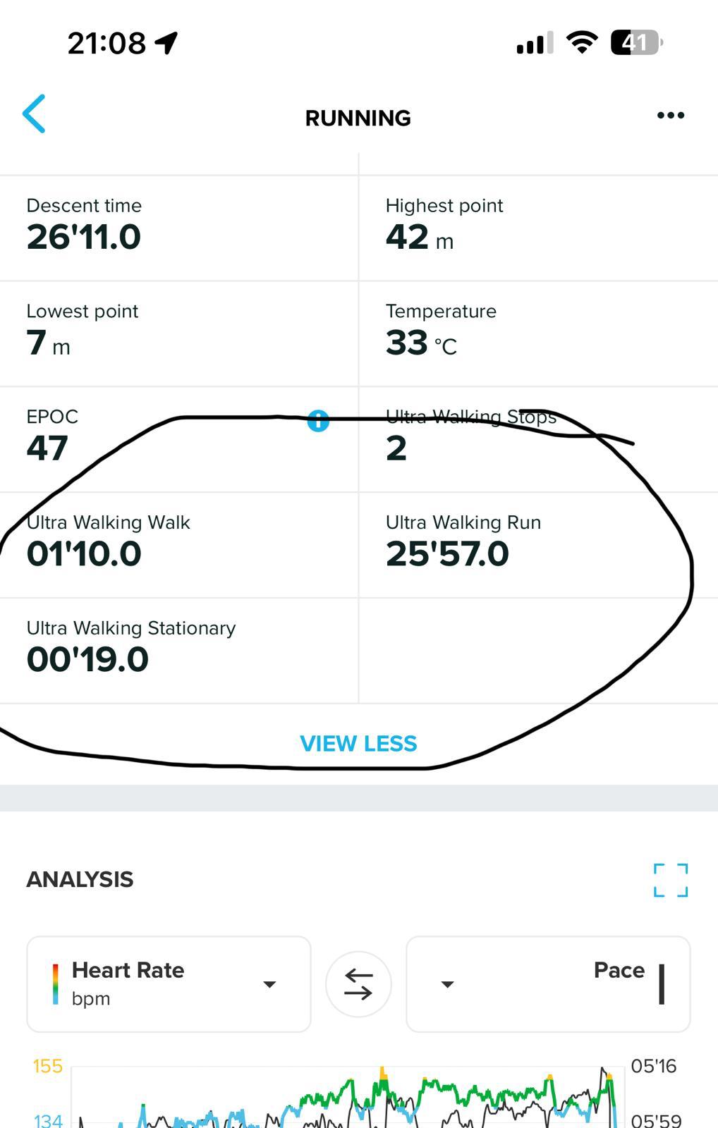
Is there a way to see the data in a graphical analysis as shown in the attached image
ultra walk data circled in the image
Hello! It looks like you're interested in this conversation, but you don't have an account yet.
Getting fed up of having to scroll through the same posts each visit? When you register for an account, you'll always come back to exactly where you were before, and choose to be notified of new replies (either via email, or push notification). You'll also be able to save bookmarks and upvote posts to show your appreciation to other community members.
With your input, this post could be even better 💗
Register Login