Barometer graph
-
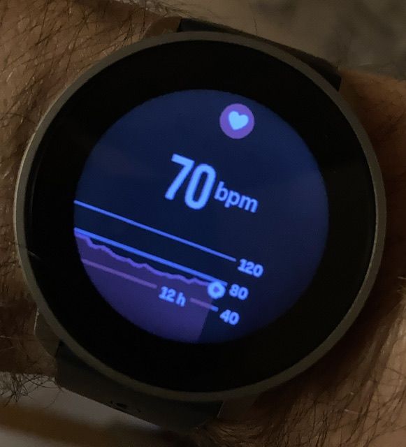
Here’s an example hr graph:
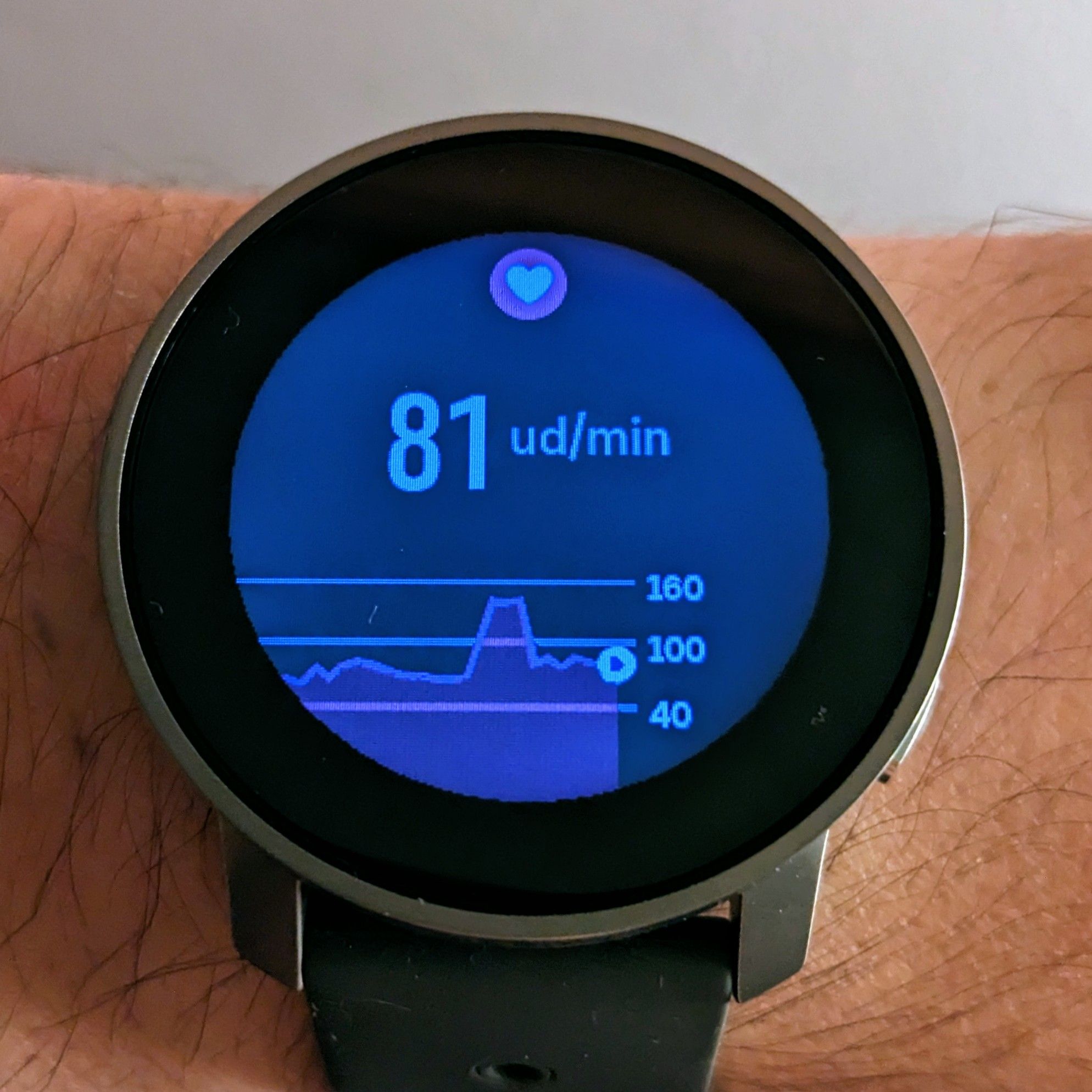
It looks OK. There’s room above the max registered hr.
Here’s an example barometer graph:
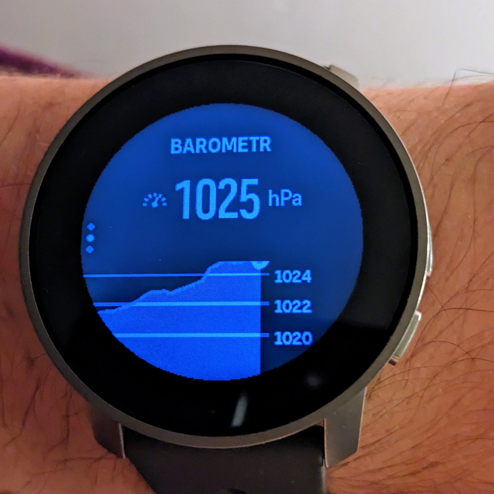
Why is it positioned like this? Why 1024 is max while the pressure is higher and it tops the graph? Shouldn’t 1026 be visible?
As a bonus, resources:
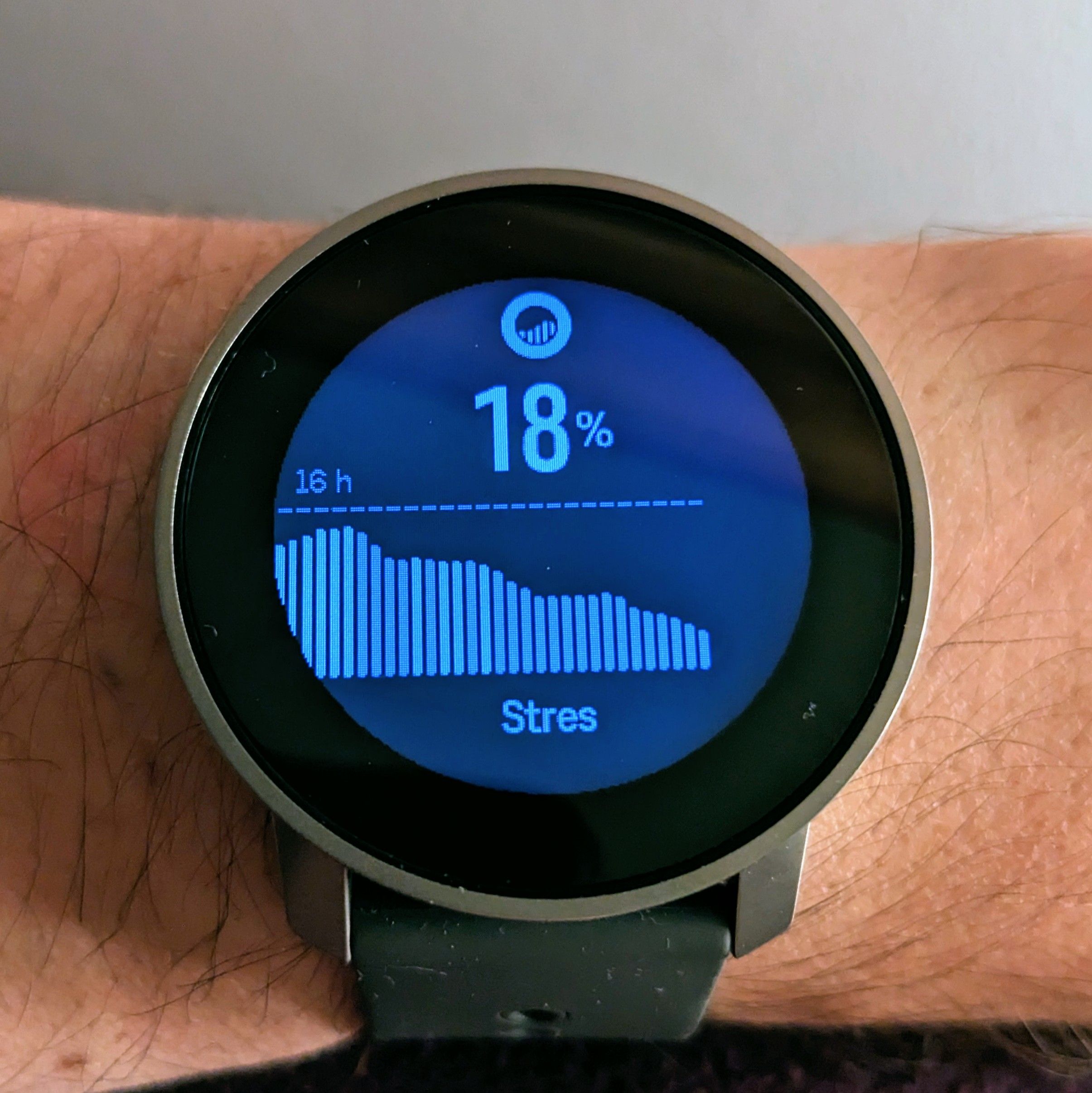
Why there’s dashed line on top with 16h? I assume that it’s resources for the last 16 hours? If so, why there’s no time scale in barometer trend or hr widget?
S9PP 2.50.28
-
@Łukasz-Szmigiel Ive seen that on mine too re: barometer. I think it’s bad code and hopefully fixed in a future firmware update.
-
@Łukasz-Szmigiel said in Barometer graph:
I assume that it’s resources for the last 16 hours? If so, why there’s no time scale in barometer trend or hr widget?
the x-axis description is there in S9B, I assume it will also find its way to the pro.
The graph going over the y-axis limit looks like unintended behavior. -
Time scale is displayed for the four graphs in S9P (HeartRate, Resources, Altimeter, Barometer) so I assume it will be solved for S9PP in next update.
-
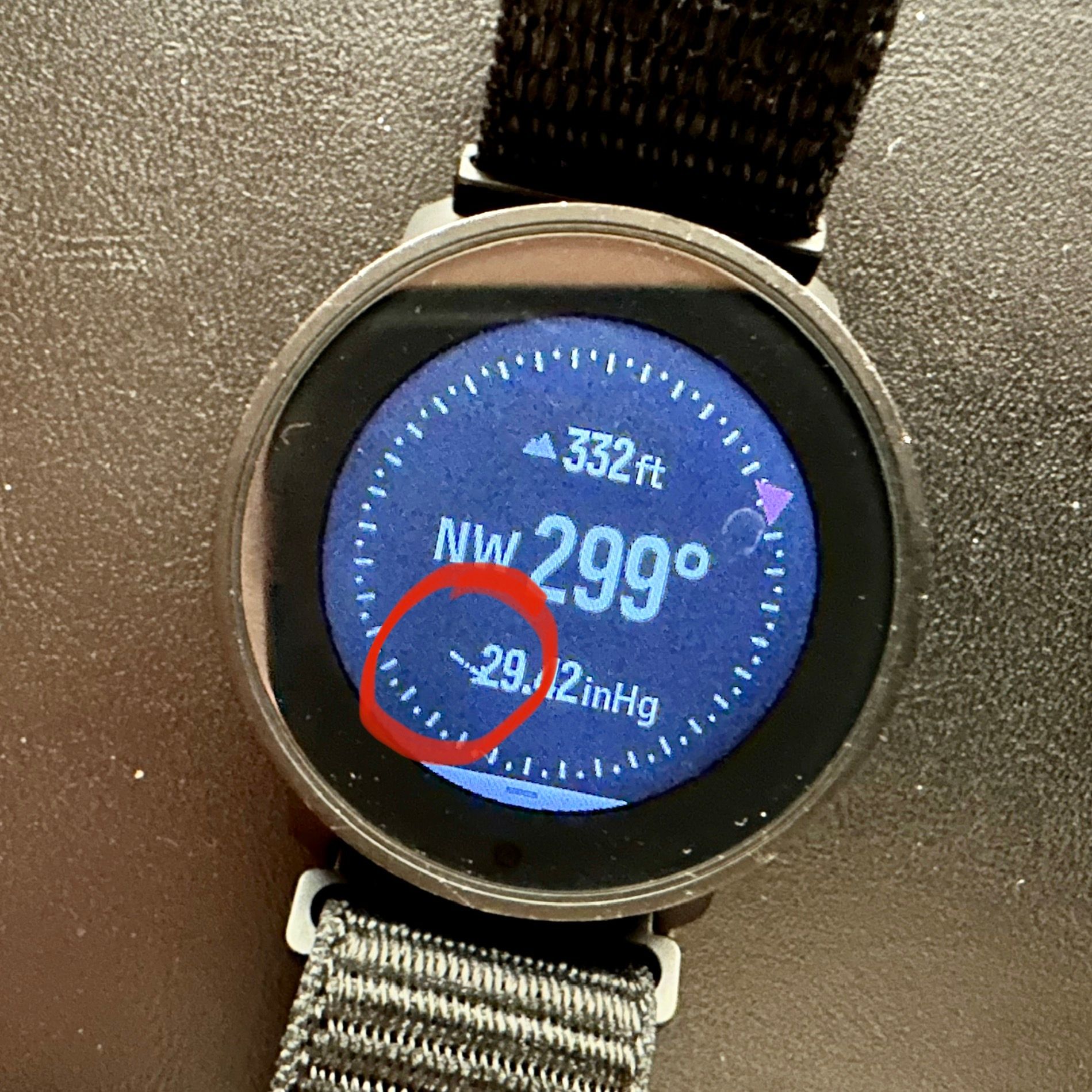
Theres a similar UI bug on the Compass widget with the pressure symbol on the S9PP.
-
@Łukasz-Szmigiel those time scales will come with next update. Test builds already have them.

-
@Egika nice!
Hello! It looks like you're interested in this conversation, but you don't have an account yet.
Getting fed up of having to scroll through the same posts each visit? When you register for an account, you'll always come back to exactly where you were before, and choose to be notified of new replies (either via email, or push notification). You'll also be able to save bookmarks and upvote posts to show your appreciation to other community members.
With your input, this post could be even better 💗
Register Login