SA iOS 2.19
-
@el2thek Ooops my mistake. Are you on beta version ? 2.19 not available for now
-
@Tieutieu yes, beta version…
-
@Tieutieu yes it’s beta version
-
@Frederick-Rochette
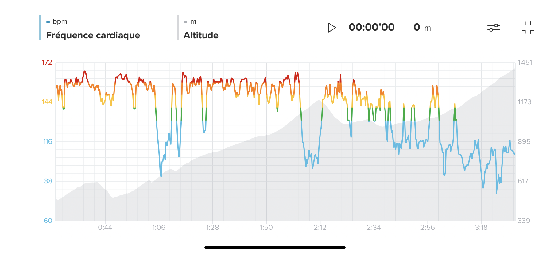
Did you notice that you can open it full screen and zoom in/out on specific sections? Is that what you’re missing?
-
No new s+ tho?
-
@DMytro S+ are not linked to a specific app version.
They are developed, tested and rolled out whenever ready. -
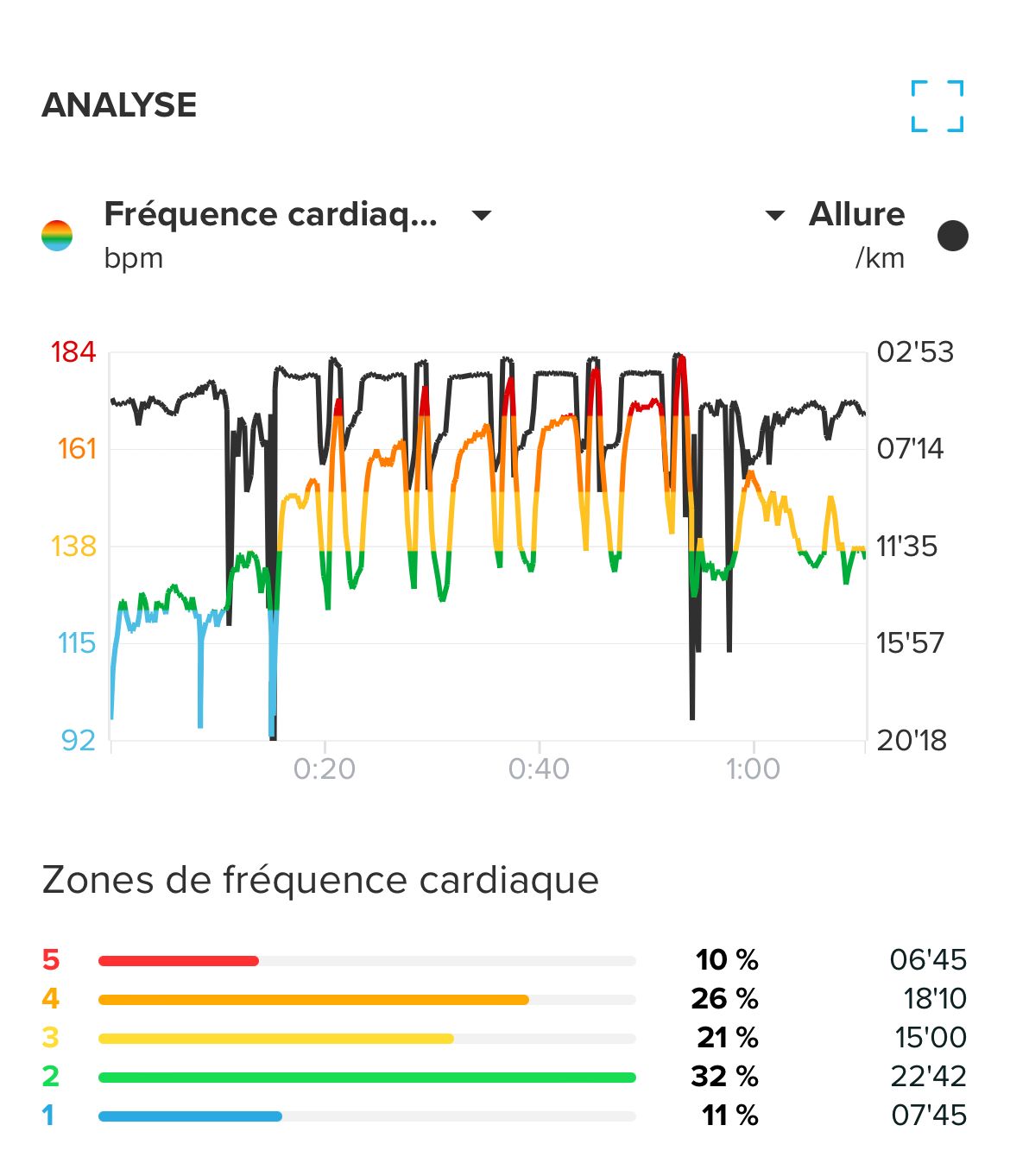
I see, that finally added S+ on graphs,
new map style - Finland (for Finland only=))
and scale on map - super useful!!! -
@Kosta Finland was there a long time ago also, then was removed. Not sure if it’s supposed to be there in production, or it’s just a test for something.
-
@jw-cou Yes I noticed that and it’s interesting but when we make a selection, I would like to have data about it. Kilometres, time,
average HR, average pace, average power, elevation gain, etc… it’s very interesting when you want to analyse a training or a race section by section. This exists on Nolio for example. -
The colored HR graph is really useful. But it would be nice, if the app would persist the last used setting of this graph. I always want the HR graph first, but whenever I open an outdoor activity (with GPS), elevation (1st metric) and heart rate (2nd metric) are selected. So I always need to deselect heart rate and then select heart rate for the first metric to get the colors.
And if I open this graph in full screen mode, my selected metrics are NOT displayed in fullscreen. Instead the selection is always reset to height/hr/speed (at least this is the case for cross country skiing) and I need to make my changes again. So if the user has selected HR as the first metric in non fullscreen mode, it should also be the first metric in fullscreen mode. That’s what I would expect as a user.
Another nice addition would be, if the interval sections of a structured interval would be displayed inside this graph (at least in full screen mode). And even better: if those sections could be selected and some metrics about the selected section would be displayed. For example: min/max/avg HR or some info about how long I have spent in the targeted HR zone (maybe as percentage).
But to be honest: I don’t know how all of this can be displayed on a smartphone screen. Maybe this is something for tablets
