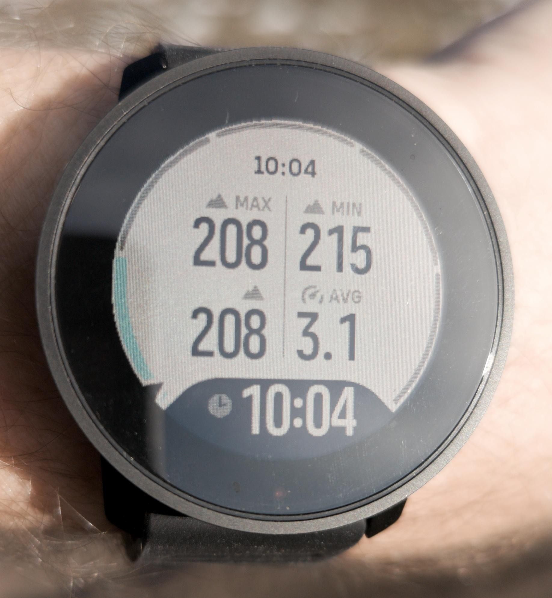
What do you think 😂
-
 MIN > MAX !?
 -
@Piotr-Grygiel

interesting… what sport mode is it? I’d like to check if I can replicate that.
but a side comment: the title says: what do you think… to track this issue/bug a bit better and clear to other users, maybe a different and more descriptive title would be helpful
-
@freeheeler Hiking.
-
-
I think that glyphs in the new UI are too tall and make the vertical spacing too shallow for good readability on a quick gaze, especially during the run, when it’s hard to keep the watch steady.
The screen is more detailed, it has better sharpness, there’s less aliasing, but I believe more spacing between data fields would be welcome.
You can see how little spacing there is in the bottom (inverted) field. The numbers have very little room and are almost touching the field boundaries. This is very bad for readability.
-
@Łukasz-Szmigiel
@Piotr-Grygiel
…see, what do you think
…I tested with my watch and min/max are fine
-
@freeheeler now I see it

Isn’t it because min / max had different time frames? Ie. 3s / 30s?
-
@Łukasz-Szmigiel
what do you mean by time frame? -
@freeheeler oh I need coffee badly. I thought it’s power, not alti

-
@Piotr-Grygiel
I’ve tried twice and can’t reproduce it. can you?